Creating Maps in Jupyter Notebook using GeoPandas
Contents
Introduction
Learning Outcomes
- Install and run GeoPandas in Jupyter Notebook.
- Load, clean, and merge tabular and spatial data.
- Produce a choropleth map with a legend, scale bar, and north arrow.
Purpose
This tutorial will demonstrate how Jupyter Notebook can be used to manage and display spatial data in conjunction with Anaconda and GeoPandas. Using Jupyter Notebook in this procedure will enable you to develop your skills in scripting and automatic mapping. This workflow is accessible to users with less computational power, and data will be easier to store and manage. In the second part of this tutorial, we will show you how to display the data as a complete map (utilizing basic cartographic elements). This tutorial is designed for GIS users with some experience using graphic user interfaces, who are looking to get into using Python to streamline their workflow. The instructions and figures included in this tutorial were developed on the Windows operating system. If you are using a different operating system, your process may be slightly different.
About Jupyter
Jupyter Notebook was created by Project Jupyter, which is a collective which aims to develop open-source software in various programming languages. Jupyter Notebook specifically enables users to easily create and share code, as well as visualise data, among other uses. It is free to download and use (Jupyter, n.d.). While it runs in web browsers, it also runs locally on the user’s machine, which makes it easy to save version controls locally. Another advantage of Jupyter is that you can type code into kernels, and run those kernels individually. This will be demonstrated in the tutorial, but as a quick explanation -- the benefits to this include being able to test code easily and quickly visualize a certain data table, or in our case, create a map quickly without having to run all of the code at once.
About GeoPandas
GeoPandas is an open source library in Jupyter that builds off of pandas in Python. It is designed for users to more easily perform geospatial operations, by taking advantage of data frames in pandas, and creating spatial data frames. GeoPandas uses fiona for accessing files, Shapely objects for geometric manipulation and Matplotlib for plotting (geoPandas, n.d.). Under the hood, GeoPandas builds on several specialized geospatial libraries. It uses Fiona for file access, Shapely for geometric operations such as buffering, intersection, and union, and Matplotlib for map visualization. More advanced functionality can also be supported with Pyproj for coordinate reference system transformations and rtree for spatial indexing. Together, these tools allow users to read, manipulate, analyze, and visualize spatial data directly in Python without needing to constantly switch between dedicated GIS software and coding environments.
GeoPandas is especially powerful when combined with Jupyter Notebook, because it allows you to interleave code, explanatory text, and map outputs in one place. This makes it an excellent tool for reproducible research, teaching, and rapid prototyping of GIS workflows. Whether you are joining attribute tables to shapefiles, creating choropleth maps, or exporting results for use in other software, GeoPandas provides a flexible, scriptable alternative to GUI-based GIS platforms while retaining accessibility for newcomers.
Note on Software Versions
This tutorial uses the latest versions of software available at the time of writing (October 2024). Python 3.12, and geoPandas 0.14.1. If you find updated versions of software when you try this tutorial, please note that there may be some differences in what you see in our screenshots and instructions, and what you see on your software.
Part 1: Getting Started
Software
This tutorial will be for Windows machines. The following steps will assume that the user is on a Windows platform, and therefore if you are using any other machine, the steps may be slightly different. This tutorial also assumes that the user already has QGIS installed. If you do not have QGIS already, please go to this website to do so.
Install Anaconda
Install Anaconda here.
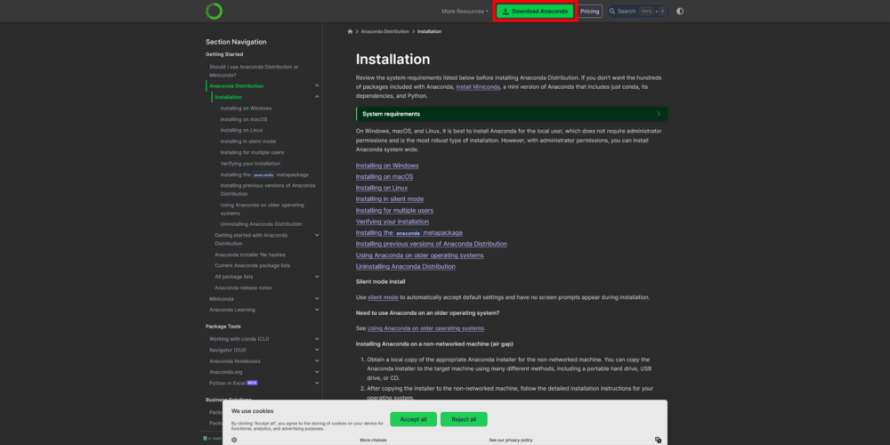
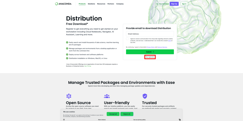
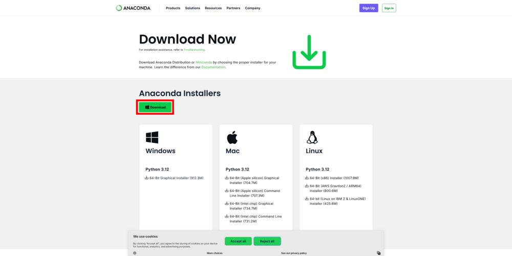
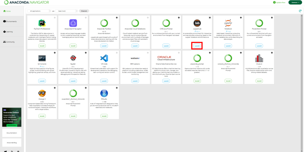
Follow the images to install Anaconda then open the Anaconda Navigator and Install/Launch JupyterLab
Step 1.
Step 2.
Step 3.
Step 4.
After Opening Anaconda Navigator
Cross-platform Software Installation
Using the code below you can install for Windows/Mac/Linux:
Step 1.
- Create a clean Conda env
Step 2.
- Install GeoPandas (+ helpers)
Step 3.
- Launch JupyterLab from this env
Data
All the data and code can be downloaded from this Google Drive Link
The download contains:
- The Jupyter Source File
- The Final Map in both PNG and PDF formats
- The Census Area Population Data[1]
- The local-area-boundary Shapefile[2]
Updated & Broader Data
For alternate method of doing this tutorial, you can find updated data on Ottawa wards and population:
- Download wards (City of Ottawa): open data item “Wards 2022–2026” download the Shapefile/GeoPackage or use the FeatureServer/GeoJSON if available.
- https://open.ottawa.ca/datasets/ottawa%3A%3Awards-2022-2026/about
- Download 2021 population from Statistics Canada 2021 Census (Census Profile downloads; pick “CT”, “DA”, or CMA/municipality and aggregate to wards).
Part 2: Opening the Code
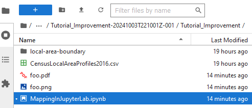
Once JupyterLab is open, navigate to the downloaded folder using the file browser tab on the left side. Once inside double click on MappingInJupterLab.ipynb and follow along
Part 3: Tools and Data Organization
Tools
Here is the code cell that contains all the import statements that will be used in the tutorial

- import pandas as pd:
- This imports the pandas library, a powerful tool for data manipulation and analysis, particularly with tabular data (dataframes). The alias pd is commonly used for brevity.
- import numpy as np:
- This imports NumPy, a library used for numerical computations, especially with arrays and matrices. In our case we use it for the orientation of the North Arrow.
- import matplotlib.pyplot as plt:
- This imports pyplot from the matplotlib library, which is widely used for creating static, animated, and interactive visualizations in Python. The alias plt is used to simplify plotting commands.
- import geopandas as gpd:
- This imports GeoPandas, an extension of pandas that adds support for geospatial data. It simplifies working with geographical data, such as handling shapefiles and performing spatial operations.
- import os:
- This imports Python’s built-in os module, which provides functionality for interacting with the operating system, such as reading or writing files, navigating directories, and managing paths.
Importing The CSV
This is the code cell that imports the CSV file into a dataframe.
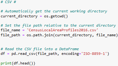
- Note that there is encoding='ISO-8859-1' which is required because of the CSV's file formatting, in most cases an encoding will not be necessary
- It is always a good idea to print out the data you have just imported to make sure that it imported correct
- the print(df.head()) will print the first 5 rows of the CSV
- the print(df.head()) will print the first 5 rows of the CSV
Ottawa Data
- This is the code cell to load wards:
- This code cell loads the census table:
Converting CSV to Desired Formatting
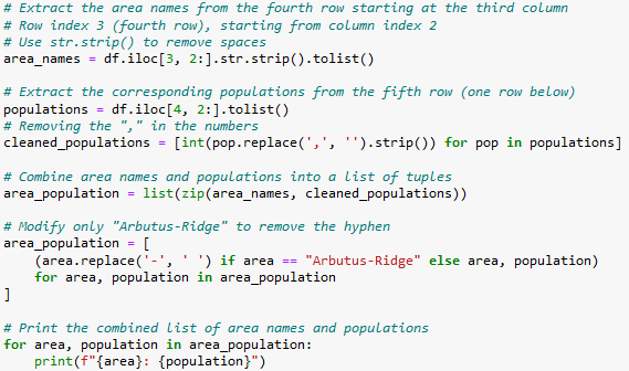
One of the biggest strengths of using Python in your workflow is the ability to automate tasks. The CSV file contains lots of information we do not need and the columns and rows are inverted to what would be intuitive. The following cell shows all the modifications and moves that were made in order to get the Are names in one column with their matching populations in the column to the right. If you want more details on what each of the lines of code is doing read the commends in the code. Once again we are printing the result to make sure they are in the desired formatting.
Importing The Shapefile
This cell takes the shapefile and imports it into a geodataframe. Note that we are printing the columns with print(gdf.columns) because we need to know the names of the columns we will be merging data to.

Part 4: Merging
The next step is the merge the data onto the geodataframe using a common variable. In this case we will must the name columns of both data. The how='left' clarifies that we are adding the population data to the left dataset (being the shapefile)

Making a Join Key
- When using the updated Ottawa census data you can use the following method to merge/join data
- If you have ward-level population already, align by a shared column (e.g., WARD_NUM ↔ a ward number/name in your table).
- If you only have CT/DA population, spatially join DAs/CTs to wards and sum:
Part 5: Displaying
Here is the cell that displays the finalized map. There are lots of different customization options that are explained in the code comments.
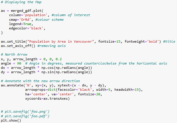
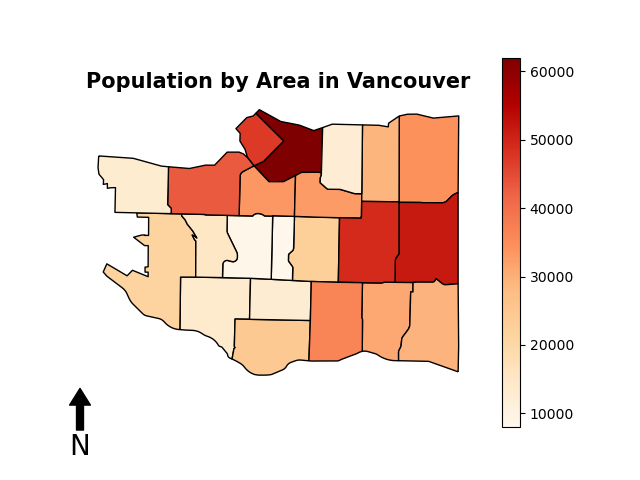
We are using matplotlib which is primarily used for graphs so there are little changes that we have to make to a good map. Additionally, there is no good implementations of a north arrow so we are forced to make our own. For the vast majority of maps the north arrow will be straight up but in the odd case where it is not you will have to manually change the angle of the arrow. Right before the map is displayed there are two commented lines of code which save the final product to either a png or a pdf. This is very useful if you want to share what you have made to others.
Final Result
Conclusion
This tutorial demonstrated how to create and visualize maps in Jupyter Notebook using GeoPandas, combining data analysis and cartography within a single, script-based workflow. Through the guided steps, you learned how to install GeoPandas across different operating systems, import and clean both tabular and spatial datasets, merge them using shared attributes, and produce a final map with cartographic elements such as a legend and north arrow.
The addition of Ottawa’s 2021 census and ward data provided an up-to-date and locally relevant example, showing how GeoPandas can be applied to real Canadian datasets. With these updates, the tutorial now serves as a complete, cross-platform reference for students and GIS users interested in transitioning from traditional software to open-source, reproducible Python workflows.
Overall, this exercise highlights the efficiency and flexibility of using GeoPandas for spatial data management and visualization, empowering users to automate mapping tasks and build professional-quality maps directly within Jupyter Notebook.
