Difference between revisions of "Creating a Heatmap using QGIS"
m (→Introduction: fixed wording) |
|||
| (36 intermediate revisions by 2 users not shown) | |||
| Line 1: | Line 1: | ||
| ⚫ | |||
| ⚫ | Heatmaps are one of the best visualization tools for dense point data. Heatmapping is an interpolation technique that is useful in determining density of input features. Heatmaps are most commonly used to visualize crime data, traffic incidents, housing density etc. The density is calculated based on the number of points in a location, with larger numbers of clustered points resulting in larger values. Heatmaps allow easy identification of “hotspots” and clustering of points. QGIS has a heatmap renderer that can be used to style a point layer and a processing algorithm Heatmap (Kernel Density Estimation) that can be used to create a raster from a point layer. |
||
== Purpose == |
== Purpose == |
||
The purpose of the tutorial is to provide users with a step by step process of how to create a heatmap on QGIS. This tutorial will contain detailed explanations on how to download and use the QGIS software, how to get open source data and how to use the Heatmap feature in Symbology, make analysis and inferences from the data and how to create a map in QGIS. The tutorial will also cover the limitations of QGIS for making Heatmaps. For the tutorial, we would be making a Toronto Crime Heatmap with Data from the Toronto Police. |
The purpose of the tutorial is to provide users with a step by step process of how to create a heatmap on QGIS. This tutorial will contain detailed explanations on how to download and use the QGIS software, how to get open source data and how to use the Heatmap feature in Symbology, make analysis and inferences from the data and how to create a map in QGIS. The tutorial will also cover the limitations of QGIS for making Heatmaps. For the tutorial, we would be making a Toronto Crime Heatmap with Data from the Toronto Police. |
||
| Line 7: | Line 11: | ||
In accordance with the Municipal Freedom of Information and Protection of Privacy Act, the Toronto Police Service has taken the necessary measures to protect the privacy of individuals involved in the reported occurrences. No personal information related to any of the parties involved in the occurrence will be released as open data. |
In accordance with the Municipal Freedom of Information and Protection of Privacy Act, the Toronto Police Service has taken the necessary measures to protect the privacy of individuals involved in the reported occurrences. No personal information related to any of the parties involved in the occurrence will be released as open data. |
||
The location of crime occurrences have been deliberately offset to the nearest road intersection node to protect the privacy of parties involved in the occurrence. All location data must be considered as an approximate location of the occurrence and users are advised not to interpret any of these locations as related to a specific address or individual. |
The location of crime occurrences have been deliberately offset to the nearest road intersection node to protect the privacy of parties involved in the occurrence. All location data must be considered as an approximate location of the occurrence and users are advised not to interpret any of these locations as related to a specific address or individual. |
||
| ⚫ | |||
| ⚫ | Heatmaps are one of the best visualization tools for dense point data. |
||
== Materials == |
== Materials == |
||
| Line 19: | Line 19: | ||
==== Download QGIS ==== |
==== Download QGIS ==== |
||
This tutorial was originally done with QGIS version 3.10.10 ‘A Coruña’ which was released in November 2019. |
This tutorial was originally done with QGIS version 3.10.10 ‘A Coruña’ which was released in November 2019. However, any version after 3.8.1 works as well. QGIS is available for download on their Official Website. Click on this link to direct you to the page https://qgis.org/en/site/forusers/download.html. Download and install the version mentioned or the most recent version for your operating system in order to follow along with the following step-by-step tutorial. |
||
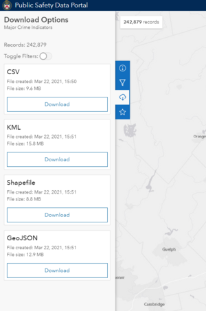
[[File:Download tab.png|thumb|right|Figure 1. On the Toronto Police Service Public Safety Data Portal, the third blue icon is the download button. ]] |
|||
==== Data Acquisition ==== |
==== Data Acquisition ==== |
||
| Line 33: | Line 34: | ||
Steps in data acquisition: |
Steps in data acquisition: |
||
<br> |
<br> |
||
# Go to the [https://data.torontopolice.on.ca/datasets/mci-2014-to-2019 MCI] page by clicking the link (https://data.torontopolice.on.ca/datasets/mci-2014-to-2019) |
# Go to the [https://data.torontopolice.on.ca/datasets/mci-2014-to-2019 MCI] page by clicking the link (https://data.torontopolice.on.ca/datasets/mci-2014-to-2019) or type in 'major crime indicators' under the 'Open Data' tab. |
||
# Click on '''Download''' |
# Click on '''Download''' (see Figure 2 for help), then under Full Dataset click on '''Shapefile''' |
||
# Repeat the same process for the [https://data.torontopolice.on.ca/datasets/neighbourhood-crime-rates-boundary-file- Neighbourhood Boundary] page by clicking the link (https://data.torontopolice.on.ca/datasets/neighbourhood-crime-rates-boundary-file-) |
# Repeat the same process for the [https://data.torontopolice.on.ca/datasets/neighbourhood-crime-rates-boundary-file- Neighbourhood Boundary] page by clicking the link (https://data.torontopolice.on.ca/datasets/neighbourhood-crime-rates-boundary-file-) or type in 'neighbourhood boundary' under the 'Open Data' tab. |
||
# Extract (Unzip) both folders and save in the working |
# '''Extract''' (Unzip) both folders and save in the working directory you will be using. |
||
== Tools and Methods == |
== Tools and Methods == |
||
| Line 42: | Line 44: | ||
=== Getting started === |
=== Getting started === |
||
For this tutorial |
For this tutorial, no changes are needed to the projection as we will be using the source projection. |
||
==== Import Data ==== |
==== Import Data ==== |
||
# The fastest way to import |
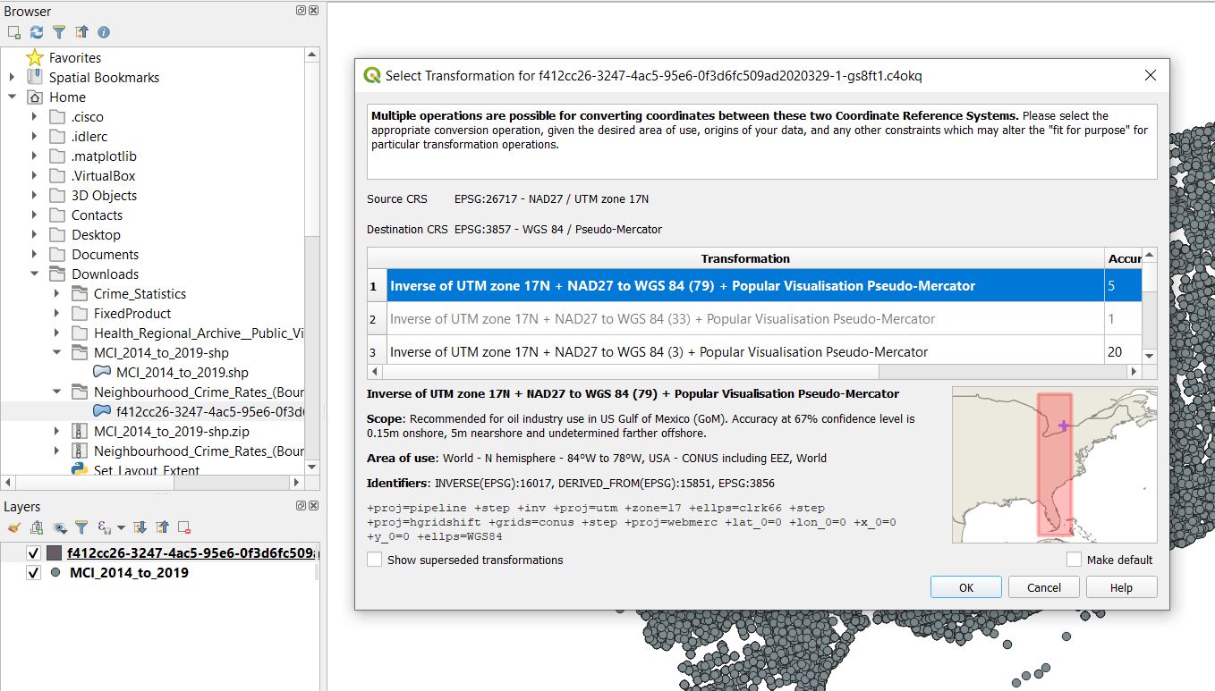
# The fastest way to import data is by going through the '''Browser Panel''' (on the left of your new project screen) and navigating to where you stored the 2 shapefiles from your working directory. In my case, I stored the shapefiles in the Download folder. Drag both shapefiles to the '''Layers''' panel. You would need to transform the Neighbourhood Data to match the Projects Projections. Simply click '''Ok'''. |
||
[[File:Hvhjv.jpg|frame|center|Figure 2. Import both shapefiles and transform the projection of neighbourhood shapefile by clicking ok on the pop up.]] |
|||
<br>2. Next, add the basemap that is provided by QGIS. In the browser panel, you should see a directory called "'''XYZ Tiles'''". In there is the “OpenStreetMap”. Drag that down to the Layer panel. |
|||
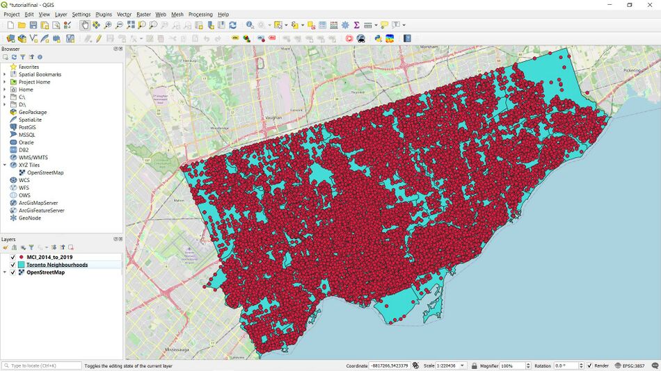
:At this point your screen should look like this (Figure 3 below). You might have to rearrange the layers in this order: MCI layer, Neighbourhood layer and OpenStreetMap layer. Feel free to rename the layers, and change the symbology for easy visualization. |
|||
[[File:C.jpg|thumb|center|950px|Figure 3. The QGIS screen with all layers added.]] |
|||
=== Process === |
=== Process === |
||
In this section we |
In this section, we will begin editing the data to what we will need to use it for. |
||
Feel free to explore the Attribute Table for the MCI layer. |
Feel free to explore the Attribute Table for the MCI layer. |
||
<br>Because this shapefile contains a lot of data for ranging (Field name: |
<br>Because this shapefile contains a lot of data for ranging (Field name: occurren_1) from 2000 - 2019 (even though the shapefile says 2014 - 2019), we would only be working with 2019 data. |
||
Due to the sensitivity of the data we are using, we would only be making heat maps for Property related crimes according to the [https://www.justice.gc.ca/eng/rp-pr/cj-jp/victim/rr05_4/p7.html#a5_2 Department of Justice] categorization: Break & Entry (all types), Theft of Motor Vehicle and Non-vehicle Theft (all of theft). |
Due to the sensitivity of the data we are using, we would only be making heat maps for Property related crimes according to the [https://www.justice.gc.ca/eng/rp-pr/cj-jp/victim/rr05_4/p7.html#a5_2 Department of Justice] categorization: Break & Entry (all types), Theft of Motor Vehicle and Non-vehicle Theft (all of theft). |
||
==== Methodology ==== |
==== Methodology ==== |
||
Here we would be creating feature layers from the MCI layer and creating the heatmaps. |
Here we would be creating feature layers from the MCI layer and creating the heatmaps. |
||
<br>For Break and Entry, 2019 shapefile: |
<br>For the '''Break and Entry''', 2019 shapefile: |
||
<br><nowiki>1. </nowiki> |
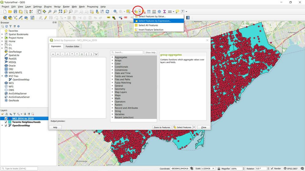
<br><nowiki>1. </nowiki> Click on the MCI layer, then on the Toolbar click on '''Select Features by Expression'''. It could be in the top row of the Toolbar (shown below in Figure 4) or on top of the "Browser" section on your left. |
||
[[File:Djv.jpg|thumb|center|1000px|Figure 4. To find "Select Features by Expression"]] |
|||
<br><nowiki>2. </nowiki> Click on “Fields and Values” and select “occurren_1”, then put an “=” and type 2019. |
<br><nowiki>2. </nowiki> Click on “Fields and Values” and select “occurren_1”, then put an “=” and type 2019. |
||
(This means we are narrowing the data to 2019 only.) |
(This means we are narrowing the data to 2019 only.) |
||
[[File:Egfr.jpg|frame|center|Figure 5. Select by Expression for 2019 B&E]] |
|||
<nowiki>3. </nowiki> Next type “And”, and click “offence”, then type “like” and finally type “ ‘B&E%’ ”. |
<nowiki>3. </nowiki> Next type “And”, and click “offence”, then type “like” and finally type “ ‘B&E%’ ”. |
||
(The “And” joins the first statement with the second statement”. The second statement narrows down offence to Break and Entry. |
(The “And” joins the first statement with the second statement”. The second statement narrows down offence to Break and Entry. |
||
| Line 68: | Line 72: | ||
Meaning it covers everything past “B&E”. ie. “B&E”, “B&E - M/Veh To Steal Firearm”, “B&E Out”, etc.) |
Meaning it covers everything past “B&E”. ie. “B&E”, “B&E - M/Veh To Steal Firearm”, “B&E Out”, etc.) |
||
Your statement should look like this: “occurren_1” = 2019 AND “offence” like ‘B&E%’ |
Your statement should look like this: “occurren_1” = 2019 AND “offence” like ‘B&E%’ |
||
After all this click Select Features. And you should see certain points on the map selected, though it may be hard to visualize. |
After all of this, click '''Select Features'''. And you should see certain points on the map selected, though it may be hard to visualize. |
||
<br>Be careful of the syntax and formatting as the tool is case sensitive. For more information about how Expressions work, check out this link (https://docs.qgis.org/2.18/en/docs/user_manual/working_with_vector/expression.html) |
<br>Be careful of the syntax and formatting as the tool is case sensitive. For more information about how Expressions work, check out this link (https://docs.qgis.org/2.18/en/docs/user_manual/working_with_vector/expression.html) |
||
<br><nowiki>4. </nowiki> Right click on the “MCI 2014 to 2019” layer and click on “Export” then “Save Selected Features As...” |
<br><nowiki>4. </nowiki> Right click on the “MCI 2014 to 2019” layer and click on “Export” then “Save Selected Features As...” |
||
[[File:Fdf.jpg|thumb|center|1000px|Figure 6. Save selected features as..]] |
|||
<br><nowiki>5. </nowiki> Change the Format to “ESRI Shapefile” and set the File name as “BreakEntry2019” (or whatever you prefer) and then click Ok. Leave everything else the same. |
<br><nowiki>5. </nowiki> Change the Format to “ESRI Shapefile” and set the File name as “BreakEntry2019” (or whatever you prefer) and then click '''Ok'''. Leave everything else the same. if the file shows an error, check the location of where the output will be saved to. |
||
<br><nowiki>6. </nowiki> Unselect the “MCI 2014 to 2019” layer and you should now see all Break and Entry cases for 2019 in Toronto. |
<br><nowiki>6. </nowiki> Unselect the “MCI 2014 to 2019” layer and you should now see all Break and Entry cases for 2019 in Toronto. |
||
<br><nowiki>7. </nowiki> Next, we would be making the heatmap. Right click on the “BreakEntry2019” layer and select “Properties”. |
<br><nowiki>7. </nowiki> Next, we would be making the heatmap. Right click on the “BreakEntry2019” layer and select “Properties”. |
||
<br><nowiki>8. </nowiki> Click on |
<br><nowiki>8. </nowiki> Click on '''Layer styling Panel''' (or Symbology if you are using a version later than 3.10.10) and change the symbology from “Single symbol” to “Heatmap”. |
||
<br><nowiki>9. </nowiki> Next you need to choose a Radius. This parameter determines the circular neighborhood around each point where that point will have an influence. This value will largely depend on the type of your input data. For our data, let’s assume a crime incident will have an influence upto 5 |
<br><nowiki>9. </nowiki> Next you need to choose a '''Radius'''. This parameter determines the circular neighborhood around each point where that point will have an influence. This value will largely depend on the type of your input data. For our data, let’s assume a crime incident will have an influence upto "5 kilometers" from the location. Notice that the current project CRS is set to EPSG: 3857 in the bottom-right corner. This CRS has a unit of meter, so we should specify 5000 meters as the radius. Remember to use "Map Units" |
||
<br><nowiki>10. </nowiki> Change the colour ramp to “Reds” and under “Layer Rendering” change the Opacity to “55%” and click Ok. |
<br><nowiki>10. </nowiki> Change the colour ramp to “Reds” and under “Layer Rendering” change the Opacity to “55%” and click '''Ok'''. |
||
<br>You should see a change in the map. |
<br>You should see a change in the map like the screenshot below (Figure 7). |
||
[[File:Kljb.jpg|thumb|center|1000px|Figure 7. Heatmap settings for B&E in 2019]] |
|||
<br><nowiki>11. </nowiki> Next, we are going to do some Spatial Interpolation. On the Toolbar click on Processing then Toolbox. Search “Heatmap”, and select “Heatmap (Kernel Density Estimation)” |
<br><nowiki>11. </nowiki> Next, we are going to do some Spatial Interpolation. On the Toolbar click on '''Processing''' then Toolbox. Search “Heatmap”, and select “Heatmap (Kernel Density Estimation)” |
||
<br>Point Layer: BreakEntry2019 (or whatever you named your layer) |
<br>Point Layer: BreakEntry2019 (or whatever you named your layer) |
||
<br>Radius: 5000 metres |
<br>Radius: 5000 metres |
||
<br>Pixel Size: X: 50, Y: 50 |
<br>Pixel Size: X: 50, Y: 50 |
||
<br>Leave everything else as is. |
<br>Leave everything else as is. |
||
[[File:Ljkb.jpg|thumb|right|500px|Figure 8. Input for heatmap.]] |
|||
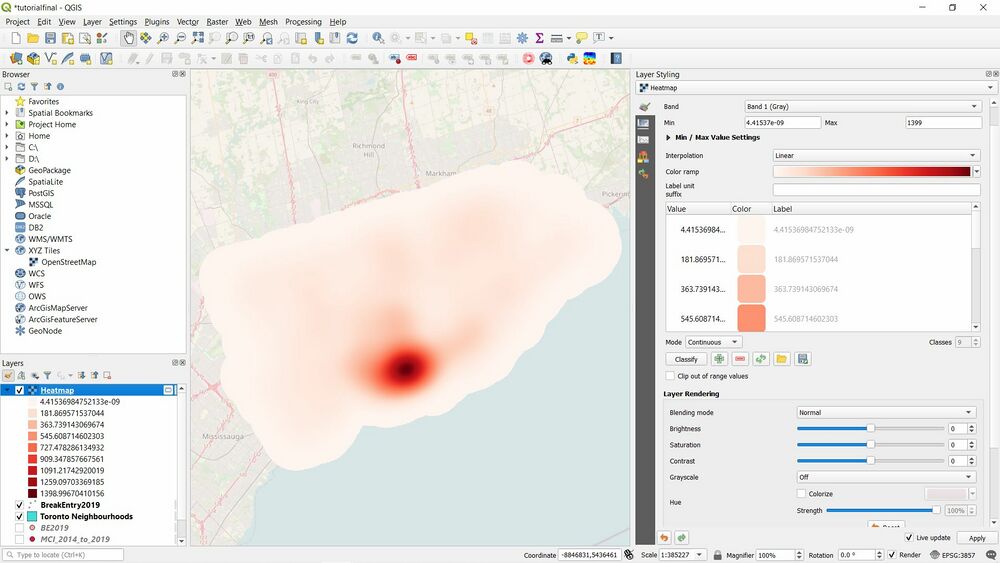
<br><nowiki>12. </nowiki> Your screen should look like this. Click on Layer Styling Panel and change “Singleband gray” to “Singleband pseudocolor”. Change colour ramp to “Reds”. Then Apply. |
<br><nowiki>12. </nowiki> Your screen should look like this (Figure 9). Click on Layer Styling Panel and change “Singleband gray” to “Singleband pseudocolor”. Change colour ramp to “Reds”. Then '''Apply'''. |
||
[[File:Nf.jpg|thumb|center|1000 px|Figure 9. Interpolation Heatmap tool]] |
|||
==== Result ==== |
==== Result ==== |
||
In this section we would be making 2 final maps. One with the output of the Heatmap Render and one with the output of the interpolation tool “Heatmap (Kernel Density Estimation)”. |
In this section we would be making 2 final maps. One with the output of the Heatmap Render and one with the output of the interpolation tool “Heatmap (Kernel Density Estimation)”. |
||
<br>For the first Map: |
<br>For the first Map: |
||
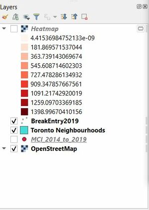
# Deselect the new Heatmap layer. |
# Deselect the new Heatmap layer. |
||
## [[File:O.jpg|thumb|center|Figure 10. Layers selected for Map 1]] |
|||
| ⚫ | |||
# On the Toolbar, click on '''Project''' and then '''New Print Layout'''. |
|||
# Name the Layout and click Ok. |
# Name the Layout and click '''Ok'''. |
||
# On the Toolbar, click Add Item and select Add Map. Create the extent for the map on the layout. |
# On the Toolbar, click '''Add Item''' and select '''Add Map'''. Create the extent for the map on the layout. |
||
# Add a North Arrow, Scale Bar, Title and Legend. |
# Add a North Arrow, Scale Bar, Title and Legend. |
||
# Export as PDF or Image. |
# Export as PDF or Image. |
||
For the Second Map: |
For the Second Map: |
||
# Reselect the new Heatmap layer. |
# Reselect the new Heatmap layer. |
||
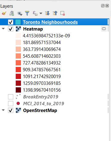
# Move the “Toronto Neighbourhood” layer above the new “Heatmap” layer and reduce its Opacity to “50%” by right-clicking and the |
# Move the “Toronto Neighbourhood” layer above the new “Heatmap” layer and reduce its Opacity to “50%” by right-clicking and the '''Properties''' and then “Layer Rendering”. |
||
## [[File:P.jpg|thumb|center|900px|Figure 11. Layers selected for Map 2]] |
|||
| ⚫ | |||
| ⚫ | |||
# Name the Layout and click Ok. |
# Name the Layout and click '''Ok'''. |
||
# On the Toolbar, click Add Item and select Add Map. Create the extent for the map on the layout. |
# On the Toolbar, click '''Add Item''' and select '''Add Map'''. Create the extent for the map on the layout. |
||
# Add a North Arrow, Scale Bar, Title and Legend. |
# Add a North Arrow, Scale Bar, Title and Legend. |
||
# Export as PDF or Image. |
# Export as PDF or Image. |
||
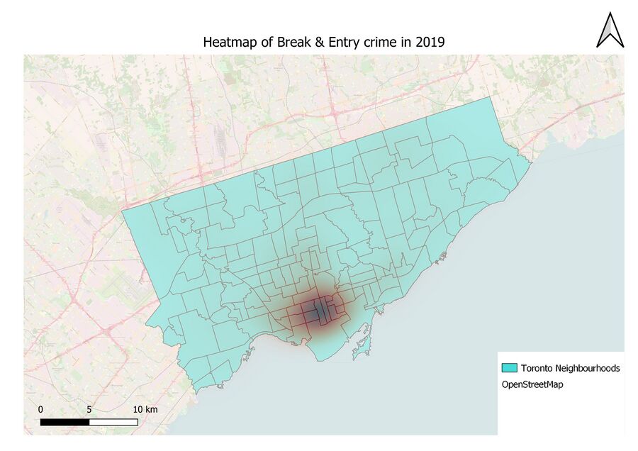
[[File:Break&Entry 2019.jpg|thumb|center|900px|Figure 12. Heatmap Using GQIS Renderer]] |
|||
[[File:Break&Entry 2019 2.jpg|thumb|center|900px|Figure 13. Heatmap using Heatmap (KDE) Interpolation tool]] |
|||
==Limitations == |
==Limitations == |
||
| Line 109: | Line 120: | ||
* Heatmaps can often be misinterpreted. Heat maps express clusters, and one can look at a map and think there is no crime except at the hotspot zone which is wrong |
* Heatmaps can often be misinterpreted. Heat maps express clusters, and one can look at a map and think there is no crime except at the hotspot zone which is wrong |
||
* Using real crime data might alter one's perception of a city which may or may not be misleading. |
* Using real crime data might alter one's perception of a city which may or may not be misleading. |
||
* Street names, cities and other detailed information of the area are not shown on the map. |
|||
* The Heatmap Render does not produce a legend or values used to calculate for the heatmap. And the interpolation tool “Heatmap (Kernel Density Estimation)” produces a heatmap that is not visually appealing. |
* The Heatmap Render does not produce a legend or values used to calculate for the heatmap. And the interpolation tool “Heatmap (Kernel Density Estimation)” produces a heatmap that is not visually appealing. |
||
== Conclusion == |
== Conclusion == |
||
Heatmaps are one of the best visualization tools for dense point data and are used to visualize crime data, traffic incidents, housing density and more. |
Heatmaps are one of the best visualization tools for dense point data and are used to visualize crime data, traffic incidents, housing density and more.The purpose of the tutorial was to provide users with a step by step process of how to create a heatmap on QGIS. This tutorial contained details on how to download and use the QGIS software, how to get open source data, how to create multiple Heatmaps, and how to make analysis and inferences from the data. The tutorial also covered the limitations of QGIS for. |
||
| ⚫ | |||
<br>The purpose of the tutorial was to provide users with a step by step process of how to create a heatmap on QGIS. This tutorial contained details on how to download and use the QGIS software, how to get open source data, how to create multiple Heatmaps, and how to make analysis and inferences from the data. The tutorial also covered the limitations of QGIS for. |
|||
<br>Due to the facts that we are working with crime data which is sensitive, the tutorial is for Educational Purposes only. |
|||
| ⚫ | |||
== Resources == |
== Resources == |
||
Latest revision as of 07:29, 13 October 2021
Contents
Introduction
Heatmaps are one of the best visualization tools for dense point data. Heatmapping is an interpolation technique that is useful in determining density of input features. Heatmaps are most commonly used to visualize crime data, traffic incidents, housing density etc. The density is calculated based on the number of points in a location, with larger numbers of clustered points resulting in larger values. Heatmaps allow easy identification of “hotspots” and clustering of points. QGIS has a heatmap renderer that can be used to style a point layer and a processing algorithm Heatmap (Kernel Density Estimation) that can be used to create a raster from a point layer.
Purpose
The purpose of the tutorial is to provide users with a step by step process of how to create a heatmap on QGIS. This tutorial will contain detailed explanations on how to download and use the QGIS software, how to get open source data and how to use the Heatmap feature in Symbology, make analysis and inferences from the data and how to create a map in QGIS. The tutorial will also cover the limitations of QGIS for making Heatmaps. For the tutorial, we would be making a Toronto Crime Heatmap with Data from the Toronto Police.
This tutorial covers themes of Open source Data, Spatial Pattern Analysis and Spatial Interpolation.
Disclaimer: This Tutorial is for Educational Purposes only. The result of the Tutorial shows real crime committed in the city of Toronto. Due to the sensitivity of the data to be used, we would only be making heat maps for Property related crimes.
In accordance with the Municipal Freedom of Information and Protection of Privacy Act, the Toronto Police Service has taken the necessary measures to protect the privacy of individuals involved in the reported occurrences. No personal information related to any of the parties involved in the occurrence will be released as open data.
The location of crime occurrences have been deliberately offset to the nearest road intersection node to protect the privacy of parties involved in the occurrence. All location data must be considered as an approximate location of the occurrence and users are advised not to interpret any of these locations as related to a specific address or individual.
Materials
About QGIS
Quantum GIS, better known and QGIS, is arguably the most powerful and commonly used free open source geographic information system software available. It allows the user to create, edit, visually represent, analyze and publish information. It is available for download on a variety of operating systems from Windows, Mac, Linux and BSD, with recent efforts working towards compatibility with Android. QGIS is licensed under the Creative Commons Attribution-ShareAlike 3.0 license (CC BY-SA).
Download QGIS
This tutorial was originally done with QGIS version 3.10.10 ‘A Coruña’ which was released in November 2019. However, any version after 3.8.1 works as well. QGIS is available for download on their Official Website. Click on this link to direct you to the page https://qgis.org/en/site/forusers/download.html. Download and install the version mentioned or the most recent version for your operating system in order to follow along with the following step-by-step tutorial.
Data Acquisition
There are numerous resources available to acquire spatial data for use in QGIS including Open Data Catalogues, Scholars GeoPortal, Ontario GeoHub etc.
For this tutorial, we will be acquiring data from the “Toronto Police Service Public Safety Data Portal”. The Toronto Police documents and release Public Safety Data. “The Public Safety Data Portal is intended to improve the understanding of policing, improve transparency and enhance confidence through the creation and use of open data for public safety in Toronto.”
Dataset to be used:
- Major Crime Indicators (MCI) 2014 - 2019 shapefile. Categories are Assault, Break and Enter, Auto Theft, Robbery and Theft Over (Excludes Sexual Assaults)
- Toronto Neighbourhood Boundary shapefile. This also contains crime data but we just need the shapefile for its boundaries, to provide context for the MCI data.
Steps in data acquisition:
- Go to the MCI page by clicking the link (https://data.torontopolice.on.ca/datasets/mci-2014-to-2019) or type in 'major crime indicators' under the 'Open Data' tab.
- Click on Download (see Figure 2 for help), then under Full Dataset click on Shapefile
- Repeat the same process for the Neighbourhood Boundary page by clicking the link (https://data.torontopolice.on.ca/datasets/neighbourhood-crime-rates-boundary-file-) or type in 'neighbourhood boundary' under the 'Open Data' tab.
- Extract (Unzip) both folders and save in the working directory you will be using.
Tools and Methods
Getting started
For this tutorial, no changes are needed to the projection as we will be using the source projection.
Import Data
- The fastest way to import data is by going through the Browser Panel (on the left of your new project screen) and navigating to where you stored the 2 shapefiles from your working directory. In my case, I stored the shapefiles in the Download folder. Drag both shapefiles to the Layers panel. You would need to transform the Neighbourhood Data to match the Projects Projections. Simply click Ok.
2. Next, add the basemap that is provided by QGIS. In the browser panel, you should see a directory called "XYZ Tiles". In there is the “OpenStreetMap”. Drag that down to the Layer panel.
- At this point your screen should look like this (Figure 3 below). You might have to rearrange the layers in this order: MCI layer, Neighbourhood layer and OpenStreetMap layer. Feel free to rename the layers, and change the symbology for easy visualization.
Process
In this section, we will begin editing the data to what we will need to use it for.
Feel free to explore the Attribute Table for the MCI layer.
Because this shapefile contains a lot of data for ranging (Field name: occurren_1) from 2000 - 2019 (even though the shapefile says 2014 - 2019), we would only be working with 2019 data.
Due to the sensitivity of the data we are using, we would only be making heat maps for Property related crimes according to the Department of Justice categorization: Break & Entry (all types), Theft of Motor Vehicle and Non-vehicle Theft (all of theft).
Methodology
Here we would be creating feature layers from the MCI layer and creating the heatmaps.
For the Break and Entry, 2019 shapefile:
1. Click on the MCI layer, then on the Toolbar click on Select Features by Expression. It could be in the top row of the Toolbar (shown below in Figure 4) or on top of the "Browser" section on your left.
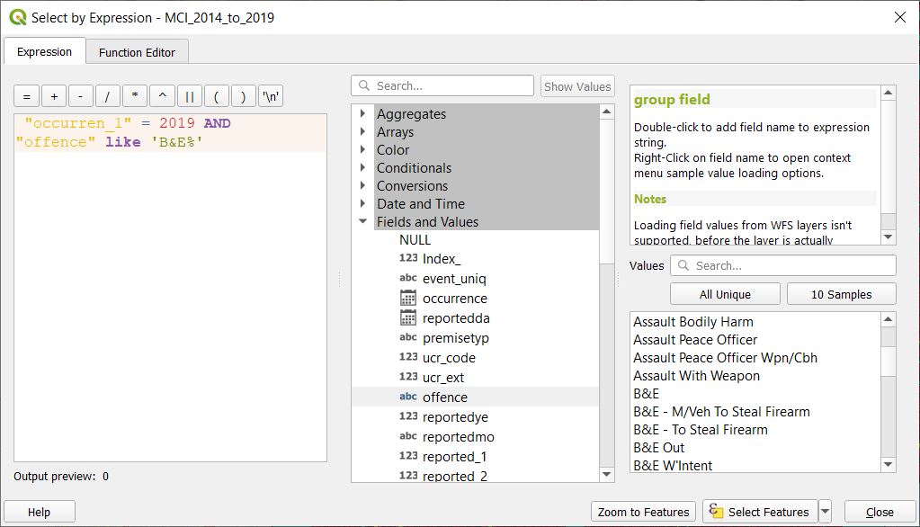
2. Click on “Fields and Values” and select “occurren_1”, then put an “=” and type 2019.
(This means we are narrowing the data to 2019 only.)
3. Next type “And”, and click “offence”, then type “like” and finally type “ ‘B&E%’ ”.
 (The “And” joins the first statement with the second statement”. The second statement narrows down offence to Break and Entry.
 The “%” is needed as the symbol acts like a wildcard.
 Meaning it covers everything past “B&E”. ie. “B&E”, “B&E - M/Veh To Steal Firearm”, “B&E Out”, etc.)
 Your statement should look like this: “occurren_1” = 2019 AND “offence” like ‘B&E%’
After all of this, click Select Features. And you should see certain points on the map selected, though it may be hard to visualize.
Be careful of the syntax and formatting as the tool is case sensitive. For more information about how Expressions work, check out this link (https://docs.qgis.org/2.18/en/docs/user_manual/working_with_vector/expression.html)
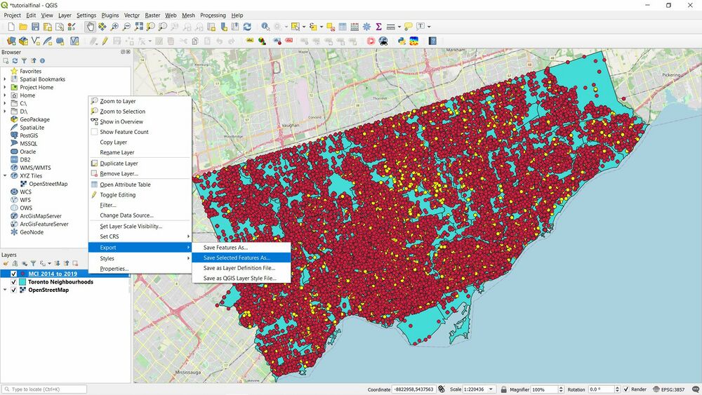
4. Right click on the “MCI 2014 to 2019” layer and click on “Export” then “Save Selected Features As...”
5. Change the Format to “ESRI Shapefile” and set the File name as “BreakEntry2019” (or whatever you prefer) and then click Ok. Leave everything else the same. if the file shows an error, check the location of where the output will be saved to.
6. Unselect the “MCI 2014 to 2019” layer and you should now see all Break and Entry cases for 2019 in Toronto.
7. Next, we would be making the heatmap. Right click on the “BreakEntry2019” layer and select “Properties”.
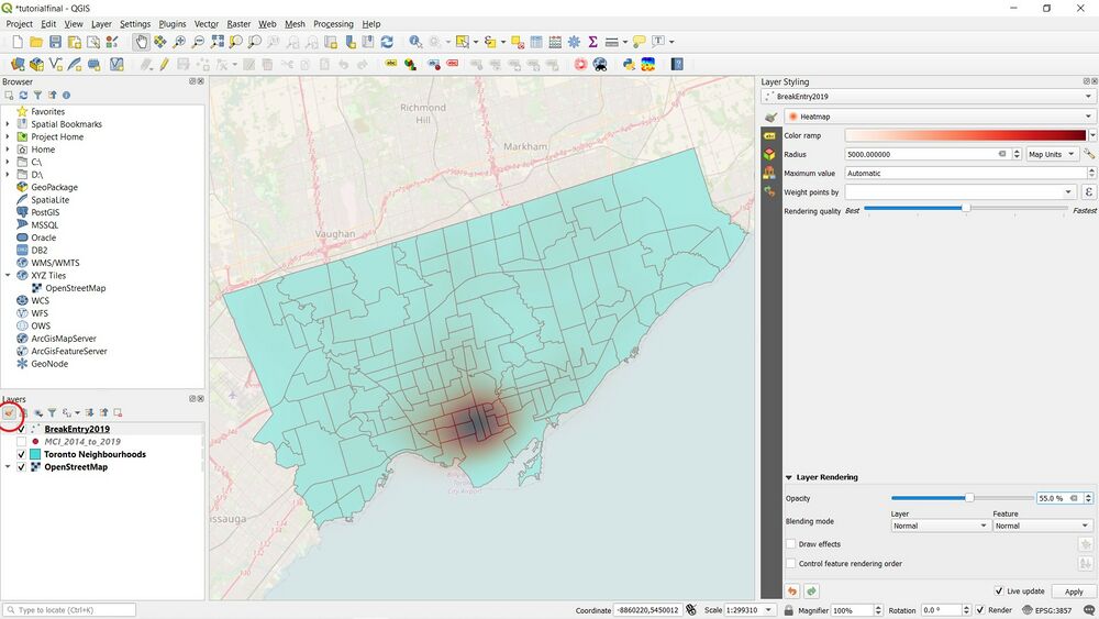
8. Click on Layer styling Panel (or Symbology if you are using a version later than 3.10.10) and change the symbology from “Single symbol” to “Heatmap”.
9. Next you need to choose a Radius. This parameter determines the circular neighborhood around each point where that point will have an influence. This value will largely depend on the type of your input data. For our data, let’s assume a crime incident will have an influence upto "5 kilometers" from the location. Notice that the current project CRS is set to EPSG: 3857 in the bottom-right corner. This CRS has a unit of meter, so we should specify 5000 meters as the radius. Remember to use "Map Units"
10. Change the colour ramp to “Reds” and under “Layer Rendering” change the Opacity to “55%” and click Ok.
You should see a change in the map like the screenshot below (Figure 7).
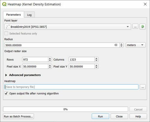
11. Next, we are going to do some Spatial Interpolation. On the Toolbar click on Processing then Toolbox. Search “Heatmap”, and select “Heatmap (Kernel Density Estimation)”
Point Layer: BreakEntry2019 (or whatever you named your layer)
Radius: 5000 metres
Pixel Size: X: 50, Y: 50
Leave everything else as is.
12. Your screen should look like this (Figure 9). Click on Layer Styling Panel and change “Singleband gray” to “Singleband pseudocolor”. Change colour ramp to “Reds”. Then Apply.
Result
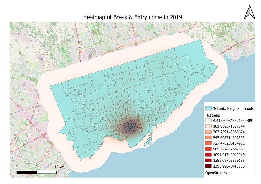
In this section we would be making 2 final maps. One with the output of the Heatmap Render and one with the output of the interpolation tool “Heatmap (Kernel Density Estimation)”.
For the first Map:
- Deselect the new Heatmap layer.
- On the Toolbar, click on Project and then New Print Layout.
- Name the Layout and click Ok.
- On the Toolbar, click Add Item and select Add Map. Create the extent for the map on the layout.
- Add a North Arrow, Scale Bar, Title and Legend.
- Export as PDF or Image.
For the Second Map:
- Reselect the new Heatmap layer.
- Move the “Toronto Neighbourhood” layer above the new “Heatmap” layer and reduce its Opacity to “50%” by right-clicking and the Properties and then “Layer Rendering”.
- On the Toolbar, Click on Project and then New Print Layout.
- Name the Layout and click Ok.
- On the Toolbar, click Add Item and select Add Map. Create the extent for the map on the layout.
- Add a North Arrow, Scale Bar, Title and Legend.
- Export as PDF or Image.
Limitations
Limitations to this tutorial include:
- QGIS map creation isn't as good as ESRI’s ArcGIS Pro, or ArcMaps
- Heatmaps can often be misinterpreted. Heat maps express clusters, and one can look at a map and think there is no crime except at the hotspot zone which is wrong
- Using real crime data might alter one's perception of a city which may or may not be misleading.
- Street names, cities and other detailed information of the area are not shown on the map.
- The Heatmap Render does not produce a legend or values used to calculate for the heatmap. And the interpolation tool “Heatmap (Kernel Density Estimation)” produces a heatmap that is not visually appealing.
Conclusion
Heatmaps are one of the best visualization tools for dense point data and are used to visualize crime data, traffic incidents, housing density and more.The purpose of the tutorial was to provide users with a step by step process of how to create a heatmap on QGIS. This tutorial contained details on how to download and use the QGIS software, how to get open source data, how to create multiple Heatmaps, and how to make analysis and inferences from the data. The tutorial also covered the limitations of QGIS for. Due to the facts that we are working with crime data which is sensitive, the tutorial is for Educational Purposes only. I hope this tutorial will help future users have a better understanding of QGIS, Open source Data and Spatial Pattern Analysis.
Resources
1. Heatmap: https://www.crazyegg.com/blog/understanding-using-heatmaps-studies/
2. QGIS: https://qgis.org/en/site/forusers/download.html
3. Toronto Police SErvice PSDP: https://data.torontopolice.on.ca
4. Department of Justice: https://www.justice.gc.ca/eng/rp-pr/cj-jp/victim/rr05_4/p7.html#a5_2
5. QGIS Expressions: https://docs.qgis.org/2.18/en/docs/user_manual/working_with_vector/expression.html
