Difference between revisions of "Creating an Interactive Web Map using QGIS and Folium"
Gwjones1995 (talk | contribs) |
Gwjones1995 (talk | contribs) |
||
| Line 127: | Line 127: | ||
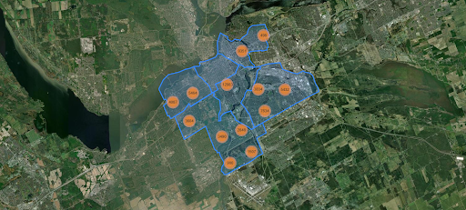
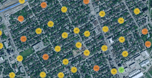
It may take a minute or two to load, but if successful, your map will appear below the code and look something like this: |
It may take a minute or two to load, but if successful, your map will appear below the code and look something like this: |
||
| + | [[File:Figgy28.png|600px|thumb|none|Figure 26. Final web map.]] |
||
| + | [[File:Figgy29.png|600px|thumb|none|Figure 27. Zoomed in view of cluster markers.]] |
||
| + | |||
| + | ===Publishing the Web Map=== |
||
| + | All we have left to do is publish our map so that anyone can view it in a web browser. This only requires one command in Python, but be sure to check that all your code runs and your symbology is to your liking before proceeding. The required code to save your map as an HTML file is as follows: |
||
| + | [[File:Figgy30.png|600px|thumb|none|Figure 28. Code to save map as an HTML file.]] |
||
| + | |||
| + | This will save your code in the files section of Google Colab, located on the toolbar to the left of your terminal. |
||
Revision as of 14:08, 4 December 2025
Contents
Overview
The goal of this tutorial is to provide a step-by-step process for developing an interactive web map using open datasets, QGIS, GeoPandas and the python library Folium.
Introduction
While this might seem like a daunting task at first, this guide will hopefully demonstrate that the workflow is rather simple once the steps are described in an easy to follow way. Now, you might be wondering, what’s the point? But this process will illustrate several skills that are broadly relevant to Geomatics, as it will provide an opportunity to practice in many different aspects of GIS knowledge, such as data preparation, its manipulation in a Python environment, as well as the integration of modern web mapping techniques.
By the end of this tutorial you should be able to:
- Successfully acquire and prepare GIS open datasets so that they are well organized and ready for your intended use.
- Utilize core QGIS tools and applications to load, analyze, and manipulate data (should it be necessary).
- Integrate QGIS projects into a Python environment and understand the workflow that facilitated this process.
- Develop a personalized interactive web map using the Folium library and your processed QGIS data.
- Visualize your data in an appealing format using modern web mapping techniques.
- Be confident in your ability to engage with new geospatial skills and refine your core GIS competencies.
Software
This guide will mostly rely on QGIS and Folium for its data development and map creation. These are both free, open source software's that are easily accessible and provide a variety of tools at your disposal.
If you do not already have QGIS downloaded it can be found here. QGIS version 3.44.3 'Solothurn' will be used in this tutorial, though other versions should work without issue. It will be assumed that at this point you already have a general understanding of GIS practices, but some guidance will be provided on how to properly import and organize your data. Additional information on QGIS and all of its applications can be found on the official QGIS Resources page.
Following this, we will delve into Folium. Given that it is based in a Python library, there are many ways to access Folium, all with their own strengths and weaknesses. For this tutorial, we will be using Google Colab, leveraging the advantages of its convenience and support for coding. Should you at any point run into an error, Google Colab has a built-in assistant that can explain the problem and offer solutions. Additionally, Google Colab has an abundance of information, guides, and datasets on its resources page, capabilities further. If you want to use other approaches to access Folium, such Command Prompt or Jupyter Notebooks, feel free!
Data
For this guide, users will be developing a map of Ottawa’s tree inventory and ward boundary data found on the Open Ottawa portal. This is an excellent source for acquiring publicly accessible information regarding the city, as it covers a variety of topics, is continuously updated, and can be exported in numerous file formats.
The tree inventory can be downloaded here using the shapefile option, and the ward boundary shapefile can be downloaded here.
Tutorial
Organizing Data in QGIS
Once your software is installed and your data is downloaded in the correct location, you will open QGIS and start a new project.
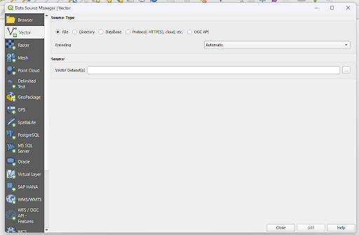
Using “Data Source Manager” on the upper toolbar, add the tree inventory/ward boundary vector shapefile.
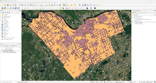
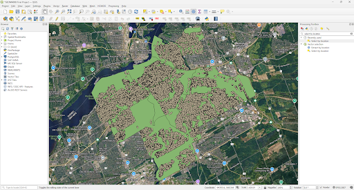
Once the data has loaded, your QGIS project should look something like this.
Don’t worry if it doesn’t look exactly the same, as the point colours are determined randomly by QGIS once the data is loaded, and this project features a basemap added by the HCMGIS plugin. Neither of these will affect the final output of this guide.
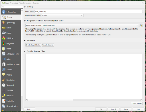
Before moving on, ensure that the points line up over Ottawa correctly and double check it has the correct assigned coordinate reference system by opening the source tab in the layer properties. It should look like this:
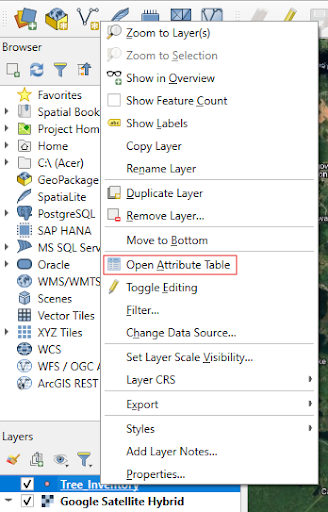
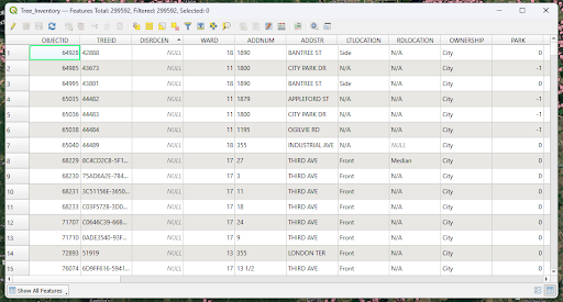
Next, you will want to inspect and clean the data of unnecessary fields. While this isn’t completely necessary, it will ensure that supplementary data isn’t being displayed accidentally in the final web map. To do so, we will first right click the layer and select the tree inventories attribute table, before identifying the key fields we will be retaining. What you consider important for your project is up to you, but in this case we will be using OBJECTID, TREEID, ADDSTR (street address), SPECIES, DBH (tree diameter in cm), X_COORD, Y_COORD.
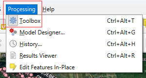
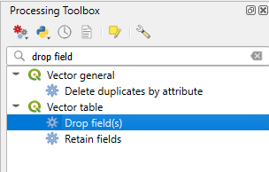
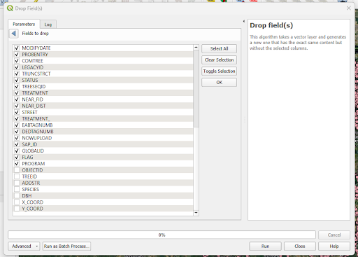
To delete all other columns, you will first open the “Processing Toolbox” by clicking “Processing” on the upper toolbar and selecting “Toolbox”. This will open a window on the right side of QGIS, in the search bar enter “Drop Field” and select the option that appears under “Vector Table”.
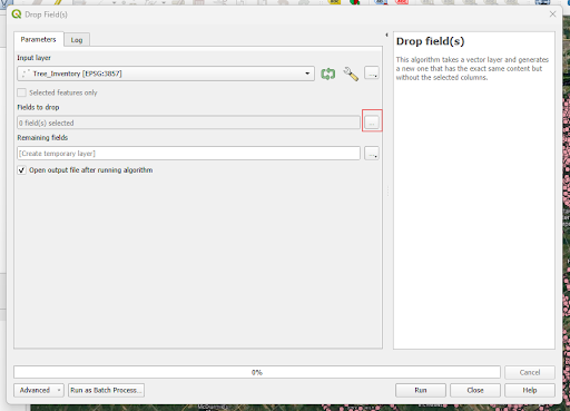
“Drop Field(s)” should automatically load the tree inventory layer. From there you will select the “...” icon next to the “Fields to drop” section.
This will open a table with all the columns for the tree inventory. From here, you just simply select all columns that are not our key fields that we identified earlier.
Now, select “Run”. This should create a new temporary layer named “Remaining fields” which only has our key columns in its attribute table.
This tree inventory is massive, at the time this tutorial is being written it contains just under 300,000 entries. While there are ways to work this large quantity of data, it does become more difficult and doing so would extend past the scope of what this guide is trying to demonstrate. As such, we will use our Ottawa ward boundaries shapefile to select only trees that fall within certain wards, making the data much more manageable.
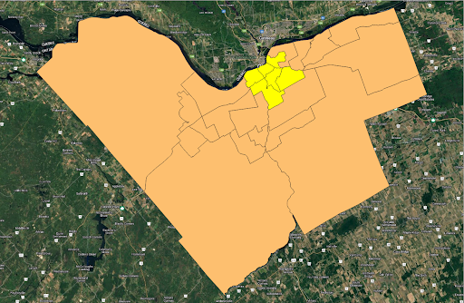
To do so, we will first highlight the wards using the “Select Features” tool in the upper toolbar and holding the Control button while clicking on the key urban wards we will be using in this project. Alternatively, you could also use the “Select Features by Value” tool here if you prefer. For the purpose of the project, these wards will include Capital, Kitchissippi, Alta Vista, Rideau-Vanier, Somerset, and River. These wards can be seen in the screenshot below, but if you’re unsure if you have picked the right polygons, open the attribute table and verify your selection.
Now you will export the chosen wards so that they are saved in their own shapefile. Right click the wards shapefile click “Export”, then “Save Features As”, and export it to your project folder. Be sure to check the “Save only selected features box” before exporting. You should now have a new layer in your project containing only the urban wards.
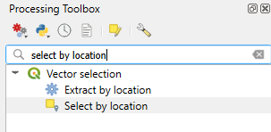
Next, use the search bar in “Processing Toolbox” to search for the select by location tool, it should appear under “Vector Selection”.
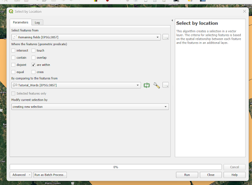
Open the tool and fill out the fields so that we are selecting features from our “Remaining fields” layer that “are within” our three “exported urban wards” layer. It should look something like the screenshot below:
After running the tool, the trees within these wards will be selected. To finish, simply export these trees in the same way we did the urban wards (eg. click “Export”, then “Save Features As”, and export it to your project folder). Your project should now resemble this:
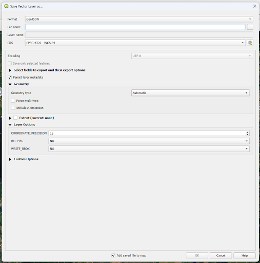
We are almost done using QGIS for this tutorial. To finish, we will simply right click on the new “Exported Trees” and the “Chosen Wards’ layers, click “Export”, then “Save Features As”, and export it as a GeoJSON file, so that Folium can access it directly and efficiently.
CRUCIAL STEP: Before you hit export, change the CRS to EPSG:4326 - WGS 84, as Folium requires an unprojected latitude/longitude in degrees to properly function.
Ensure that the files are exported to the same location as the rest of your data, with a recognizable name, in the correct format. As a final check, ensure that the CRS is still correct in this window.
Working with QGIS data in Google Colab/Folium
Now that we have our data, we’ll begin working with it in Google Colab. First, you will need to load the required Python libraries that we will be working with. These include, GeoPandas and Folium, as well as the MarketCluster plugin. Create a new code box using the “+ Code” icon on the top toolbar and enter the code found in the below screenshot before hitting the play button next to the code box.
Next, you will have to import your QGIS cleaned tree inventory data to a Google Drive, mount your drive within Google Colab, and access the necessary files. The following code will achieve that, but always remember to hit the play button after to ensure the code runs before moving on to the next step. Navigate through the authorization windows that open and then open another code box.
Now you will import the tree inventory data into Google Colab and assign a name for it that Python will use in the remainder of the code.
NOTE: The code used in this section will depend on the path, folder names, and file names that you have chosen. Modify the code accordingly before hitting the play button, as it will fail otherwise.
Next, you will have to set the webmaps coordinates that it will load into automatically. To do so, you must first pick three variable names that will be used for the rest of our work in Google Colab. The first will represent Ottawa's latitude (45.41117), the second will be the city’s longitude (-75.69812), and the final variable will contain both of these values. You can decide how you want to name your variables, but the structure should look similar to below:
This is where it gets interesting and slightly more complicated. First, we must create our map using a map object, for this guide we will use “map”. Following this, we have to set the default location for the map to load into when we run the code. To set this initial view we will use “location=” and set it as our map_coord variable. Now we must select an appropriate scope, to do so we will use “zoom_start=” and then input a number to determine the zoom level that will be used. In this case, we will use the level 12, as it centres Ottawa nicely in the middle of the terminal. The final portion of this code is the “tiles=” selection, which allows us to select a new basemap layer. For the tutorial we will be using “Esri.WorldImagery” but an entire library of basemaps can be found here, in the extras section of Leaflets Github page.
Beneath this code, we will now set up our Marker Clusters. This is pretty straightforward, we will simply set up a marker variable to hold our tree data (e.g. cluster_marker) and then add it to the map using .add_to(map). You should give the Marker Cluster layer a name here too using name =.
Together, your code structure should resemble something like what is shown in the screenshot below, however, feel free to change variables names and play around with different zoom levels and basemaps.
Next, we have to use GeoPandas to properly load our tree data GeoJSON file so that it can be read. To do so, we will turn the data into a GeoDataFrame with the code gpd.read_file(). Again, you’ll have to pick a variable name and tailor the code to the name you’ve given the tree inventory data, but it should resemble something like this:
In the following section, we will go over the core piece of code that will process our tree data, create our markers, organize our popups, and then add all of it to the map. To begin, we will start an iterative loop. If you are unfamiliar with this term, it essentially tells Python to go through our GeoDataFrame row by row and index (tree_index) all the information for the current tree in a temporary variable, which we will call “data”.
We also have to call on the coordinates for our trees stored in the GeoDataFrame, so that each icon is placed in the correct location, and clicking on the pop ups actually registers. To do this, we will again make another variable to hold the coordinate data that is stored within the GeoDataFrame’s geometry.x and geometry.y columns.
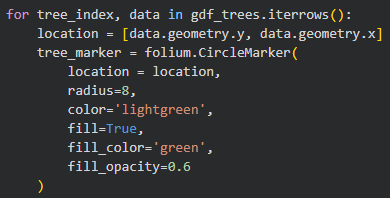
In addition to these steps, we will also create our tree icon that will represent each tree when the map is fully zoomed in. For this tutorial, we will use the folium.CircleMarker() command which allows for the creation of customized markers. The default folium.Marker() also works, but can result in errors with what information will be displayed when selecting a popup. Remember to enter the coordinates variable within the parentheses so that the icon is correctly oriented. The CircleMarker command requires some additional details for the customization to appear properly, which you will see below. These mostly correspond to settings that will affect the symbology of the marker, including radius, colour, opacity, etc. If you wish to learn more about CircleMarkers, you can click here for Folium’s official documentation on them. Once the map is rendered, you should go back and try playing around with different visual settings until you find symbology that you like.
The following is a screenshot of the code, but make sure that you have used the same temporary variable as earlier:
Now, we will build the text that will be displayed in our tree pop ups. This will involve creating an HTML string that pulls specific attribute data from the rows within our GeoDataFrame. First create another popup variable, in this instance we will use tree_popup. Then, we will create aliases and insert the attribute data that we want displayed into placeholders represented by {} in the code. This will reformat the displayed text to show Species instead of SPECIES and Address instead ADDSTR. To break up the lines, we will use the
code, ensuring that each piece of information appears below the previous one. We will then bind this data to the actual icon using folium.Popup().add_to() and add it to the cluster markers using the .add_child() command.
The final step for this section of the guide is simple, we will add our ward boundaries onto the map so that the polygons can provide contextual info for which region of the city the trees are located in. To do so, load the ward data with the folium.GeoJson() command with the variable name you used for the data inside the parentheses. Like the Marker Clusters, you should give this a relevant name as well. Since there is no need for a loop at this step, we can also utilize the folium.GeoJsonPopup command to create the ward popups. Here, you must define which column of the GeoJSON file will be used (in this case NAME), but you can also add an alias of your choice that will replace the column header when the popup is opened.
Once finished, add it to your map and then also add a layer control so that the user can turn off the tree data and ward boundaries if they wish. You will then call up your map by using the variable it was initially stored in. The final part of the code should resemble the screenshot below:
It may take a minute or two to load, but if successful, your map will appear below the code and look something like this:
Publishing the Web Map
All we have left to do is publish our map so that anyone can view it in a web browser. This only requires one command in Python, but be sure to check that all your code runs and your symbology is to your liking before proceeding. The required code to save your map as an HTML file is as follows:
This will save your code in the files section of Google Colab, located on the toolbar to the left of your terminal.

