Difference between revisions of "Creating Hexbin Maps in R"
m (→Installing Packages: clarifying what ?? does in R (as opposed to just ?)) |
|||
| (77 intermediate revisions by 2 users not shown) | |||
| Line 1: | Line 1: | ||
== Objective == |
== Objective == |
||
The objective of this tutorial is to create a thematic hexbin map of U.S. higher education in RStudio. Users will learn how to create a hexbin map from a geospatial object and plot thematic data. In addition, this tutorial will demonstrate how to add and customize various cartographic elements to your map including symbolization, labelling, and map elements (e.g., title, legend). Users will have the opportunity to become more familiar with the R programming language as well as explore the spatial and cartographic capabilites of the software. This tutorial uses open-source software and data and will discuss the advantages and limitations of each. Finally, this tutorial contributes to the collection of Open |
The objective of this tutorial is to create a thematic hexbin map of U.S. higher education in RStudio. Users will learn how to create a hexbin map from a geospatial object and plot thematic data. In addition, this tutorial will demonstrate how to add and customize various cartographic elements to your map including symbolization, labelling, and map elements (e.g., title, legend). Users will have the opportunity to become more familiar with the R programming language as well as explore the spatial and cartographic capabilites of the software. This tutorial uses open-source software and open data and will discuss the advantages and limitations of each. Finally, this tutorial contributes to the collection of Open GIS tutorials created by students at Carleton University. |
||
'''Software Requirements:''' R, RStudio, spreadsheet software (e.g., Microsoft Excel) |
'''Software Requirements:''' R, RStudio, spreadsheet software (e.g., Microsoft Excel) |
||
'''Skills:''' Cartographic design, programming |
|||
''Note: This tutorial assumes basic knowledge of the R programming language. This version of the tutorial was created using a Windows platform with R version 3.6.2.'' |
''Note: This tutorial assumes basic knowledge of the R programming language. This version of the tutorial was created using a Windows platform with R version 3.6.2.'' |
||
== Why Hexagons? == |
== Why Hexagons? == |
||
Thematic mapping generally visualizes statistical data by using irregularly shaped polygons. These shapes are often politically-defined (e.g., states, provinces, counties) and can vary widely in size and shape. This can lead to disparities in viewers' perceptions of a map and the spatial patterns it reveals (Esri, 2015). Alternatively, we can use regularly shaped features in order to normalize geographies for the purpose of thematic mapping. Equilateral trianges, squares, and hexagons are the three polygon shapes which can be used to create regularly shaped, evenly spaced grids. Hexagons are a good choice for visualization as the shapes 'nest' together and the edge effects of the grid shape reduce sampling bias. In addition, hexagons can be used to obscure sensitive source data (e.g., personal addresses). Figure 1 provides an example of how data is visualized differently between hexagons and irregularly shaped polygons. |
|||
[[File:hexbinesri.jpg|500px]] |
|||
''Figure 1. Choropleth maps of southern Californa comparing thematic mapping using county boundaries vs hexgons. (Source: Esri, 2015).'' |
|||
== Getting Started == |
== Getting Started == |
||
| Line 15: | Line 17: | ||
=== Downloading the Software === |
=== Downloading the Software === |
||
The first step of this tutorial is downloading R and RStudio if they are not already installed on your device. R version 4.1.2 is the latest version of the software released in 2021. R is a widely used open-source software environment used for data manipulation and analysis (statistics, graphics, etc.). R is easily customizable and is executed line by line in a console. |
The first step of this tutorial is downloading R and RStudio if they are not already installed on your device. '''R version 4.1.2''' is the latest version of the software released in 2021. R is a widely used open-source software environment used for data manipulation and analysis (statistics, graphics, etc.). R is easily customizable and is executed line by line in a console. |
||
The latest version of R can be downloaded from the Comprehensive R Archive Network (CRAN) [https://utstat.toronto.edu/cran/ HERE] |
|||
For the purposes of this tutorial, we will be using an integrated development environment (IDE) called '''RStudio'''. This software provides users with a console, a syntax-highlighting editor, and a set of integrated tools for plotting and debugging R code. RStudio is available in open source (free) and commercial ($995/year) editions, and has both a desktop and server version. This tutorial only requires the open source edition. |
For the purposes of this tutorial, we will be using an integrated development environment (IDE) called '''RStudio'''. This software provides users with a console, a syntax-highlighting editor, and a set of integrated tools for plotting and debugging R code. RStudio is available in open source (free) and commercial ($995/year) editions, and has both a desktop and server version. This tutorial only requires the open source edition. |
||
| Line 23: | Line 27: | ||
=== Finding Data === |
=== Finding Data === |
||
| ⚫ | When creating a hexagonal map, users have the option to create a hexbin map from (1) a geospatial object or (2) a list of coordinates. For the purposes of this tutorial, we will use an existing hexagon boundary file (.geojson) of the United States published by a member of the GIS community. The file includes a total of fifty-one hexagons (50 U.S. States and the District of Columbia). Download the data in .geojson format and save to a new project folder. ''(Note: you are not required to create a CARTO account to access the data.)'' |
||
'''Spatial data''' |
|||
| ⚫ | |||
| ⚫ | When creating a hexagonal map, users have the option to create a hexbin map from (1) a geospatial object or (2) a list of coordinates. For the purposes of this tutorial, we will use an existing hexagon boundary file (.geojson) of the United States. The file includes a total of fifty-one hexagons (50 U.S. States and District of Columbia). Download the data in .geojson format and save to a new project folder. |
||
[[File:hexbinspatialdata.png|500px]] |
|||
| ⚫ | |||
''Figure 2. Screenshot of the CARTO website - Select 'Download' (circled) to begin'' |
|||
'''Non-spatial data''' |
|||
The |
The '''attribute data''' for this tutorial will be sourced from the United States (U.S.) Department of Education, National Center for Education Statistics. The data of interest is the state-level “Bachelor's Degrees in Science and Engineering Conferred per 1,000 Individuals 18-24 Years Old” from 2000 to 2019. This data is an important indicator of higher education attainment and bachelor's-level training. According to the U.S. Department of Education, Science and Engineering (S&E) fields include physical, life, earth, ocean, atmospheric, computer, and social sciences; mathematics; engineering; and psychology (excludes medical and technology fields). Download the data and save it to your project folder. Spend some time exploring the data and taking note of any observable trends. |
||
The data is available to view and download [https://ncses.nsf.gov/indicators/states/indicator/se-bachelors-degrees-per-1000-18-24-year-olds HERE]. |
The data is available to view and download [https://ncses.nsf.gov/indicators/states/indicator/se-bachelors-degrees-per-1000-18-24-year-olds HERE]. |
||
[[File:hexbinattributedata.png|500px]] |
|||
''Figure 3. Screenshot of the National Science Board website - Select 'Downloads' (circled) to begin'' |
|||
==== Cleaning the Data ==== |
==== Cleaning the Data ==== |
||
Before importing |
Open source data often requires 'cleaning' in order to detect any errors in the dataset, ensuring the data is usable, and preparing it for further analysis. Before importing our attribute data into R, we will need to clean the data and save it as a text file. The data provided includes three tables: (1) the number of S&E Bachelor's Degrees conferred, (2) the population of cohort 18-24 years old, and (3) the number of degrees conferred per 1,000 individuals. For our choropleth map, we are most interested in the third table because the values have been normalized. Following the instructions below, we will prepare the data for import. |
||
# Open the downloaded data file (se-bachelors-degrees-per-1000-18-24-year-olds.xlsx) in a spreadsheet software (E.g., Microsoft Excel) |
# Open the downloaded data file (se-bachelors-degrees-per-1000-18-24-year-olds.xlsx) in a spreadsheet software (E.g., Microsoft Excel) |
||
# Select and delete the 'S&E bachelor's degrees' and 'Individuals 18-24 years old' tables |
# Select and delete the 'S&E bachelor's degrees' and 'Individuals 18-24 years old' tables |
||
# Select the 'Degrees/1,000 individuals 18–24 years old' table |
# Select the 'Degrees/1,000 individuals 18–24 years old' table (columns AR-BK) |
||
# Click on the column border, hold down the shift key and drag across |
# Click on the column border, hold down the shift key and drag across |
||
# Simplify the data by deleting all unnecessary rows |
# Simplify the data by deleting all unnecessary rows ''(Note: this map does not include Puerto Rico)'' |
||
# Save the spreadsheet to your directory folder as a comma-seperated values (.csv) file |
# Save the spreadsheet to your directory folder as a comma-seperated values (.csv) file |
||
=== Navigating RStudio === |
=== Navigating RStudio === |
||
The RStudio workspace consists of four panes: |
The RStudio workspace (see Figure 4) consists of four panes: |
||
# (Top left): '''Script window''' ( |
# (Top left): '''Script window''' (Create and work on multiple scripts; Write and run your code) |
||
# (Bottom left): '''R console''' (View error messages) |
# (Bottom left): '''R console''' (View the results of a command and error messages) |
||
# (Top right): '''Environment''' ( |
# (Top right): '''Environment''' (View a list of your created variables); '''History''' (View the command history of your session) |
||
# (Bottom right): '''Plots''' ( |
# (Bottom right): '''Plots''' (View and save your graphs and maps); '''Packages''' (Explore available packages); '''Help''' (View R documentation and manuals) |
||
[[File:hexbinrstudio.png|500px]] |
[[File:hexbinrstudio.png|500px]] |
||
''Figure |
''Figure 4: Screenshot of the RStudio Environment'' |
||
At the start of your session: |
At the start of your session: |
||
*Start a new R script by clicking on the icon in the top left corner of the script window or go to ''File > New > R script''. |
*Start a new R script by clicking on the icon in the top left corner of the script window or go to ''File > New > R script''. |
||
*Save your script to your project folder by clicking the 'save' icon or go to ''File > Save As''. |
*Save your script to your project folder by clicking the 'save' icon or go to ''File > Save As''. |
||
*Set your working directory (the folder where R reads and saves files). |
*Set your working directory (the folder where R reads and saves files). ''File > Session > Set Working Directory > Choose Directory'' |
||
*Comment your code using the (#) symbol |
*Comment your code using the (#) symbol |
||
| Line 66: | Line 75: | ||
#How to Create a Hexbin Map |
#How to Create a Hexbin Map |
||
#December 2021</syntaxhighlight> |
#December 2021</syntaxhighlight> |
||
'''TIP:''' RStudio allows users to change the theme of the IDE's user interface. The 'Modern' theme is the default, however you can switch to a darker palette if you prefer. Learn how [https://support.rstudio.com/hc/en-us/articles/115011846747-Using-Themes-in-the-RStudio-IDE HERE]. |
|||
== Creating a Choropleth Map == |
== Creating a Choropleth Map == |
||
In this section, we will follow a series of steps to install R packages, and import, prepare, and visualize our spatial and attribute data. Next, we will create a choropleth map that shows the number of science and engineering bachelor's degrees conferred in the United States in 2019. Feel free to explore the functions introduced in the below sections and experiment with different customizations (e.g., colour schemes). |
|||
=== Installing Packages === |
=== Installing Packages === |
||
R |
R enables users to install and load packages from the CRAN. A package is a shareable bundle of code, sample data, documentation and tests. R packages are an advantage of this piece of software as they allow users to easily share their code with others. In additional to the pre-installed base package, we will need to download additional packages for this tutorial. Click the link beside each package listed below to learn more. Install the required packages using the below script. Once installed, we have to call each of the packages from our library. Alternatively, you can use the 'Install Packages' dialog box which is accessible through the main menu (Tools > Install Packages). |
||
*'''tidyverse''' [https://cran.r-project.org/web/packages/tidyverse/index.html Learn more] |
*'''tidyverse''' [https://cran.r-project.org/web/packages/tidyverse/index.html Learn more] |
||
*'''geojsonio''' [https://cran.r-project.org/web/packages/geojsonio/index.html Learn more] |
*'''geojsonio''' [https://cran.r-project.org/web/packages/geojsonio/index.html Learn more] |
||
| Line 79: | Line 92: | ||
<syntaxhighlight lang="R">#Install required packages for this tutorial |
<syntaxhighlight lang="R">#Install required packages for this tutorial |
||
install. |
install.packages('tidyverse') |
||
install. |
install.packages('geojsonio') |
||
install. |
install.packages('RColorBrewer') |
||
install. |
install.packages('sp') |
||
install. |
install.packages('broom') |
||
install. |
install.packages('rgeos') |
||
| Line 95: | Line 108: | ||
library(rgeos)</syntaxhighlight> |
library(rgeos)</syntaxhighlight> |
||
'''TIP:''' If you want to learn more about a specific package or function, you can write a command to view the corresponding 'Help' page. In the script window you can run <code>help()</code> or type the name of the function preceded by a question mark in the R console, for example <code> ?brewer.pal</code> (see Figure 5). If the package or function is not found in your library, you can still access the documentation by using two question marks, for example <code>??brewer.pal</code>. The R documentation will provide a description, a list of arguments, details, references, as well as a number of examples. |
'''TIP:''' If you want to learn more about a specific package or function, you can write a command to view the corresponding 'Help' page. In the script window you can run <code>help()</code> or type the name of the function preceded by a question mark in the R console, for example <code> ?brewer.pal</code> (see Figure 5). If the package or function is not found in your library, you can still access the documentation by searching the entire help library, by using two question marks at the prompt, for example <code>??brewer.pal</code>. The R documentation will provide a description, a list of arguments, details, references, as well as a number of examples (see Figure 5 for an example). |
||
[[File: hexbinhelp.png|500px]] |
[[File: hexbinhelp.png|500px]] |
||
''Figure 5. Screenshot of R Documentation'' |
''Figure 5. Screenshot of R Documentation for RColorBrewer package'' |
||
=== Importing Data === |
=== Importing Data === |
||
Before reading your data into R, ensure that |
Before reading your data into R, ensure that they are located in the folder that you set as your working directory in the previous step. |
||
To import the hexbin data, we will use the <code> geojson_read()</code> function. The data will now appear in the 'Global Environment' tab in the top-right pane. After the file has been imported, we will need to reformat our data using the <code> mutate</code> and <code> gsub</code> functions and fortify it using the <code> tidy</code> function |
To import the hexbin data, we will use the <code> geojson_read()</code> function and assign it to a variable called "hex". The data will now appear in the 'Global Environment' tab in the top-right pane. After the file has been imported, we will need to reformat our data using the <code> mutate</code> and <code> gsub</code> functions and fortify it using the <code> tidy</code> function. At this stage, we can plot a basic version of our map using the fortified data (Figure 6). |
||
<syntaxhighlight lang="R">#Import hexbins |
<syntaxhighlight lang="R">#Import hexbins |
||
hex <- geojson_read("us_states_hexgrid.geojson", what = "sp") |
hex <- geojson_read("us_states_hexgrid.geojson", what = "sp") #where "sp" is spatial class |
||
#Reformat the 'google_name' field |
#Reformat the 'google_name' field |
||
| Line 119: | Line 132: | ||
#Plot the hexbins |
#Plot the hexbins |
||
#I chose a green hue for the fill and white for the outline |
|||
ggplot () + |
ggplot () + |
||
geom_polygon(data = hex_fortify, aes( x = long, y = lat, group = group), fill="#a1dab4", color="#f7f7f7") + |
geom_polygon(data = hex_fortify, aes( x = long, y = lat, group = group), fill="#a1dab4", color="#f7f7f7") + |
||
| Line 127: | Line 141: | ||
[[File:hexbinbasic.png|500px]] |
[[File:hexbinbasic.png|500px]] |
||
''Figure 6. Plot of hexagon boundaries of the United States'' |
|||
Figure 4. |
|||
Next, we will import the education data using the <code> read.csv</code> function. |
Next, we will import the education data and assign it to a variable called "bach" using the <code> read.csv</code> function. The data will now appear in the 'Global Environment' tab with our spatial data. Once imported, we can delete any unnecessary rows that contain NA values and view the data table (Figure 7). |
||
<syntaxhighlight lang="R">#Import education data |
<syntaxhighlight lang="R">#Import education data |
||
#Note: my file name is bachelor.csv |
#Note: my file name is bachelor.csv |
||
bach <- read.csv("bachelor.csv", header=T) |
bach <- read.csv("bachelor.csv", header=T) #indicate that the first row (header) contains the variable names |
||
#Remove rows and columns with NA values |
#Remove rows and columns with NA values |
||
bach <-bach[-c(53:54), ] #rows |
bach <-bach[-c(53:54), ] #rows |
||
| Line 141: | Line 155: | ||
#Verify the class of our data is numeric |
#Verify the class of our data is numeric |
||
sapply(bach, class)</syntaxhighlight> |
sapply(bach, class)</syntaxhighlight> |
||
[[File:hexbinbachtable.png|500px]] |
|||
''Figure 7. Attribute table of Science and Engineering Bachelor's Degrees Conferred per 1,000 Individuals 18-24 YO from 2000-2019'' |
|||
=== Merging Data Frames === |
=== Merging Data Frames === |
||
In order to create our choropleth map, we need to join our spatial and attribute data together. Using the <code> left_join</code> function, we will perform the join by merging our data frames. The two fields that we will use to join the data are "id" and "state". Run the below script to join our attribute data to the fortified hexbin attribute table. Use the <code>view()</code> function to verify that the join was successful. |
|||
<syntaxhighlight lang="R">#Perform spatial join |
<syntaxhighlight lang="R">#Perform spatial join |
||
hex_fortify <- hex_fortify %>% |
hex_fortify <- hex_fortify %>% |
||
left_join(. , bach, by=c("id"="State")) |
left_join(. , bach, by=c("id"="State")) |
||
#Check if the join was successful |
|||
view(hex_fortify) |
|||
</syntaxhighlight> |
</syntaxhighlight> |
||
| Line 153: | Line 173: | ||
Choropleth maps are a common type of thematic map that portray geographic patterns for areal units such as states and provinces. They generally consist of two to six colour symbols which represent a corresponding number of nonoverlapping classes for an intensity index (Monmonier, 2018). |
Choropleth maps are a common type of thematic map that portray geographic patterns for areal units such as states and provinces. They generally consist of two to six colour symbols which represent a corresponding number of nonoverlapping classes for an intensity index (Monmonier, 2018). |
||
To symbolize the attribute data in our choropleth map, we will use graduated colour symbology. By varying the colours of the hexagons, our map will show the quantiative difference in the number of Bachelor's Degrees awarded in Science and Engineering (per 1,000 indiviuduals) in the age cohort of 18-24 between the U.S. states. We will classify the data into ranges and assign a specific colour to each of the classes. When selecting the size and total number of classes, it is important to explore the distribution and central tendencies |
To symbolize the attribute data in our choropleth map, we will use graduated colour symbology. By varying the colours of the hexagons, our map will show the quantiative difference in the number of Bachelor's Degrees awarded in Science and Engineering (per 1,000 indiviuduals) in the age cohort of 18-24 between the U.S. states in 2019. This visualization method will allow us to observe and analyse geographic patterns in the mapped variable. We will classify the data into ranges and assign a specific colour to each of the classes. When selecting the size and total number of classes, it is important to explore the distribution and central tendencies of our data. Too many classes can make our map overly complex and potentially confuse viewers. On the other hand, too few classes can oversimplify our data. |
||
The <code> RColorBrewer</code> package contains a number of ready-to-use colour palettes for creating graphics including maps. Users can choose from sequential (multi-hue and single cue), diverging, and qualitiative colour palettes, or users can create their own colour palettes using HEX codes. We can use the <code> display.brewer.all(colorblindFriendly=TRUE)</code> function to view ColorBrewer palettes that are colourblind-friendly (Figure 8). To create your own palette or to learn more, the ColorBrewer tool can be explored [https://colorbrewer2.org/ HERE] |
|||
| ⚫ | |||
<syntaxhighlight lang="R"> |
<syntaxhighlight lang="R"> |
||
#Explore descriptive statistics |
#Explore descriptive statistics |
||
mean(bach$X2019) |
mean(bach$X2019) #The sum of the values divided by the number of values |
||
[1] 25.27635 |
[1] 25.27635 |
||
range(bach$X2019) |
range(bach$X2019) #A measure of dispersion within the dataset |
||
[1] 9.68 67.07 |
[1] 9.68 67.07 |
||
| Line 178: | Line 198: | ||
[[File:hexbincolorbrewercbf.png|500px]] |
[[File:hexbincolorbrewercbf.png|500px]] |
||
''Figure |
''Figure 8. Colourblind-friendly Brewer palettes.'' |
||
=== Adding Map Elements === |
=== Adding Map Elements === |
||
'''Labels''' can be added to our map to provide viewers with geographic reference information. This is especially important |
'''Labels''' can be added to our map to provide viewers with geographic reference information. This is especially important for our hexbin map where the U.S. states boundaries are not positioned or shown as they would appear on a political map. To add labels to the hexbin map, we must first calculate the centroid of each hexagon using the <code> gCentroid</code> function. Next, we will create our labels using the two-letter state abbreviations in the "id" field. The labels will be added to the plot using the <code> geom_text</code> function. The colour and size of the labels can also be changed. |
||
<syntaxhighlight lang="R"> |
<syntaxhighlight lang="R"> |
||
| Line 188: | Line 208: | ||
centers <- cbind.data.frame(data.frame(gCentroid(hex, byid=TRUE), id=hex@data$iso3166_2))</syntaxhighlight> |
centers <- cbind.data.frame(data.frame(gCentroid(hex, byid=TRUE), id=hex@data$iso3166_2))</syntaxhighlight> |
||
A '''legend''' can be created and added to our map to help the viewer understand what each colour symbol represents. The legend should include a title as well as labels that indicate the data range for each symbol. Different functions found within the <code> ggplot2</code> package allow us to add a legend to our map and customize its size, colour, and position. |
A '''legend''' can be created and added to our map to help the viewer understand what each colour symbol represents. The legend should include a title as well as labels that indicate the data range for each colour symbol. Different functions found within the <code> ggplot2</code> package allow us to add a legend to our map and customize its size, type colour, background colour and position. |
||
Arguments for <code> guide.legend</code>: |
|||
* '''title.position''' - the position of a title. One of "top" (default for vertical), "bottom", "left" (default for horizontal), or "right". |
|||
* '''direction''' - the direction of the guide. One of "vertical" or "horizontal". |
|||
* '''nrow''' - the desired number of rows of legends. |
|||
* '''label.position''' - the position of a label. One of "top", "bottom" (default for vertical), "left", or "right" (default for horizontal). |
|||
* '''key.width''' - the width of the legend key |
|||
* '''key.height''' - the height of the legend key |
|||
A '''title''' is another important cartographic element that is used to tell the viewer what the map is about. The title of our map should answer the questions of what?, where?, and when?. |
A '''title''' is another important cartographic element that is used to tell the viewer what the map is about. The title of our map should answer the questions of what?, where?, and when?. |
||
<syntaxhighlight lang="R"># |
<syntaxhighlight lang="R">#Plot our final map |
||
ggplot() + |
ggplot() + |
||
geom_polygon(data=hex_fortify, aes(fill=bin, x=long, x=lat, group=group), size=0, alpha=0.9, color="#f7f7f7") + |
geom_polygon(data=hex_fortify, aes(fill=bin, x=long, x=lat, group=group), size=0, alpha=0.9, color="#f7f7f7") + |
||
geom_text(data=centers, aes(x=x, y=y, label=id), color="#252525", size=5) + |
geom_text(data=centers, aes(x=x, y=y, label=id), color="#252525", size=5) + #Add our labels |
||
theme_void() + |
theme_void() + |
||
scale_fill_manual( |
scale_fill_manual( |
||
values=my_palette, |
values=my_palette, |
||
name="Degrees per 1,000 Individuals 18-24 Years Old", |
name="Degrees per 1,000 Individuals 18-24 Years Old", #Add legend title |
||
guide= guide_legend( keyheight=unit(4, units="mm"), keywidth=unit(10, units="mm"), direction="horizontal", label.position="bottom", title.position="top", nrow=1) |
guide= guide_legend( keyheight=unit(4, units="mm"), keywidth=unit(10, units="mm"), direction="horizontal", label.position="bottom", title.position="top", nrow=1) |
||
) + |
) + |
||
ggtitle( "Bachelor's Degrees in Science & Engineering Conferred in the United States in 2019" ) + |
ggtitle( "Bachelor's Degrees in Science & Engineering Conferred in the United States in 2019" ) + #Add map title |
||
theme( |
theme( |
||
legend.position = c(0.5, 0.9), |
legend.position = c(0.5, 0.9), #Choose legend positioning (horizontal, vertical) |
||
text = element_text(color = "#f7f7f7", face="bold"), |
text = element_text(color = "#f7f7f7", face="bold"), #This is where we customize the legend text |
||
plot.background = element_rect(fill = "#252525", color = NA), |
plot.background = element_rect(fill = "#252525", color = NA), #Choose the colour of the background behind the title |
||
panel.background = element_rect(fill = "#252525", color = NA), |
panel.background = element_rect(fill = "#252525", color = NA), #This is the main background |
||
legend.background = element_rect(fill = "#252525", color = NA), |
legend.background = element_rect(fill = "#252525", color = NA), #This is the legend background |
||
plot.title = element_text(size=18, hjust=0.5, color = "#f7f7f7", face="bold"), |
plot.title = element_text(size=18, hjust=0.5, color = "#f7f7f7", face="bold"), #This we where we customize the title |
||
) </syntaxhighlight> |
) </syntaxhighlight> |
||
== Results == |
== Results == |
||
After adding labels, a legend, and a title, we can highlight the <code> ggplot</code> in the script editor and run it. The final map will appear in the bottom left pane (Figure 9). To make adjustments to any of the map elements such as increasing the type size or changing the background colour, simply edit the code in the script window and run it again. |
|||
[[File:hexbinfinal1.png|750px]] |
[[File:hexbinfinal1.png|750px]] |
||
''Figure 9. Choropleth map of Science and Engineering Bachelor's Degrees Conferred in the U.S. in 2019'' |
|||
''Figure 6. Final choropleth map'' |
|||
This tutorial has demonstrated how to create a hexbin choropleth map from a geospatial object in RStudio. Having completed this tutorial, you will be more knowledgeable about the advantages of using hexagons to visualize data as well as how to follow the process of finding open source data, applying GIS functions and incorporating elements of cartographic design in order to create a finalized map product. You will also have gained more familiarity with programming and explored the spatial and cartographic capabilities of the software that can be shared with others and used for future professional, academic, or personal interest projects. |
|||
== References == |
== References == |
||
Esri. (2015, April 8). Thematic mapping with hexagons. https://www.esri.com/about/newsroom/insider/thematic-mapping-with-hexagons/ |
Esri. (2015, April 8). Thematic mapping with hexagons. Retrieved from https://www.esri.com/about/newsroom/insider/thematic-mapping-with-hexagons/ |
||
Holtz, Yan. (n.d.). Hexbin map in R: an example with US states. https://www.r-graph-gallery.com/328-hexbin-map-of-the-usa.html |
Holtz, Yan. (n.d.). Hexbin map in R: an example with US states. Retrieved from https://www.r-graph-gallery.com/328-hexbin-map-of-the-usa.html |
||
https://team.carto.com/u/andrew/tables/andrew.us_states_hexgrid/public/map |
Andrewxhill. (2015). US states hexgrid. [Data file]. Retrieved from https://team.carto.com/u/andrew/tables/andrew.us_states_hexgrid/public/map |
||
Monmonier, M. (2018). ''How to lie with maps''. (3rd ed.). The University of Chicago Press. |
Monmonier, M. (2018). ''How to lie with maps''. (3rd ed.). The University of Chicago Press. |
||
National Science Board. (2021). https://ncses.nsf.gov/indicators/states/indicator/se-bachelors-degrees-per-1000-18-24-year-olds |
National Science Board. (2021). Bachelor's Degrees in Science and Engineering Conferred per 1,000 Individuals 18-24 Years Old. [Data file]. National Science Foundation. Retrieved from https://ncses.nsf.gov/indicators/states/indicator/se-bachelors-degrees-per-1000-18-24-year-olds |
||
== Resources == |
|||
'''The R Graph Gallery:''' A collection of charts made with the R programming language [https://www.r-graph-gallery.com/index.html] |
|||
| ⚫ | |||
Latest revision as of 12:40, 7 January 2022
Contents
Objective
The objective of this tutorial is to create a thematic hexbin map of U.S. higher education in RStudio. Users will learn how to create a hexbin map from a geospatial object and plot thematic data. In addition, this tutorial will demonstrate how to add and customize various cartographic elements to your map including symbolization, labelling, and map elements (e.g., title, legend). Users will have the opportunity to become more familiar with the R programming language as well as explore the spatial and cartographic capabilites of the software. This tutorial uses open-source software and open data and will discuss the advantages and limitations of each. Finally, this tutorial contributes to the collection of Open GIS tutorials created by students at Carleton University.
Software Requirements: R, RStudio, spreadsheet software (e.g., Microsoft Excel)
Note: This tutorial assumes basic knowledge of the R programming language. This version of the tutorial was created using a Windows platform with R version 3.6.2.
Why Hexagons?
Thematic mapping generally visualizes statistical data by using irregularly shaped polygons. These shapes are often politically-defined (e.g., states, provinces, counties) and can vary widely in size and shape. This can lead to disparities in viewers' perceptions of a map and the spatial patterns it reveals (Esri, 2015). Alternatively, we can use regularly shaped features in order to normalize geographies for the purpose of thematic mapping. Equilateral trianges, squares, and hexagons are the three polygon shapes which can be used to create regularly shaped, evenly spaced grids. Hexagons are a good choice for visualization as the shapes 'nest' together and the edge effects of the grid shape reduce sampling bias. In addition, hexagons can be used to obscure sensitive source data (e.g., personal addresses). Figure 1 provides an example of how data is visualized differently between hexagons and irregularly shaped polygons.
Figure 1. Choropleth maps of southern Californa comparing thematic mapping using county boundaries vs hexgons. (Source: Esri, 2015).
Getting Started
Downloading the Software
The first step of this tutorial is downloading R and RStudio if they are not already installed on your device. R version 4.1.2 is the latest version of the software released in 2021. R is a widely used open-source software environment used for data manipulation and analysis (statistics, graphics, etc.). R is easily customizable and is executed line by line in a console.
The latest version of R can be downloaded from the Comprehensive R Archive Network (CRAN) HERE
For the purposes of this tutorial, we will be using an integrated development environment (IDE) called RStudio. This software provides users with a console, a syntax-highlighting editor, and a set of integrated tools for plotting and debugging R code. RStudio is available in open source (free) and commercial ($995/year) editions, and has both a desktop and server version. This tutorial only requires the open source edition.
The desktop version of RStudio can be downloaded HERE
Finding Data
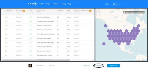
When creating a hexagonal map, users have the option to create a hexbin map from (1) a geospatial object or (2) a list of coordinates. For the purposes of this tutorial, we will use an existing hexagon boundary file (.geojson) of the United States published by a member of the GIS community. The file includes a total of fifty-one hexagons (50 U.S. States and the District of Columbia). Download the data in .geojson format and save to a new project folder. (Note: you are not required to create a CARTO account to access the data.)
The hexgrid file is available to download HERE.
Figure 2. Screenshot of the CARTO website - Select 'Download' (circled) to begin
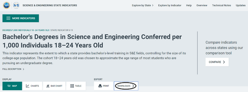
The attribute data for this tutorial will be sourced from the United States (U.S.) Department of Education, National Center for Education Statistics. The data of interest is the state-level “Bachelor's Degrees in Science and Engineering Conferred per 1,000 Individuals 18-24 Years Old” from 2000 to 2019. This data is an important indicator of higher education attainment and bachelor's-level training. According to the U.S. Department of Education, Science and Engineering (S&E) fields include physical, life, earth, ocean, atmospheric, computer, and social sciences; mathematics; engineering; and psychology (excludes medical and technology fields). Download the data and save it to your project folder. Spend some time exploring the data and taking note of any observable trends.
The data is available to view and download HERE.
Figure 3. Screenshot of the National Science Board website - Select 'Downloads' (circled) to begin
Cleaning the Data
Open source data often requires 'cleaning' in order to detect any errors in the dataset, ensuring the data is usable, and preparing it for further analysis. Before importing our attribute data into R, we will need to clean the data and save it as a text file. The data provided includes three tables: (1) the number of S&E Bachelor's Degrees conferred, (2) the population of cohort 18-24 years old, and (3) the number of degrees conferred per 1,000 individuals. For our choropleth map, we are most interested in the third table because the values have been normalized. Following the instructions below, we will prepare the data for import.
- Open the downloaded data file (se-bachelors-degrees-per-1000-18-24-year-olds.xlsx) in a spreadsheet software (E.g., Microsoft Excel)
- Select and delete the 'S&E bachelor's degrees' and 'Individuals 18-24 years old' tables
- Select the 'Degrees/1,000 individuals 18–24 years old' table (columns AR-BK)
- Click on the column border, hold down the shift key and drag across
- Simplify the data by deleting all unnecessary rows (Note: this map does not include Puerto Rico)
- Save the spreadsheet to your directory folder as a comma-seperated values (.csv) file
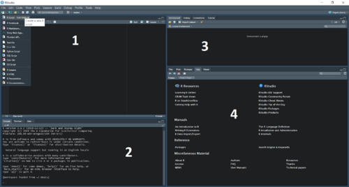
The RStudio workspace (see Figure 4) consists of four panes:
- (Top left): Script window (Create and work on multiple scripts; Write and run your code)
- (Bottom left): R console (View the results of a command and error messages)
- (Top right): Environment (View a list of your created variables); History (View the command history of your session)
- (Bottom right): Plots (View and save your graphs and maps); Packages (Explore available packages); Help (View R documentation and manuals)
Figure 4: Screenshot of the RStudio Environment
At the start of your session:
- Start a new R script by clicking on the icon in the top left corner of the script window or go to File > New > R script.
- Save your script to your project folder by clicking the 'save' icon or go to File > Save As.
- Set your working directory (the folder where R reads and saves files). File > Session > Set Working Directory > Choose Directory
- Comment your code using the (#) symbol
setwd("~/FALL 2021/GEOM 4008/Data")

#4008 Tutorial
#How to Create a Hexbin Map
#December 2021
TIP: RStudio allows users to change the theme of the IDE's user interface. The 'Modern' theme is the default, however you can switch to a darker palette if you prefer. Learn how HERE.
Creating a Choropleth Map
In this section, we will follow a series of steps to install R packages, and import, prepare, and visualize our spatial and attribute data. Next, we will create a choropleth map that shows the number of science and engineering bachelor's degrees conferred in the United States in 2019. Feel free to explore the functions introduced in the below sections and experiment with different customizations (e.g., colour schemes).
Installing Packages
R enables users to install and load packages from the CRAN. A package is a shareable bundle of code, sample data, documentation and tests. R packages are an advantage of this piece of software as they allow users to easily share their code with others. In additional to the pre-installed base package, we will need to download additional packages for this tutorial. Click the link beside each package listed below to learn more. Install the required packages using the below script. Once installed, we have to call each of the packages from our library. Alternatively, you can use the 'Install Packages' dialog box which is accessible through the main menu (Tools > Install Packages).
- tidyverse Learn more
- geojsonio Learn more
- RColorBrewer Learn more
- sp Learn more
- broom Learn more
- rgeos Learn more
#Install required packages for this tutorial
install.packages('tidyverse')
install.packages('geojsonio')
install.packages('RColorBrewer')
install.packages('sp')
install.packages('broom')
install.packages('rgeos')


#Load the packages
library(tidyverse)
library(geojsonio)
library(RColorBrewer)
library(sp)
library(broom)
library(rgeos)
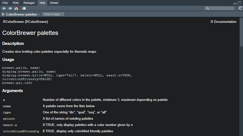
TIP: If you want to learn more about a specific package or function, you can write a command to view the corresponding 'Help' page. In the script window you can run help() or type the name of the function preceded by a question mark in the R console, for example ?brewer.pal (see Figure 5). If the package or function is not found in your library, you can still access the documentation by searching the entire help library, by using two question marks at the prompt, for example ??brewer.pal. The R documentation will provide a description, a list of arguments, details, references, as well as a number of examples (see Figure 5 for an example).
Figure 5. Screenshot of R Documentation for RColorBrewer package
Importing Data
Before reading your data into R, ensure that they are located in the folder that you set as your working directory in the previous step.
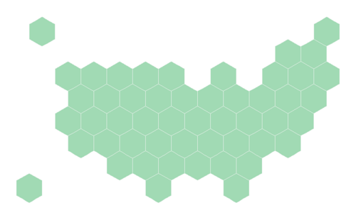
To import the hexbin data, we will use the geojson_read() function and assign it to a variable called "hex". The data will now appear in the 'Global Environment' tab in the top-right pane. After the file has been imported, we will need to reformat our data using the mutate and gsub functions and fortify it using the tidy function. At this stage, we can plot a basic version of our map using the fortified data (Figure 6).
#Import hexbins
hex <- geojson_read("us_states_hexgrid.geojson", what = "sp") #where "sp" is spatial class

#Reformat the 'google_name' field
#This will remove the (United States) from each value
#E.g., Vermont (United States) will be changed to Vermont
hex@data = hex@data %>% mutate(google_name = gsub(" \\(United States\\)", "", google_name))

#Fortify the data to create a data format output
#This format is needed to plot the map using the ggplot2 package
hex_fortify <- tidy(hex, region = "google_name")

#Plot the hexbins
#I chose a green hue for the fill and white for the outline
ggplot () +
  geom_polygon(data = hex_fortify, aes( x = long, y = lat, group = group), fill="#a1dab4", color="#f7f7f7") +
  geom_text () +
  theme_void () +
  coord_map ()
Figure 6. Plot of hexagon boundaries of the United States
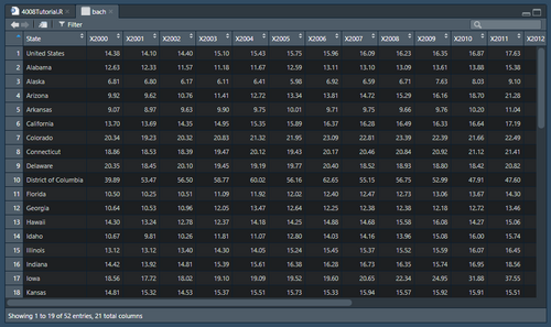
Next, we will import the education data and assign it to a variable called "bach" using the read.csv function. The data will now appear in the 'Global Environment' tab with our spatial data. Once imported, we can delete any unnecessary rows that contain NA values and view the data table (Figure 7).
#Import education data
#Note: my file name is bachelor.csv
bach <- read.csv("bachelor.csv", header=T) #indicate that the first row (header) contains the variable names
#Remove rows and columns with NA values
bach <-bach[-c(53:54), ] #rows
bach <-bach[-c(22:63)] #columns
#View the data table
view(bach)
#Verify the class of our data is numeric
sapply(bach, class)
Figure 7. Attribute table of Science and Engineering Bachelor's Degrees Conferred per 1,000 Individuals 18-24 YO from 2000-2019
Merging Data Frames
In order to create our choropleth map, we need to join our spatial and attribute data together. Using the left_join function, we will perform the join by merging our data frames. The two fields that we will use to join the data are "id" and "state". Run the below script to join our attribute data to the fortified hexbin attribute table. Use the view() function to verify that the join was successful.
#Perform spatial join
hex_fortify <- hex_fortify %>%
       left_join(. , bach, by=c("id"="State"))
#Check if the join was successful
view(hex_fortify)
Symbolizing Data
Choropleth maps are a common type of thematic map that portray geographic patterns for areal units such as states and provinces. They generally consist of two to six colour symbols which represent a corresponding number of nonoverlapping classes for an intensity index (Monmonier, 2018).
To symbolize the attribute data in our choropleth map, we will use graduated colour symbology. By varying the colours of the hexagons, our map will show the quantiative difference in the number of Bachelor's Degrees awarded in Science and Engineering (per 1,000 indiviuduals) in the age cohort of 18-24 between the U.S. states in 2019. This visualization method will allow us to observe and analyse geographic patterns in the mapped variable. We will classify the data into ranges and assign a specific colour to each of the classes. When selecting the size and total number of classes, it is important to explore the distribution and central tendencies of our data. Too many classes can make our map overly complex and potentially confuse viewers. On the other hand, too few classes can oversimplify our data.
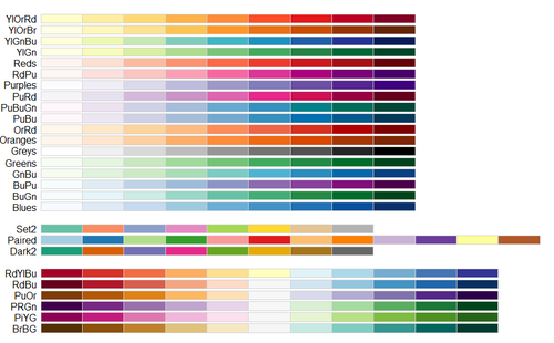
The RColorBrewer package contains a number of ready-to-use colour palettes for creating graphics including maps. Users can choose from sequential (multi-hue and single cue), diverging, and qualitiative colour palettes, or users can create their own colour palettes using HEX codes. We can use the display.brewer.all(colorblindFriendly=TRUE) function to view ColorBrewer palettes that are colourblind-friendly (Figure 8). To create your own palette or to learn more, the ColorBrewer tool can be explored HERE
#Explore descriptive statistics
mean(bach$X2019) #The sum of the values divided by the number of values
[1] 25.27635
range(bach$X2019) #A measure of dispersion within the dataset
[1] 9.68 67.07

#Create bins
#These labels will appear on the legend
hex_fortify$bin <- cut( hex_fortify$X2019 , breaks=c(9, 20, 30, 50, 70), labels=c("9-20", "20-30", "30-50", "50+"))

#Select a color ramp
#Display all colorblind-friendly ColorBrewer palettes
display.brewer.all(colorblindFriendly = TRUE)

#Choose a sequential ramp for our map
#Where n = number of data classes
my_palette <- brewer.pal(n=4, name="Greens")
Figure 8. Colourblind-friendly Brewer palettes.
Adding Map Elements
Labels can be added to our map to provide viewers with geographic reference information. This is especially important for our hexbin map where the U.S. states boundaries are not positioned or shown as they would appear on a political map. To add labels to the hexbin map, we must first calculate the centroid of each hexagon using the gCentroid function. Next, we will create our labels using the two-letter state abbreviations in the "id" field. The labels will be added to the plot using the geom_text function. The colour and size of the labels can also be changed.
#Add labels
centers <- cbind.data.frame(data.frame(gCentroid(hex, byid=TRUE), id=hex@data$iso3166_2))
A legend can be created and added to our map to help the viewer understand what each colour symbol represents. The legend should include a title as well as labels that indicate the data range for each colour symbol. Different functions found within the ggplot2 package allow us to add a legend to our map and customize its size, type colour, background colour and position.
Arguments for guide.legend:
- title.position - the position of a title. One of "top" (default for vertical), "bottom", "left" (default for horizontal), or "right".
- direction - the direction of the guide. One of "vertical" or "horizontal".
- nrow - the desired number of rows of legends.
- label.position - the position of a label. One of "top", "bottom" (default for vertical), "left", or "right" (default for horizontal).
- key.width - the width of the legend key
- key.height - the height of the legend key
A title is another important cartographic element that is used to tell the viewer what the map is about. The title of our map should answer the questions of what?, where?, and when?.
#Plot our final map
ggplot() +
  geom_polygon(data=hex_fortify, aes(fill=bin, x=long, x=lat, group=group), size=0, alpha=0.9, color="#f7f7f7") +
  geom_text(data=centers, aes(x=x, y=y, label=id), color="#252525", size=5) + #Add our labels
  theme_void() +
  scale_fill_manual(
    values=my_palette,
    name="Degrees per 1,000 Individuals 18-24 Years Old", #Add legend title
    guide= guide_legend( keyheight=unit(4, units="mm"), keywidth=unit(10, units="mm"), direction="horizontal", label.position="bottom", title.position="top", nrow=1)
  ) +
  ggtitle( "Bachelor's Degrees in Science & Engineering Conferred in the United States in 2019" ) + #Add map title
  theme(
    legend.position = c(0.5, 0.9), #Choose legend positioning (horizontal, vertical)
    text = element_text(color = "#f7f7f7", face="bold"), #This is where we customize the legend text
    plot.background = element_rect(fill = "#252525", color = NA), #Choose the colour of the background behind the title
    panel.background = element_rect(fill = "#252525", color = NA), #This is the main background
    legend.background = element_rect(fill = "#252525", color = NA), #This is the legend background
    plot.title = element_text(size=18, hjust=0.5, color = "#f7f7f7", face="bold"), #This we where we customize the title
  )
Results
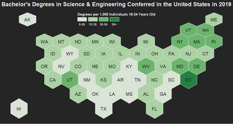
After adding labels, a legend, and a title, we can highlight the ggplot in the script editor and run it. The final map will appear in the bottom left pane (Figure 9). To make adjustments to any of the map elements such as increasing the type size or changing the background colour, simply edit the code in the script window and run it again.
Figure 9. Choropleth map of Science and Engineering Bachelor's Degrees Conferred in the U.S. in 2019
This tutorial has demonstrated how to create a hexbin choropleth map from a geospatial object in RStudio. Having completed this tutorial, you will be more knowledgeable about the advantages of using hexagons to visualize data as well as how to follow the process of finding open source data, applying GIS functions and incorporating elements of cartographic design in order to create a finalized map product. You will also have gained more familiarity with programming and explored the spatial and cartographic capabilities of the software that can be shared with others and used for future professional, academic, or personal interest projects.
References
Esri. (2015, April 8). Thematic mapping with hexagons. Retrieved from https://www.esri.com/about/newsroom/insider/thematic-mapping-with-hexagons/
Holtz, Yan. (n.d.). Hexbin map in R: an example with US states. Retrieved from https://www.r-graph-gallery.com/328-hexbin-map-of-the-usa.html
Andrewxhill. (2015). US states hexgrid. [Data file]. Retrieved from https://team.carto.com/u/andrew/tables/andrew.us_states_hexgrid/public/map
Monmonier, M. (2018). How to lie with maps. (3rd ed.). The University of Chicago Press.
National Science Board. (2021). Bachelor's Degrees in Science and Engineering Conferred per 1,000 Individuals 18-24 Years Old. [Data file]. National Science Foundation. Retrieved from https://ncses.nsf.gov/indicators/states/indicator/se-bachelors-degrees-per-1000-18-24-year-olds
Resources
The R Graph Gallery: A collection of charts made with the R programming language [1]
ColorBrewer: A diagnostic tool for evaluating colour schemes for cartography [2]

