Difference between revisions of "Hierarchical Cluster Analysis using QGIS and R"
Cnidarian17 (talk | contribs) |
Cnidarian17 (talk | contribs) |
||
| Line 53: | Line 53: | ||
=Adding files to QGIS= |
=Adding files to QGIS= |
||
= |
=Loading shapefiles= |
||
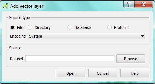
To load the shapefiles into QGIS either find the files in the '''Browser''' and double click the file(s) or use the '''Add vector''' layer tool located on the sidebar of the program window. |
To load the shapefiles into QGIS either find the files in the '''Browser''' and double click the file(s) or use the '''Add vector''' layer tool located on the sidebar of the program window. |
||
Revision as of 11:05, 21 December 2014
Contents
- 1 Purpose
- 2 Installation
- 3 Required Data
- 4 Adding files to QGIS
- 5 Loading shapefiles
- 6 Loading the csv data
- 7 Manipulating and displaying data in QGIS
- 8 Selecting Data using the Select by Location Tool
- 9 CSV data and Joins
- 10 Creating a Heatmap
- 11 Distance Matrix
- 12 Preforming a Hierarchical Cluster Analysis in R
Purpose
The purpose of this tutorial is to familiarize users with open source software, that will teach them how to manipulate, process, and map using freely accessible data. This tutorial will teach users skills such as:
- adding shp and csv data
- preforming complex attribute queries
- creating new layers from selected features
- Splitting vector layers
- Creating joins
- Adjusting layer visual features
- Creating raster heatmaps
- Generating a distance matrix
- Conducting a hierarchical cluster analysis
Installation
Quantum GIS (QGIS)
QGIS is a free and open source GIS software that is available for download from the QGIS website and compatible with all systems. It is a member of the GNU project and provides access to spatial data processing, manipulation, and visualization. Its interface is similar to ArcMap, but has fewer tools. Similar to R, users are able to create new tools for QGIS by programing python scripts that must be approved by the QGIS team. Once approved the scripts become downloadable plugins for the program.
Download and Install QGIS
- Click on the following link to download the QGIS software [1]
- The version used in this tutorial was version 2.6.1
- Click on the download option and select the option that is appropriate to your operating system.
- The program should begin to download, once it is finished downloading, run the program and follow the prompts.
The R Project
R is a freeware package used for statistical computation and graphic generation within a coding language environment (Torfs & Brauer, 2014). It was an original member of the GNU project, as it provides free software for all operating systems available for download from the r-project website. R is often used both in educational and professional contexts. What makes this system invaluable is its flexibility, in that there are often many ways to preform simple tasks and its capabilities are constantly growing as users code new functions in downloadable packages that can be added to the main system.
Download and Install R
- Click on the following link to download R [2]
- Choose the appropriate system to download the program
- Once downloaded run the file and follow the prompts
Required Data
Shapefile Data
The data is freely available and downloadable by accessing the following websites. Once on the website selecting the appropriate files for download, save them to the computer in an appropriate file and unzip them. The following is the list of data required to compete this tutorial.
- City of Ottawa street tree inventory shapefile (Tree_Inventory_Apr 2013 shp) [3]
This layer contains point data as a shapefile of all City of Ottawa City-owned trees, which includes street trees and some park trees. It is a tree inventory database that was developed by City of Ottawa forestry staff in the field using GPS software. The data was published by the City on April 22, but the dates when it was collected are unknown. It contains data such as locational information for trees, their species type and treatment regimen.
- City of Ottawa Ward boundaries 2010 shapefile(wards-2010-2 shp) [4]
This is a shapefile of polygon data for the City of Ottawa’s 23 wards, that was published by the city.
- Canadian Census Tract boundaries 2006 [5]
The census tract boundary is one of the smallest, and most static political boundaries. This file contains polygon census tract boundaries for major metropolitan areas in Ontario.
csv data
- Canadian Census 2006 Income and Earnings – this file is available from Carleton University or by downloading it from this page File:FIELD 1788.pptx
This file contains the data from field 1788 of the Income and Earnings portion of the 2006 Canadian Census for all Ottawa census tracts. Field 1788 is the median family income after taxes.
Adding files to QGIS
Loading shapefiles
To load the shapefiles into QGIS either find the files in the Browser and double click the file(s) or use the Add vector layer tool located on the sidebar of the program window.
If you are using the Add vector layer tool (![]() ), select the tool, use the Browse button in the source section to locate the files and then select Open. Repeat this step to load each shapefile.
), select the tool, use the Browse button in the source section to locate the files and then select Open. Repeat this step to load each shapefile.
Note: All of the files are from the City of Ottawa and as such they all are projected in MTM zone 9 NAD83, as their projections are all the same and recognized by QGIS there is no need to set or change their projection.
Loading the csv data
Once the census data file is downloaded from this webpage, open it and copy all the contents of the table. Open the program excel or another spreadsheet program, paste the data into the spreadsheet using match destination formatting and then save the file as a csv. Open the program Notepad, type "String","Integer" and save the file as a csvt using the exact same name as the csv file. This is an important step because it prevents QGIS from discarding the zeros that follow the decimal place in the census tract geocodes when it is uploaded.
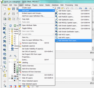
To load the table into QGIS in the main menu select Layer, then select Add Layer from the drop down menu and then select Add Delimited Text Layer.
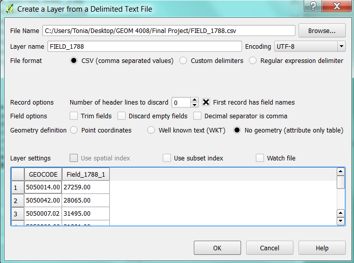
The Create a layer from a delimited text file window will open. In the new window select the Field_1788 csv file. All other selections should look like the following. Once complete, select OK.
You will notice that the file is now table in your layers list.
==
Manipulating and displaying data in QGIS
A Multi-Criteria SQL Feature Selection
The purpose of this part of the tutorial is to identify all true ash tree species data points from the City of Ottawa tree inventory vector layer. The features selection tool is used to select features from an attribute table using SLQ (Structured Language Queries)
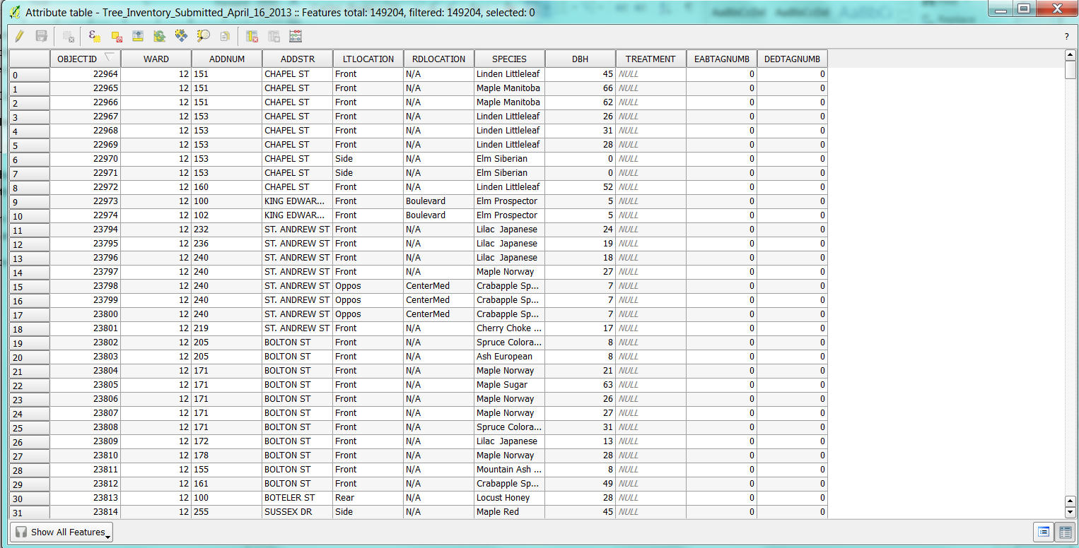
- In the layers window, right click the “Tree_Inventory_Apr 2013” vector layer, then from the drop down menu select Open Attribute Table. Your attribute table should look something like this.
- To perform the query click the Select Features using an Expression button(
 ) in the layer attribute table window.
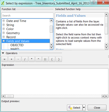
 - Expand the fields and values in the function list, notice that there is a list of the different attribute fields from your data set.
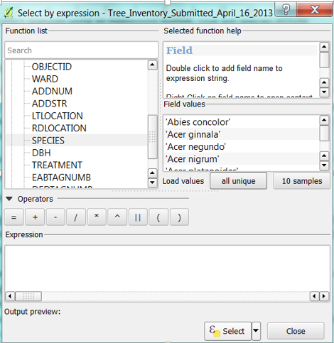
- Scroll down the function list and select the species field. Once it is selected, under the field values select the Load values all unique.
Note. This dataset uses a combination of naming methodologies, it uses Latin species names the species’ common name under the species attribute field, therefore both name types must be selected in the query.
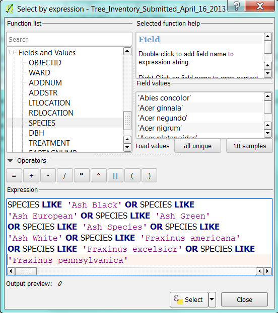
Write in the query expression
The purpose of this query is to select all true ash species from the dataset using SQL in the select by expression tool. The following is a query expression that selects ash species from the dataset using both their common name and Latin species name from the Species field. The expression can be generated by double clicking names in the field values column and injecting the required SQL such as “LIKE” and “OR”, which can be found by expanding the Operators Group in the Function list. The operators are then added to the expression by double clicking on them or by typing them in manually. The LIKE operator is used before a field value meaning that it will select field values that are similar to but not necessarily equal to the field value that is selected. The OR operator links components of the expression together and indicates that not all of the conditions of the expression must be met to produce a selection.
This particular expression is more complex in that it is composed of eight conditions for data selection. The query expression should look like the following.
- Once the query has been entered choose the select button and close the window. Notice that in the attribute table window the number of selected features is shown. From the selection query there should be 18,129 features selected.
- To see the selected features choose use the move selection to the top button (
 ), to see the species in alphabetical order you can click on the species column.
Now we want to get rid of all non-ash species data from this layer.
- Click the toggle editing mode button(
 ) to turn on the editing function.
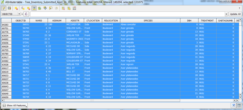
 - Choose the invert selection button (File:B3.png)) to invert the selection so that all non-ash species are selected. The table should look similar to the one bellow.
- Choose the delete selected features button (
 ).
). - Turn off the editing function by clicking the toggle editing mode button (
 )
)
I have achieved mixed results with previously discussed methodology, as attempting to delete selected features has occasionally caused QGIS to crash. Below is an alternative method for achieving a similar result by creating a new layer from the selected features rather than by deleting un-desirable features.
- If the non-ash species are selected in the attribute table invert the selection using the invert selection button (File:B3.png)). Now all ash species should be selected.
Create a new Vector Layer
- Minimize the attribute table. In the main menu open the Edit menu and select the copy features option.
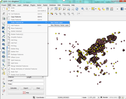
- Reopen the Edit drop down menu and select the Paste Features as and from extended menu select New Vector Layer.
- A new window will open, the Coordinate Reference System Selector. As the vector already has a coordinate reference system associated with it select OK.
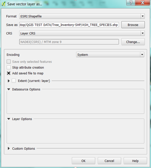
- A new window will open, "Save vector layer as...", where you have to choose where you will save the file by selecting browse, and will name your new vector shape file.
- Select OK. Your new layer should appear on your map and in your layers list.
Splitting Vector Layers
In the later sections we will need to analyze ash tree data based on whether or not they have been injected against EAB (emerald ash borer) infestation or not. If you open up the attribute table for the ASH_TREE_SPECIES layer, you will notice that there is a field called TREATMENT. This field indicates whether each ash tree has been injected against EAB, trees that have been injected against EAB will contain the value EAB in the TREATMENT column, whereas trees that have not been injected will contain the value NULL.
To split up the data between EAB and NULL treatments we could use a methodology similar to the previous section, by selecting features and creating a new layer. However, a quicker alternative is to use the Split Vector Layer tool. The Split Vector Layer tool splits up vectors by selected fields and creates new vectors based on groups of field values. It is useful for splitting up fields that have many field values, but is generally used to split fields that have discrete categorical data.
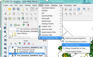
- To access the Split Vector Layer tool in the main menu select Vector, from the drop down menu select Data Management Tools, and then Split Vector Layer.
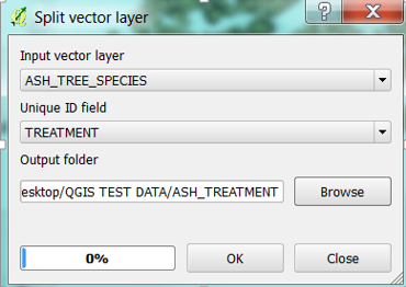
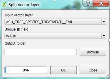
- A window will open for the Split vector layer tool. Select the ASH_TREE_SPECIES layer as the input vector layer and TREATMENT as the unique field ID. Select the output folder where you want the files to be saved or create a new folder by clicking Browse. Once a folder has been selected click OK.
- The program will alert you when the task is complete. However, the two new layers will not automatically load into your map so you must either add them using the add vector layer tool or select them from the appropriate folder in the browser section of the main menu. If you need a refresher as to how to do this refer back to the add shapefile section of this tutorial.
- Once added, you will find that they have been automatically named either ASH_TREE_SPECIES_TREATMENT_EAB or ASH_TREE_SPECIES_TREATMENT_NULL.
Splitting the ASH_TREE_SPECIES TREAMENT_EAB vector layer further
In this section we want to split the ASH_TREE_SPECIES_TREATMENT_EAB vector layer further, by splitting the data by city ward. To achieve this, repeat the methods used previously in this section which used the Split Vector Layer tool.
- Once the tool is open select the ASH_TREE_SPECIES_TREATMENT_EAB layer as the target layer and the WARD field as the Unique ID field.
- -The result of the split should be 23 vector layers of data for Ash trees injected against EAB by ward. Again, add the desired layers to the map using the steps outlined in the add shape file layer data section of the tutorial.
Selecting Data using the Select by Location Tool
The Canadian census boundaries layer includes polygons that are not in Ottawa. Therefore, in this section we will eliminate all polygons from the data set that are not located in Ottawa. To do this we will use the Select by location tool.
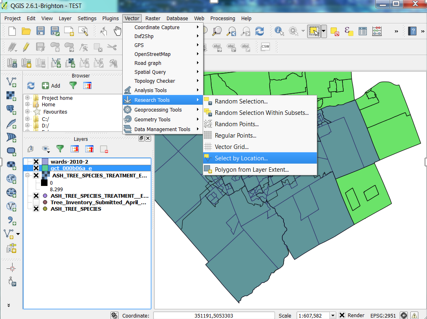
- Select the Select by location tool by opening the Vector menu, from the drop down menu select Research Tools, and then select Select by location.
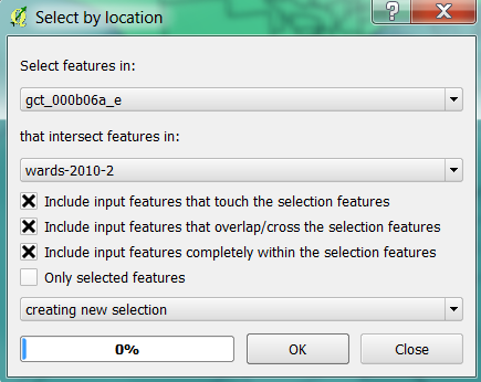
- A window for the tool will open, select the census boundaries layer as the first file and the wards layer as the intersect. The window should look similar to the following image. Once complete, select OK.
When I tried this method it did not produce any selection, therefore if this method works for you then please disregard the following section and skip on ahead to the paste feature as a new vector layer section. However, if it did not work keep reading.
The other method that can be used relatively quickly to isolate only census tracts within the City of Ottawa is to use the Select Features by Area tool.
- First, right click the Census shapefile and open the Properties.
- In the Properties menu select Style on the left hand toolbar. Adjust the transparency bar from 0% to 50%. Select OK to close the window.
- Make sure that the Census layer is above the Wards layer in the layers list. This will allow you to see the wards layer when making your selection. If it is not manually drag it with your mouse to the desired location.
- Now click on the Select Features by Area tool (
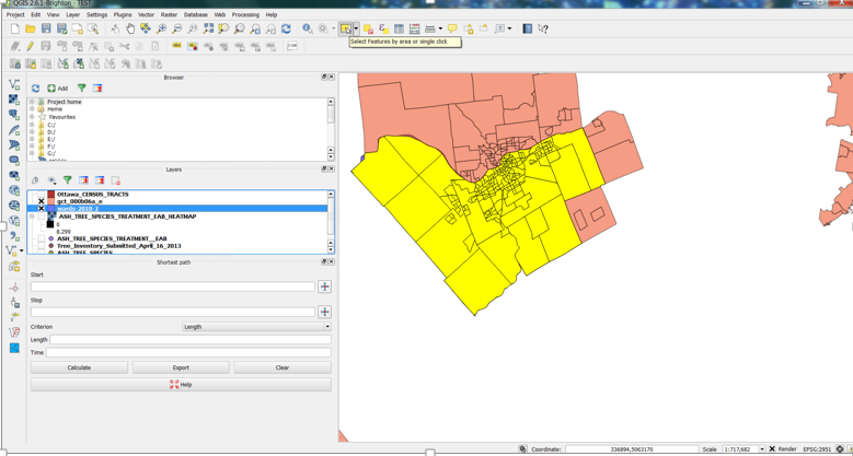
 ), zoom into the Ottawa area, hold down the Crtl on your keyboard and select all census tracts that fall within the city wards layer. Any census tracts within the wards layer should be a slightly different shade. Once all the tracts have been selected your map should look like the following.
- Now that the needed census tracts have been selected, select the Edit menu, and Copy Features. Then in the Edit menu select paste features as and New Vector layer.
- A coordinate reference system selector window will appear, select OK. Under save as select Browse, select where you want your file to be saved, name your file and select SAVE and then OK.
- Your new layer should appear in your map and layer list.
CSV data and Joins
One of the layers that was loaded into the map at the beginning of the tutorial was a csv file. Now we want to join the income data from that file to the census tract layer.
- Open up the properties of the census tract layer. Select Joins from the left-hand toolbar of the window.
- Select the Add Join button (
 )
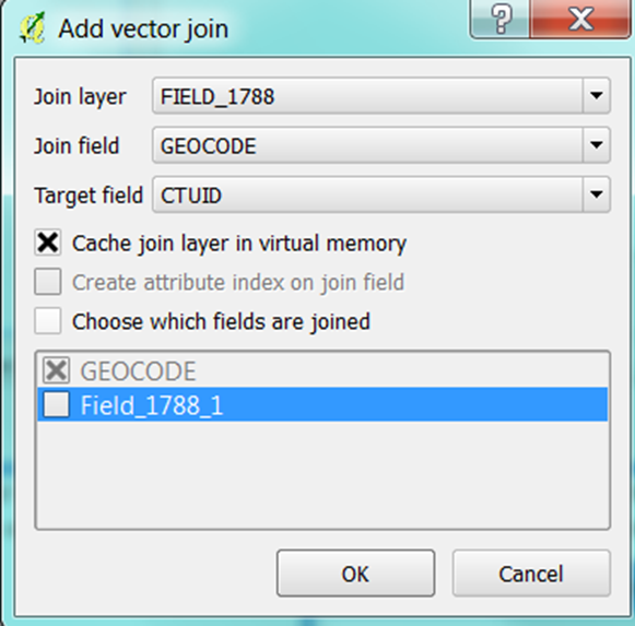
) - Select the csv file as the join layer, select the GEOCODE as the join field and the target field as CTUID. GEOCODE and CTUID both refer to the same census tract codes even though they have been given different names in each file.
- Select OK.
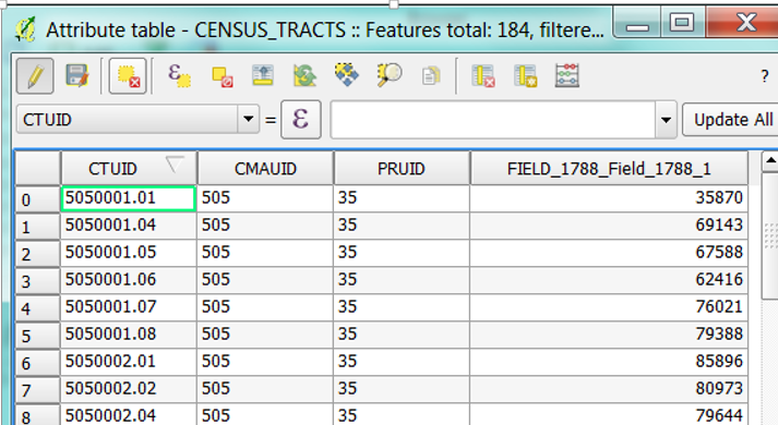
- Open the attribute table of the census tract layer to see the new field FIELD_1788.
Visualizing the Census Data
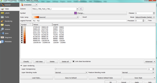
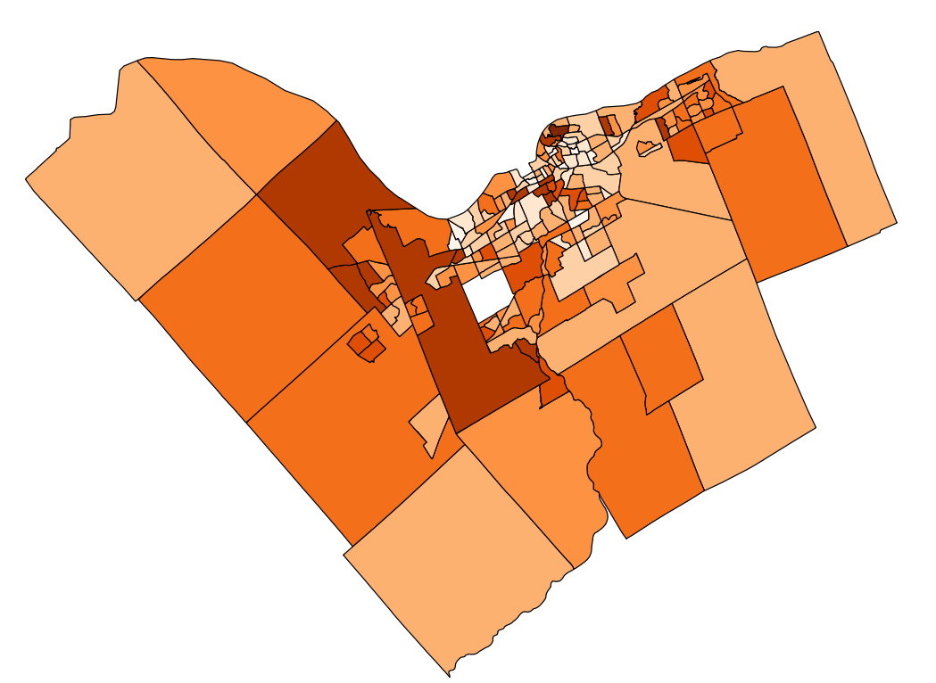
To visualize the median family income after taxes, field 1788, open the Properties in the census tract layer. Select Style from the left-hand toolbar. Adjust the window to look like the one bellow. The symbols have been changed from single symbol to gradual to represent 9 classes that are created using the natural breaks method. When done select Ok.
- The resulting map should look similar to the following.
Creating a Heatmap
Heatmaps are a means of visualizing clusters of events or data points. While they are not a statistical method of identifying clusters, they are useful to generalize the location of clusters of data with a landscape. They are often used when there are a large number of observations made and the distribution is clustered making it difficult to discern their density. The heatmap tool works by creating distance buffers zone around a radius of data points, and assigning density values to resulting raster pixels.In this section we will create two heatmaps of the treated ash trees and all ash tree datasets.
Heatmap for trees injected against EAB
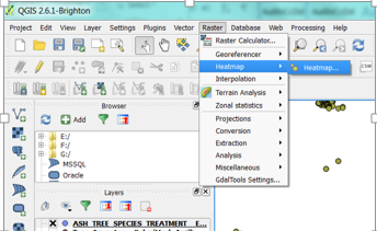
- To create the first heatmap select Raster from the main menu and select the Heatmap option and then Heatmap….
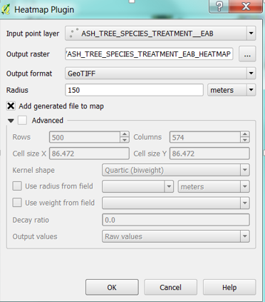
- A window will open for the Heatmap Plugin. Use the ASH_TREE_SPECIES_TREATMENT_EAB as the input point layer, name the output raster, and set the radius to 150m. Your window should look like the following.
- Select OK.
- The newly created raster will automatically load into the map.
- To create a nicer visual appearance of your raster open up the raster layers properties, by right clicking the layer and selecting Properties.
- On the left hand of the window select Style.
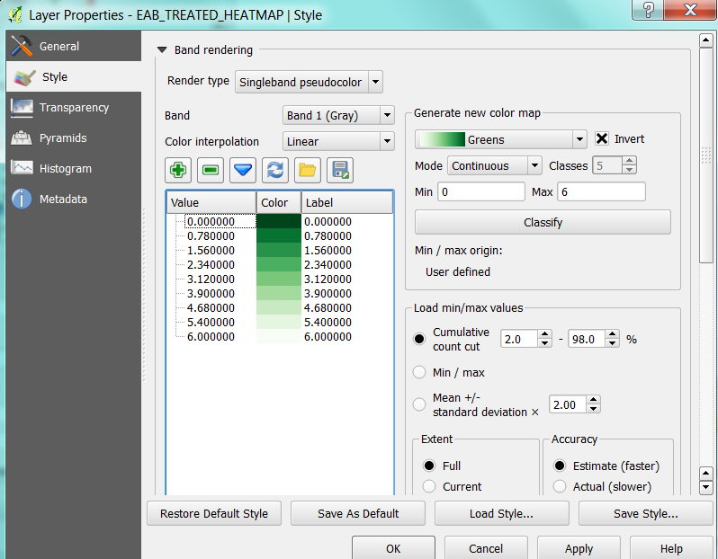
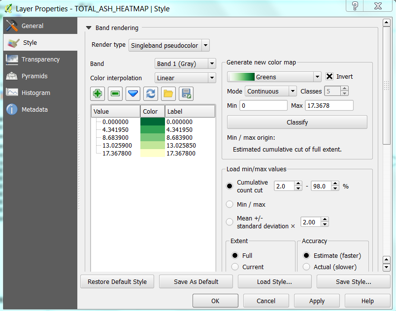
-Change the Band rendering Render type to Singleband psudocolor from the drop down menu. If you want to change the colour of the raster in the new colour map section of the window, then select the Classify button. Once the classified you’ll notice that a continuum of values and colours have materialized in the Band Rendering portion of the window. If you want you can play with the colour, mode, classes, min and max settings in the generate new colour map section.
- The following is the selection that I have made:
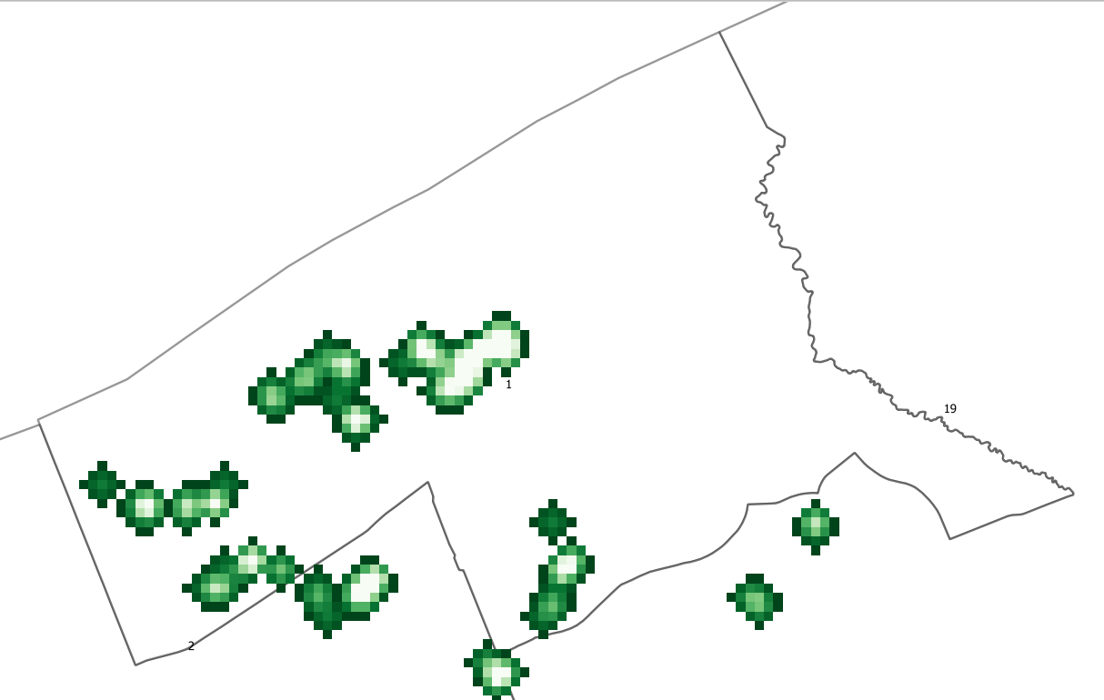
Note: In this selection I have inverted the selection so that the lighter colours indicate a greater density of observations, or more individuals in a cluster. I also have selected a maximum class of six, after some experimentation so that the high density clusters are more visible in the map.
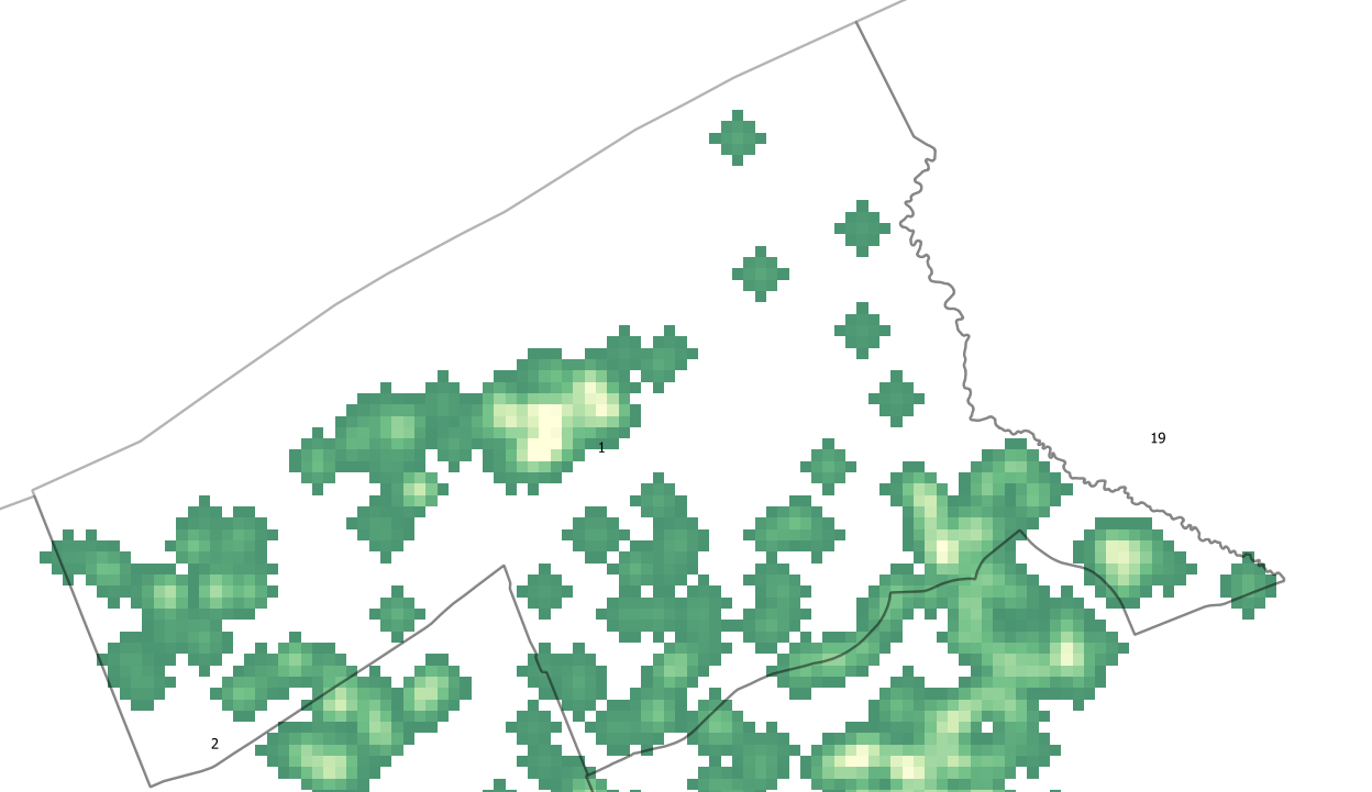
Bellow is a zoomed in example of what the EAB treated ash tree heatmap looks like for Ward 1.
Bellow is an example of how the heatmap looks with the point data for the EAB treated ash trees overlain. Notice the effect the a greater cluster density has on the appearance of the heatmap.
Heatmap for All Ash Trees
- To create this map follow the same instructions as above, but use the layer that includes both treated and non-treated ash trees.
- Once generated the properties window of the new raster layer should look like the following.
- Bellow is an example of what this raster looks like in Ward 1. Note how similar it is to the treated ash trees heatmap and how many of the clusters identify agree with the treated ash tree point data. Although, in this map the clusters are larger due to the increased number of data points used.
Distance Matrix
Creating a distance matrix is generally the first step towards preforming a cluster analysis. It is possible to generate a distance matrix in R, but as QGIS also has this tool available and it seemed more straight forward to use it. A distance matrix calculates the distance between points of observation. In this distance matrix calculation the Euclidean distance, the straight line distance, was calculated between each data point.
One of the major limitations of using a linear distance matrix is that the calculation becomes convoluted when the sample size is large. As the matrix calculates the distance between each data point and every other data point in the sample, the larger the sample the larger the matrix will be and more time will be required to calculate it. For example this data set includes 2955 data points, that would result in 4.4 million comparisons, even for a computer program this is a large amount of data to process. Therefore, the data set has been broken down by each city ward so that a distance matrix is created for each ward separately. This method keeps the analysis smaller and more manageable, but it does so at the price of a full landscape cluster analysis.
Creating a Distance Matrix for Ward 1
- In the main menu select Vector, then Analysis Tools, and then Distance matrix.
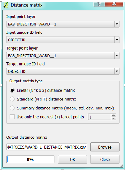
- The distance matrix window will open. In this matrix, we are calculating the distance between the locations of each tree injected against EAB within a particular ward. Therefore, the input point layer will be the injected ash tree data for a particular ward and the target point layer will be the same layer. The unique ID field for each layer is the OBJECTID.
- In this example, we will use the data for ash trees injected against EAB for ward 1. Therefore the input and target point layer should be EAB_INJECTION_WARD_1 with the ID field set as OBJECT ID. The Output matrix type should be set to linear, as we are interested in the Euclidian distance between all data points. In the output distance matrix box hit Browse, choose the appropriate output folder where you want your output file to be saved and name your output matrix with a meaningful name and select save. When you are ready hit OK.
Note. Depending on the size of the dataset, this program may take a few minutes to complete this task. The percent progress bar may advance and then freeze making it appear as though the whole program is frozen. Generally, if you wait out the program and refrain from trying to do anything in it, it will complete the task, producing a csv file in the folder that you have selected.
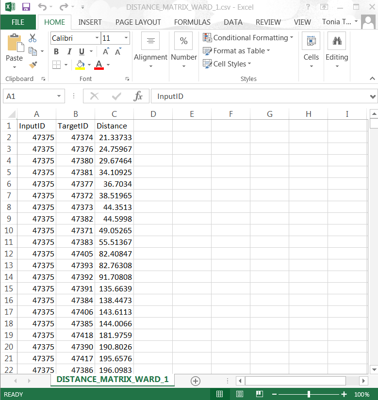
- If you want to see your distance matrix for Ward 1, look at the csv file and it should look like the following.
Preforming a Hierarchical Cluster Analysis in R
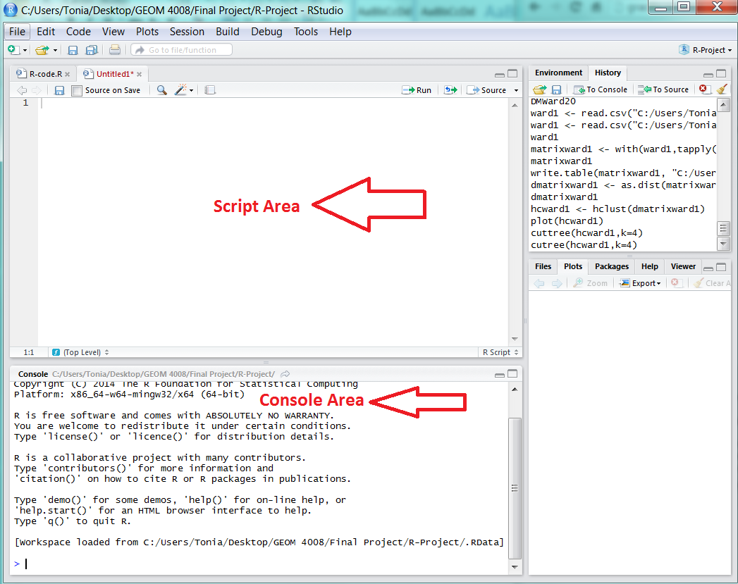
- Open the R program. Note that there are two areas where script is written in R, in the script area or console area. The script area is where script is written, it is written in lines and can be saved and adjusted. Once script is written, to run script, select the run button (
 ). The console area will display the output or response of the program to the script.
- Step 1:Load the distance matrix data
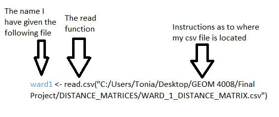
In this step we will load the distance matrix data (csv file) for the ward you are interested in. This is the csv file that was generated in the distance matrix portion of the tutorial, which was generated in QGIS. To load the data, you will use the read function. The read function allows you to load and read data files in the R environment, the use of the “<-“ function in the following code is to create a name that you will refer to the file as, without using the whole file name when you want to use it. Also the script included following the first bracket indicates where the file is that the function is to read, your script will differ here from mine depending on where you have saved the files. In this example we will be using distance matrix data from ward 1 treated ash trees. The following is the script that is used to load and read the csv data, it should be entered into the script area of the program:
Note. The function names that I have chosen are blue, indicating that they can be named differently depending on the preference of the user.
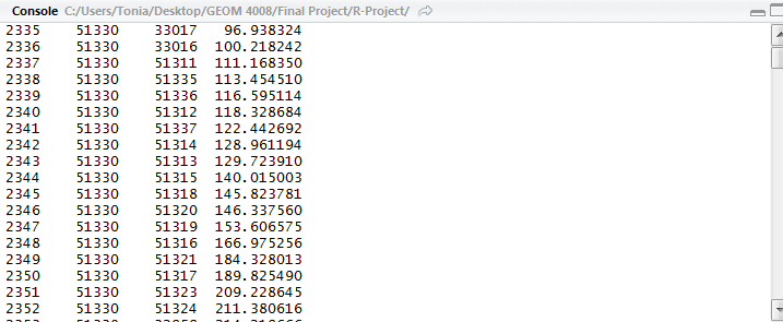
- To check that the file has loaded, and to see what it looks like in R, type in "ward1" and run the line (
 ), this should give you a preview of your data table. Here is a preview of my table.
- Step 2: The distance matrix created in QGIS is not compatible with R yet, because it is in list form rather than the matrix form. To convert the data you must use the following code and giving the file a new output name.
- To see the layout of the newly created matrix use the command matrixward1 and run the script. The new table will be in a matrix layout, notice towards the centre of the table that there is a diagonal of columns that say N/A, these are points in the matrix where the same observations were compared for their distance to each other.
- Step 3: Format the matrix so that is compatible with R
The data is in now in a matrix format, but R cannot process it, as there is non-numerical data in the matrix, such as “NA”. The program also does not require the entire matrix, as its upper and lower portions are symmetrical. The following code will convert the matrix into an R compatible distance matrix. Note that we are giving this output the new name dmatrixward1.
- Step 4: Preform the hierarchical cluster analysis
Now that the distance matrix is compatible with the program, the hierarchical cluster analysis can be performed using the hcluster function. This is the basic hierarchical cluster function that comes with R. It is an agglomerate clustering meaning that clusters are built from individual observations upwards into bigger clusters until a single cluster has been formed.
- Step 5: Plot clusters in a Dendrogram
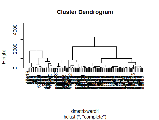
This step involves the creation of a dendogram that displays the result of the hcluster function. The dendogram will show how many clusters have been determined based on different scales of analysis and how they have been arranged. Observations that have the shortest distances between them will be clustered together. The y-axis displays the distance in meters between branches of clusters, although clusters which are short distances from one another will have recorded distances which are almost too small to be detectable. The dendogram is plotted using the plot function, as follows:
- The dendrogram should now be in the plot section of the R window. Bellow is the plot that has been generated for Ward 1.
- Step 6: Extracting a list of Cluster Allocations
As you may have noticed the dendrogram shows the clusters that are the result of the hierachrical cluster analysis, but it is impossible to determine which individual trees have been clustered into the different tree branches of the plot. To see the list of how individual trees have been allocated to different clusters, we will use the cutree function. This allows us to specify how many branches of the cluster we would like to see, either as a range or a discrete number. The following is the code that was used to separate the dendrogram into 4 clusters.
- Step 7: Extracting the list of clusters into a txt. File
This step allows you to extract the table that you have just generated by writing the table as a new file. The first part of the script is the write.table function, whereas the latter portion is our file name in R and directions for R as to where we want this new file to be saved in our system.


