Difference between revisions of "Spatial Analysis of Different Types of Traffic Accidents with QGIS"
Sabeeh Syed (talk | contribs) |
Sabeeh Syed (talk | contribs) |
||
| Line 61: | Line 61: | ||
=== Clipping Files === |
=== Clipping Files === |
||
| − | When the newly merged shapefile has been made, you can simply clip all of the other information (accidents, roads, railways, pedestrian paths) onto the study area as well. To do this, go to the '''Vector Menu''', select '''Geoprocessing Tools''' and then select '''Clip'''. |
+ | When the newly merged shapefile has been made, you can simply clip all of the other information (accidents, roads, railways, pedestrian paths) onto the study area as well. To do this, go to the '''Vector Menu''', select '''Geoprocessing Tools''' and then select '''Clip'''. |
| − | [[File: |
+ | [[File:VectorMenu.png|400px|thumb]] |
| + | A clip window will appear and the input vector layer will be what shapefile you want to clip onto the output vector layer. For example, in order to clip all the Side Swipe Accidents that occurred in the Barrhaven area, the input vector layer should be '''Side Swipe Accidents''' and the overlay layer would be the '''Barrhaven''' shapefile that was created in the previous selection. For output shapefile, you can browse to the folder that contains all of your other shapefiles and choose a name for your clipped file. |
||
| − | When clipping the other shapefiles, the clip layer remains the same, but the input vector layer changes. |
||
| − | Format the style of your clipped shapefiles to your liking. |
||
| + | [[File:Clip Window.png|650px|thumb|Clip Window]] |
||
| − | [[File:BarrhavenClipped.PNG|300px|thumb|none|The output of all layers being clipped to the AOI]] |
||
| + | |||
| + | When clipping the other shapefiles, the overlay layer remains the same, but the input vector layer changes. Proceed to clip all the other vector layers as done above, and format them to the style of your liking. Once completed, you should have a map similar to something below. |
||
| + | |||
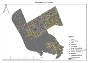
| + | [[File:BarrhavenClip.png|650px|thumb|none|Example of a completed Barrhaven, with all required layers clipped to it.]] |
||
=== Analyzing the Data === |
=== Analyzing the Data === |
||
Revision as of 14:03, 5 October 2020
Purpose
The purpose of this tutorial is to give users an understanding of what free and open source software (FOSS) is and demonstrate how to use Quantum GIS (QGIS) by using spatial data. This tutorial will be analyzing the spatial data of different types of traffic accidents that occur in Barrhaven, Ottawa using QGIS.
Introduction
The city of Ottawa has many programs regarding the safety of transportation and safer roads. A Safer Roads Ottawa Program is committed to preventing or eliminating road deaths and serious injuries. The program is conducted by Ottawa Fire Services, Ottawa Paramedic Service, Ottawa Police Service, Ottawa Public Health, and the Public Works Department. They are conducting the program through culture change, community engagement, and developing a sustainable safe transportation environment. Another program called the Safety Improvement Program includes all three E's of road safety: education, enforcement, and engineering. Locations chosen to be studied are usually higher-than-average traffic collision rate locations. The Safety Improvement Program is carried out on an annual basis because that is when year-end traffic collision and volume data is available.
Data
The data used in this tutorial are from Carleton University's Maps, Data, Government Information Centre (MADGIC) and the City of Ottawa's Open Data Website. The files used in this tutorial are a polygon shapefile of the wards of Ottawa, a point shapefile of traffic accidents, a polyline shapefile of Ottawa roads, a polyline shapefile of Ottawa railways, and a polyline shapefile of the pedestrian network. You may use any other data for another city or location as long as there is a polygon shapefile of your chosen city or neighbourhood, a polyline shapefile for roads, and a point shapefile for accidents, as well as any other information you would like to analyze. To get ready for this tutorial, you should download all of these shapefiles and keep them in a working folder on your PC to make your work easier to locate.
Quantum GIS (QGIS)
Quantum GIS, also known as QGIS, is a great free and open source software (FOSS GIS tool). QGIS is great tool that enables users to create maps with the help of core functions and plugins that are available through the software, and at this site. QGIS is available for Windows, Mac OS X, and Linux. Download the long term release repository (most stable version) of QGIS (v.3.14) to begin this tutorial.
Tutorial
Now that you have downloaded the software and shapefiles, it is time to begin.
Setting Up the Environment
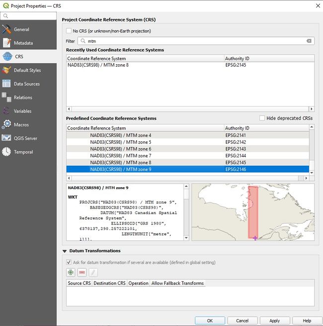
Go to the Project menu, select Projection Properties. The Projection Properties windows will open. Select NAD83(CSRS) / MTM Zone 9 as your projection due to the area of study being the Ottawa region. In previous versions one would have to toggle the Enable on the fly button, but in current versions of QGIS (3.0+), this is is on by default. Click Apply and OK.
Adding Shapefiles into QGIS
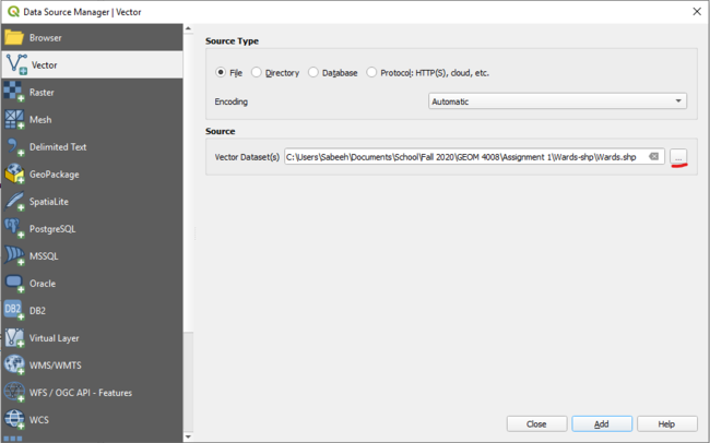
Once QGIS is launched, go to the Layer menu -> Add Layer -> Add Vector Layer. In the pop-up window, set your source type as File and click the Browse button under the Source header. Browse to where your shapefile is and double-click it or highlight it and select Open.
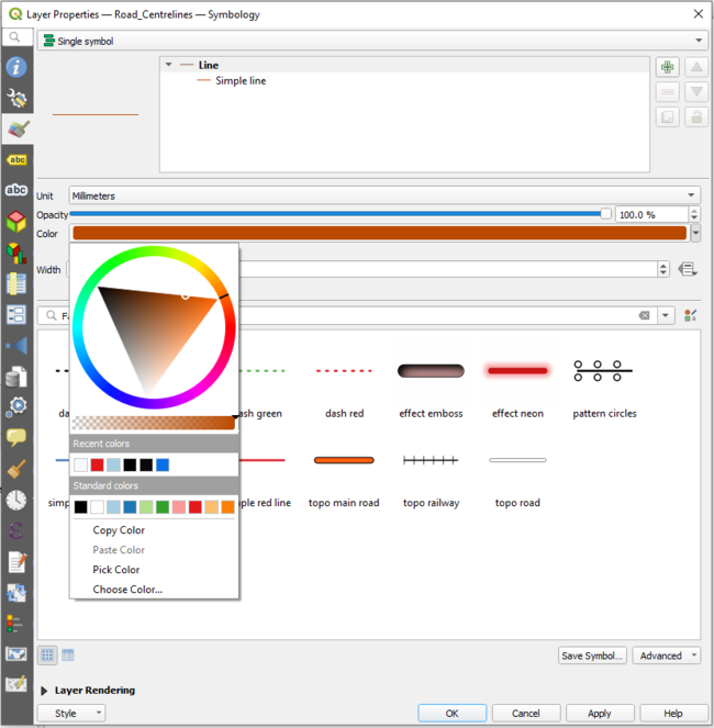
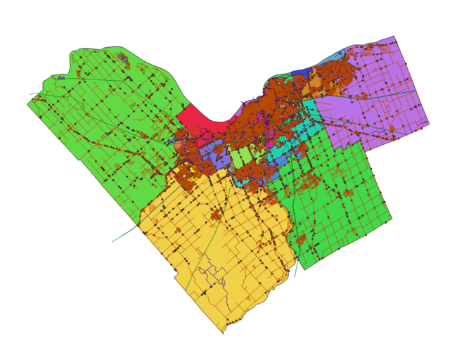
Insert each of the shapefiles you would like to analyze. Modify each shapefile to look the way you would like it to by double-cliking the layer from the Layers Panel on the left hand side, then selecting Style from the left hand side of the popup window. Here you can change the symbol type (such as gradient, single symbol, categorized etc), the colour, the size and more.
Editing Attribute Tables: Selecting by Expression
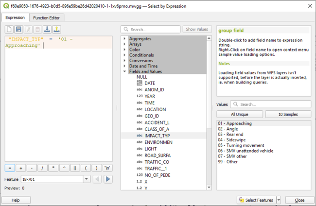
Right click on the accidents layer that you have imported and select Open Attribute Table. An attribute table of the accident layer will appear containing a multitude of different fields, including the different types of impacts and the street names where the accident occurred. Once you have the attribute table open, select Select Features Using an Expression (![]() ). A Select By Expression window will appear, and in the function list, expand the Fields and Values and select IMPACT_TYP. Select the All unique button underneath the Search Bar. Doing so will bring up a list of the unique values from the chosen attribute. In this case, choosing IMPACT_TYP will list all the different impact types observed in the attribute table.
). A Select By Expression window will appear, and in the function list, expand the Fields and Values and select IMPACT_TYP. Select the All unique button underneath the Search Bar. Doing so will bring up a list of the unique values from the chosen attribute. In this case, choosing IMPACT_TYP will list all the different impact types observed in the attribute table.
The expression box allows the user to create formulas that aid in simplifying the search process for the field desired. In the expression box, double clicking a field adds it to the expression. Double clicking on the IMPACT_TYP will cause "IMPACT_TYP" to appear in the expression window. Once that appears, you select the equal (=) sign where the available operators are listed. The next step is to select a field value. In this example, the first field value selected is Approaching. The expression listed in the expression window should read: "IMPACT_TYP" = 'Approaching'. Upon hitting Select Features in the bottom right corner, the impact types that are Approaching are now highlighted on your map.
Saving Selected Points (Shapefile)
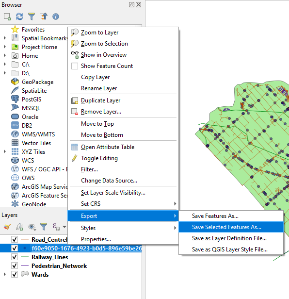
The selected points that are now highlight can be saved as their own shapefile. To do this, right click on the accidents layer, mouse over Export, then select Save Selected Features As and a window will appear.
In this window, the format that the shapefile should be saved under is "ESRI Shapefile". Additionally, you will be given the option to set the CRS of the shapefile you are about to create. Set the CRS to the Project CRS, in this case it will be Project CRS: ESPG:2146 - NAD83(CSRS98)/MTM zone 9. Name the file what you please, and then click OK. Doing so will create and save the shapefile in the location/folder where the Map Project is saved.
Repeat both the Editing Attribute Tables: Selecting by Expression and Saving Selected Points (Shapefile) steps until all the impact types have been saved as their own individual shapefiles.
Selecting a Specific Area
To select a specific area, open the attribute table for the Wards shapefile layer. Click on the Select features using an expression (![]() ) button.
) button.
The Select By Expression window will appear, and in the function list, expand the Fields and Values and select the specific area you want to study. In our case, Barrhaven is the chosen site. In order to select only Barrhaven, we can use a many of different functions: "WARD_EN" = 'BARRHAVEN' , "WARD_NAME_" = 'Barrhaven' , "WARD_NAM_1" = 'Barrhaven' , "DESCRIPTIO" = 'BARRHAVEN - Jan Harder' . Any of them do the job.
If we were tasked with selecting more than one ward at a time, our expression would look something like: "WARD_EN" = 'BARRHAVEN' OR "WARD_EN" = 'CUMBERLAND' . Once the wards you want are selected, save and create shapefiles for the selected layers as described in the Saving Selected Points (Shapefile) section.
Clipping Files
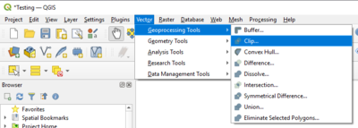
When the newly merged shapefile has been made, you can simply clip all of the other information (accidents, roads, railways, pedestrian paths) onto the study area as well. To do this, go to the Vector Menu, select Geoprocessing Tools and then select Clip.
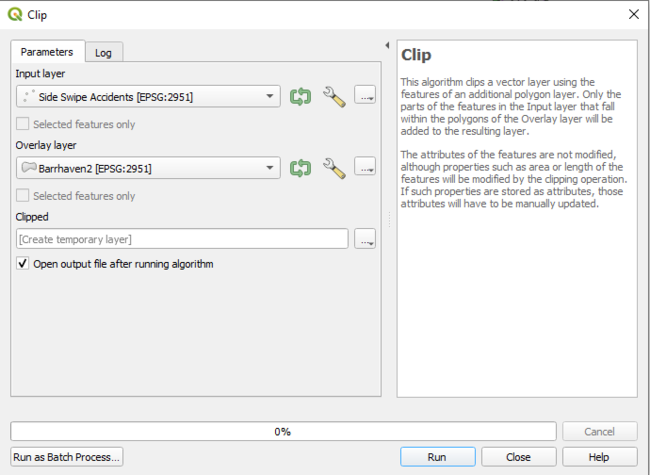
A clip window will appear and the input vector layer will be what shapefile you want to clip onto the output vector layer. For example, in order to clip all the Side Swipe Accidents that occurred in the Barrhaven area, the input vector layer should be Side Swipe Accidents and the overlay layer would be the Barrhaven shapefile that was created in the previous selection. For output shapefile, you can browse to the folder that contains all of your other shapefiles and choose a name for your clipped file.
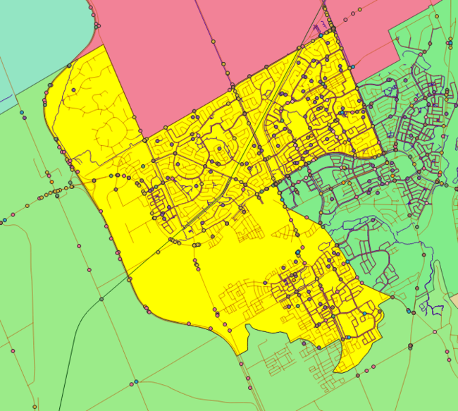
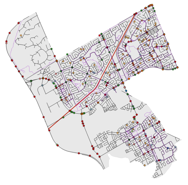
When clipping the other shapefiles, the overlay layer remains the same, but the input vector layer changes. Proceed to clip all the other vector layers as done above, and format them to the style of your liking. Once completed, you should have a map similar to something below.
Analyzing the Data
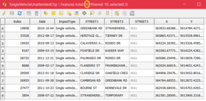
To see how many of each accident type occur, we can look at the attribute table. For example, in our recorded data for Single Vehicle Unattended Accidents in the Barrhaven ward, 10 incidents occurred.
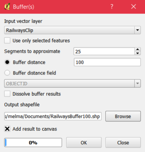
To see how many accidents occur within 100 m of a railway track, we can first create a buffer around our clipped railways shapefile. Select Vector -> Geoprocessing Tools -> Buffer. In this example, a buffer distance of 100m was used and the segments to approximate value was 25 (this mean that our finished polygon will have 100 sides (the higher the segments to approximate value, the smoother the buffer). We save this in our desired folder with a file name of our choice.
Because we want to know how many accidents of any type occurred within 100 m of a railway, we can clip our original accidents shapefile to our Barrhaven polygon.
Here’s the outcome:
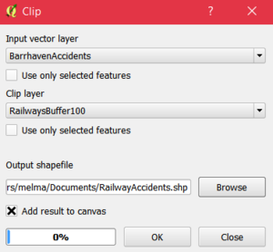
To find out how many accidents occurred within our buffered region, we can make a clip of accidents in Barrhaven from our railway buffer.
From the output layer and it’s attribute table we can see that only one accident occurred within 100 m of a railway in Barrhaven.
Using these methods, you can perform a multitude of operations to interpret things such as how many accidents occur within a distance from pedestrian pathways, how many accidents occur within a ward, how many accidents occur within a distance from railways, how many of a certain accident type occur within a distance from other accident types etc.
Making a Map
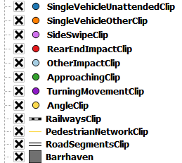
Once we have produced the data that we want to showcase, we can use QGIS to make an aesthetically pleasing map. First, turn on all of the layers that you would like to be showcased and turn off all others by selecting and unselecting the checkbox next to each layer name. I want to showcase different types of accidents that occur within Barrhaven so I have selected these layers:
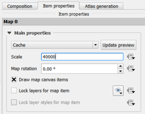
Select Project -> New Printer Composer and then type a name for your map in the text box and select OK (it does not have to be the same as the title you place on your final map). In the pop-up window, select Layout -> Add Map and then draw a rectangle on your canvas where you would like your map. To reposition your map display, select Layout -> Move Content. Now you can drag your map into place and zoom in and out. Under the Item Properties tab on the right hand side, you can also change the scale to get the perfect sizing.
To add a title, select Layout-> Add Label and draw a box for your title. Under Item Properties -> Label you can type your title in the textbox and change the font type, size, colour etc.
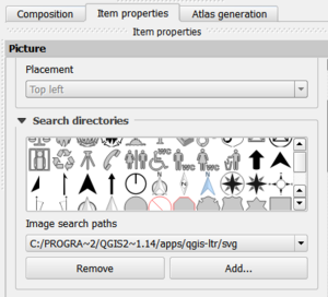
To add a north arrow, select Layout -> Add Image and draw a box on your canvas. Under Item Properties -> Search directories you can view different North Arrows and choose which one you would like to use.
Similarly, you can add a scale bar by selecting Layout -> Add Scalebar.
To add a legend select Layout -> Add Legend. To show only the legend items that are present on your current map, select the icon that resembles a filter cone under the Item Properties -> Legend items menu. To rename legend items, double click a legend item and enter the text you want displayed. You can also rearrange legend items by dragging them up and down. Once you are happy with your map, you can export it as an image, SVG or PDF by selecting Composer from the top left hand menu and choosing either Export as Image, Export as SVG or Export as PDF.
Conclusion
QGIS is an intuitive and user-friendly software that in this instance has allowed the production of a map that showcases traffic accidents in the Barrhaven ward of Ottawa as well as allowed the user to analyze different scenarios. This is just an example of the many ways that a few shapefiles can be combined to produce a multitude of useful and easily understood data
References
- City of Ottawa. (2017). OpenData Ottawa | City of Ottawa. Retrieved October 9, 2017, From City of Ottawa: http://data.ottawa.ca/
- City of Ottawa. (2014). Safer Roads Ottawa Program | City of Ottawa. Retrieved December 20, 2014, from City of Ottawa: http://ottawa.ca/en/residents/transportation-and-parking/safer-roads-ottawa-program
- City of Ottawa. (2014). Safety Improvement Program | City of Ottawa. Retrieved December 20, 2014, from City of Ottawa: http://ottawa.ca/en/residents/transportation-and-parking/road-safety/safety-improvement-program
- MacOdrum Library. (2014). Maps, Data and Government Information Centre | MacOdrum Library. Retrieved December 19, 2014, from MacOdrum Library: https://www.library.carleton.ca/contact/service-points/maps-data-and-government-information-centre
- QGIS. (2014). Discover QGIS. Retrieved December 20, 2014, from QGIS: http://www.qgis.org/en/site/about/index.html
- QGIS. (2014). Download QGIS. Retrieved December 20, 2014, from QGIS: http://www.qgis.org/en/site/forusers/download.html
- Wikipedia. (2017). Wards of the City of Ottawa. Retrieved October 13, 2017, from https://en.wikipedia.org/wiki/Wards_of_the_City_of_Ottawa
