Analyzing Crime Data in Ottawa using QGIS
Contents
- 1 Introduction
- 2 Where to get the data?
- 3 Loading the Dataset into QGIS
- 4 Transforming the Coordinate System
- 5 Introduction to Layer Properties
- 6 Looking at Statistics in 3D
- 7 Additional Statistics
- 8 Different Scenarios
- 9 Conclusion
- 10 Reference List
Introduction
The main purpose of this tutorial is to identify trends in crime in the Ottawa region using open source software. QGIS is the software that will be used for this tutorial. QGIS version 3.14 "Pi" can be downloaded here: (https://www.qgis.org/en/site/forusers/download.html). The data includes many different types of crimes that occurred in Ottawa from 2005 to 2013. The sub regions include: Orleans, Innes, Barrhaven, Kanata North, West-Carleton March, Stittsville-Kanata West, Bay, College, Knoxdale-Merivale, Gloucester-Southgate, Beacon Hill-Cyrville, Rideau-Vanier, Rideau-Rockcliffe, Somerset, Kitchissippi River, Capital, Alta Vista, Cumberland, Osgoode, Rideau-Goulbourn, Gloucester-South Nepean and Kanata South. Some examples of the crimes in the data set are: Total Criminal Code of Canada (CCC) including Traffic, Total Criminal Code of Canada (CCC) excluding Traffic, Crimes against Person, Total number of Homicides, Total Number of Attempted Murders, Total Number of Robberies and Total Number of Assaults (including Sexual Assaults), Total Number of Other Sexual Offences, Number of Abductions, Total Number of Uttering Threats or Intimidation Offences and Total Number of Other Crimes.
Where to get the data?
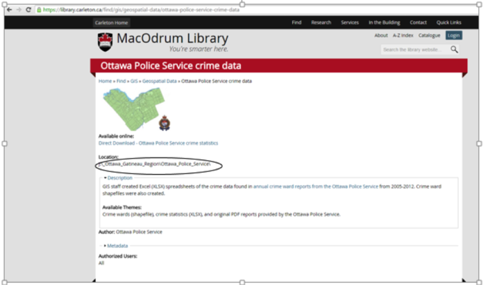
Based on the statistics that the Ottawa Police Service have provided, the MADGIC librarians at Carleton University created the shapefiles and they are available for download from the MacOdrum Library website. Considering it is an open source dataset, no login information is required.
The shapefiles are available for download at this link: http://madgic.library.carleton.ca/deposit/GIS/Crime_Statistics.zip
Loading the Dataset into QGIS
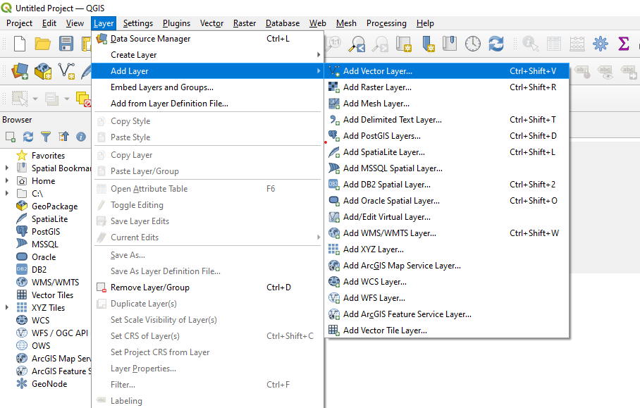
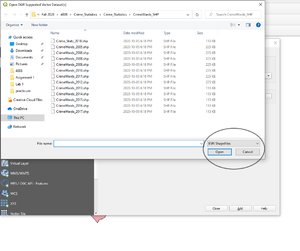
The first step to analyzing the data is adding it into QGIS. To do so, select the Add Vector Layer symbol. In QGIS 3.14, the Add Vector Layer button is accessible by clicking the Layer dropdown on the top toolbar. From there, navigate to Add Layer and Add Vector Layer. Adding vector layers can also be done by pressing Ctrl+Shift+V on a Windows computer or a Linux machine. Locate the folder where all of the (.shp) files were extracted. You can select to filter by ESRI Shapefile in the bottom right corner to make it easier as there are other types of files in the dataset that were downloaded.
Transforming the Coordinate System
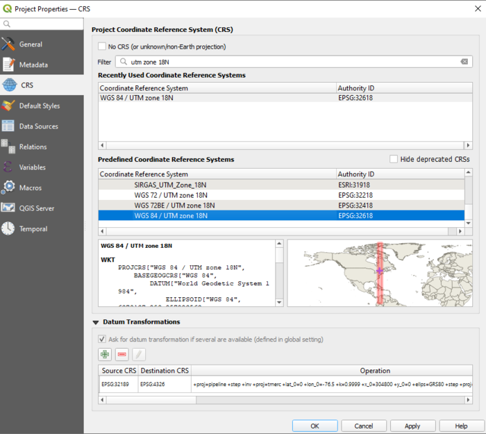
When using GIS software, using the correct coordinate reference system is detrimental in terms of properly analyzing spatial data. Ensuring that all data frames have the same projection allows all of the data frames to align properly. To start the analysis, we will transform the coordinate system to WGS 1984 UTM zone 18N, which is the UTM zone for Ottawa.
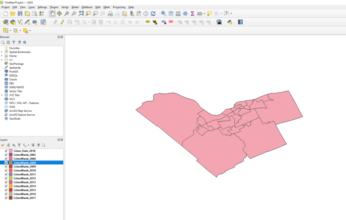
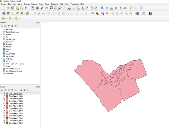
This is how the shapefiles look after importing them into QGIS. The City of Ottawa appears to be warped. To change this, hover to Project>Properties (as a shortcut on Windows or Linux machines, Ctrl+Shift+P also brings you to Project Properties).
Under the CRS frame, you can search for any coordinate reference system under the Filter box. To find the coordinate system we are working with easier, search for "UTM zone 18N". On the map in the bottom right, QGIS will highlight where the UTM zone is assigned to. In this case, UTM zone 18N spans over the City of Ottawa.
After the layer coordinates have been transformed, the map appears to be less warped. Ensure that all of the layers have the same coordinate system. Repeat this step for all of the crime data layers that were imported.
Introduction to Layer Properties
Layer Properties can be opened by right clicking any of the layers and clicking Properties. This opens the Layer Properties window. From here, several aspects of the layer can be edited. Some examples include layer title, symbology, labels and so on.
General Settings
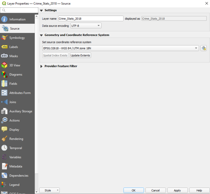
Under Source:
- Layer name can be modified and changed to anything. Changing layer names is key to be able to identify different layers. In the case that the data layers came without clear labels, labelling them by year is crucial in order to easily identify each data set.
- Data source encoding can be changed (System, Windows, and Macintosh for example)
- Coordinate Reference System can be changed
- Scale dependency can be turned on to restrict the minimum and the maximum scale
Labels
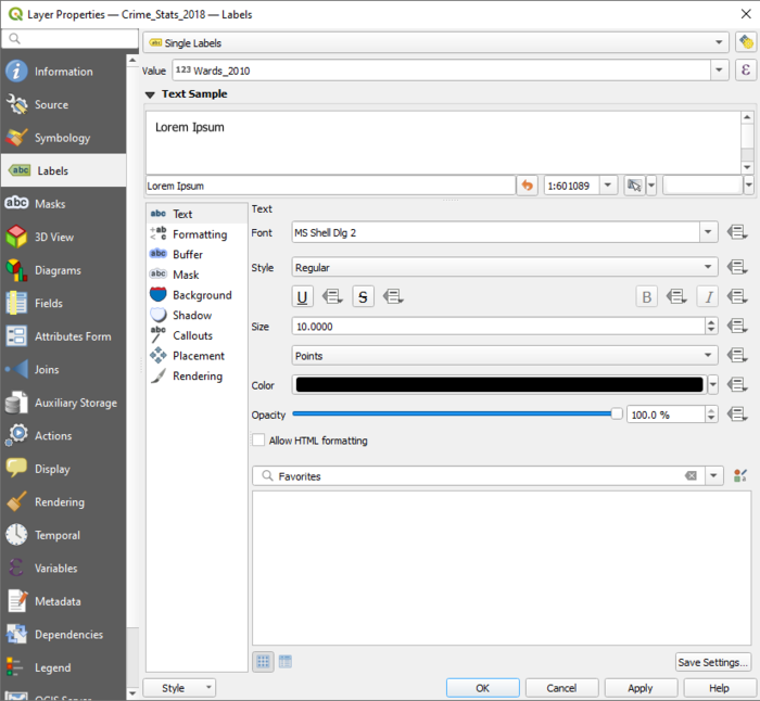
Labels can be used in any vector layer. Some label settings include:
- Text (Able to modify the size, font style, transparency, color and style of text)
- Formatting (Able to modify the line height and alignment)
- Buffer
- Background (Able to modify the background settings)
- Shadow (Use this setting to add depth to labels by adding shadows)
- Placement (Use this setting to modify the placement of the labels, including distance from centroid)
- Rendering (Able to perform scale based visibility and pixel based visibility)
Fields
Within the Field Properties tab, you can edit the field data as well as create new fields using the Field Calculator. Any new fields you create will appear at the bottom of the field list.
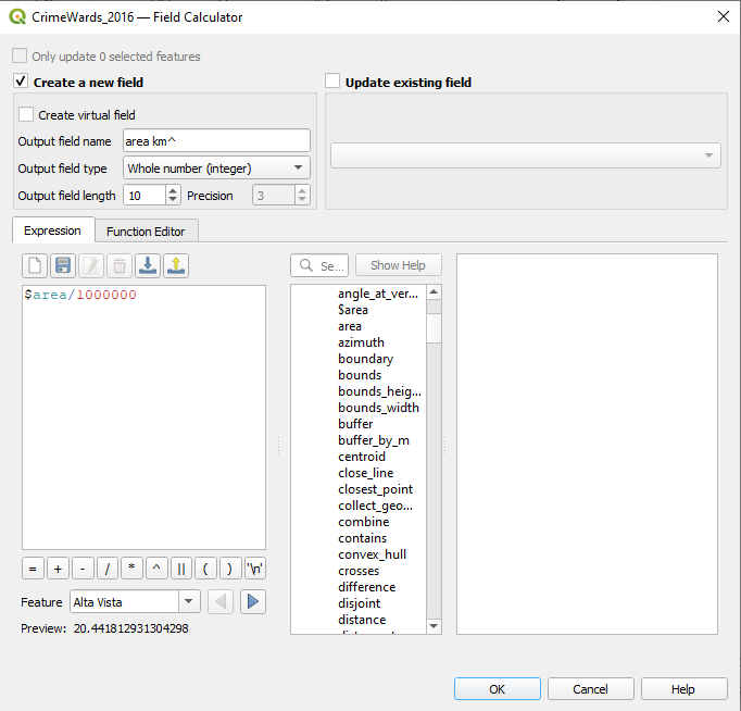
To create a new column in the attribute table, open Fields under Properties and click the Area Calculator button. Here we will start to calculate the population density of crimes for years 2016, 2013 and 2010. The data downloaded does not contain the area km^2 value that is needed to calculate population density of crimes. Therefore, it needs to be created. Under Field Calculator, the first step is to calculate area km^2. In the Expression box, enter the calculation $area/1000000. Enter an output field name (In the example, "area km ^" was used), and click OK. When doing calculations in the Field Calculator, if an expression is invalid, it will state "Expression is invalid" in red.
Creating the population density field
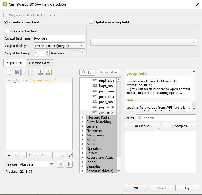
The total population divided by the area will result in the population density. We will calculate population density for layers 2010, 2013 and 2016.
To calculate population density, insert the function (pop2016/"area km2") into the calculator. Area km2 is the attribute that was created in the previous step. The area km^2 attribute that was just created can also be found under the Fields and Values tab.
Rendering
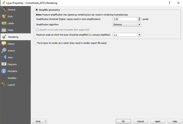
Rendering can be used to simplify the geometry. Under the Rendering tab, simplification threshold and scale can be customized to enhance the rendering process.
Additional Settings under Layer Properties
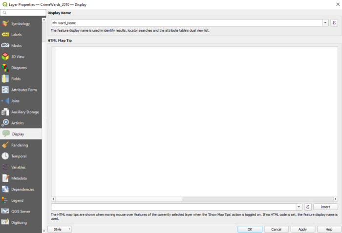
Additionally, under Layer Properties, other tools such as Legend, Actions, Joins, Display and Variables can be accessed.
Using Style and Diagram Functions under Layer Properties
Style Function
Under Style there is a dropdown menu, which the Single Symbol, Categorized, Graduate, Rule Based, Point Displacement, Inverted Polygons and Heat Map can be selected. For the purpose of this tutorial I am mainly going to focus on the Graduate Style.
Single Symbol
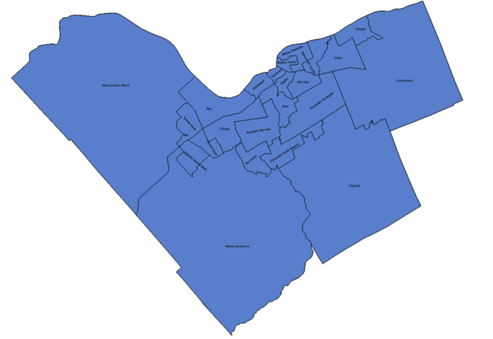
Single Symbol Function is useful for showring the features without any sort of categorization. An example below demonstrates a map of Ottawa without any sort of categorization.
Categorized Style
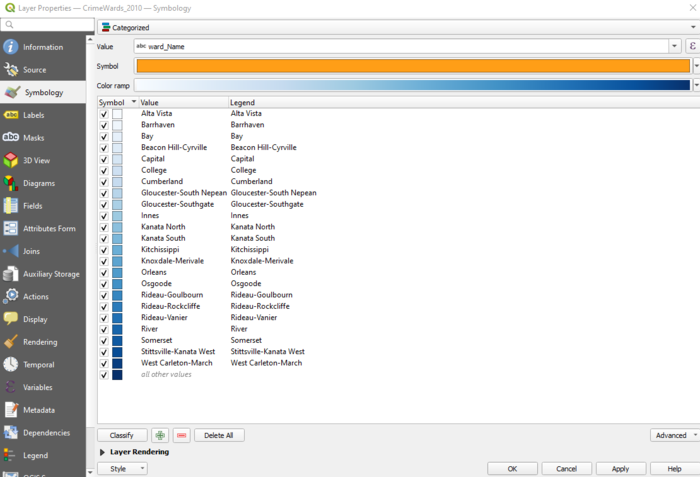
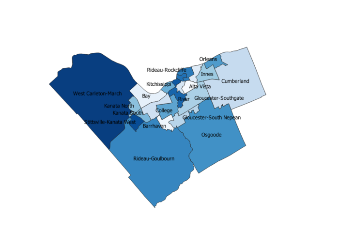
Categorized style is useful for demonstrating areas in the City of Ottawa. To symbolize the map this way, right click any layer (in this case, the crime wards in 2010 is used), and go to Symbology.
Select ward_Name as the value, and select Classify on the bottom left corner.
Under the Labels tab in Layer Properties, click Single Labels and select ward_Name for the value. This will generate labels for each ward in the City of Ottawa.
Graduated Symbols
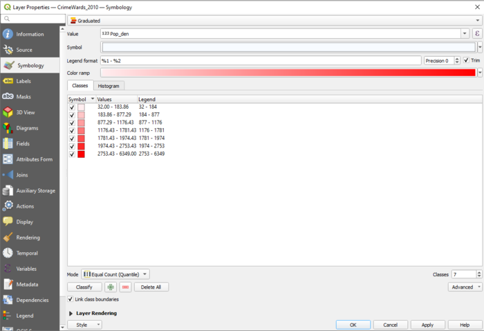
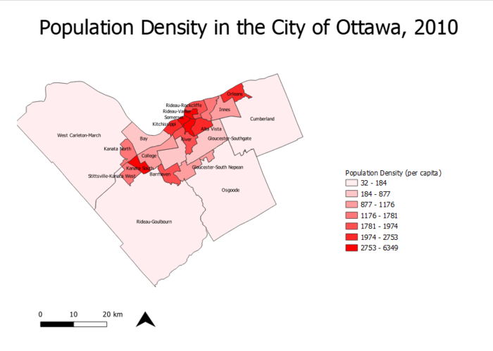
Graduated Symbols are useful for displaying the features based on their numerical values. First, the style of symbology needs to be selected as Graduated under the Symbology tab. The value that will be classified is the Population Density attribute that was created earlier. Select "pop_den" from the Value dropdown.
Map demonstrating population density in the City of Ottawa in 2010, using graduated symbols and labels.
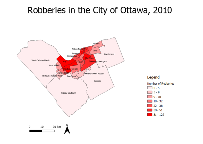
Map demonstrating total number of robberies by ward in the City of Ottawa in 2010, using graduated symbols and labels.
Using the Graduated Symbols function, it is apparent from the map that there is a higher population density in the downtown core of Ottawa. From observing the second map, there were more robberies in the downtown core in 2010 as well.
Diagrams
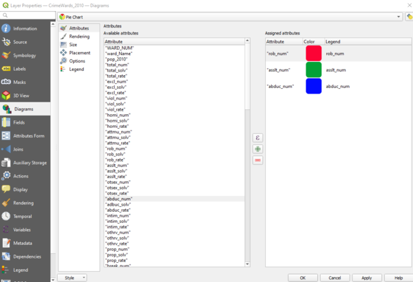
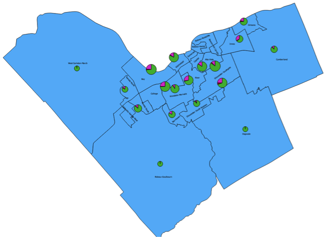
Diagrams are useful for showing multiple features on a single layer. To access diagrams, open Layer Properties and navigate to Diagrams. On the dropdown in Diagrams, select Pie Chart. Below, all of the attributes in the selected layer (in this case crime wards in 2010) will be displayed. For the purpose of this tutorial, total number of robberies, abductions and assaults are used as attributes in the pie chart.
At first, the pie charts can be too large and cover most of the map, similar to this:
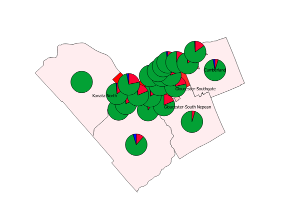 To counter this, open Diagrams again and navigate to Size. There, the pie chart (or other diagrams) size can be adjusted. For the sake of the tutorial, size 7 will be used.
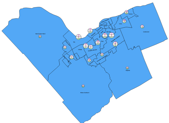
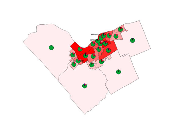 Maps below are showing the difference between the Pie Chart diagram type and text diagram type for the same data.
Figure is showing the Pie chart diagram type
Figure is showing the text diagram type
Looking at Statistics in 3D
Analyzing and interpreting the statistics of the Ottawa Crime Data in 2D has many uses. But you can look at the same data in 3D.
Utilizing the QGIS plugin QGIS2threejs you can transform flat 2D DEMs, vector data and terrain data into 3D maps. Looking at other Tutorials and background information you can get a better grasp of the capabilities of this plugin;
- http://qgis2threejs.readthedocs.io/en/docs-release/
- http://qgis2threejs.readthedocs.io/en/docs-release/Tutorial.html
- https://media.readthedocs.org/pdf/qgis2threejs/latest/qgis2threejs.pdf
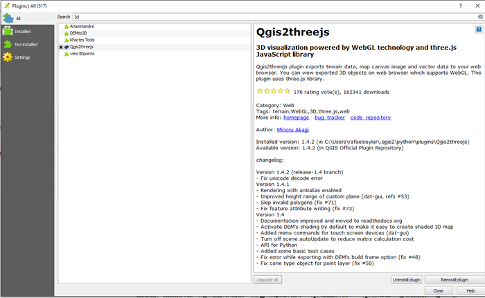
Before starting anything you need to install the QGIS2threejs Plugin. This is done by clicking the Plugins tab on the main banner, then selecting Manage and Installing Plugins. This will generate a Plugins wizard.
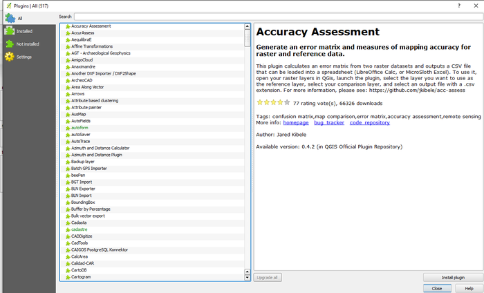
As you can see there are many plugins. If you know the desired plugin you can scroll to it or you can search the list of plugins. Each plugin comes with it's own description. Once you've selected your desired plugin click Install Plugin.
Looking around you'll see that nothing really has changed. If you click on the Web tab on the main ribbon you'll see QGIS2threejs, click on it.
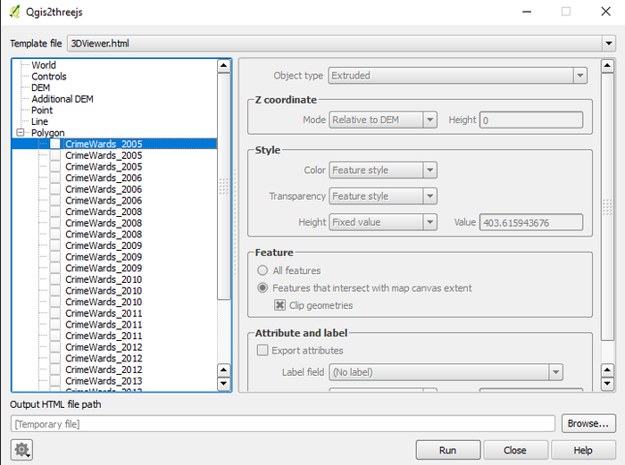
The QGIS2threejs Plugin has alot of power in what you can do. Along the top you can choose from among template files.
Along the left-hand side you can see how you can choose from many options. While on the right-hand side you can set your inputs.
- Clicking World lets you set your extents, the default will be your project.
- Clicking Controls allows you to choose in what manner you want to interact with your 3D map.
- Clicking DEM lets you select which elevation data to use or just leave it as a flat plane.
- Clicking Additional DEM allows you to add more DEM's (ex. Heat maps) to you map, adding content.
- Clicking Point allows you to choose from existing Point features within your project to add in or become the focus of.
- Clicking Line allows you to choose from existing Line features within your project to add in or become the focus of.
- Clicking Polygon allows you to choose from existing Polygon features within your project to add in or become the focus of.
Within this example we'll focus on the Polygon aspect and check out the first CrimeWards_2005. Notice that you can select multiple Polygons and incorporate them into your map.
By selecting this polygon you'll notice how the inputs on the right are no longer grayed-out and you can set your desired inputs. Object Type has two options; Extrude or Overlay.
Overlay works with existing DEM files and allows you to drape it over with your settings.
Extrude on the other hand extrudes your polygon based on a set height. This will be the one to select for this exercise.
Within the Z coordinate mode you have options on where the extrusion will occur from. The default is the DEM but you can choose a field. You then can set the desired height.
For this example we'll leave it at the default Relative to DEM and set the height to 0 for now as we're not working with any DEMs.
Within the Style mode you can select how you want the 3D map to be depicted by setting Color, Transparency, Height and Value.
There are options within the Color input, select Random as this will be very distinct, as well as Transparency, leave at it's default. Within Height we'll be selecting what Field in the CrimeWards_2005 that'll be your focus.
Let's choose Assault Rates (asslt_rate) and give it a Multiplier of 10 so differences will be very exaggerated.
The Features mode allows you to select which features will be the output. You can choose everything or something specific.
Check All features
Within the Attribute and label mode you can choose what attributes will be on your map as you interact with it. First you'll have to check Export attributes.
Within the Label field you can assign whatever label you want to each of your polygons (Ex. Ward Name) or just leave them blank.
Label height and Value can also be set but we'll leave them as is for now.
Lastly you can set an Output HTML file path but you needn't right now. Your wizard should look like this.
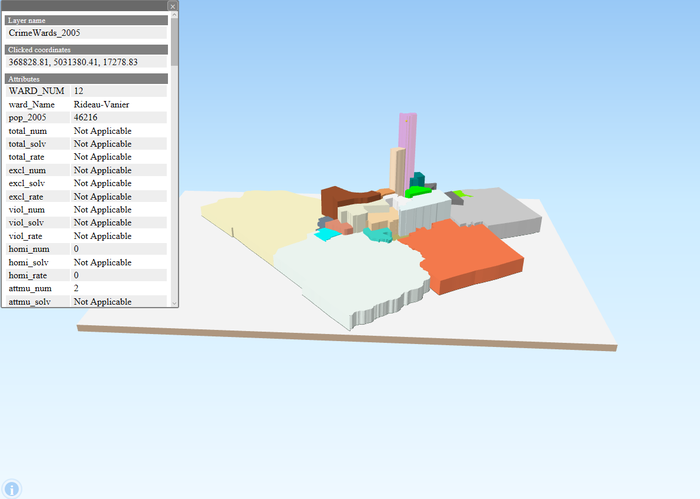
You'll now have an interactive window wherein you can zoom in and move around looking at each ward. In this case you can see that the Rideau-Vanier ward clearly has the largest Assault Rate.
You can click on individual wards and see their attributes.
This method of mapping allows you to visually analyze the distribution of your stats. Though this is at a very basic level further development would allow you to create 3D maps with an abundance of content.
Additional Statistics
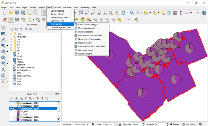
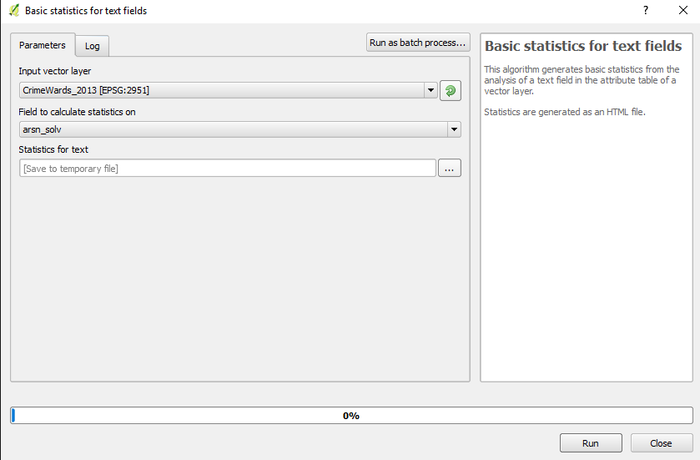
Additional statistics can be obtained under Vector tab/Analysis tool/Basic Statistics. Input Vector Layer needs to be selected then type of crime needs to be selected. As a result it will show the mean, standard deviation, sum, min, and max, number of unique values, range and median.
Different Scenarios
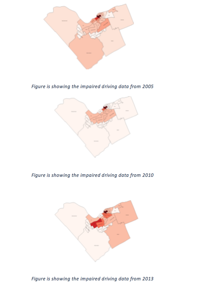
Scenario 1 (Comparing the Impaired driving data from 2005, 2010 and 2013)
Quick Analysis: The number of impaired driving occurrences in suburbs (Kanata, Cumberland) from 2005 to 2010 has become lower. However the number of impaired driving occurrences in east end from 2010 to 2013 has become significantly higher, and the number of impaired driving occurrences increased dramatically in College ward in from 2005 and 2010 to 2013.
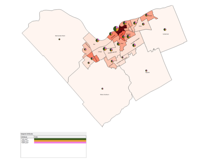
Scenario 2 (Analyzing the total number of violent crimes, the total number of assaults and the number of traffic offences from 2010 data using Diagrams )
The diagrams are showing that the western and the southern areas of Ottawa have less number of violent crimes, assaults and traffic offences even though they have relatively similar population density. Somerset ward has the highest population density as well as the highest number of violent crimes, assaults and traffic offences.
Conclusion
Conclusively this tutorial highlights that QGIS was a powerful open source GIS software for analyzing the crime trends in Ottawa from 2005 to 2013. There are many other different crimes to analyze from, only limited number of crimes were highlighted in this tutorial. The QGIS software can be downloaded from the website highlighted above and the crime data can be downloaded from the MacOdrum Library website mentioned above for further analysis.
Reference List
- Ottawa Police Service Crime Data. (2013).
The data is gathered from the Carleton University MADGIC Desk’s website.
Ottawa Police Service Crime Data retrieved from: http://madgic.library.carleton.ca/deposit/GIS/Crime_Statistics.zip
- QGIS 3.14 ("Pi") Software, which was downloaded from:
