Creating Maps in Jupyter Notebook using GeoPandas
Contents
Introduction
Purpose
This tutorial will demonstrate how Jupyter Notebook can be used to manage and display spatial data in conjunction with Anaconda and GeoPandas. Using Jupyter Notebook in this procedure will enable you to develop your skills in scripting and automatic mapping. This workflow is accessible to users with less computational power, and data will be easier to store and manage. In the second part of this tutorial, we will show you how to display the data as a complete map (utilizing basic cartographic elements). This tutorial is designed for GIS users with some experience using graphic user interfaces, who are looking to get into using Python to streamline their workflow. The instructions and figures included in this tutorial were developed on the Windows operating system. If you are using a different operating system, your process may be slightly different.
About Jupyter
Jupyter Notebook was created by Project Jupyter, which is a collective which aims to develop open-source software in various programming languages. Jupyter Notebook specifically enables users to easily create and share code, as well as visualise data, among other uses. It is free to download and use (Jupyter, n.d.). While it runs in web browsers, it also runs locally on the user’s machine, which makes it easy to save version controls locally. Another advantage of Jupyter is that you can type code into kernels, and run those kernels individually. This will be demonstrated in the tutorial, but as a quick explanation -- the benefits to this include being able to test code easily and quickly visualize a certain data table, or in our case, create a map quickly without having to run all of the code at once.
About GeoPandas
GeoPandas is an open source library in Jupyter that builds off of pandas in Python. It is designed for users to more easily perform geospatial operations, by taking advantage of data frames in pandas, and creating spatial data frames. GeoPandas uses fiona for accessing files, Shapely objects for geometric manipulation and Matplotlib for plotting (geoPandas, n.d.).
Note on Software Versions
This tutorial uses the latest versions of software available at the time of writing (December 2020). Python 3.12, and geoPandas 0.14.1. If you find updated versions of software when you try this tutorial, please note that there may be some differences in what you see in our screenshots and instructions, and what you see on your software.
Part 1: Getting Started
Software
This tutorial will be for Windows machines. The following steps will assume that the user is on a Windows platform, and therefore if you are using any other machine, the steps may be slightly different. This tutorial also assumes that the user already has QGIS installed. If you do not have QGIS already, please go to this website to do so.
Install Anaconda
Install Anaconda here. You may also choose to simply install miniconda which will run everything necessary for the purpose of this tutorial, and most Jupyter notebook commands. You can install miniconda here in silent mode (recommended). Silent mode will automatically accept default settings and allow for quicker installation.
Install Jupyter Notebook
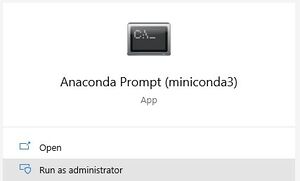
Next, you will need to install Jupyter Notebook.This can be done easiest through the Command Line in Windows. To open this up, you can search for “Anaconda Prompt” in the Windows Start Menu, and right-click “Run as Administrator” on the Anaconda Command Prompt application.
Figure 1.1. How to open Anaconda Prompt.
Install Jupyter Notebook in your users file directory by “Changing Directory” using cd to where you want to install it and using the following command:
conda install -c conda-forge jupyterlab
Install GeoPandas
Install the GeoPandas library using the same Anaconda Prompt application as used before. You should “Change Directory” using the cd prompt to where you would like geopandas to be installed. For the purpose of this tutorial, I will be installing it into a working folder, however I recommend installing both Jupyter Notebook and GeoPandas somewhere permanent in your file directory that will be easy to navigate to in the future, for example your users folder. Once in your desired file directory, install the latest version of GeoPandas using:
conda install geopandas
Figure 1.2. How to install GeoPandas.
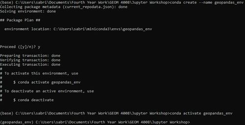
Next, we will be creating a new environment for geopandas. This is optional, but also recommended as good practise, as you may have dependency conflicts from previous installs of other software on your machine. This way, we can have a fresh start. To do this, enter the following command:
conda create --name [name of environment]
(Note: -n and --name is the same syntax)
Once created, you can activate this environment using:
conda activate [name of environment]
Figure 1.3. Setting up the GeoPandas environment.
Next, configure the environment to work with packages and install GeoPandas within them. Use the following commands, accepting the defaults with y.
conda config --env --add channels conda-forge
conda config --env --set channel_priority strict
conda install python=3 geopandas
Install Matplotlib and CartoPy
These packages will allow us to plot. Install them by running:
conda install -c conda-forge matplotlib
conda install -c conda-forge cartopy
conda install -c conda-forge descartes
Data
Download the following data and save the .csv files into your working directory:
World Health Organization COVID-19 Dataset:
Once you have downloaded the data, take a second to open up the dataset to familiarize yourself with what kind of information it holds. For the purpose of this tutorial, we will be displaying the values under "Cases - cumulative total per 1 million population" which can be found in the WHO dataset.
Part 2: Intro to Jupyter Notebook
Run Jupyter Notebook locally on your machine by searching for “Jupyter Notebook” in the Windows Start Menu. This will open up a terminal window that looks like Figure 2.1 below:
Figure 2.1. Opening up Jupyter.
It should also open up a new browser window automatically or you can use the URL provided above and copy & paste it into your browser.
Another way to open Jupyter Notebook is to use the following command in your working file directory:
jupyter-lab
Remember, that if you are ever running something in the command line and you want to stop running the process, ctrl + c will stop the process without having to restart your terminal.
Once opened, navigate to your working folder and Select “New” → Python 3 Notebook. This will open up a new tab where you can rename your project at the top and save.
Figure 2.2. Opening a new Notebook.
If you navigate back to the other tab, you will see something like the following (Figure 2.3):
Figure 2.3. Overview of working folder.
This shows a list of what is in your working folder. Here, we can see that the newly created notebook has been saved properly. If you navigate to the “Running” tab, you will see (Figure 2.4):
Figure 2.4. Overview of the Running tab.
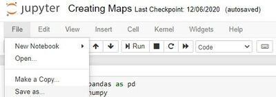
We should have one notebook running. This tab is useful to visualize what terminals and processes are running, and manage them accordingly. In the newly created notebook, we can see the top ribbon has many options (Figure 2.1). Here is a brief overview of some options you may find useful:
- Can change the title (“Creating Maps”)
- “File” has many useful options
- Typical new, save as, open, make a copy.
- The most useful feature is “Save and Checkpoint” where you can take advantage of Jupyter’s simple version controlling and then “Revert to Checkpoint”
- “Close and Halt” will close the notebook and halt it from running in the terminal (Note: if you open up the terminal again at any time while making changes to your notebook, you will see the changes being made locally on your machine)
- “Edit” and “Cell” helps move cells around, you can play around with these options or manually click and drag cells
- “Kernel” is important when running processes
- You can “Interrupt” the process (i.e if it is taking too long, or if you have noticed an error)
- You can “Restart and “Clear” it to get rid of any errors or outputs that may have come up
Part 3: Tools and Data Organization
Tools
Here is the code cell that contains all the import statements that will be used in the tutorial

- import pandas as pd:
- This imports the pandas library, a powerful tool for data manipulation and analysis, particularly with tabular data (dataframes). The alias pd is commonly used for brevity.
- import numpy as np:
- This imports NumPy, a library used for numerical computations, especially with arrays and matrices. In our case we use it for the orientation of the North Arrow.
- import matplotlib.pyplot as plt:
- This imports pyplot from the matplotlib library, which is widely used for creating static, animated, and interactive visualizations in Python. The alias plt is used to simplify plotting commands.
- import geopandas as gpd:
- This imports GeoPandas, an extension of pandas that adds support for geospatial data. It simplifies working with geographical data, such as handling shapefiles and performing spatial operations.
- import os:
- This imports Python’s built-in os module, which provides functionality for interacting with the operating system, such as reading or writing files, navigating directories, and managing paths.
Importing The CSV
This is the code cell that imports the CSV file into something the Notebook can understand.
- Note that there is encoding='ISO-8859-1' which is required because of the CSV's file formatting, in most cases an encoding will not be necessary
- It is always a good idea to print out the data you have just imported to make sure that it imported correct
- the print(df.head()) will print the first 5 rows of the CSV
- the print(df.head()) will print the first 5 rows of the CSV
Converting CSV to Desired Formatting
One of the biggest strengths of using Python in your workflow is the ability to automate tasks. The CSV file contains lots of information we do not need and the columns and rows are inverted to what would be intuitive. The following cell shows all the modifications and moves that were made in order to get the Are names in one column with their matching populations in the column to the right. If you want more details on what each of the lines of code is doing read the commends in the code. Once again we are printing the result to make sure they are in the desired formatting.
Part 3: Merging
Part 3: Displaying
END OF LEO STUFF :)
Part 2: Jupyter Notebook
Step 1: Introduction to Jupyter
Run Jupyter Notebook locally on your machine by searching for “Jupyter Notebook” in the Windows Start Menu. This will open up a terminal window that looks like Figure 2.1 below:
Figure 2.1. Opening up Jupyter.
It should also open up a new browser window automatically or you can use the URL provided above and copy & paste it into your browser.
Another way to open Jupyter Notebook is to use the following command in your working file directory:
jupyter-lab
Remember, that if you are ever running something in the command line and you want to stop running the process, ctrl + c will stop the process without having to restart your terminal.
Once opened, navigate to your working folder and Select “New” → Python 3 Notebook. This will open up a new tab where you can rename your project at the top and save.
Figure 2.2. Opening a new Notebook.
If you navigate back to the other tab, you will see something like the following (Figure 2.3):
Figure 2.3. Overview of working folder.
This shows a list of what is in your working folder. Here, we can see that the newly created notebook has been saved properly. If you navigate to the “Running” tab, you will see (Figure 2.4):
Figure 2.4. Overview of the Running tab.
We should have one notebook running. This tab is useful to visualize what terminals and processes are running, and manage them accordingly. In the newly created notebook, we can see the top ribbon has many options (Figure 2.1). Here is a brief overview of some options you may find useful:
- Can change the title (“Creating Maps”)
- “File” has many useful options
- Typical new, save as, open, make a copy.
- The most useful feature is “Save and Checkpoint” where you can take advantage of Jupyter’s simple version controlling and then “Revert to Checkpoint”
- “Close and Halt” will close the notebook and halt it from running in the terminal (Note: if you open up the terminal again at any time while making changes to your notebook, you will see the changes being made locally on your machine)
- “Edit” and “Cell” helps move cells around, you can play around with these options or manually click and drag cells
- “Kernel” is important when running processes
- You can “Interrupt” the process (i.e if it is taking too long, or if you have noticed an error)
- You can “Restart and “Clear” it to get rid of any errors or outputs that may have come up
Step 2: Configuring the Data
In order to make our data usable and ready to be plotted, we need to first read it and slightly manipulate it. Copy this text into the first cell, replacing the red text in figure 2.5 with your [working directory/name of csv.csv].
import pandas as pd
import numpy as np
import matplotlib.pyplot as plt
from matplotlib import patheffects
from cartopy import crs as ccrs
import geopandas
import os
covid = pd.read_csv ([working directory/name of csv.csv])
world = geopandas.read_file(geopandas.datasets.get_path('naturalearth_lowres'))
Figure 2.5 Importing packages into Jupyter.
Here, we are importing all of the necessary packages, as well as assigning a variable name to our csv. We are also importing a world dataset from GeoPandas which we will be using to spatially merge to our csv, in order to map it.
You can run this cell, as well as the next two in order to see that the data has imported properly.
Figure 2.6 Individual cells to run in Jupyter.
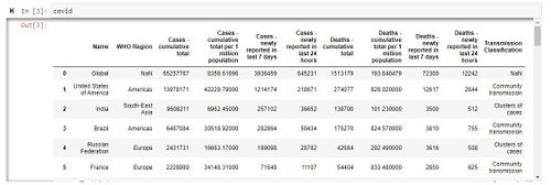
If you run these one at a time, you should see outputs like Figure 2.7:
Figure 2.7 Output of the covid cell.
Now that we have the two tables, we need to merge them by first, turning the WHO dataset into a dataframe, and then renaming our country “Name” column to “name” using the following:
dfc = pd.DataFrame(covid)
df3 = dfc.rename({'Name': 'name'}, axis=1)
Figure 2.8 Syntax for turning the dataset into a dataframe and renaming columns.
Next, we will spatially merge these datasets using the following:
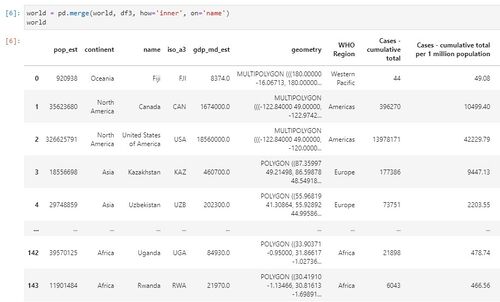
world = pd.merge(world, df3, how='inner', on='name')
If you run this, you will see that they have been merged as shown below in Figure 2.9:
Figure 2.9 Output of the merge.
The first argument here is our “left” dataset, which is the geodataframe. The second is the “right” dataframe. ‘Inner’ refers to the retention of indices from both data frames, and we specified the ‘name’ column here.
Step 3: Displaying the Data
To display a map, simply enter:
covidworld = world.plot()
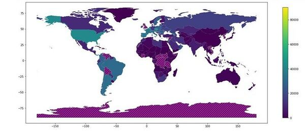
This will indicate any missing values, as well as will produce a basic map. However, to symbolize according to the Hopkins data, the following is required (Figure 2.10):
covidworld = world.plot(column='Cases - cumulative total per 1 million population',\
legend=True, legend_kwds={'shrink': 0.5}, figsize=(20, 15),\
missing_kwds={"color": "purple","edgecolor": "grey","hatch": "///","label": "Missing values"})
Figure 2.10 Configuring how the data is displayed.
This will symbolize by the cases per 1 million column, will display an appropriate legend, and resize the map, as well as shrink the legend proportionately and symbolize missing data values.
Part 3: QGIS
Step 4: Importing the data into QGIS
As you can see in Figure 3.1, we have an almost complete map here. There are many resources that GeoPandas provides to customize the map, however the fine-tuning of the map is best done outside of Jupyter. This will be easier for visualizing the details of symbolization, and to better communicate the data in your map. This can be done in QGIS.
Figure 3.1 The finished layout in Jupyter.
To import the map into QGIS, run the following, by replacing the [working directory]:
output_folder = r"[working directory]
output_fp = os.path.join(output_folder, "covidmap.shp")
covidworld.to_file(output_fp)
Figure 3.2 Exporting your map.
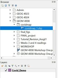
In QGIS, you can bring the file into your project by navigating to your directory in the Browser, then dragging the file down into the Layers window.
Figure 3.3 Adding data to QGIS.
Step 5: Symbolizing and saving styles
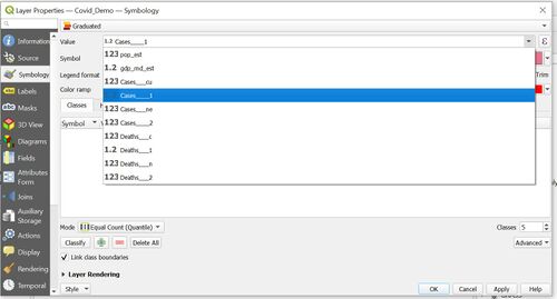
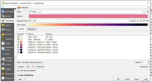
We must now symbolize the data in order to show the differences in cumulative cases of COVID-19 per million. Double click on your layer to open up the Layer Properties. On the left-hand panel of the Layer Properties window, go to Symbology. At the top of this tab it will most likely say Single Symbol. We want our map to show a progression of values so that we can compare totals between countries. For this you want to therefore select the Graduated scheme, which you can select from the drop-down menu. In the Value dropdown, select the field you want to symbolise – in this case it will be Cases – cumulative total per 1 million population.
Figure 3.4 Navigating to Symbology and choosing your Value.
Select a color ramp of your choice in the drop down – in this case we used the Magma colour ramp, as it shows clear contrasts between countries. If you click the Classify button, QGIS will break the data into several classes. Because the values of our selected field vary greatly among countries, Equal Interval or Equal Count classification modes could result in lower values not being displayed. If you’re curious, you can look at the histogram of the distribution of your values by clicking the Histogram tab next to the Classes tab. In this case we opted for the Natural Breaks (Jenks) classification mode, which finds the optimal ways to break down classes. You can play around with different numbers of classes and classification modes here.
Figure 3.5 Establishing a colour scheme and classification mode.
Ultimately, we opted for a total of 7 classes, including a 0 class (to show areas with no cases). You may notice that the values of the classes appear to be quite random. While they are very intentional statistically speaking, the average map viewer probably doesn’t need to know the values to such precise significant figures. To ameliorate this, double click the numbers in the Values column and change them to more rounded values. In the Legend column, you can also edit the values so that they look nice in the eventual map legend.
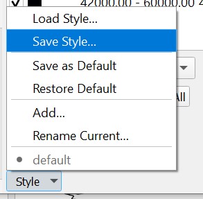
Now that we have adequately symbolised our data, we will save the Style so that we can quickly symbolise future updated versions of this dataset. To do so, click the Style button at the very bottom of the Symbology tab in the Layer Properties window. Click on Save Style.
Figure 3.6 Navigating to the Save Style option.
In the File field in the Save Layer Style window, click on the three dots and navigate to your directory. Name your file, and hit OK. Every category that you see checked below will be saved in your Style File – in this case, the most important categories are the symbology and layer configuration, so do make sure they are checked. Now, in future iterations of the data, you can choose the Load Style option (seen in Figure 3.6) and load the symbology we’ve just saved.
Step 6: Adding map elements and exporting
Finally, we must add the basic cartographic elements that will ensure that viewers can understand what you are trying to convey. These include a title, legend, North arrow, and scale indicator. If you have experience with this in QGIS, feel free to skip these instructions and finish your map as you’d like. If you need more detailed step-by-step instructions than what is provided here, this is a good resource that will walk you through the procedure.
If you have not done this before, click on Project in the top left of the screen, then on New Print Layout. Name your layout.
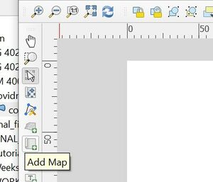
In the new window that pops up, click on the Add Map button on the left panel, then click and drag on the blank sheet to draw out your map.
Figure 3.7 Location of the Add Map button.
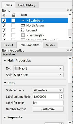
This panel is also where you can find various options to add the other aforementioned map elements. To add them, click on the button, and then click and drag on your map. You can edit them in the panel on the right side of the window.
Figure 3.8 Editing map elements.
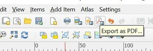
Finally, we must export the completed map layout. To do so, go to the top ribbon and select which file format you’d like your map to be exported in - the options are as image, as SVG, or as PDF. In future iterations of your data, you can take your updated data and simply draw a new map into the layout you have just configured. This will ensure a consistent stylization of the data, so that case numbers can be compared both spatially and temporally. For our final map, please refer to the Conclusion below.
Figure 3.9 Exporting the completed layout.
Conclusion
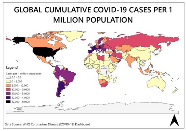
This tutorial explored how Jupyter Notebook and QGIS can be used together to facilitate the display of frequently updated spatial data. Below you can see the finished map showing the total cumulative cases of COVID-19 per 1 million population, using the streamlined workflow we developed in this tutorial.
Figure 4.1 The completed map, showing cumulative COVID-19 cases per 1 million population.
For additional resources, check out these websites:
References
GeoPandas. (n.d.). GeoPandas 0.8.0. Retrieved from https://geopandas.org/index.html
Jupyter. (n.d.). Jupyter. Retrieved from https://jupyter.org/
QGIS. (n.d.). Applications. Retrieved from https://www.qgis.org/en/site/about/features.html#qgis-desktop
