An Introduction to Unsupervised Image Classification in SAGA GIS
Contents
Introduction and Purpose
The analysis of multispectral imagery is useful for a detecting a wide range of geospatial patterns that would otherwise not show in visible spectrum imagery. The purpose of this tutorial will be to familiarize you with concepts related to landcover classification from on multispectral imagery, and to expose you to SAGA GIS; an open source application for geospatial analysis.
Software
To perform the tasks described below, you will need to dowload SAGA from sourceforge.net
SAGA GUI interface
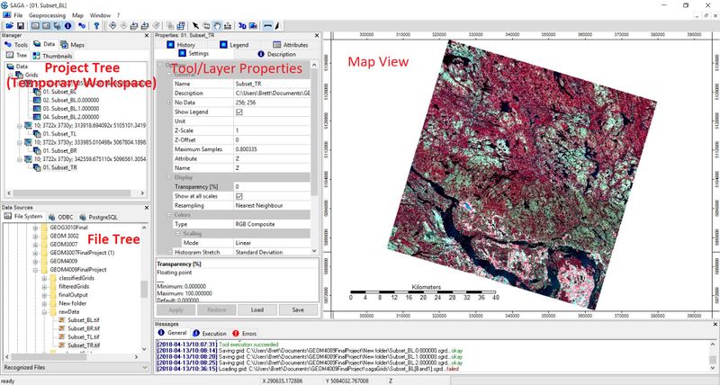
Here is the basic layout of SAGA GIS. Notice the multi-pained format. The project tree or temporary work space is in the top left. This where you'll find all of your project data as well as access SAGA's array of Geoprocessing tools. You can navigate between data view, map layer view, tools, and thumbnails using the tabs at the top of the temporary work space. Below that is the file tree. There is not a lot to be said about this area; It is where you can look up files and folders in order to add data. Beside the file tree is the Tool/layer properties window. This is where you will enter tool parameters, look up layer properties, analyse look up tables and set display parameters for you data. To the right, is the map view; fairly self explanatory. One thing you should be aware of is that SAGA stores all newly created files and layers in a temporary workspace that goes away if your SAGA session ends (or crashes). If you want to save any grids or shapes, you will have to manually save them by right clicking on the file in question and selecting "save as".
Data
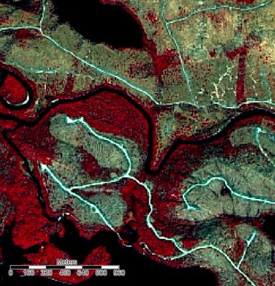
The sample data used for the creation of this tutorial came from the Ontario SPOT Pansharpened Orthoimagery dataset. The dataset can be found on scholar's geoportal Here. The data is three band, false-colour composite imagery with bands NIR-R-G. This combination of spectral bands is often used for the study of vegetation due to the high NIR reflectance of foliage. The sample data was collected with the SPOT satellite on May 5, 2007. In this scene, there is a mixture of agricultural activity, forest, and forested (clear cut) land. Since this imagery was collected in early spring, there is a large amount of spectral difference between coniferous forest, mixed forest, and forested land. The pixel size for this imagery is 20m and each scene covers a geographic area of 40km by 40km. If you would like to perform the tutorial on the same image I used, it is "S5_07702_4605_20070505_PS_10_UTM18_E". If you find Ile Aux Allumettes (look on the Ottawa River) on the base map of scholar's geoportal, and then toggle on the SPOT dataset, you will be able to download the same image as used below.
Pre-Classification Workflow
Getting Started
After you open SAGA, in order to view the data you must first select:
File -> Open
and navigate to the desired image
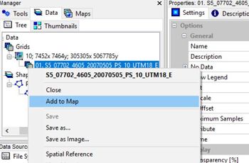
To display the image in the map view pane, right click on the image in the "Data" pane and select "add to map". The image will appear in the Map pane to the right of the screen.
Clipping the Image
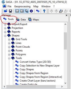
The imagery as it comes from scholar's Geoportal, covers a very large area with a relatively high resolution and therefore, is a very large file (~150mb). In order to improve processing speed and ensure that SAGA does not crash during the classification process, we will first clip a more manageable subset from the larger image. To do this, first click on the "tools" tab at the top of the temporary work space.
Then Navigate to:
Shapes -> Tools -> Create New Shapes Layer
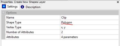
In the properties window for the Create New Shapes Layer tool, enter a name for the shape, select the polygon option, and click "Execute". The other parameters are not important and can be left default in this case.
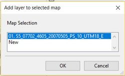
Next, in the workspace pane, click the "Data" tab and double click on the newly created polygon layer. this will bring up the "Add Selected Layers to Map " dialogue box will appear. Add the layer to the map created for the original image.
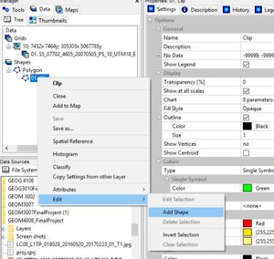
Now right click on the polygon layer in the "Data" pane. Select:
Edit -> Add Shape
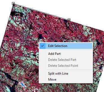
Select Action and use the mouse to select vertices for the new shape in the map pane. I selected the bottom right quarter of the image but any subset will serve the same purpose. When you have finished creating the shape, right click toggle off "Edit Selected Shape".
The save changes prompt will appear, click "Yes"
Now that we have a polygon representing the area we want to clip, in the "Tools" tab of the workspace pane, navigate to:
Shapes -> Grid Tools -> Clip Grid With Polygon
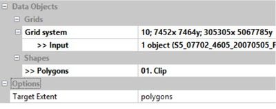
In the tool properties pane, select the original image as the input and the clip layer as the polygons. You will want the target extent to be set to polygons in order to clip the image with the shape instead of the other way around. When done, click "Execute".
In the "Data" tab you will now have three new grids representing each band of the newly cropped image. Feel free to right click on the original image as well as the clip layer and hit "Close" to delete them and keep your workspace clean.
Viewing an RGB Composite Image from Individual Bands
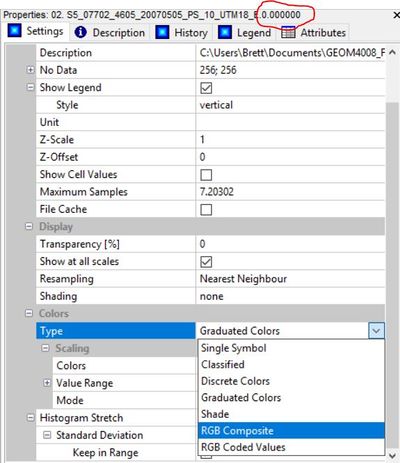
Now that you have three raster grids representing each band of the original image (NIR-R-G), if you add them to the map pane, you'll notice they are only displayed individually in a graduated colour scale. To view them combined as in the original image, click on the top most band (band 0.000 representing NIR in this case), go to the properties pane, in the "Type" field under the heading "Colours", select "RGB Composite".
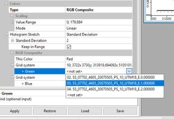
If you scroll down, you will see that the raster band 0.000 (NIR) has been assigned to the red display band of the composite image. If you assign raster band 1.000 (red) to the green display band, and raster band 2.000 (green) to the blue display band and hit "Apply", the resulting image will look like the original.
Improving Contrast
If you take a look at the Image created above, it appears to be slightly "washed out". This is due to the fact that by default, the data is normalized. This means that pixel values are assigned based on a normal distribution on a scale of 1-255, with the majority assigned towards the central tendency of the data. Due to the fact that in the original image, pixel values were not normally distributed, the normalization has removed a degree of spectral difference which we need to recreate by applying a linearr stretch to the histogram.
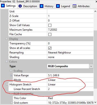
This can be done by first clicking on a band of our image in the workspace pane, then by selecting "linear" in the histogram stretch field. A linear percent stretch factor of 2 will adequately improve contrast. This must be repeated for the other two bands before the image in the map view pane will appear normal.
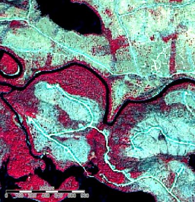
Comparison of a small section of the image before and after. Illustrating the improvement in the differentiation of distinct features by applying a linear stretch to the histogram.
Noise Reduction
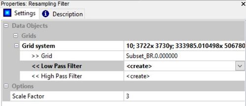
To reduce the "salt and pepper" effect that often is associated with raw imagery, we will need to filter the image bands. While sacrificing some of the absolute accuracy, this will greatly improve the appearance of the finished map. In order to reduce the image noise, we will use a low-pass filter. This can be found clicking the tools tab and navigating to:
Grid -> Filter -> Resampling Filter
Input the grid system, the first grid (band 0.00), and a scale factor. I found a scale factor of 3 provided a good amount of smoothing without blending too much and sacrificing accuracy. This tool will also create a high-pass filtered grid (increased noise) which is not needed and can be deleted. You will need to repeat this step on the other two image bands as well.
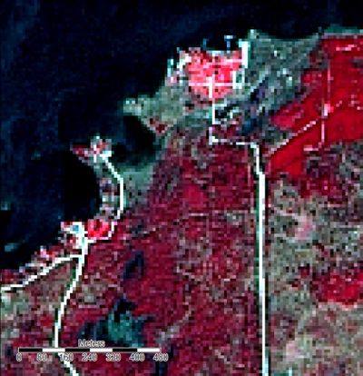
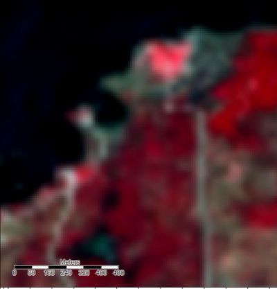
Below is a close up comparison between the original and filtered images. While at this extent, it looks as though we are sacrificing a lot of accuracy, the pictures are very similar when viewed at full extent.
Unsupervised Classification
Classification of land cover can be carried out using a wide range of techniques that fall into two broad categories; supervised and unsupervised. Supervised classification requires the creation of training sites (pixel samples of known ground cover type) to be created beforehand and used to train an algorithm that assigns all the other pixels to classes based on the samples. This however, has already been covered by other tutorials so will not be the focus here. Unsupervised classification is carried out by algorithms that find natural clusters in the data and assigns pixels to classes created at natural "mean" points in the distribution of pixel values. The idea is that it maximizes variation between classes, with the minimum amount of variation within classes. There are several different algorithms that perform this operation but one of the most common is ISODATA. In order to conceptualize how it works, you have to picture all of the pixel values on a scatter plot. ISODATA is an iterative algorithm that begins by placing cluster nodes equidistant from one another on the plot. Pixels are assigned a cluster based on which node is closest. The process is run again and nodes are reassigned if the standard deviation in a cluster is greater than the distance between nodes. Clusters are split if the standard deviation within a cluster is above certain threshold and pixels are reassigned. This process is repeated until no further pixels or nodes are reassigned between iterations or it reaches a predetermined maximum nuber of iterations.
ISODATA Clustering
To perform an ISODATA unsupervised classification, click on the tools tab in the workspace and navigate to:
Imagery -> ISODATA Clustering -> ISODATA Clustering for Grids
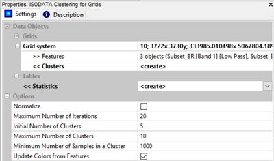
First, input the grid system and add all three bands to "features". I found the default of 20 iterations to be sufficient (running it with more didn't change the result). Starting with 5 up to a max of 12 clusters should allow us to capture spectral differences between different land covers without making so many classes that they no longer mean anything or too few; in which case more than one discrete surface would be represented by the same class. Ultimately, it is preferable to have too many clusters than too few because they can be combined in post classification analysis. The number of clusters created by the ISODATA algorithm depends on the range and variability of pixel values in any particular image. Finally, the minimum cluster size of 1000 pixels should limit the number of classes created and make it so we don't have any clusters that don't cover a noticeable portion of the image (that may seem high but there are millions of pixels in the image).
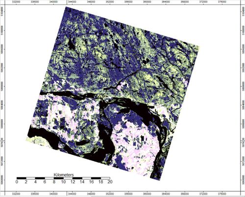
Running the unsupervised classifier will produce a grid that looks something like this:
Making the Re-class Table
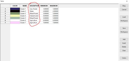
Now that we have a series of spectral clusters, we need to analyse the cluster map next to the original image and determine what each one represents. This, of course, will vary from scene to scene so some knowledge of the spectral reflectance characteristics of different types of landcover is required. A good resource can be found here In the case of the sample image, we want to turn 7 arbitrary classes into five classes that represent:
- Water
- Coniferous Forest
- Mixed Forest
- Cleared Land
- Agriculture
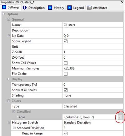
The first step is to open up the lookup table for the "clusters" grid.
Go into the look up table. In the description column, enter the land cover class you believe corresponds to each cluster. Then save the table to your work space after you enter land cover descriptions by pressing "workspace"
Now you will see your table in the work space pane. Open the table by double clicking. Now we want to add a new column to the table. This can be done by clicking the add add field button in toolbar at the top of the page
Give the new field a name and assign it type "8-bit unsigned integer". then click "okay".
In the new column, give each cluster a number that corresponds to the land cover type you assigned in the description.
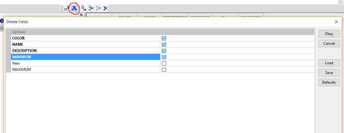
Now Delete the columns: Colour, Name , Description, and Minimum. using the delete field button on the toolbar, selecting the first four fields, and clicking "okay"
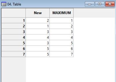
The resulting table should look something like this and will be used for the reclassification of our clusters grid. You can change the name of the "MAXIMUM" column to "old values" or something similar if you desire, but it is enough just to know that this column represents the old clusters values.
Reclassifying Clusters
In order to reclassify the clusters so they correspond to discrete types of land cover observed in our scene, we will use the reclassify tool:
Grid -> Tools -> Change Grid Values
Input the grid system, the clusters map and set the replace condition to "range".
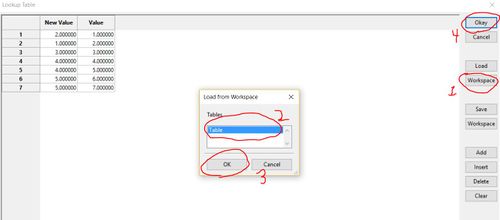
Load the look-up table by clicking "workspace", select your table, then click "ok" and "okay".
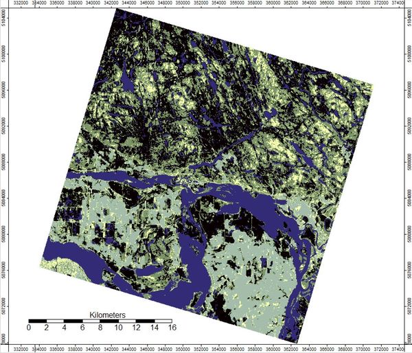
The reclassified grid will look something like this.
Changing Map Colours
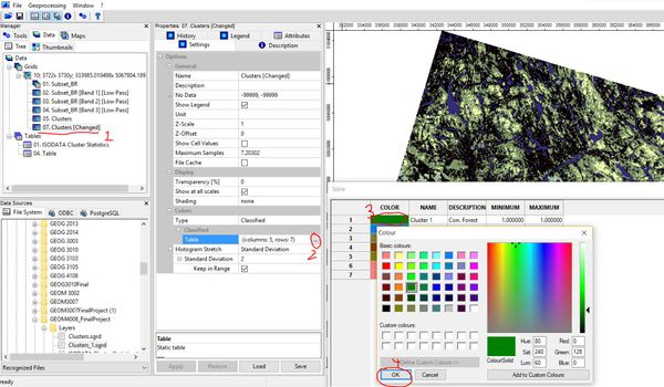
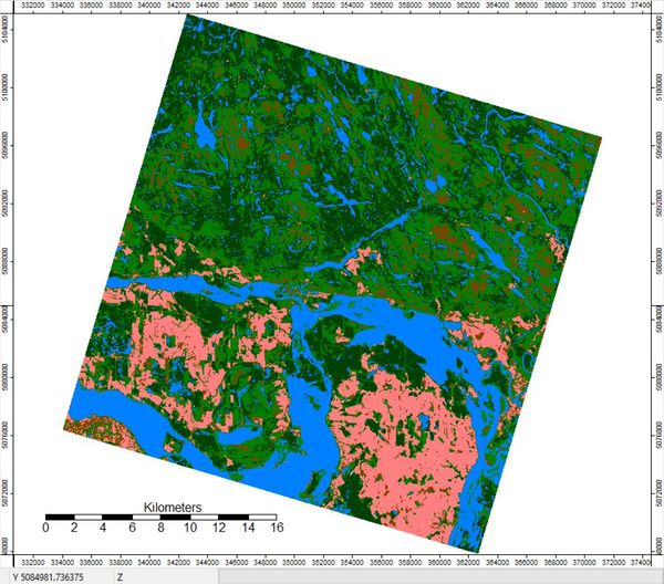
Now that we have a reclassified grid representing landcover, the last step is to change the colours to reflect what each class represents. You can change the colours associated with each class by opening the look-up table, clicking on the colour box for each class and selecting from available options.
The result is your final classified map!
Conclusion
Unsupervised classification in SAGA GIS is an
