Calculating historical agricultural land differences using QGIS
ContentsIntroductionOne issue when working with large sized data sets is the massive resources required to render the files. This is not so bad when you have a computer powerful enough to handle it, or you absolutely need to have data that detailed, but it is when you do not. I found myself in that situation about a year ago. I was attempting to graphically represent agricultural land attrition in Southern Ontario, from 1983 – 2017. The data I had downloaded was incredibly detailed, perfect for if you wanted to grab a subset and analyze it on a micro level. Not so great when you are trying to analyze on a macro level. While I was able to complete my analysis, it was frustratingly time consuming. Every map movement caused a render lag, and any use of analysis tools resulted in a long wait. This leads me to now. While I was not able to think up a way to do it back then, I figured now might be the time to try. This lead me to a feature in QGIS called ‘dissolve’. While it is also available in ArcPro, that is not the purpose of this assignment. I decided to see if I recreate my project, using QGIS instead of Arc, and perhaps improve upon it a little.
DataTwo files are needed for thhis project, the 1983 Agricultural Resource Inventory, and the most current Agricultural Resource Inventory. The source is constantly being updated, so I have provided a link to the homepage of each file, rather than a direct download link. Once on the page, select 'open', and the data will begin downloading. For the 1983 data, please visit: https://geohub.lio.gov.on.ca/datasets/agricultural-resource-inventory-1983 For the current data, please visit: https://geohub.lio.gov.on.ca/datasets/agricultural-resource-inventory-final
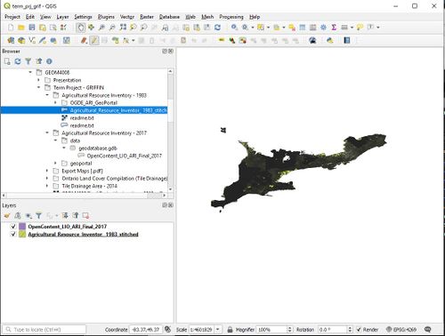
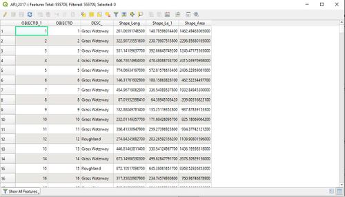
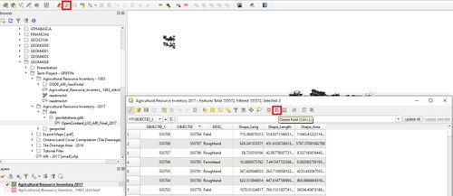
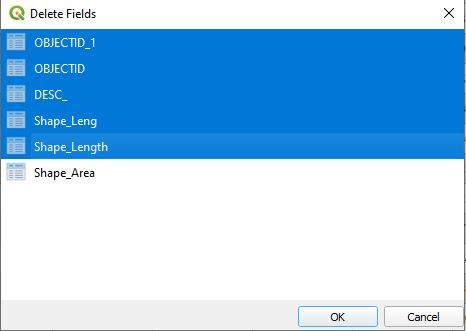
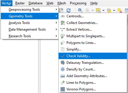
Tutorial InstructionsStep 1: Identifying the ProblemIn this image we can see the problem. The data is so dense that changes between the two cannot be seen. This data is really meant for querying, not so much for display. Looking at this, it isn’t hard to see why we’re having the difficulties we are. There are 555,000 individual features in six fields, in the 2017 data, alone. We need to pare that down. All we want to keep is the ‘Shape_area’, which is in meters squared. This will allow us to calculate a final area. Step 2: Deleting FieldsBy deleting unnecessary fields, we can hopefully reduce the size and complexity of the data. Ensure that the editing tool is toggled on (highlighted in red), then open the new files attribute table, and delete the unnecessary fields. Everything except ‘Shape_Area’ should be removed. This can take a while. Once completed, save layer edits by selecting the icon on the right of the editing tool. Editing can be toggled off at this point as well. Step 3: Check Data ValidityThis is a very important step. Unlike ArcGIS, if there is any errors or invalid data, QGIS will quit whatever process is running. Now that we have deleted all unnecessary fields, we need to be sure that there are no errors in our shapefile geometry. To do this, we need to use the Check Validity tool.
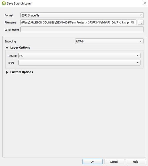
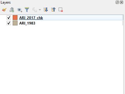
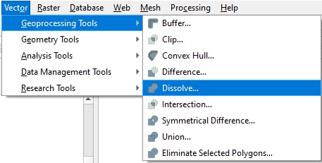
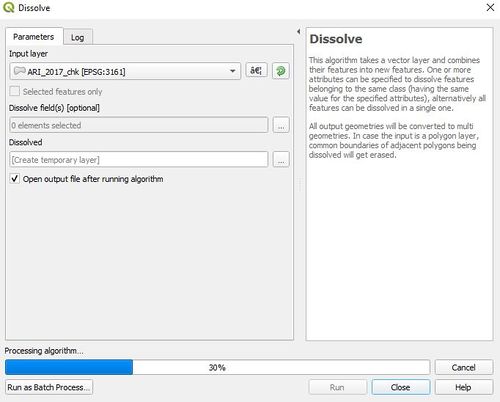
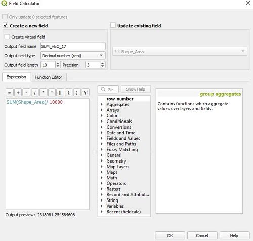
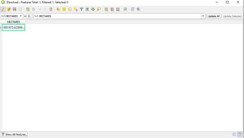
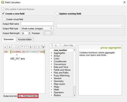
Once the validity checker has completed its operation, there should be three files. Valid output, Invalid output, and error. Remove the invalid and error, then right click on Valid_output and select Make Permanent… When the new file has been saved, remove Valid_output, as well as the old ARI_2017 file, and open the newly created file from where you have saved it. You should wind up with something like this. You may not see the new file in the QGIS browser. If this happens, simply hit the refresh button. Be sure to duplicate this process for ARI_1983. Step 4: Dissolve PolygonsThe dissolve tool will allow us to merge all the individual polygons into one. This should make it much less resource intensive to render the data. It will also merge the area for each polygon into one attribute. This will make it easy to compare with the field calculator later on. Fair warning, this process for both files was somehow the longest, and most varied in terms of time. Each file will need anywhere from 15 minutes to more than five hours to process. This appears to be based on the number of attributes, as well as relative density of the data. With closer together 'dense' data being faster to process than more spread out 'less dense' data. Once completed, we can then finish the processing by dissolving the individual breaks, and creating a seamless surface. Open the dissolve tool, ensure ARI_2017_chk is selected, and run the tool. Save the new file as a shapefile, and leave all other options the same. This process can take a while. Step 5: Field CalculatorNow that processing is complete, we need to calculate the area of each file. This will give us a number, that can then be converted into percent change. When QGIS dissolves the ARI_2017_chk file, it keeps only one area entry. This means that area must be calculated from ARI_2017_chk, and manually added to the new dissolved layer (ARI_2017_dis). To access the Field Calculator, open the attribute table, toggle on editing and navigate over to the abacus icon. It is one to the right of the delete field icon highlighted in figure 3. First, we have to sum the 'area' field manually using Once we have a single value for both fields, navigate to the dissolve file, open the attribute table, enable the editor, and manually update the value for both dissolved files. Independently, of course.
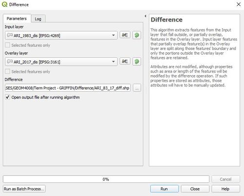
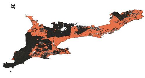
Above is an example of the updated value in ARI_1983_dis. By double clicking on the attribute, we can update it manually with the correct value. Step 6: DifferenceThis allows us to generate a shapefile of the differences between two files, making it extremely easy to visually represent what has changed. To access the difference tool, navigate over to Vector > Geoprocessing tools. Set the larger layer as the input, and the smaller layer as the overlay. In this case, ARI_1983_dis is the input, and ARI_2017_dis is the overlay. Ensure the file is saved in a known location. Final OutputOnce all processing is completed, we can see the output. Dissolve worked much better for ARI_1983 (Orange), than it did for ARI_2017 (Black but supposed to be Green). When zooming in, borders can be clearly seen around the image which is probably because each piece of agricultural land in ARI_2017 was delineated much better, providing proper breaks between each field. This would also explain why there are many more attributes present in ARI_2017. Using the field calculator (sort of) we are able to calculate the percent difference between 1983 and 2017. The difference is highlighted in red. 66.8% drop from 1983 to 2017. |
