Land Use Change Assessment Two Ways in SAGA GIS
Contents
Introduction
The purpose of this tutorial is to introduce users to land use change assessment in SAGA GIS. This will be done two ways, in order to help users to choose which is best for their applications. There will be step-by-step instructions on how to use SAGA GIS to do this assessment. This tutorial will be designed for those who have never used SAGA, and each step will be very detailed. If you have used SAGA before you may be able to skip some parts.
Land use change assessment
Land use change assessments can be useful to detect the extent of human influence on natural environment. This is often done by taking two satellite images from different time periods and classifying them, and then calculating the difference between both classified images. ADD MORE INFO.
SAGA GIS
SAGA GIS is a free open source software that can be run under Windows and Linux operating systems. SAGA stands for System for Automated Geoscientific Analysis. According to SAGA's website, it is a GIS that has been designed for an easy and effective implementation of spatial algorithms. It offers a comprehensive, growing set of geoscientifc methods and provides easily approachable user interface with many visualisation options. To learn more about SAGA here is the link to their site.
In order to do the analysis outlined on this page, you will need to download SAGA GIS onto your computer, using the following link SAGA GIS download.
Data
The data used in this tutorial was obtained from Google Earth Engine, and I have provided it below. There are two images, the first is an ortho image of Orleans in 2006, and the second is an ortho image of the same area in 2016. These images were chosen as there is a clear change in land use in the 10 years between the images. There are other sources for finding ortho images, such as Land Viewer, and USGS....
File:Orleans2006.tif ... add data.
Pre Classification Workflow
This is adding the data into SAGA, and setting it all up before classifying. After you have opened SAGA GIS, you need to add the two images provided, or your own two images. This can be done using the following steps:
Adding Data into SAGA GIS
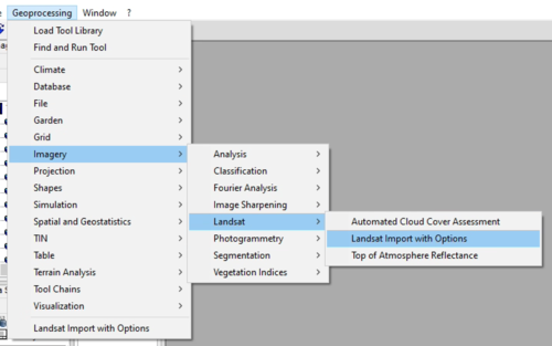
In order to add the data into SAGA you must save it onto your computer somewhere where you can find it, then use the following steps. Below, there is also an image depicting the steps.
1. In the top left corner click on Geoprocessing > Imagery > Landsat > Landsat Import with Options
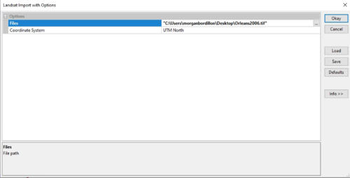
2. Once you've clicked on Landsat Import with Options, a window will pop up like the one below. In this situation you have to click on the ... beside Okay to find the data you would like to select. Once you've selected your data, press Okay.
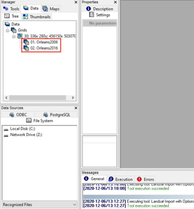
3. To add both images to the map, in Manager, under Data you must double click on both files, and they will appear
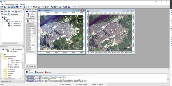
Once you have followed these three steps, your workspace should look something like this:
Classifying the data
bla bla bla
Unsupervised classification
In order to be able to do a land use change assessment, we must first simplify the images by classifying them. The first way we will do this is using a unsupervised classification method. This is demonstrated in the steps below.
1. Click Geoprocessing > Imagery > Classification > Unsupervised > K-Means Clustering for Grids
We use the K-Means Clustering because it assumes that the number of clusters is known, whereas the ISODATA algorithm allows for different number of clusters. In order to keep things simple, we will be using K-Means Clustering. source (http://www.wu.ece.ufl.edu/books/EE/communications/UnsupervisedClassification.html#:~:text=The%20ISODATA%20algorithm%20is%20similar,minimize%20the%20within%20cluster%20variability.)
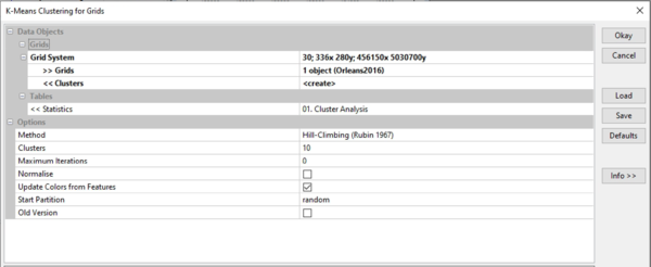
Once you've clicked on K-Means Clustering for Grids, a menu like the one below should pop-up.
As you can see, there are specific parameters used to create the unsupervised classification.
- The grid system will be the same for both images, and it should be the only one to select from if you have not cropped the image.
- Because you have to classify both images, you must choose one image at a time for Grids
- Clusters, Statistics, Methos and Cluster under Options can be left as is
- Maximum Iterations can be changed to zero **EXPLAIN**
- And select Update Colors from Features, this will be useful for the next step
Once you have changed these parameters, click Okay. You can now display your classified images on the map, the same way as putting the original images on it.
2. Now we must simplify the images further by taking the classified table and assigning each cluster a name and colour.
- To do this, under properties, go to settings and scroll to the bottom of the page where under classified you will find Table,
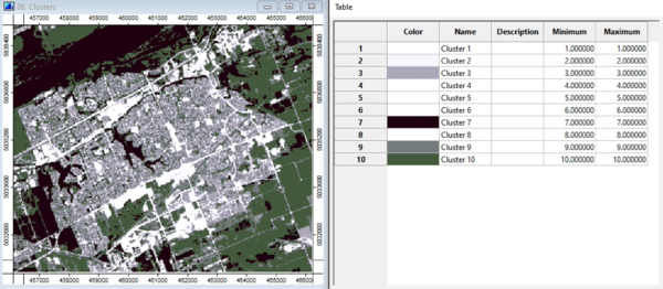
- Click on the ... to open the table displaying the colours and clusters. Your map and table should look something like the image below for the Orleans 2016 image.
- As can be seen, there are 10 classes, but many of them are similar. Because we are trying to determine land use change, we will be relabeling and recolouring some of the classes.
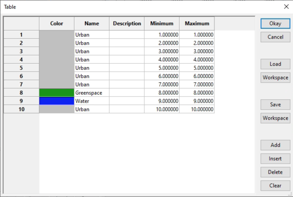
- We will narrow it down to three classes, Urban, Greenspace, and Water.
- When looking at the image, most of what is white, or grey would be considered urban, black looks like water, and green looks like greenspace, therefore we can change the names from cluster to their respective names, as well as assign a colour for each of the three names, as seen below.
-
