Land Use Change Assessment Two Ways in SAGA GIS
Contents
Introduction
The purpose of this tutorial is to introduce users to doing a land use change assessment in SAGA GIS. This will be done using an unsupervised classification, then the land use change assessment. There will be step-by-step instructions on how to use SAGA GIS, as the tutorial is designed for those who have never used SAGA GIS. Each step will be very detailed, therefore if you have used SAGA before, you may be able to skip through some parts.
Land use change assessment
Land use change assessments can be useful to detect the extent of human influence on the natural environment. This is often done by taking two satellite images from different time periods and classifying them, them calculating the difference between both classified images, as well as comparing their histograms, and analyzing a confusion matrix.
Land cover change and land use change are two different types of analysis. Land cover change indicates the physical land type, which can be forest, water, etc, whereas land use is based on how people are using the land.
For this analysis, we want to look at how much a suburb has expanded, and taken over green space, therefore we will be doing a land use change.
SAGA GIS
SAGA GIS is a free open source software that can be run under Windows and Linux operating systems. SAGA stands for System for Automated Geoscientific Analysis. According to SAGA's website, it is a GIS that has been designed for an easy and effective implementation of spatial algorithms. It offers a comprehensive, growing set of geoscientifc methods and provides easily approachable user interface with many visualization options. To learn more about SAGA here is the link to their site.
In order to do the analysis outlined on this page, you will need to download SAGA GIS onto your computer, using the following link SAGA GIS download.
Data
To do the analysis, you will need two satellite images of the same area. Below, there are two images provided that have been obtained form Google Earth Engine. The images are of Orleans, a suburb in Ottawa, from 2006 and 2016. This area was chosen as there is a significant change in land use between 2006 and 2016 in that area. If you are planning on doing you own analysis, there are many sources to obtain free satellite imagery, these include Land Viewer, USGS, Google Earth Engine (if images are not being used for business), and many others can be found with a quick search on the internet.
Pre Classification Workflow
Once you've downloaded and opened up SAGA, you can close the tip window that pops up. Then, you need to add the data into SAGA, and set it up before classifying.
To add the images to the workspace, please follow the steps below:
Adding Data into SAGA GIS
In order to add the data into SAGA you must save it onto your computer somewhere where you can find it.
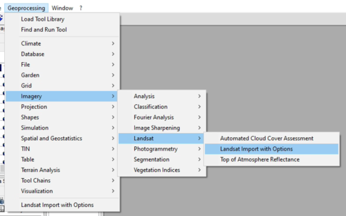
1. In the top left corner click on Geoprocessing > Imagery > Landsat > Landsat Import with Options , as seen in the image below.
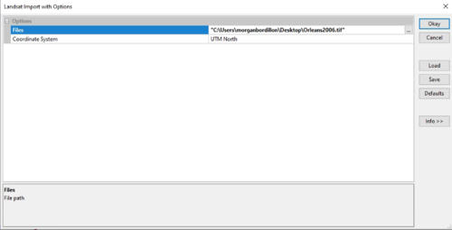
2. Once you've clicked on Landsat Import with Options, a window will pop up like the one below. In this situation you have to click on the ... beside Okay to find the data you would like to select. Once you've selected your data, press Okay.
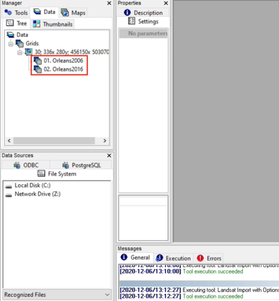
3. To add both images to the map, in Manager, under Data you must double click on both files, and they will appear
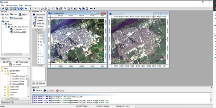
Once you have followed these three steps, your workspace should look something like this:
Classifying the data
Next we need to classify the images. This is done by categorizing all pixels from the image into several land cover / land use classes. You will pick the number of classes based on what you are trying to accomplish with your analysis. Here, we are demonstrating how to do an unsupervised classification in SAGA, but it is also possible to do a supervised classification. In an unsupervised classification, the software classifies the images for you, whereas in a supervised classification, you must first collect training data, and the software will run the classification with that data.
Unsupervised classification
In order to be able to do a land use change assessment, we must first simplify the images by classifying them. The first way we will do this is using a unsupervised classification method. This is demonstrated in the steps below. Another tutorial on how to do an unsupervised classification in SAGA GIS is available | here.
These steps need to be done for both images
1. Click Geoprocessing > Imagery > Classification > Unsupervised > K-Means Clustering for Grids
We use the K-Means Clustering because it assumes that the number of clusters is known, whereas the ISODATA algorithm allows for different number of clusters. In order to keep things simple, we will be using K-Means Clustering. [1]
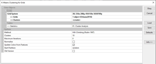
Once you've clicked on K-Means Clustering for Grids, a menu like the one below should pop-up.
As you can see, there are specific parameters used to create the unsupervised classification.
- The grid system will be the same for both images, and it should be the only one to select from if you have not cropped the image.
- Because you have to classify both images, you must choose one image at a time for Grids
- Clusters, Statistics, Methods and Cluster under Options can be left as is
- Maximum Iterations can be changed to zero
- And select Update Colours from Features, this will be useful for the next step
Once you have changed these parameters, click Okay, they will appear in the data tab. You can now display your classified images on the map, the same way as putting the original images on it.
This step just assigns each pixel a vlaue/colour.
2. In order to reclassify the images we need to narrow down what classes we'd like to include based on what we are hoping to find. Because the data we are working with is an urban setting I'm mostly interested in seeing how much the urban area has grown, and replaced greenspace. So, we will be taking our 10 classes and narrowing them down to three classes. Water, urban, and green space. It is really up to you on how many classes you would like to include, and will vary based on what you are trying to accomplish.
In order to keep things simple, we can assign each class a number:
Urban will be identified as - 1
Water will be identified as - 2
Greenspace will be identified as - 3
a.
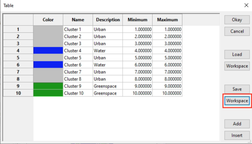
- Open the classified table, under settings. Here you can either change the colour of each class, or change the description to the name of one of the three classes. In the image below, both have been done, as you can see there are three colors, each representing a class, and the description has been changed.
- Once those changes have been made, save this table into the workspace by clicking workspace, under save, then press okay.
- Open your new table, it will be below the grids in data.
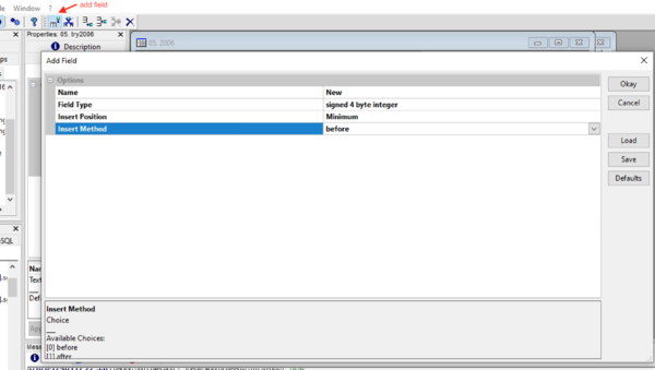
- Add a new field by pressing add field on the top menu bar. This field will be our land cover class value.
- Open the table and press the add field button on the top menu bar as shown here. We want to add a new field that will contain our land cover class value.
- Name the field New and make sure it is a integer number. It is also important for the position of the field to be before Minimum, as seen in the picture below.
- Press Okay
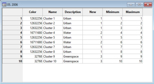
- You will now have a field titled New. Assign each cluster their proper value based on the colour and/or description you assigned them in step a. Your table should now look like the one below.
- You must delete Color, Name, and Description using the delete field option, which is right beside the add field option. Once that is done, press Okay.
- Your new table should just have three variables, New, Minimum, and Maximum, this will be used as our reclassification table.
3. To reclassify the cluster grid you must:
- Geoprocessing > Grid > Values > Change Grid Values
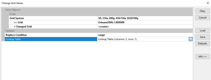
- The parameters you need to set in Change Grid Values are displayed in the image below. Grid system and Grid will depend on what your map looks like, as well as what you've named it. But, grid will be the product of your unsupervised classification, not the original image.
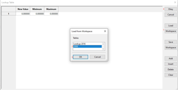
- In Lookup table you will click on... then workspace, beneath load, and choose the table for the year you are working with
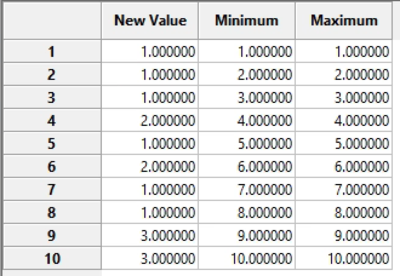
- Once you've followed the steps outlined in the image, and have pressed okay, your table should look something like the image below.
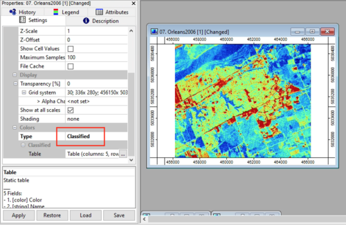
- After you've closed that table, you can open the new map it has created. You will notice that it shows up in graduated colours, so under settings, under colours you should change it to classified.
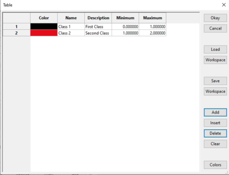
- Open the table under classified. You will notice that only two classes show up, in red and black. Depending on how you've classified your variables, you will have to make some changes.
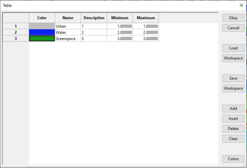
- Add a class by clicking add, and rename all the classes with the appropriate labels, as well as change class one minimum and maximum to 1, class 2, to 2, class 3 to 3. You should also change the colours. Below, you will see what the table will originally look like, and then what it should resemble.
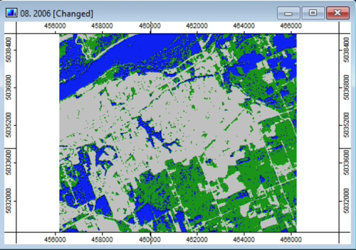
- Finally, you will have an image that looks something like the image below. Don't forget to do this for both images.
Land Use Change Assessment
Now, we will go over a few ways to compare 2006 and 2016, in order to determine how the land has changed based on our unsupervised classification.
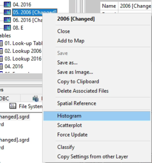
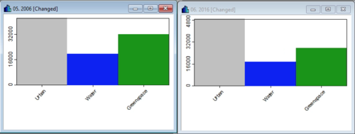
1. First we will look at the histograms for both years, this can be done by right clicking on the classified image, and selecting histogram, as seen in the image below. The histograms should look something like the second image below.
The histograms help visualize how the land use has changed. As can be seen, there is more urban space, and less water and greenspace in 2016 than there was in 2006. Evidently, some of what was classified as water should actually be greenspace, but we can still see that the urban has taken over those areas as well, therefore we will leave it as is. In the future, more classes when doing the unsupervised classification may be necessary.
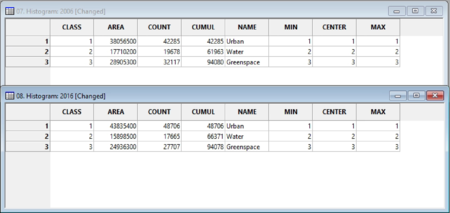
Alternatively, you can view the data in tabulated form by selecting convert to table when the histogram is open.
The table will appear in the data tab, which you can then open to view the area of each class in square meters.
2.In order to compare the land cover changes more directly, we can combine the two tables.
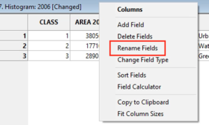
First, rename the area column in both tables to their respective year. This will help when working with the combined table. Please see image below on how to change field names.
Right click on Area, and select rename fields. Then, change the name, as seen in the second picture below.
To combine the two tables use
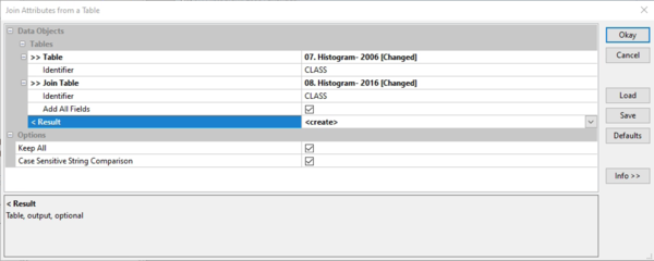
Geoprocessing > Tables > Tools > Join Attributes from a table
Choose the two histogram tables (2006 and 2016), make sure you have the same parameters as the image below, then click okay.
Right click on the resulting combined table and select ‘Diagram’. It should be the last table under data.
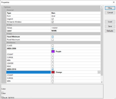
In the diagram properties window select the:
- Display type as bar
- Label value as 'name'
- Choose the two area attributes
Before pressing okay, your properties should look like the image below.
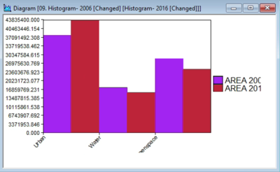
Your graph will appear, and look something like the one below.
This graph is another way to visualize the changes, the colours can be changed as you see fit.
We can see that Urban has increased in the 10 years, whereas water and greenspace have both decreased, as was expected.
Confusion Matrix
A confusion matrix is a technique used for comparing changes between two raster data sets.
To produce a confusion matrix, grid classes must be defined by the lookup table and values of the grid classes for each image must be the same. Here, we will use the classified grids from 2006 and 2016 to create a confusion matrix.
We will also need an input look up table to define the cell class names.
Open a lookup table from one of your classified grids (2006 or 2016) and save it to your workspace.
To create the confusion matrix use:
Geoprocessing > Imagery > Classification > Confusion Matrix (Two Grids)
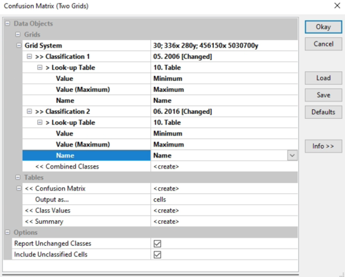
Please use the properties as seen in the image below to fill out the confusion matrix. Table was the table we just saved to the workspace. Once you've filled out the properties, press Okay.
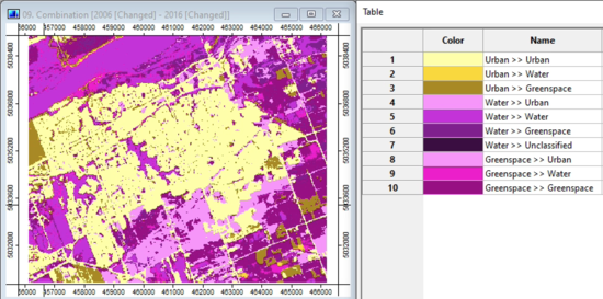
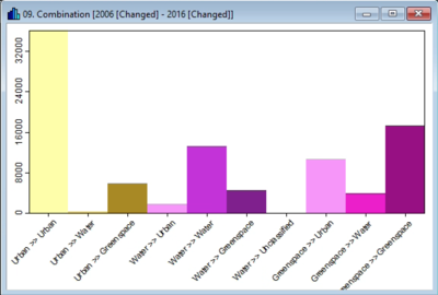
A new image will appear in the data window, which should look something like the image below. You can also open the table for the image to see what classes have changed, and from which types of land use.
You can also view the image as a histogram by right clicking on it in the data window and selecting histogram, it will look similar to the image below
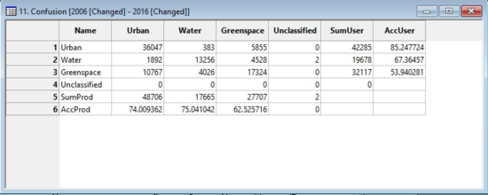
Another way to see the changes are by opening the confusion table, which will also appear in the data window. This table shows pixel values, which can be converted into square meters or kilometres. It should be labeled as confusion by default.
In order to determine the change in land use these can be converted to meters or kilometres squared by doing the following steps:
- The cell value of this data is 30, therefore we can multiply the value by 900 (30x30), which would be the value in m2.
- If you would like it in km2, divide that number by 1,000,000.
Converting the pixels to interpretable numbers enables us to determine how land use has changed over a ten year time span. For example from 2006 to 2016, 9.6 square kilometres of greenspace turned into urban area, and 1.7 square kilometres of 'water' was turned into urban area as well.
This concludes the tutorial on how to do a land use change assessment using SAGA GIS.
Conclusion
When preparing to do a land use change assessment, we must first classify the data using either a unsupervised, or supervised classification. This way, both images we are looking to compare have the same values assigned to pixels. Deciding which classification method to use is up to the user, and most software can do both classifications. When doing the land use change assessment, there are qualitative and quantitative methods used to analyze the outcome, and both can be used to determine the change between years, based on what you are trying to accomplish.
