An Easy Guide to Dialectometric Analysis with Gabmap
Contents
- 1 Introduction
- 2 What is Gabmap?
- 3 Data Preparation
- 4 Gabmap web application
- 5 Creating an account
- 6 Creating a new project
- 7 Analyzing the Data
- 8 Conclusion
- 9 Acknowledgment
- 10 Technical Support
- 11 Resources
Introduction
Welcome to this tutorial on analyzing linguistic data using Gabmap, a powerful web application for dialectometric analysis and linguistic mapping. In this guide, we will explore how to leverage Gabmap to create thematic maps, dendrograms, and visualizations that highlight linguistic features across a given dataset. Whether you’re a linguist, researcher, student, or simply curious about language variation, this tutorial will provide step-by-step instructions to help you analyze and interpret linguistic data effectively. By the end of this guide, you’ll have the skills to create similarity maps, interpret clustering patterns, and understand how Gabmap can be used to explore the relationships between dialects or linguistic varieties. Let’s get started!
What is Gabmap?
Gabmap is a web application for dialectometrics and cartography. It allows you to make mappings and statistical analyses of your dialect data. Using Gabmap, you can compare the pronunciation of words in the different dialects and make maps of the results (1). This tutorial primarily emphasizes the analysis of phonetic transcriptions. However, Gabmap is versatile and can also handle numeric dialect data, such as formant frequencies, as well as categorical data, like syntactic or morphological variables.
Data Preparation
In this step, you need to prepare 2 types of data. The first one is the table that contains your linguistic data. You will upload it in the “Data” section of Gabmap. The second one is a google earth file that contains your locations. Having this file is not mandatory, but if you want to have a realistic data analysis, you need it. You will upload it in the “Map” section of Gabmap. The place and how to do this work will be taught to you in the upcoming sections.
Data File
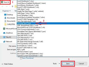
Gabmap works with datasets where rows represent locations (e.g., cities or villages) and columns represent linguistic features (e.g., pronunciations or lexical items). The data is uploaded to Gabmap as a plain text file containing a single tab-separated table, which can be easily created using Microsoft Excel or Google Sheets. The data extension can be .txt or .xls(x). If you want to save your data as .txt, in Excel, go to "File," select "Save As," and choose "Unicode Text (*.txt)" as the file type. This will create a .txt file that you can upload to Gabmap.
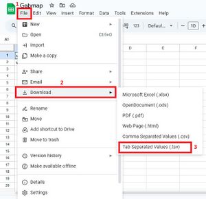
If you use Google Sheets, follow this instruction: From the File menu, choose "Download as" and then select "Tab-separated values (.tsv)." This will save the current sheet as a .TSV file, using the spreadsheet's name.
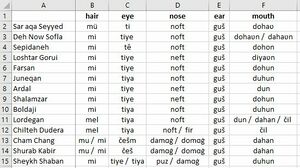
After all is done, you prepare a data file to add in Gabmap. Figure 4 helps you to see a proper data set that Gabmap accepts.
Tip 1: When you have 2 or more pronunciations for a location, your data should follow this rule: the first phonetic, space, slash, space, the next phonetic. For example in Fig 2, the location named Cham Chang (row 13) has 2 phonetics for hair: mu / mi.
Tip 2: All the cells you have in your spreadsheet, must be filled. If any cell stays empty, you will receive an error that states you have empty cells.
Tip 3: Note that it does not need to assign a name for the locations column. Leave it blank, because sometimes it causes errors!
Tip 4: Don’t use dash (–) in column names and your location names.
Map File
To create dialect maps of your data, you’ll need a base map of the area you're analyzing. This map must be uploaded to Gabmap in a .kml or .kmz format, which you can generate using Google Earth. Google Earth is free software that you can download and install on your computer. For downloading it please go to: https://earth.google.com/intl/earth/download/ge/agree.html In Google Earth, you can draw borders for your area using polygons and add placemarks for the data collection locations. You can also add extras like borders or rivers if you want. If you are not familiar with Google earth, go to this link and use the short manual for making a map with Google Earth that Gabmap provided for you. https://www.let.rug.nl/~kleiweg/L04/kml/manual.html Having a map file is optional, but you really should have. If you don’t add your locations, Gabmap will present your data in a way that is not useful.
Tip 1: Make sure the place names match your data file exactly.
Tip 2: In the Google Earth manual, you can skip the last step (Convert to RuG/L04) since in the new version of Gabmap, you can directly upload the .kml file.
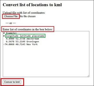
Tip 3: If you have a list of locations with coordinates, Gabmap has a conversion tool for you! Go to https://gabmap.nl/tools/ll2kml.html and easily convert your list to a .kml file. You can either add a file which contains coordinates or enter them in the box. Note the order in which the coordinates are placed. From left to right, first enter the longitude, then the latitude and finally the name of the location. Use a tab between each of these pieces of data. See the green box in Fig 6. After entering the coordinates, click on “Convert to kml” at the bottom to download your kml file. If you want to add other data such as borders, open the downloaded file in Google Earth to add whatever you want.
Gabmap web application
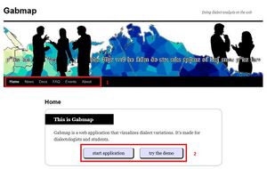
Gabmap can be used without creating an account. You can explore and experiment with the projects Gabmap has prepared for you. However, having an account allows you to save and revisit your projects. Remember, if you don’t log into your account for 30 days, it will be deleted! Go to Gabmap | Doing dialect analysis on the web and you can see the Gabmap home page, which is shown in fig 7.
As you can see, there are two panels on the website. The first one covers home, news, docs, etc., that you can check there if something is useful for you. The second panel has 2 options. If you don’t have data and want to use the Gabmap prepared projects, click on “try the demo”. Otherwise, click on “start application” to create your project, using your data.
This page also has a link to a video on YouTube, which gives you an overview about Gabmap. If you want to see it, go to https://www.youtube.com/watch?v=e2t5zGNvTS4
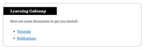
At the end of the home page, some documents are provided to give you more information. By clicking on the “Tutorials”, you will be directed to the Docs section. Additionally, in the “Publications” section, you can see the articles that used Gabmap. These sections are shown in Figure 8.
Creating an account
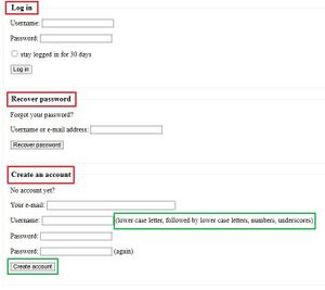
Creating an account to use Gabmap is free and simple. All you need is an active email address. Visit the Gabmap homepage Gabmap | Doing dialect analysis on the web and click on “start application”. As shown in Figure 9, the page is divided into three sections: • Log in: Use this after creating your account. • Recover password: Retrieve a new password if you forget yours. • Create an account: This is the option you need now. To create an account, enter your email, choose a username and password, and click the “Create an account” button. Make sure your username meets the criteria! Your user name must contain two consecutive lowercase letters, and numbers and underscore. For example: eli_br2000 is an acceptable username for Gabmap.
After clicking on “Create account”, an email will be sent to your email address containing an activation link. Click the link to complete the account creation process, and you will then be able to log into your account.
Creating a new project
Congratulations! You now have an active account and can start using Gabmap. Go to the login page, enter your username and password, and click “Log In”. As you’ll notice, your project list is currently empty. But don’t worry—you’re about to create your first project! Every project has five parts, which you will learn more about by carefully following this tutorial.
Description
You can write a short phrase or assign a name to your project.
Map
You can upload the map file you created in the Data Preparation section of this tutorial. No further changes are needed.
Data
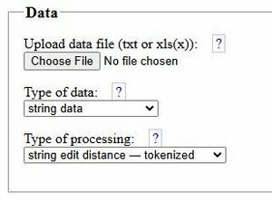
In this section, you can upload the dataset created in the Data Preparation section of this tutorial. There are three steps to complete:
1. Upload your data file. 2. Choose the data type (in this case, we will analyze string data). 3. Select the processing type (we will use string edit distance - tokenized). If you want to know more about processing types, visit https://gabmap.nl/doc/manual/processing-sed.html
As you may noticed, there are additional options for data types and processing methods. To learn more about these options, click the '?' symbol next to them. Gabmap offers helpful guidance in every section, and reading these tips will give you a better understanding of how to set your desired parameters for your next projects.
Weight data
This part is optional and can be skipped. However, if you have additional data you want to include in your analysis (e.g., population), you can upload it here.
Advanced options
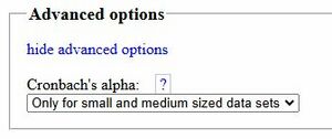
This part is optional too. At first, you see a blue text “show advanced options”. When you click on it, the upcoming window will appear.
Gabmap calculates Cronbach's alpha for your dataset. Cronbach's alpha is a statistical measure used to assess the internal consistency or reliability of a set of items in a test or survey. It indicates how closely related the items are as a group, with values ranging from 0 to 1—higher values suggest better reliability. Typically, a value above 0.7 is considered acceptable for most purposes (2). Since this calculation can be time-consuming for large datasets, Gabmap, by default, only calculates it for small and medium-sized datasets. If you want, you can change the default to “Never” or “Always”.
Once everything is done, click the “Create project” button. Well done! You created your first project in Gabmap.
Tip 1: If you don’t have any data, you can use Gabmap's example datasets. Visit https://gabmap.nl/examples/ and download any data or map file you need. Another way to practice is using Demo version of Gabmap by clicking on this link https://gabmap.nl/bin/home
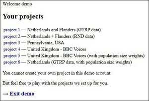
As seen in figure 15, six different projects are provided for users. You can click on any project you like to start using Gabmap.
Tip 2: Creating your own project is not possible with these demos.
Analyzing the Data
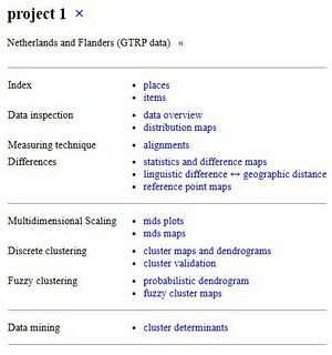
When you start your project, you can extract a wide range of results from your data. Figure 16 depicts different parts of analyzing data in Gabmap.
All of these are calculated for your data, and you can save the results in formats such as PDF, PNG, tables, etc. In the following sections, these analyses will be explained to help you gain a good understanding of these methods.
Index
The Index section helps to organize and visualize your data. It includes information about the locations of your data points (places) and the items you are analyzing (words or linguistic variables).
places
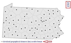
Places refer to the geographic locations where linguistic data is collected. These places can be cities, regions, or specific locations that are part of the dataset being analyzed. The platform visualizes these locations on a map, helping users understand how language features or dialects vary across different regions. It also provides Voronoi (Thiessen) polygons for your data, as shown in Figure 17. You can download the results in various formats provided by Gabmap.
If you want to read more about Voronoi (Thiessen) polygons, see: https://en.wikipedia.org/wiki/Voronoi_diagram
https://support.esri.com/en-us/gis-dictionary/thiessen-polygon
https://support.esri.com/en-us/gis-dictionary/voronoi-diagram
items
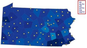
Items refer to the specific linguistic features or variables being analyzed. These could include words, phrases, or other language forms that you are studying in relation to different places or regions. Gabmap allows you to examine how these items vary geographically by visualizing their distribution on a map, showing where specific linguistic features are found. Figure 18 shows the total amount of data available for each location.
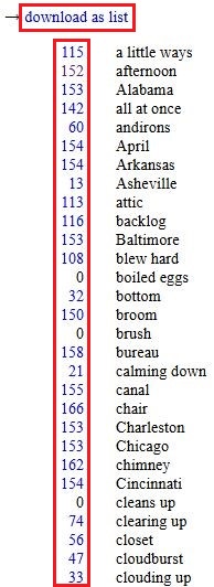
Below the map, there is a list of all the items (column labels) in your dataset. The numbers next to each item indicate how many instances are available. By clicking on a number, you can view a data map for that specific item.
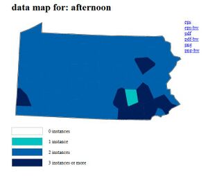
For example, when you click on '152 afternoon,' as shown in Figure 19, the result is a map created, as shown in Figure 20.
You can easily click on the numbers, view the result, and save it in the available format.
Data inspection
Data Inspection in Gabmap allows you to check the dataset you've uploaded for accuracy and consistency. It helps you review the data, identify any issues, and ensure it matches the correct format for analysis. This tool also lets you explore how the values of specific items correspond to the regions on the map.
Data overview
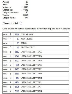
The Data Overview feature in Gabmap summarizes your dataset, showing the number of places, linguistic items, and unique symbols (characters) used. It helps you check the frequency of symbols and tokens, highlighting their distribution on maps. This feature is useful for spotting errors, such as rare symbols that might indicate typos. You can download the results in various formats for further use.
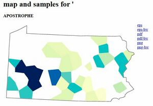
By clicking on the numbers in column 3, a distribution map for that sample is created, as shown in Figure 22 for “APOSTROPHE”.
Distribution maps
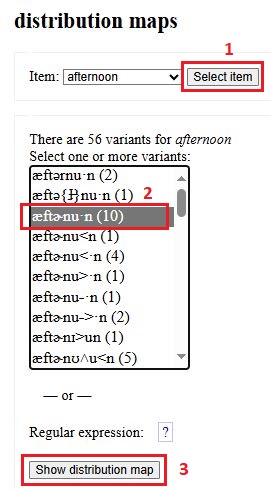
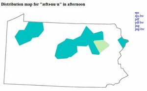
Distribution maps in Gabmap show where specific linguistic features or characters from your dataset appear across different locations. You can select a feature, and Gabmap creates a map to display its geographical distribution. These maps are helpful for identifying patterns and can be downloaded for further use. To complete this step, first select your item, then choose your variant, and finally click on the 'Show distribution map' button to view the related map. All these steps are shown for “afternoon” item in figure 23 and 24.
Measuring technique
Gabmap employs string edit distance (also called Levenshtein distance) measuring technique for linguistic analysis. This technique calculates the smallest number of edits (insertions, deletions, or substitutions) required to transform one pronunciation into another. It is particularly useful for phonetic transcriptions, as it identifies alignments and linguistic distances between words or dialects. If you want to know more about it, see https://en.wikipedia.org/wiki/Levenshtein_distance
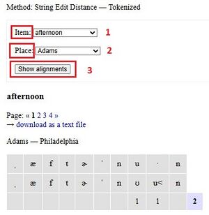
Alignments
The alignments feature helps you compare linguistic differences between word variants from different locations. It shows the steps needed to transform one pronunciation into another, such as insertions, deletions, or substitutions. These steps are used to calculate the linguistic distance between the variants.
As shown in Figure 25, you need to select your item and place, then click the “Show Alignments” button. This helps identify specific phonetic differences and understand how dialects vary between regions.
Differences
The differences section provides tools to analyze and visualize linguistic distances between locations in your dataset. Together, these features provide insights into the spatial and quantitative aspects of language variation. It includes the following features:
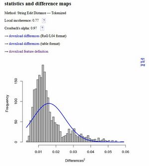
Statistics and difference maps
This section helps you explore how language features are spread across different regions. • 'Statistics': This tool summarizes your data, showing measures like how often a linguistic variant appears in specific locations. It helps you identify patterns in language use. You can see more details about this section in figure 26.
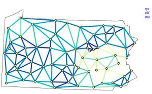
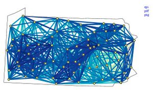
• Difference Maps: These maps highlight contrasts in language features between regions. They make it easy to spot areas with significant linguistic differences and understand the geographic spread of dialects. In this part, lines are drawn between sites and darker lines indicating higher similarity. Two types of maps are available here: one that connects only neighboring locations (figure 27), and another that covers broader areas, illustrating linguistic relationships across the dataset (figure 28).
Linguistic difference ↔ geographic distance
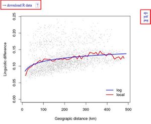
This feature looks at how linguistic variation relates to geographic distance. It helps compare how language differences change as distances between locations grow. Using graphs like scatterplots and regression lines, it shows whether areas that are closer together have more similar dialects. This is useful for understanding how geography shapes language patterns. In addition to saving results in PDF or PNG formats, you can also download the R code. This allows you to see the process behind the scenes and modify parameters if needed. If you want to know more about R programing language, visit https://www.r-project.org/about.html In Figure 29, you can see the results of a simple linear regression analysis conducted using the R programming language. This type of analysis is commonly used in dialectometry to understand spatial patterns in language.
Figure 30 presents a plot with local regression (red) and asymptotic regression (blue). Generally, a large b/a ratio indicates a high signal-to-noise ratio in the data, meaning the data is clearer and more reliable. A smaller value for c suggests that linguistic variation can be detected over shorter geographic distances, pointing to more localized patterns of language change.
Reference point maps
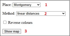
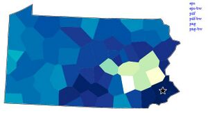
These maps display the linguistic distances from a chosen location to all others. A selected location is marked with a star, and other sites are shaded based on their linguistic similarity—the darker the color, the more similar the dialect. As shown in Figure 31, you need to adjust some settings for this step. • Select the location • Select the method • Click on “show map” button
In the methods section, you have four options. These methods help analyze geographic relationships and spatial patterns, so you can choose the one that best fits your needs.
1. Linear distances: Calculates the straight-line distance between two points, useful for direct spatial relationships. More https://en.wikipedia.org/wiki/Euclidean_distance 2. Quadratic distances: Similar to linear distances but squared, emphasizing larger distances and modeling diminishing spatial influence. More https://en.wikipedia.org/wiki/Quadratic_equation 3. Zero-based Linear distances: Adjusts the starting point to zero, focusing on relative distances rather than absolute ones. 4. Zero-based quadratic distances: Uses quadratic scaling from a zero point to model more complex spatial relationships and non-linear effects.
Figure 32 illustrates a reference point map for Montgomery using the linear distances method.
Tip: In Gabmap, you cannot select custom colors, but if you prefer, you can click on “Reverse colors” (see Figure 31).
Multidimensional Scaling
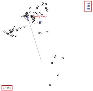
Unlike reference point maps, which display linguistic distances from a single selected site to all other sites, MDS shows the linguistic relationships between all sites in the dataset at once. It provides a more comprehensive visualization by positioning the sites in a way that reflects their similarities or differences across the entire dataset together. If you want to know more details, check https://www.statisticshowto.com/multidimensional-scaling/
MDS plots
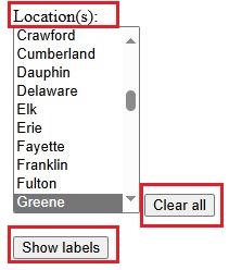
This tool is used to visualize the relationships and patterns within linguistic or geographic data. The MDS plot arranges data points so that points with similar characteristics (e.g., linguistic variants, geographic locations) are placed closer together, while those with differences are farther apart. It also reports an 'r' value, which indicates how accurately the MDS plot represents the original data. Higher values indicate a better fit between the visualized map and the actual relationships within the data. To see labels in the plot, select your locations and click on “Show labels”. If you would like to clear the names, click on “Clear all”.
Tip: You can select multiple labels to display by holding the Ctrl key on your keyboard while clicking.
MDS maps
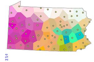
The MDS map shows the outcome of a three-dimensional MDS analysis. It shows how dialects are related to each other in three-dimensional space. Dialects that are similar will appear close together and have similar colors, while dialects that are very different will be farther apart and have different colors. This helps you see patterns in how the dialects compare to one another.
Discrete clustering
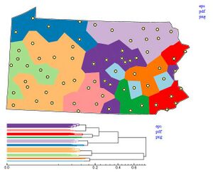
The discrete clustering groups locations based on linguistic similarity, starting with each location as its own cluster and merging them step by step. A dendrogram visualizes this process, and users can select the number of clusters by choosing a break point. The results can be shown on a map, where each cluster is represented by a distinct color for easy visualization.
Tip: The colors are random and only show which cluster each group belongs to; they don’t indicate how similar the clusters are.
Cluster maps and dendrograms
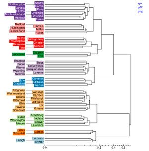
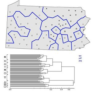
Cluster analysis is a method used to classify dialects and identify dialect regions. Cluster analysis is performed on a distance matrix that represents the pairwise linguistic distances between locations. It involves grouping objects—in this case, geographic locations—into clusters based on their linguistic similarities. The goal is to organize places into distinct groups that share common linguistic features. This section in Gabmap provides various options for users. Dendrograms are hierarchical tree diagrams represent the relationships between linguistic groups. The closer two branches are, the more linguistically similar the corresponding groups. Figure 36 shows the results for a dataset: the upper image is a cluster map, and the lower image displays the dendrograms.
If you want more detailed dendrograms, scroll down the page to view the results with additional details. See figure 37.
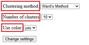
In this section, you can customize the settings according to your needs. Figure 38 shows the settings section. You can explore results from four clustering algorithms: Complete Link, Group Average, Weighted Average, and Ward's Method. These methods calculate distances between clusters differently, influencing the clustering results. For example, Ward's Method tends to create clusters of equal sizes, while the others keep linguistic distances more perfect. By default, the cluster map shows eight clusters created using the Weighted Average method, but you can adjust the settings to change this as needed. Once you're done, click on “Change settings” to apply your changes to the data analysis.
Gabmap creates cluster maps and dendrograms in color. If you prefer a black-and-white version, select “No” in the “Use color” option instead of “Yes”. This will remove the colors, and different point symbols will be used to distinguish clusters. See figure 39 for clarification.
Cluster validation
If you look at the top of the cluster maps and dendrograms page, you'll notice a warning for users. Figure 40 shows this warning as well.
In Gabmap, Cluster Validation is a tool that helps you evaluate how well the results of your cluster analysis fit the linguistic data by comparing them to multidimensional scaling (MDS). This process is useful for determining the optimal number of clusters for your data.
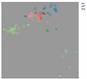
In the Cluster Validation view, you will see a cluster map and a two-dimensional MDS plot, where the MDS plot shows how well-separated the clusters are based on linguistic similarity. The colors of the points in the plot reflect the results of the cluster analysis. By comparing the cluster map and the MDS plot, you can assess if the clusters are well-defined or if the data might not form distinct groups.
If no clear clusters appear in the plot, it might indicate that the data is continuous rather than discrete, suggesting that clustering might not be appropriate.
Additionally, the black dots in the map mark the "cluster center," representing the most typical place in each cluster, and numbers indicate outliers—locations that are on the edge of the cluster.
Similar to the previous section, you can adjust the parameters. See figure 43 for details.
If you need more details about cluster validation, visit Gabmap: cluster validation - demonstration
Fuzzy clustering
Cluster analysis can sometimes be unstable, meaning that small changes in the data can lead to big changes in the results. Fuzzy clustering helps solve this by adding small amounts of random noise to the data several times. Each time, clustering is done on the altered data, and the clusters that appear most often are considered the most stable and reliable. This method helps make the results of clustering more robust. These maps combine multidimensional scaling (MDS) and clustering, visualizing both distinct linguistic groups and continuous relationships for locations that don’t fit clearly into a single group. They provide a nuanced view of dialect relationships.
Probabilistic dendrogram
The results of fuzzy clustering are displayed in a probabilistic dendrogram. The percentages shown in the probabilistic dendrogram represent how often each cluster appeared in multiple rounds of clustering with added noise. For example, the largest clusters are found in every iteration, with a probability of 100%, indicating they are likely real clusters. However, clusters with lower percentages appear less consistently, meaning their reliability is less certain. This approach helps identify stable clusters while acknowledging the uncertainty of those that appear less frequently.
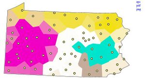
This part also gives you a map (figure 45) for data analysis.
The colors in the probabilistic dendrogram come from a separate analysis and are used to assist in identifying the locations on the map beneath the dendrogram. They are not part of the clustering results but serve as a visual aid for interpreting the data.
If needed, you can adjust the parameters according to your preferences. After making changes, click on “Update settings”. To revert to the default values, click on “Restore defaults”.
Fuzzy cluster maps
It is the same map as shown in the probabilistic dendrogram (Figure 45). This map combines aspects of both MDS and cluster analysis. It highlights main dialect groups but also shows continuous relationships for locations that don’t fit strongly into one cluster. This visualization is created by applying MDS to the branch lengths of the dendrogram, known as “cophenetic” distances, instead of using the original linguistic distances. For more details see https://en.wikipedia.org/wiki/Cophenetic
Data mining
This section of Gabmap has not yet been fully launched. It includes a subsection called Cluster Determinants that performs a series of processes and generates outputs. However, its function is not explained in the Gabmap tutorial and is still under development. This might be a good starting point for anyone looking to expand or improve this tutorial in the future.
Conclusion
Gabmap is a comprehensive tool for analyzing and visualizing linguistic data, designed to help researchers explore dialectal variation and linguistic relationships geographically. Its tutorial walks users through essential features and functionalities, including data inspection, distance measurements, multidimensional scaling, clustering, and data visualization techniques. Key highlights include: • Interactive Maps: Tools like reference point maps and cluster maps help display geographic and linguistic relationships. • Analysis Techniques: Features like MDS and fuzzy clustering, allow for in-depth analysis of dialect patterns and linguistic stability. • Customizable Settings: Users can adjust parameters to tailor analyses and visualizations to their specific research needs. • Visualization Outputs: Gabmap offers colorful, interpretable outputs like dendrograms and probabilistic maps to convey findings effectively. The tutorial ensures a step-by-step understanding of how to utilize Gabmap's tools, making it accessible for both novice and advanced researchers.
Acknowledgment
The Gabmap tutorial and its documentation have greatly contributed to understanding its features and functionalities. The insights in this guide are drawn from Gabmap's official resources, including its documentation and examples, to explain the step-by-step processes for linguistic analysis and visualization. Gabmap is a free web-based application for dialectometry. Gabmap source code can be downloaded from GitHub - coltekin/Gabmap: Doing dialect analysis on the web
Technical Support
If you have any questions or difficulties using Gabmap, rest assured that excellent technical support is available. Dr. Martijn Wieling is the contact person for assistance. During the preparation of this tutorial, I reached out to him several times, and he responded promptly. He is responsible for technical support, and you can email him at m.b.wieling@rug.nl
Resources
(1) https://gabmap.nl/doc/tutorials/tutorial/intro.html
