Analysing Traffic Accidents Using QGIS - Heatmaps, Hotspot Analysis, and the Time Controller Panel

Contents
Learning Outcomes of this Tutorial
By the end of this tutorial, you will be able to perform the following tasks within 'Quantum' GIS (QGIS):
- Importing point data files (shapefile, CSV)
- Importing satellite imagery basemaps
- Labeling point data using attribute information
- Creating heatmaps and hotspot maps
- Learning to use the time controller panel
- Visualizing traffic trends as a finished map
Purpose
The purpose of this tutorial is to create a map that can aid in Traffic Accident Analysis while introducing users to heatmaps and hotspot maps, using several tools and plugins within QGIS.
Introduction
QGIS is a free and open source geographic information system (GIS) that is developed and supported by thousands of users and organizations around the world. It's core features include a suite of vector and raster tools that are compatible with many of the most popular geospatial file formats.
The required knowledge level of this tutorial is a basic understanding of GIS. This tutorial incorporates step-by-step instructions and screenshots for each step of the procedures which should be easy to follow along at any skill level.
Techniques
Heatmaps
A heatmap is a visualization method that displays the geographic clustering of a phenomenon. Heatmaps can also be used when clustering points where more points in an area will have higher value compared to less points in the same area. Thus, with a heatmap a concentration of an event's occurrence can be seen.
Hotspot Maps
Hot spot analysis uses statistical analysis in order to define areas of high occurrence versus areas of low occurrence.
Heatmaps Vs. Hotspot Maps
Though seemingly similar and often used interchangeably heatmaps and hot spot maps are not identical processes. Both processes are used to visualize spatial data o show occurrences in an event using a colour gradient to indicate high levels of density. However, heatmaps are created by assigning each raster cell to a density value and the entire layer is visualized using a gradient. The resulting visualization affects how the data is interpreted by the viewer and is subjective. Hot spot areas are statistically significant, resulting in a final visualization that is less subjective. The designation of an area as being a hot spot is therefore expressed in terms of statistical confidence.
For more information see this link on the difference between a heatmap and a hot spot map.
Before starting the analysis, you should choose what you want to analyze and determine which tool and what settings suit your needs.
Open Source
The term ‘open source’ refers to accessible, free and redistributable programs available to the public. Compared to more common commercial packages such as ArcGIS, which have costly license subscriptions, open source programs like QGIS are free of charge to use. Additionally, open source programs and data allows individuals to work together to code. This type of model encourages open collaboration. If you would like, feel free to look at available open source technology at OSGeo.
About QGIS

As described on their website, QGIS is a "A Free and Open Source Geographic Information System", and the latest version of the software (v3.26 Buenos Aires as of September 2022) is available for download on their Official Website. Similar to other GIS platforms it can be used to edit, create, visually represent, analyze and export a variety of geospatial data and it is licensed under the GNU General Public License. QGIS is an official project of the Open Source Geospatial Foundation (OSGeo). It runs on Linux, Unix, Mac OSX, Windows and Android and supports numerous vector, raster, and database formats and functionalities.
Installing QGIS
There are several versions of QGIS available for download. For the purposes of this tutorial, we will be using the long-term release version (QGIS 3.22).
- Follow this link QGIS Download to the QGIS site.
- Ensure that you are on the “Installation Download” tab.
- There are three versions of the QGIS installer available in this tab. The first is a network installer which is not needed for our application, the other two are the latest release (Version 3.26) and the long-term release (Version 3.22). We will be using the long-term release because it provides the most stability and is more widely used due to it receiving minor updates less frequently.

- The slightly older version of QGIS that will be used for the purpose of this tutorial is v.3.22, which can be downloaded by clicking this link.
- Once you have downloaded the software from the QGIS website, follow the step-by-step installation instructions on your computer. After the QGIS v.3.22 LTR is downloaded and ready to execute, double click the QGIS shortcut icon on your Desktop or search for it in the Start Menu. The QGIS window opens, and we are ready to begin.
Example 1 Heatmap of Ottawa Traffic Accidents
Data
The data used in this tutorial is available through the City of Ottawa's Open Data Website. The files used in this tutorial are a polygon shapefile of the wards of Ottawa and point shapefiles of traffic accidents. You may use any other data for another city or location as long as there is a polygon shapefile of your chosen city or neighborhood, a polyline shapefile for roads, and a point shapefile for accidents, as well as any other information you would like to analyze. To get ready for this tutorial, you should download all of these shapefiles and keep them in a working folder on your PC to make your work easier to locate.
Downloading the Data
- Open the Open Data Website, search ‘wards’ in the search bar.
- Download the Wards 2022-2026 for Ottawa, or the most up to date version. To download the shapefile, click the link and click on the download button on the left hand toolbar. Make sure you extract all your files from the downloads folder to your working folder.
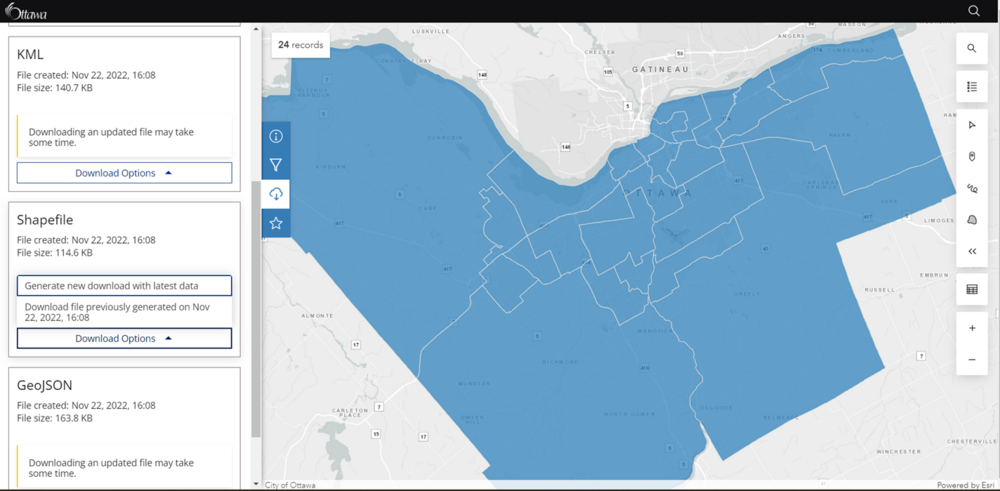
- Download Traffic Collisions by Location 2015 to 2019.

Feel free to go back to the Open Ottawa homepage and browse the transportation category.

Adding a Base Layer
- Launch QGIS once you have installed it on your computer and downloaded the suitable shapefiles to work with that were mentioned in the previous ‘Data’ section.
- Create a New Empty Project.
- At the top of your toolbar, click the plugin tab and click the "manage and install plugins" item.
- In the "all" tab, search for the " HCMGIS" plugin and install it to QGIS. Once this is done restart QGIS.
- Once you are back into a new project layer, click the HCMGIS tab at the top and go to the ‘Basemaps’ dropdown and select ‘Google Maps’.
Specifying a Project Projection
You will also need to specify a projected coordinate system for the project and shapefiles, in order to run interpolations on the data’s output shapefile in later steps. For North American datasets, one would commonly use the NAD83 UTM projections, making sure to select the correct UTM zone for the map area of your dataset. Today we will use ‘NAD83 / UTM zone 18N’.
- Use Ctrl+Shift+P.
- In the CRS tab search ‘NAD83 / UTM zone 18N’ or ‘26918’.
- Click NAD83 / UTM zone 18N under projected coordinate systems then click ‘OK’.

Adding Shapefiles to the Map
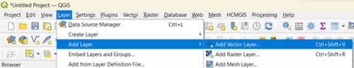
- Click on ‘Layer’, ‘Add Layer’, ‘Add Vector Layer’.
- Under ‘Source’, import the shapefiles into the ‘Vector Dataset(s)’ section.
- The resulting map should have all the data layers added.

Method 1- Create Heatmap with QGIS Symbology
Customize the Symbology
A method to create a heatmap is by simply altering the symbology of the traffic layer.
- Right click the ‘Traffic_Collisions_by_Location_2015_to_2019’ layer. (You can also double click and navigate to the ‘Symbology menu’).
- Go to ‘Properties’, ‘Symbology’ under what is originally ‘Single Symbol’ change to ‘Heatmap’.
- Change the colour ramp to your liking. We will be using the ‘Reds’ colour ramp today. The darker the red the denser the occurrences for a given area.
- We will then use the automatic selections QGIS has given.

The output should look like the image below after applying it to the map.

Though this does visualize where more occurrences happen it does not quite show us a suitable visualization. One way to achieve a more suitable visualization is to go back to the properties menu and change the radius of the heatmap. Below are images using different radius values.


- For this tutorial we will use a ‘Radius’ of 500 at ‘Map Units’ . We will also weight points by ‘Total_Coll’. With this radius we can start to draw conclusions on which streets or wards have the most traffic accidents.
- Additionally, in the ‘Symbology’ tab under ‘Heatmap’ you can open the layer rendering dropdown at the bottom left of the window and change the ‘Opacity’. By changing the opacity, you can view the other layers and the base map better. See the image below.

The final heatmap output should look like the image below.

After modifying the colour ramp values and opacity of the ‘Symbology’ to reflect the range of values in a suitable way click ‘apply’ and ‘ok’ and you will now have coloured map of the Heatmap interpolation surface for total collisions 2015-2019 in Ottawa.

Additionally, you can save the style and use it for our time series example. Or you can open the edit colour ramp by clicking the drop down arrow beside the colour ramp.

Method 2-Using the Heatmap plug in
We will use the ‘Density Analysis’ plugin. This plugin adds density heatmap geohash, H3, and polygon density algorithms to QGIS. See this page for more information on the plugin. This tutorial will only demonstrate one function of the plugin. Feel free to experiment with the plug in on your own.
- First, download the plugin. Under ‘Plugins’ on the top menu click ‘Manage and Install Plugins’. Search ‘Density Analysis’ or ‘Heatmap’ and install the ‘Density Analysis’ plugin.
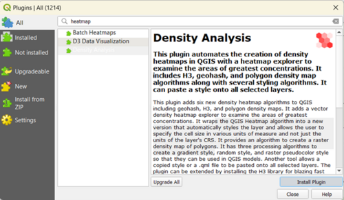
- We will be using the Geohash algorithm. You can access the plugin under the ‘Plugins’ menu at the top menu. Go to ‘Density Analysis’ select the ‘Styled geohash density map’. Or by clicking on the icon that looks like
 . This algorithm iterates through every point indexing them using a geohash with a count of the number of times each geohash has been seen. The bounds of each geohash cell is then created as a polygon. Depending on the resolution these polygon are either a square or rectangle.
 - We will set the parameters as follows. ‘Input point vector layer’ will be our 2015-2019 traffic collisions by location layer. We will then change the ‘Weight field’ to the total collisions column and the ‘Colour ramp mode’ will be set to ‘Natural Jerks’.
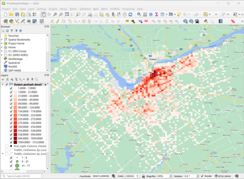
- Run the algorithm and a resulting layer will look similar to the image below. From the new heatmap we can see that there are densely clustered accidents near the downtown byward market and Centertown areas. As well as along highway 417.
- Using the ‘Density map analysis tool’ , use the tool by either going to plugins and finding it or by clicking the
 image.
 - We can also see the top scoring values by selecting the original point layer and the previously generated density heatmap polygon layer. Once the parameters have been set, click on Display Density Values and the top scores will be listed. If you click on any of entries only that grid cell will be display. A drop down set of actions selects what happens when clicking on one or more of the score entries. Below are images of the first and second areas with the most traffic accidents, ByWard market area and near the Isabella Street Loblaws.
- Make sure you save all layers and newly created temporary layers for later.


Using the tool will give you areas that look similar to the images below.


If we want to use the density analysis instead with the created heatmap using the symbology example previously those same areas will look like the images below.


Example 2 Time Series
For the next example we will be using the same data then we will separate collisions into years then see the changes with the time controller panel.
Recreating new layers
We are first going to duplicate all the 2015-2019 collision layer into 5 new layers. Each should be renamed to reflect the year. When you are finished the layers panel should have 5 duplicated layers of the ‘Traffic_Collisions_by_Location_2015_to_2019’ layer, similar to the image below.

Changing the Symbology
We could use the heatmap style previously created in the tutorial however we will be using graduated symbols instead. This will cut down on the rendering time.
- Double click the newly created 2015 layer.
- Go to symbology.
- Choose the ‘Graduated’ symbol and use the method ‘Size’. Feel free to uses any symbol to represent collisions.
- Under Value choose the collisions for the year of choice. In this case choose ‘F2015_Total’.
- Change the mode to ‘Natural Jerks’. The symbology should look like the image below.

Using the Temporal Controller
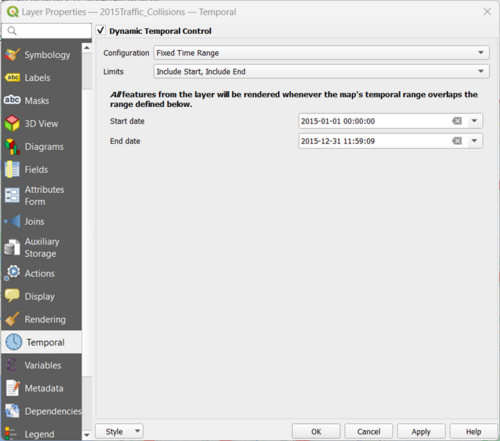
- Under the ‘Temporal’ tab (in the area where ‘Symbology’ was previously created) press the ‘Dynamic Temporal Control’, Configuration ‘Fixed Time Range’, Limits ‘ Include Start, Include End’, then set the start date as the start of 2015 and the end date the end of 2015.
- Next, we are going to save the general outline of this layer to save us time on the next layers.
- In the bottom left corner click ‘Style’, then ‘Save Style’.
- Rename the file and click the three dot symbol to save the new style in your working folder.
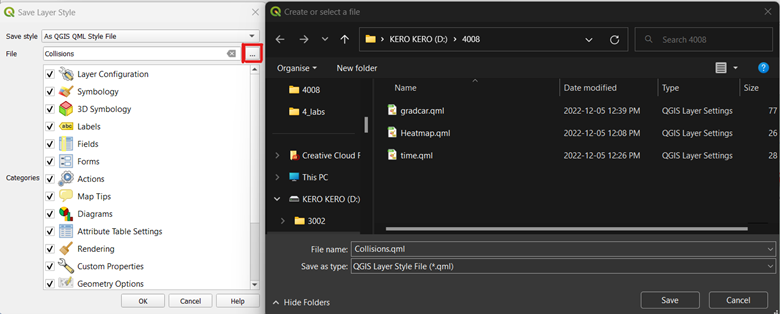
- Click ‘Save’ in the file browser, then ‘OK’ in the save layer style window.
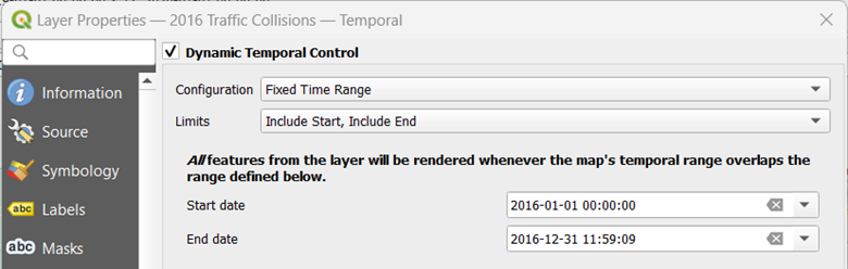
- For the other years’ layers, you can now load the style file and simply change the parameters to match the year of focus. After opening the properties tab of another year click the same Style button at the bottom of left of the window, then ‘Load style’. Search where you had saved the file and open it.
- Make sure you change the year in the Temporal tab to the year of focus and the value to the year of choices’ collisions.
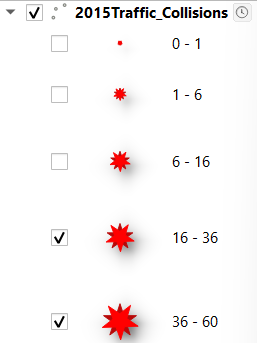
- Before we use the controller, we will filter out all but the last two symbols so the map we display has greater than 16 incidents per point for all years.
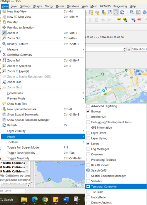
- Then under ‘View’, hover over ‘Panels’, then make sure the ‘Temporal Controller’ is turned on. Or simply look for this button
 .
. 
- Set the time range to full range and in ‘1’ step per ‘years’.
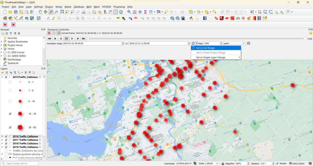
- Click the play button to start the animation. If the animation is too fast, you can adjust the frame rate by clicking Temporal Settings, the yellow gear icon at top-right corner of Temporal Controller panel. Decreasing the frame rate slows the animation.


Adding Labels
- It would be helpful to also display a label showing the current time frame/year on the map. We can do that using the built in Title decoration.
- Go to View, hover over ‘Decorations’, and click ‘Title Label’.
- Click the checkbox to enable it and click Insert an Expression button and enter the following expression to display the year. Here the variable @map_start_time contains the timestamp of the current time slice being displayed. So we can use that timestamp and format it to display year of occurrence.
format_date(@map_start_time, 'yyyy')
Feel free to change the font to your liking. This tutorial changed the font to ‘28’, set the background bar to ‘white’ and set opacity low.

The resulting image is below.

Saving the GIF
To export these as images and convert them as GIFs select the Export Animation (save button icon) in the Temporal control window.
- Click on the ‘…’ working folder to choose where the images will be saved.
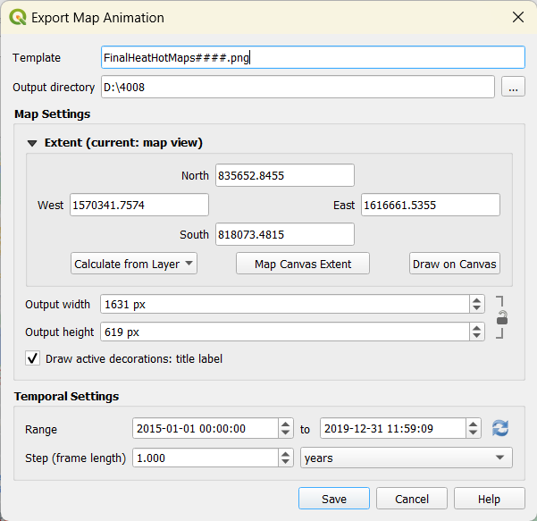
- Once the export finishes, you will see PNG images for each year.
- Create an animated gif using ezgif or another online gif creator. Visit the site and click Choose Files and select all the .png files. Once selected, click the ‘Upload and make a GIF!’ button. Once created, you can download the GIF using the Save button. You can play around with the delay settings and view a preview by scrolling down before saving.
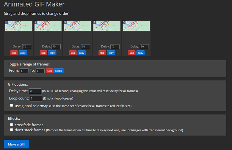
- I had also cropped the gif to a 16:9 ratio and then saved the gif.


The result looks like this.

Example 3 Hotspot Mapping
For the next example we will be using the same data with a different plugin, the Hotspot plug-in. We will be using the same QGIS window. Adding the Hotspot Analysis Plugin The Hotspot Analysis Plugin is an experimental plugin.
- At the top of your toolbar, click the plugin tab and click the "manage and install plugins" item.
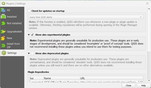
- In the ‘Settings’ tab, make sure the ‘Show also experimental plugins’ is checked.
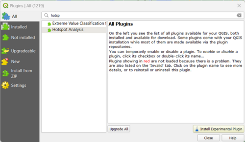
- In the "All" tab, search for the " Hotspot" plugin and install it to QGIS.
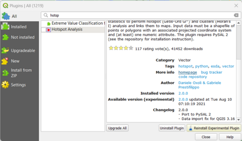
- When first clicking the ‘Install’ button, there is an error message that appears. One of the problems of this being an experimental plugin is the extra steps needed in the installation. We need to install a few things outside of QGIS and tweak those.
- There are some tips on the plugin’s homepage.
- Click the link to the plugin’s homepage under the ‘More info’ section of the plugin.
- You must have admin rights to your pc to install the dependencies.
- Since you have QGIS the necessary ‘OSGeo4W Shell’ should be installed already.
- Generally you can find it by going into your start menu and typing ‘OSGeo4W’.
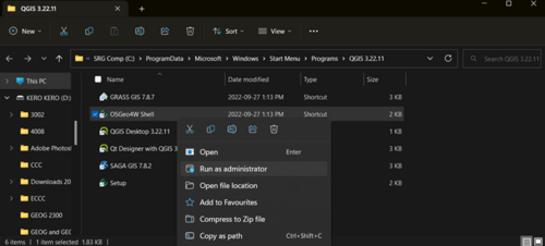
- To open OSGeo4W as an admin we need to right click the app and click on ‘open file location’.
- Find the location of the app right click then ‘Run as administrator’.
- Then copy and paste the code from the website into the OSGeo4W.


python -m pip install --upgrade pip
python -m pip install pysal==2.1.0
After running the code OSGeo4W will look like
- Once this is done restart QGIS and relaunch the project file.
- Do steps #1 to #4 again. After clicking install you should now have the plugin. The tool should now be added and look like
 .
.
Using the Hotspot Analysis tool
Create a Grid
- First, we will create a grid. Go into the ‘Processing’ tab under ‘Toolbar’.
- Search ‘Grid’ and we will be using the ‘Create grid’ tool. We will create two grids with rectangles and two grids with hexagons all with various spacing. As for the reason why hexagons, click on the link.
- Set the extent to the point file layer’s extent. Choose a ‘Horizontal spacing’ and ‘Vertical spacing’ of your choosing. NAD83 / UTM zone 18N projects in meters, so the spacing should translate as such. For the purpose of this tutorial various grid sizes will be made. The sizes are outlined in the images below.


Using the Count Tool
We need to count the points per polygon so we will use the count tool. In the toolbox search ‘count points in polygon’ tool. Our polygon is the grid, point is the total collision, call the field ‘NUMPOINTS’. Click ‘Run’ and the output will be a grid that looks the same except there is an extra column in the attribute table with the new column. Do the same for all the grids. The smaller the grid, the more detail and the longer the processing time. For the 100 x 100m grid it took over 1 and a half hours to process.


Extra! Method 3: Heatmap using the grid and count tool using graduated symbols
The count now should have the total collisions column from 2015-2019. Go into the ‘Symbology’ of the count layer. From here you can make another heatmap, only this time use the ‘Graduated’ symbols. This will create a similar heatmap to example 1.

Using the Hotspot Analysis Plugin
We can now use the tool with the various new count layers. Click on the hotspot tool that we had downloaded. Select the count layers, and the ‘NUMPOINTS’ attribute field. Finally, create a unique name for the output file and save to the working directory.

The following images are examples outputs all using the same total collision data.
The 1000x1000 rectangle grid

The 500x500 rectangle grid

The 500x500 hexagonal grid

The 100x100 hexagonal grid

A closeup of the same 100x100 hexagonal grid

Troubleshooting the Hotspot Tool
You may have some trouble with the plugin if the version of python on your pc old. If you get an ‘array.array’ object has no attribute ‘fromstring’ error. You can check this page out.

Some things to check
- First try deleting and redownloading the plugin.
- If that does not work make sure your input data has no non-values in the attribute table.
- Check the installed version of python. An easy way to check is by opening the python console within QGIS, under the ‘Plugin’ menu and run these lines:
from platform import python_version
print(python_version())
If your python package was from python 3.9.5 like mine it may be depreciated.
- Find the file where the error occurred. For me it was in C:\Program Files\QGIS 3.22.11\apps\Python39\Lib\site-packages\pysal\lib\io\util\shapefile.py
Under line 155 change 'fromstring' to 'frombytes' save the file to desktop. Then resave the file in the exact same place that the orginal shapefile was in with the same name (overwrite the file). Restart QGIS and try to use the tool again. If all goes well it should work.
Exporting the final map
Now we will make a print layout of the map and save it as an image.
- Under the ‘Project’ tab, select “New Print layout”.
- Assign a ‘print layout title’ that will be used for the new print layout (For example: ‘Ex1 Map’).
- Under the ‘Layout’ tab, you can add a number of map elements to the print layout including the actual map, a legend, scale bars, etc., depending on the nature and purpose of the final map.
- For this tutorial, we will make a comparison between the hotspot analysis output and the heatmap output, add the maps, the map title (under ‘add label’), a legend and scale bar. A few tips: Make sure you zoom to the layer extent of the map first before adding it as a map to the print composer, text editing for the ‘label’ is done in a text editing box on the right hand side of the print composer window. There is a wide variety of graphics editing tools within this print composer, so feel free to explore and play with them before exporting the final map.
The final map will look like this.

Conclusion
In conclusion, this tutorial aimed to show the user how to import data into QGIS, create heatmaps using various methods, create a timeseries analysis, run hotspot analysis on the point data, clip and symbolize the data and export the data as a finished map. I hope this tutorial provided adequate instructions on how to download the software and data, to perform the various tasks needed to create heatmaps, time series gifs, and hotspot analysis maps.
Resources
- ArcGIS Pro 3.0. (n.d.). Why hexagons? ArcGIS Pro 3.0. Retrieved December 13, 2022, from https://pro.arcgis.com/en/pro-app/latest/tool-reference/spatial-statistics/h-whyhexagons.htm
- Ezgif. (n.d.). Animated GIF Maker. Retrieved December 13, 2022, from https://ezgif.com/maker
- Github. (n.d.). Density Analysis Plugin: QGIS vector based density analysis plugin. Retrieved December 13, 2022, from https://github.com/NationalSecurityAgency/qgis-densityanalysis-plugin/#readme
- GitHub. (2021, May 11). Issues Hot Spot Analysis Plugin. https://github.com/danioxoli/HotSpotAnalysis_Plugin/issues/64
- Homepage - OSGeo. (n.d.). OSGeo. Retrieved October 5, 2022, from https://www.osgeo.org/
- Hot Spot Analysis Plugin: A QGIS plugin for hotspot analysis. (n.d.). Retrieved December 13, 2022, from https://github.com/danioxoli/HotSpotAnalysis_Plugin
- Open Ottawa. (n.d.). Retrieved December 13, 2022, from https://open.ottawa.ca/
- Open Ottawa. (2022, January 27). Traffic Collisions by Location 2015 to 2019. Open Ottawa. https://open.ottawa.ca/datasets/ottawa::traffic-collisions-by-location-2015-to-2019/explore?location=45.243984%2C-75.800230%2C0.96
- OSGeo. (n.d.). Choose a project - OSGeo. OSGeo. Retrieved October 5, 2022, from https://www.osgeo.org/choose-a-project/
- QGIS. (n.d.). Welcome to the QGIS project! Retrieved October 5, 2022, from https://www.qgis.org/en/site/
- Wikipedia contributors. (2022a, June 16). Universal Transverse Mercator coordinate system. Wikipedia, The Free Encyclopedia. https://en.wikipedia.org/wiki/Universal_Transverse_Mercator_coordinate_system
- Wikipedia contributors. (2022b, August 16). QGIS. Wikipedia, The Free Encyclopedia. https://en.wikipedia.org/w/index.php?title=QGIS&oldid=1104710526
- Wikipedia contributors. (2022c, September 15). Geographic Information System. Wikipedia, The Free Encyclopedia. https://en.wikipedia.org/w/index.php?title=Geographic_information_system&oldid=1110491855
- Wikipedia contributors. (2022d, September 22). Projected coordinate system. Wikipedia Contributors . https://en.wikipedia.org/wiki/Projected_coordinate_system