Analyzing Crime Data in Ottawa using QGIS
Contents
- 1 Introduction
- 2 Where to get the data?
- 3 Loading the Dataset into the QGIS
- 4 Layer Properties
- 5 Additional Statistics
- 6 Different Scenarios
- 7 Conclusion
Introduction
The main purpose of this tutorial was to determine the criminal trends based on the spatial locations in Ottawa using open source software. The QGIS was selected for the purpose of this tutorial it can be downloaded from: (https://www.qgis.org/en/site/forusers/download.html). The data includes many different crimes occurred in Ottawa from 2005 to 2013. The spatial locations include: Orleans, Innes, Barrhaven, Kanata North, West-Carleton March, Stittsville-Kanata West, Bay, College, Knoxdale-Merivale, Gloucester-Southgate, Beacon Hill-Cyrville, Rideau Vanier, Rideau-Rockcliffe, Somerset, Kicthissippi, River, Capital, Alta Vista, Cumberland, Osgoode, Rideau-Golbourn, Gloucester-South Nepean and Kanata South. Some of the crimes include: Total Criminal Code of Canada (CCC) including Traffic, Total Criminal Code of Canada (CCC) excluding Traffic, Crimes against Person, Total number of Homicides, Total Number of Attempted Murders, Total Number of Robberies and Total Number of Assaults (including Sexual Assaults), Total Number of Other Sexual Offences, Number of Abductions, Total Number of Uttering Threats or Intimidation Offences, Total Number of Other Crimes.
Where to get the data?
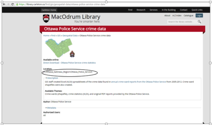
Based on the statistical data that the City of Ottawa Police Services provided, the Carleton University staff at the MADGIC desk created the shafiles and it was downloaded from the MacOdrum Library website. It is an open source data no login information is required. Retrieved from: http://madgic.library.carleton.ca/deposit/GIS/Crime_Statistics.zip
Loading the Dataset into the QGIS
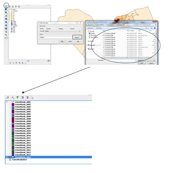
First step was to select Add Vector Layer symbol. Second step was to use Browse function to locate the data. Finally all shp files were selected from the Crime Wards Shp folder and loaded to the QGIS.
Layer Properties
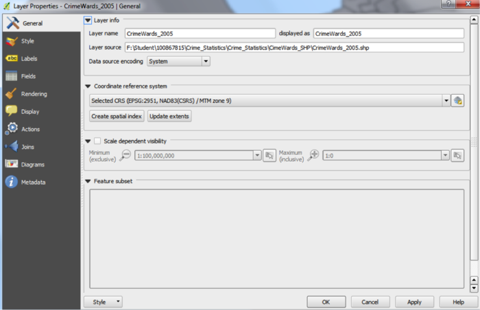
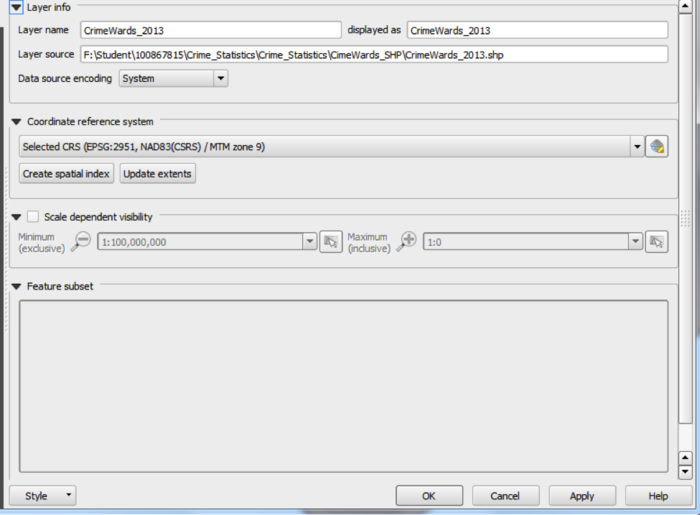
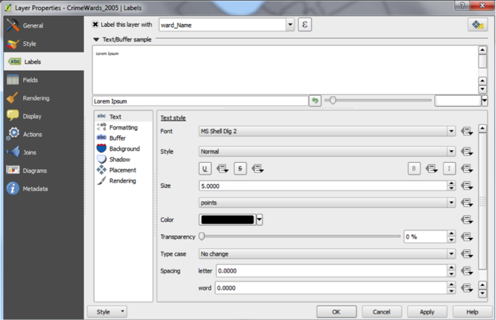
Layers Properties can be opened by right clicking any of the layers and selecting properties. Right clicking the Layer Properties would bring up the following screen.Layer Properties include: General Settings, Style, Labels, Fields, Rendering, Display, Actions, Joints, Diagrams and Metadata.
General Settings
Under General Settings:
- Layer name can be modified and displayed as something else
- Layer source can be modified
- Data source encoding can be changed (System, Windows, and Macintosh etc.)
- Coordinate Reference System can be changed
- Scale dependency can be turned on to restrict the minimum and the maximum scale
Labels
Labels can be turned on turned and displayed for any columns. Labels Settings include:
- Text (to modify the size, font style, transparency, color and style of the text)
- Formatting (to modify the line height and alignment)
- Buffer
- Background (to modify the background settings)
- Shadow
- Placement (to modify the placement such as: offset from centroid, offset centroid, around centroid, using perimeter, horizontal and free and to set up priority for the text)
- Rendering (to perform scale based visibility and pixel based visibility etc.)
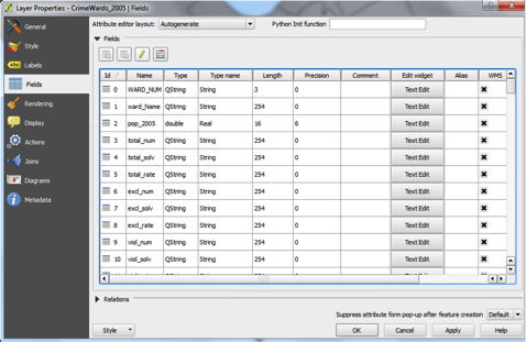
Fields
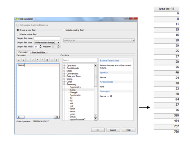
Using the field properties fields can be edited, and new fields can be created using field calculator. New output-field name, output-field type, output-field width and output-field precision should be determined when creating a new column. As an example new field called “area” is created, which is under geometry function called “$area”. It is going to be used to determine the population density because the data does not have that information, it only has total population. (Area/ 1000000 was used to get the area km^2 value)
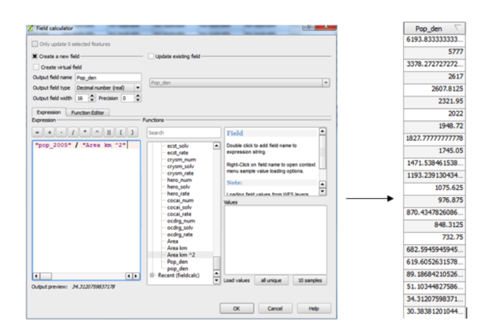
Creating the population density field
The total population divided by the total area would give us the population density. This process needs to be done for each layer that is going to be used. I am going to repeat the same process for the 2010 and 2013 layers so that the comparison between those layers can be done. If you want to use other layers rather than 2005, 2010 and 2013, area calculation and population density needs to be done for the interested layers.
Rendering
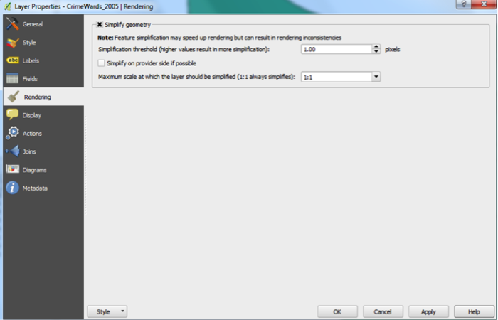
Rendering can be done to simplify the geometry. Simplification threshold can be customized, and the scale can be set up for rendering process.
Additional Settings under Layer Properties
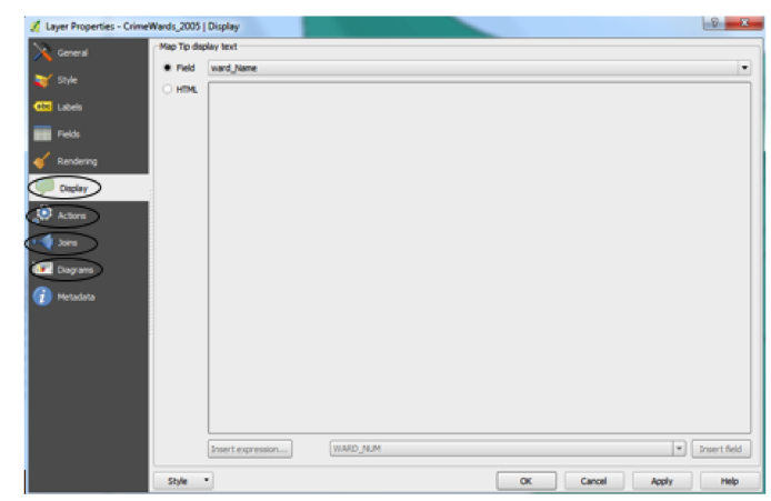
Additionally Display Settings, Actions, Joints and Metadata can be accessed under Layer Properties.
Using Style and Diagram Functions under Layer Properties
Style Function
Under Style there is a dropdown menu, which the Single Symbol, Categorized, Graduate, Rule Based, Point Displacement, Inverted Polygons and Heat Map can be selected. For the purpose of this tutorial I am mainly going to focus on the Graduate Style.
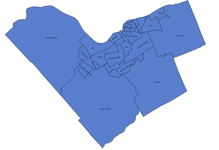
Single Symbol
Single Symbol Function is useful for showing the features without any categorization. As an example below: Map of Ottawa without any categorization.
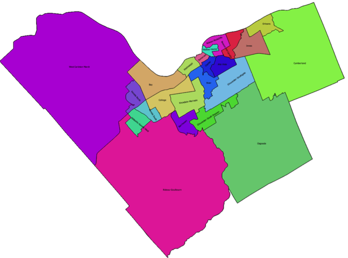
Categorized Style
Categorized style is useful for showing simple categorizations. As an example below: Map of Ottawa showing the wards in different colors.
Graduated Symbols
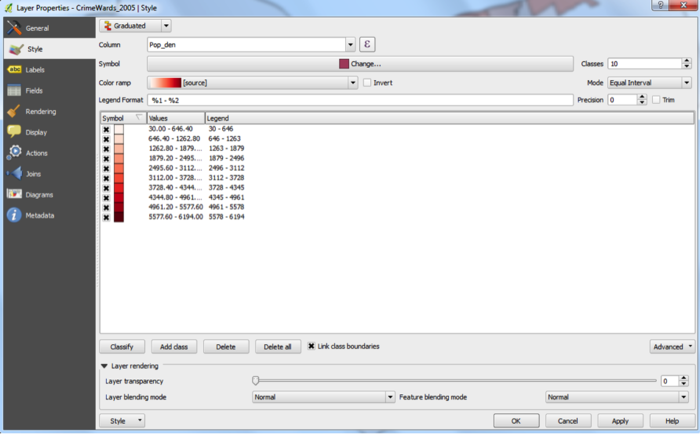
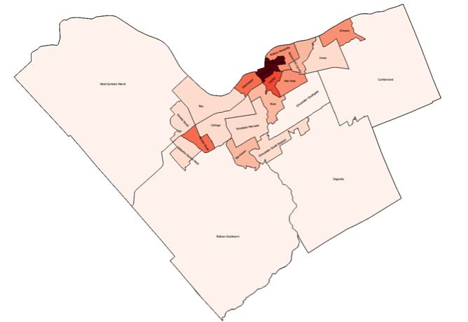
Graduated Symbols are useful for displaying the features based on their numerical values. First style needs to be selected as Graduated then column needs to be selected and after that Classes, Color Ramp, and Legend Format needs to be determined. As an example: I have selected Population density for the column and set the class number to 10, then I have selected the color ramp to red (the higher the number the darker red it would be), and I have set the legend format to %1 - %2.
Figure is showing the population density by the wards for 2005 in Ottawa
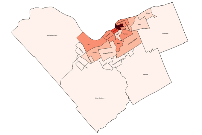
Figure is showing the total number of robberies by the wards in 2005 in Ottawa
Quick Analysis: Even though Somerset ward has one of the highest population densities with Rideau Vanier ward. The total number of robberies are lower at Somerset ward compare to Rideau Vanier ward. Capital ward has one of the highest population densities in the city coming after Somerset ward and Rideau Vanier ward, however Capital ward has one of the lowest total number of robberies in Ottawa.
Diagrams
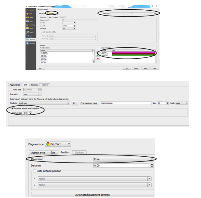
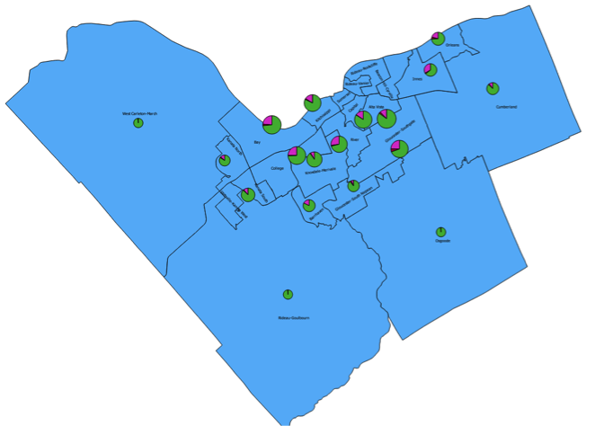
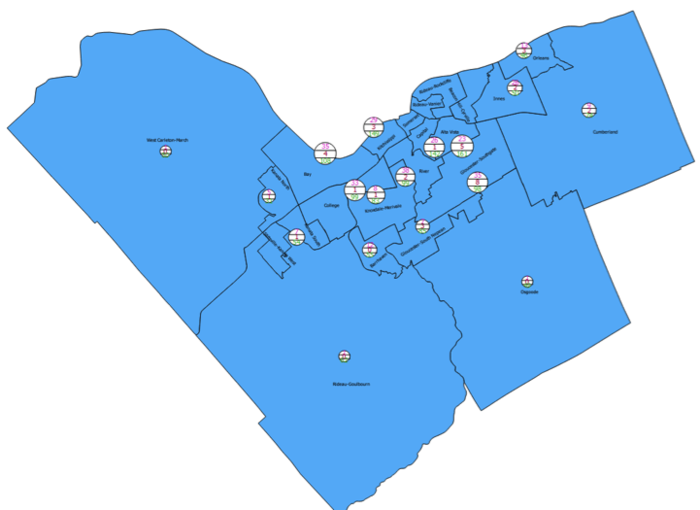
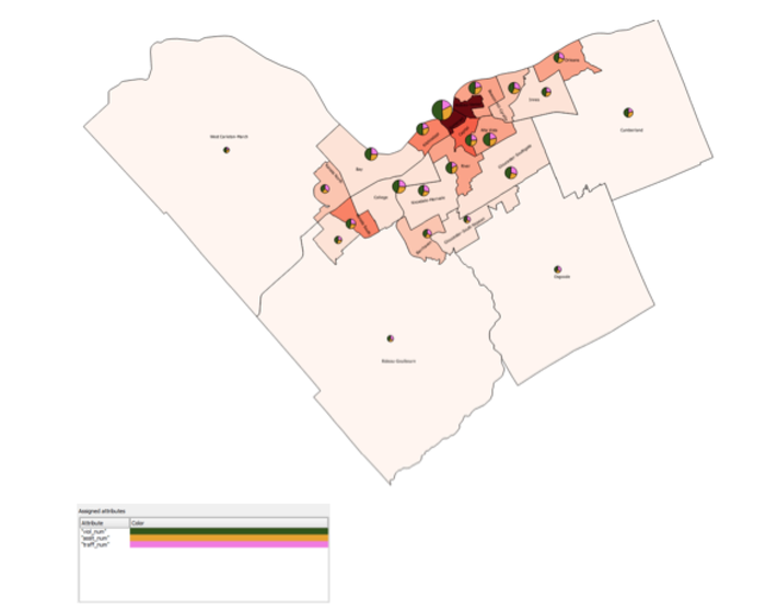
Diagrams are useful for showing multiple features on a single layer. First display diagram should be toggled on. Then diagram type should be selected (Pie Chart, Histogram or Text diagram). After that priority level was set to medium. Furthermore size and positions can be rearranged under the size and the position tabs. Additionally minimum size of the diagram was set to 5 to make all the diagrams visible. Then under Position tab placement was selected to free. And finally attributes were assigned, in this case total number of robberies, total number of abductions and total number of break ins were assigned as an attribute.
Maps below are showing the difference between the Pie Chart diagram type and text diagram type for the same data.
Figure is showing the Pie chart diagram type
Figure is showing the text diagram type
Additional Statistics
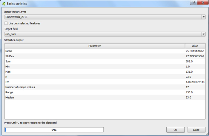
Additional statistics can be obtained under Vector tab/Analysis tool/Basic Statistics. Input Vector Layer needs to be selected then type of crime needs to be selected. As a result it will show the mean, standard deviation, sum, min, and max, number of unique values, range and median.
Different Scenarios
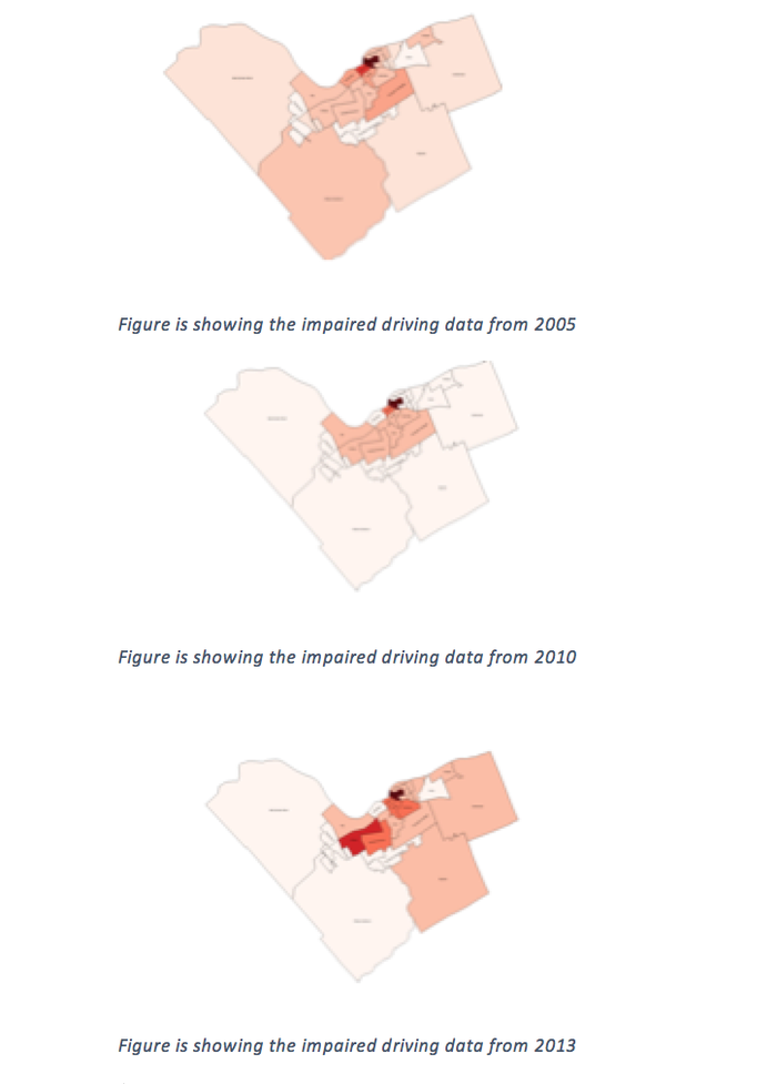
Scenario 1 (Comparing the Impaired driving data from 2005, 2010 and 2013)
Quick Analysis: The number of impaired driving occurrences in suburbs (Kanata, Cumberland) from 2005 to 2010 has become lower. However the number of impaired driving occurrences in east end from 2010 to 2013 has become significantly higher, and the number of impaired driving occurrences increased dramatically in College ward in from 2005 and 2010 to 2013.
Scenario 2 (Analyzing the total number of violent crimes, the total number of assaults and the number of traffic offences from 2010 data using Diagrams )
The diagrams are showing that the western and the southern areas of Ottawa have less number of violent crimes, assaults and traffic offences even though they have relatively similar population density. Somerset ward has the highest population density as well as the highest number of violent crimes, assaults and traffic offences.
Conclusion
Conclusively this tutorial highlights that QGIS was a powerful open source GIS software for analyzing the crime trends in Ottawa from 2005 to 2013. There are many other different crimes to analyze from, only limited number of crimes were highlighted in this tutorial. The QGIS software can be downloaded from the website highlighted above and the crime data can be downloaded from the MacOdrum Library website mentioned above for further analysis.
