IDW interpolation using QGIS
Introduction and Purpose
Using spatial data, it is possible to analyze, interpret, and represent phenomena almost everywhere on Earth. But what can be done when data exists near our area of interest, but not directly at the location? In these situations, we can use Inverse Distance Weighting (IDW) interpolation, a process which calculates values for locations based on nearby known values. It operates on the first law of geography, which states that near things are more alike than far things and assigns greater influence to known values which are nearby than those that are distant. In this tutorial, we will be conducting IDW interpolation in QGIS, an open-source GIS system. Open-source ([1]) is a term that refers to having accessible, free and redistributable programs available to the public. This allows for individuals to work on the code together to create a model that encourages open collaboration and develops code together. To look at GIS programs available for free download, you can visit the [2] page to look at all the projects currently being worked on by the community.
The purpose of this tutorial is to expand your abilities in QGIS by teaching you how to run an important analysis tool- IDW interpolation [[3]], with the end goal of creating an interpolated raster surface. The difficulty level for this tutorial is an entry-level QGIS user. This tutorial will contain screen-shots for each step to show the path to create all the layers that are in the finished product
Tutorial
Downloading QGIS
This tutorial uses QGIS, you will need to have the software installed [[4]] on your desktop or laptop. This tutorial uses QGIS 3.23. Once you have selected the version you wish to download based on your operating system, follow the guide that is installed in the package. With QGIS now installed on your computer and a proper path for accessing the application on your hard drive, you are now able to start the tutorial!
Data
The data used in this tutorial is monthly climate summaries from Statistics Canada, which publishes extensive and easily accessible data for all provinces and territories in Canada. For more information about the data, visit the "About the Data" page here [[5]]. This in-depth look at provincial weather will be an easily malleable data set to use for the tutorial. In this example, we will be looking at Alberta's average mean temperature. This will give us a well-distributed data set that we will be able to use to create an IDW model and help us calculate the approximate temperature values of areas that do not have weather stations.
Downloading the data
- First, set up a folder in your file directory for your project. This will be where you save all your data and your QGIS project
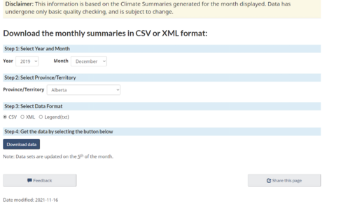
- Next, go to [[6]] and set the date to December of 2019
- Select your area of interest (for this assessment Alberta was used as it has the most climate stations in the country)
- Select CSV as the data format and click "Download data" to start your download
- You can also download the Legend(txt) file as it will allow you to see what all the data is meant to represent
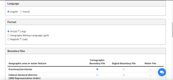
- Next, we will download our provincial boundary file from [[7]]
- Select your preferred language, the .shp file format, and provinces/territories under "Cartographic Boundary File"
- Next hit continue at the bottom of the page, this will redirect you to a new page with a link labelled "Archived – gpr_000b11a_e.zip (ZIP version, 40,968.0 kb)" click the link to download the .zip folder
Editing the data
With this data having so many variables we need to edit it to make it easier to work with:
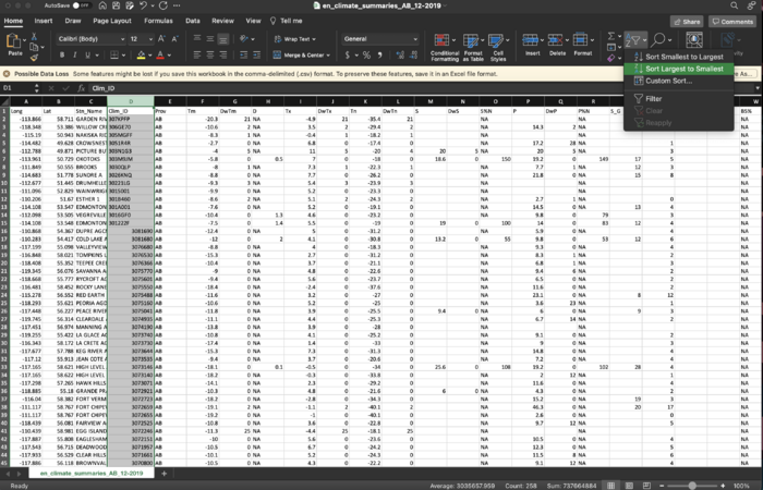
- Open your CSV file using a spreadsheet software like Excel
- Right click on the "Clim_ID" column to select the entire row
- Use the sort/filter drop-down menu and filter the "Clim_ID" column from largest to smallest
- Select the rows with values that contain letters and delete them from your file. These rows are not needed and can create some issues when loading the data into QGIS
- Save your worksheet as a CSV in your project folder and close your spreadsheet software
QGIS
Loading CSV File and Provincial Boundary File
- Launch QGIS and create a new project file. Save your project to the folder you created at the start of the tutorial
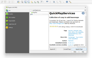
- At the top of your toolbar, click the plugin tab and click the "manage and install plugins" item.
- Search for the "QuickMapServices" plugin in the pop-up window and install it to QGIS. Save your project, close and re-open the QGIS application to activate the plug-in
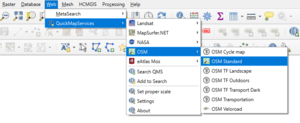
- After reopening your project, click the Web tab on the menu, then QuickMapServices dropdown and select OSM standard. This will serve as a base map to your project
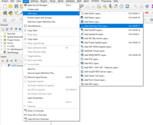
- Add in the monthly climate summary data by clicking on the layer tab in the menu, selecting "Add Layer" and clicking "Add Delimited Text layer"
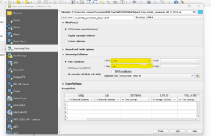
- In the pop up window, click the 3 dots at the top right corner of the screen (highlighted in blue in the image below) and navigate to your project folder. Select the climate summary CSV file. In the Geometry definition option set your x field to "Long" and your y field to "Lat" (highlighted in yellow) to set your coordinates
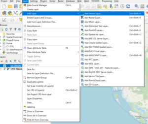
- Click on the layer tab in the menu, go to the "Add Layer" tab and select "Add Vector Layer"
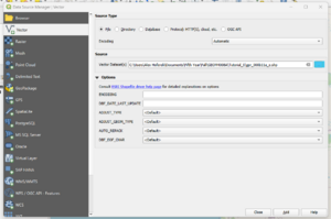
- In the pop up window, click the 3 dots at the top right corner of the screen (highlighted in blue in the image below) and navigate to your project folder. Select boundary file with a .shp ending
- Right-click on the boundary layer and select "Open attribute table"
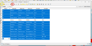
- In the pop up window, click the pencil (circled in yellow) at the top right of the window to begin editing. Select all layers except Alberta and click the " Delete Selected Feature" tool (circled in red) on the menu
- Right-click on the boundary and toggle editing to stop editing the layer. Select the "Save your Edits" option from the ensuing pop-up
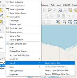
- The following step is to save both of your layers as individual files. If this is not done, they will have to be re-created each time you open you open your project. To do this right-click on the layer, click "Export", the select "Save Feature As"
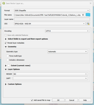
- In the pop up window, click the 3 dots (highlighted in blue) and navigate to your project folder. Give your feature an appropriate name and then click "Okay"
- Repeat this step for both the boundary and weather station layers
Interpolating data to create a Raster Surface layer
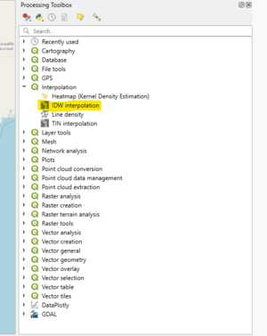
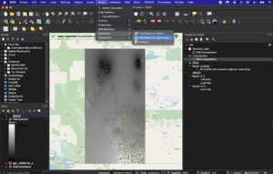
- Click the processing tab or the gear icon in the menu
- This will bring up a menu on the left side of the application with a search bar at the top of its menu. Click on the "Interpolation" row to open the sub-menu. Once you have located it, double-click "IDW Interpolation" (highlighted in yellow) to open the tool window
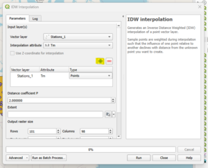
- In the new window, select the weather stations layer from the "Vector layer" drop-down. Next, select "Tm" as from the "Interpolation attribute" drop-down to assign the mean temperature as the value we are interpolating
- Click the plus button (highlighted in yellow) to add the stations layer to the "Vector layer" list. Select the "points" tab under the "Type" drop-down
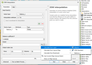
- Click the drop-down by the "Extent" option to limit the extent of the interpolation. Click "Calculate from Layer" and select your boundary file as the extent
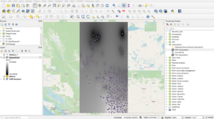
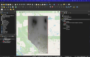
- Once the processing is complete the result should resemble the image below
Clipping Interpolation Surface to create a final raster layer
- This portion of the tutorial will focus on creating a masked layer for the raster layer we just created to fit within our boundary file.
- at the top of the application there is a raster tab, click this and scroll to the "extraction" tab and select the "clip raster by mask layer"
- At the top of the window select your interpolated layer as the "input layer". you want to mask it to the shape of Alberta so choose the boundary file as your "mask layer"
- Ensure that both layers are using the same projection and then click run.
- You will notice that these layers are only temporary and if you were to close the application right now the layer would not save to combat this we need to export the layer as its GeoTIFF file so that we can share your data later.
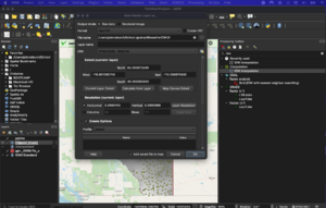
- to do this right-click on the layer and click export "save feature as"
- Make sure the format is GeoTIFF and click the 3 dots next to the file name. in the folder you created earlier give this layer a name like AB Weather IDW. once all of this is done it should look something like the figure on the left
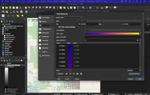
- to finish this layer off we will be changing the symbology as the tones of gray are hard to grasp with a dataset like this. to change this right-click on the new layer and select the "properties" button at the bottom of the pop-up window.
- at the top of this window it says "render type" click that menu and select "single-band pseudocolour". this will allow you to select a colour ramp different from black and white select something that makes sense for your map, of this example I have used the "plasma" ramp to show the difference between the warmest temperatures and the coldest.
- Once this has been completed and looks complete save your project by clicking the project tab and selecting "save as" this will bring you to the folder you created earlier. Name your project Alberta Weather IDW map and click "save".
- once this is completed the analysis portion of the tutorial is over and you successfully ran an interpolation on open source software!
Exporting the Final Maps
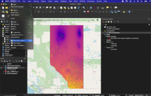
- Under the ‘Project’ tab, select “New Print Layout".
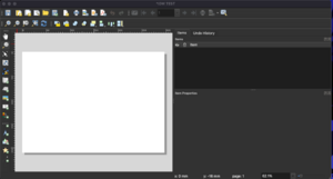
- Name this print layout something like IDW MAP FINAL then click ok, this should bring you to an entirely different window like the one on the right.
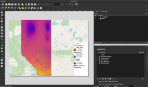
- on the left side of the screen you will see an icon that looks like a rolled-up map and if you hover over the button it says 'add Map' click this to bring in the map we just created. You can now fit the map to the size of the print layout and adjust the placement and size of the map on the left with the move "item content" and "select/move item" tools.
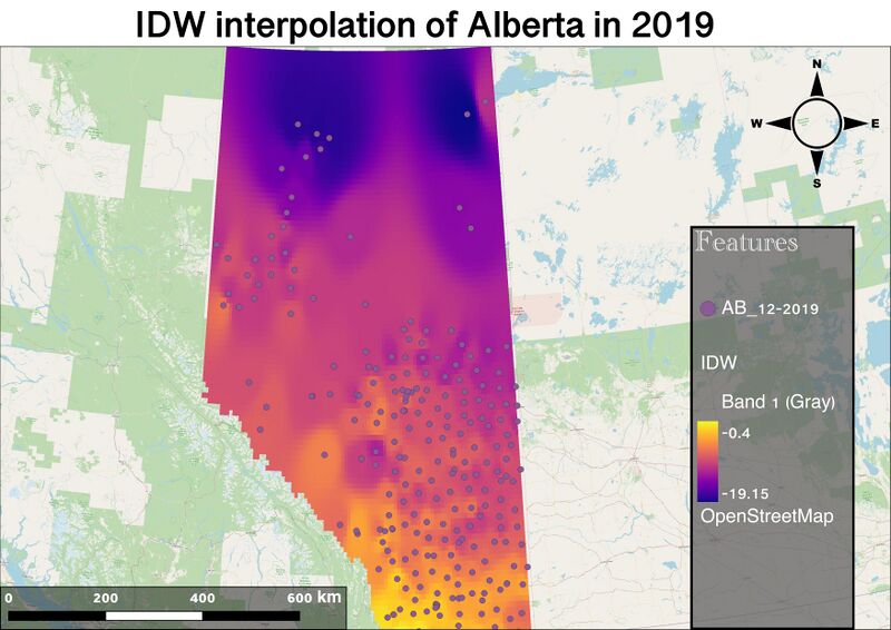
- once you are satisfied with the placement you can start adding in other map elements to display the data in the easiest way possible, we will start by adding in a legend to make sense of our IDW
- By clicking the legend icon labelled "add legend" you can now click and size your legend to fit in your map. Since we are in the layout view and not the mapping tool itself you may see some items in our legend that we do not want there. to remove these unwanted items be sure to unclick the "auto-update" box under the "legend items" tab on your right.
- Once it is unclicked you can select a feater that you do not need in your legend and remove it with the minus button on the bottom of the "Legend item" menu. make sure to title your legend something appropriate for your reader to understand what the symbols are representing in your data.
- from this menu you can adjust the font, size and background for the legend to get your desired aesthetic (get creative while keeping the elements of what make a good map in mind).
- Below the "add legend" button, add in a scale bar and northern arrow of your choosing adjusting the design elements to match the rest of the map. For the Scale bar, you can adjust how many segments are being displayed and how the increments go up.
- to cap off the layout include a title that explains a little about the map itself for example "Alberta weather interpolation for December 2019"
- when you are happy with what you have click the layout tab at the top of the application and select "export as image" or "export as SVG" to export it as a jpeg or SVG. Both are acceptable it just depends on what you will be needing it for after you have finished.
- Once you have saved this you have fully completed this tutorial!
Conclusion
In conclusion, this tutorial aimed to try and bridge the gap between this software and Esri’s products, to make it easier to learn how to use the software and carry out the functions that the user is already familiar with. This all ties into making this tutorial practical and accessible for all users picking up this software for the first time, or just wanting to expand their knowledge. I had originally intended to make this tutorial a kriging tutorial as the data we were using would greatly benefit from weighting distance and degree of variation when predicting the data in an area of interest. unfortunately, all the plugins I tried to use did not work when I tried to run any data through them to create a kriged layer. This led me to make the switch to an IDW map even though it would not allow me to work with the semivariogram to adjust the model. I tried using open Smart map and SAGA plugins with no success even after trying to troubleshoot with the professors themselves. In the future, I would love to see if someone could change this into a kriging tutorial as it would greatly benefit this data and push the tutorial even further. Had I been given more time I would have also expanded the tutorial to use PostGIS, GeoNode or MapServer to expand the tutorial’s viability even more. This would have allowed for easy sharing and the ability to update the data in real-time. None less I hope you learned something about open source programs with this tutorial and that you can update any areas I missed in the future. Feel free to email me if you have any questions or need any advice about the tutorial
best, Pierce
. pierce.w.burch@gmail.com
Resources
Boundary files. (n.d.). Retrieved December 23, 2021, from https://www12.statcan.gc.ca/census-recensement/2011/geo/bound-limit/bound-limit-2011-eng.cfm
Kriging Interpolation—The Prediction Is Strong in this One. (2017, February 4). GIS Geography. https://gisgeography.com/kriging-interpolation-prediction/
Types of Interpolation—Advantages and Disadvantages. (n.d.). GIS Resources. Retrieved December 22, 2021, from https://www.gisresources.com/types-interpolation-methods_3/
Media, G. R. is an initiative of S. (2013, October 4). Interpolation. GIS Resources. https://www.gisresources.com/gis_interpolation_techniques_2/
Canada, E. and C. C. (2011, October 31). Monthly Climate Summaries—Climate—Environment and Climate Change Canada. https://climate.weather.gc.ca/prods_servs/cdn_climate_summary_e.html
Meng, Q., Liu, Z., & Borders, B. E. (2013). Assessment of regression kriging for spatial interpolation – comparisons of seven GIS interpolation methods. Cartography and Geographic Information Science, 40(1), 28–39. https://doi.org/10.1080/15230406.2013.762138
Li, J., & Heap, A. D. (2014). Spatial interpolation methods applied in the environmental sciences: A review. Environmental Modelling & Software, 53, 173–189. https://doi.org/10.1016/j.envsoft.2013.12.008
