Difference between revisions of "User:Brettbechamp"
Brettbechamp (talk | contribs) |
Brettbechamp (talk | contribs) |
||
| Line 73: | Line 73: | ||
Now that you have three raster grids representing each band of the original image (NIR-R-G), if you add them to the map pane, you'll notice they are only displayed individually in a graduated colour scale. To view them combined as in the original image, click on the top most band (band 0.000 representing NIR in this case), go to the properties pane, in the "Type" field under the heading "Colours", select "RGB Composite". |
Now that you have three raster grids representing each band of the original image (NIR-R-G), if you add them to the map pane, you'll notice they are only displayed individually in a graduated colour scale. To view them combined as in the original image, click on the top most band (band 0.000 representing NIR in this case), go to the properties pane, in the "Type" field under the heading "Colours", select "RGB Composite". |
||
| + | |||
[[File:RGBcomp.JPG|Left|400px]] |
[[File:RGBcomp.JPG|Left|400px]] |
||
Revision as of 16:53, 20 December 2018
Contents
Introduction and Purpose
The analysis of multispectral imagery is useful for a detecting a wide range of geospatial patterns that would otherwise not show in visible spectrum imagery. The purpose of this tutorial will be to familiarize you with concepts related to landcover classification from on multispectral imagery, and to expose you to SAGA GIS; an open source application for geospatial analysis.
Software
To perform the tasks described below, you will need to dowload SAGA from sourceforge.net
SAGA GUI interface
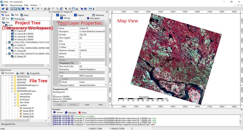
Here is the basic layout of SAGA GIS. Notice the multi-pained format. The project tree or temporary work space is in the top left. This where you'll find all of your project data as well as access SAGA's array of Geoprocessing tools. You can navigate between data view, map layer view, tools, and thumbnails using the tabs at the top of the temporary work space. Below that is the file tree. There is not a lot to be said about this area; It is where you can look up files and folders in order to add data. Beside the file tree is the Tool/layer properties window. This is where you will enter tool parameters, look up layer properties, analyse look up tables and set display parameters for you data. To the right, is the map view; fairly self explanatory.
Data
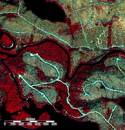
The sample data used for the creation of this tutorial came from the Ontario SPOT Pansharpened Orthoimagery dataset. The dataset can be found on scholar's geoportal Here. The data is three band, false-colour composite imagery with bands NIR-R-G. This combination of spectral bands is often used for the study of vegetation due to the high NIR reflectance of foliage. The dataset was collected with the SPOT satellite between 2005 and 2010. The pixel size for this imagery is 20m and each scene covers a geographic area of 40km by 40km.
Classification Workflow
Getting Started
After you open SAGA, in order to view the data you must first select:
File -> Open
and navigate to the desired image
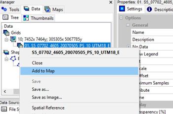
To display the image in the map view pane, right click on the image in the "Data" pane and select "add to map". The image will appear in the Map pane to the right of the screen.
Clipping the Image
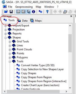
The imagery as it comes from scholar's Geoportal, covers a very large area with a relatively high resolution and therefore, is a very large file (~150mb). In order to improve processing speed and ensure that SAGA does not crash during the classification process, we will first clip a more manageable subset from the larger image. To do this, first click on the "tools" tab at the top of the temporary work space.
Then Navigate to:
Shapes -> Tools -> Create New Shapes Layer
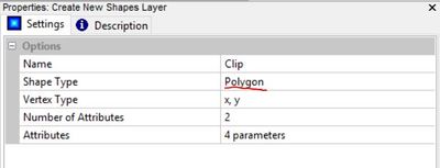
In the properties window for the Create New Shapes Layer tool, enter a name for the shape, select the polygon option, and click "Execute". The other parameters are not important and can be left default in this case.
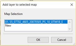
Next, in the workspace pane, click the "Data" tab and double click on the newly created polygon layer. this will bring up the "Add Selected Layers to Map " dialogue box will appear. Add the layer to the map created for the original image.
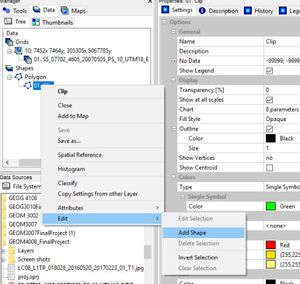
Now right click on the polygon layer in the "Data" pane. Select:
Edit -> Add Shape
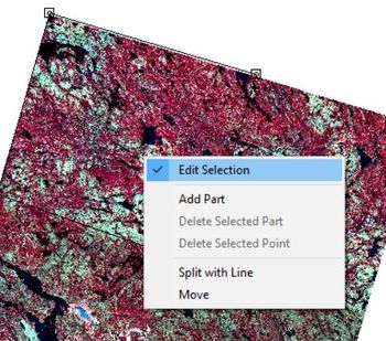
Select Action and use the mouse to select vertices for the new shape in the map pane. I selected the bottom right quarter of the image but any subset will serve the same purpose. When you have finished creating the shape, right click toggle off "Edit Selected Shape".
The save changes prompt will appear, click "Yes"
Now that we have a polygon representing the area we want to clip, in the "Tools" tab of the workspace pane, navigate to:
Shapes -> Grid Tools -> Clip Grid With Polygon
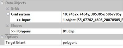
In the tool properties pane, select the original image as the input and the clip layer as the polygons. You will want the target extent to be set to polygons in order to clip the image with the shape instead of the other way around. When done, click "Execute".
In the "Data" tab you will now have three new grids representing each band of the newly cropped image. Feel free to right click on the original image as well as the clip layer and hit "Close" to delete them and keep your workspace clean.
Viewing an RGB Composite Image from Individual Bands
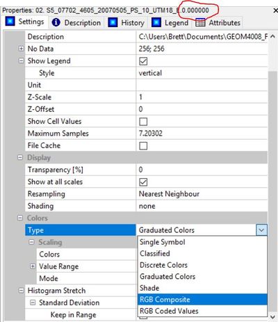
Now that you have three raster grids representing each band of the original image (NIR-R-G), if you add them to the map pane, you'll notice they are only displayed individually in a graduated colour scale. To view them combined as in the original image, click on the top most band (band 0.000 representing NIR in this case), go to the properties pane, in the "Type" field under the heading "Colours", select "RGB Composite".
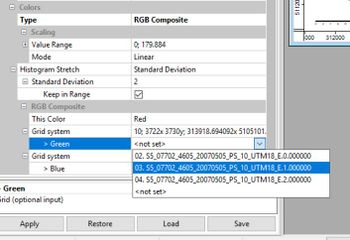
If you scroll down, you will see that the raster band 0.000 (NIR) has been assigned to the red display band of the composite image. If you assign raster band 1.000 (red) to the green display band, and raster band 2.000 (green) to the blue display band and hit "Apply", the resulting image will look like the original.
Improving Contrast
If you take a look at the Image created above, it appears to be slightly "washed out". This is due to the fact that by default, the data is normalized. This means that pixel values are assigned based on a normal distribution on a scale of 1-255, with the majority assigned towards the central tendency of the data. Due to the fact that in the original image, pixel values were not normally distributed, the normalization has removed a degree of spectral difference which we need to recreate by applying a linearr stretch to the histogram.
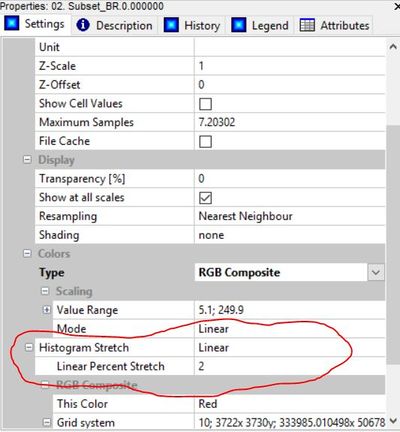
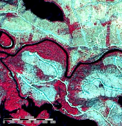
This can be done by first clicking on a band of our image in the workspace pane, then by selecting "linear" in the histogram stretch field. A linear percent stretch factor of 2 will adequately improve contrast. This must be repeated for the other two bands before the image in the map view pane will appear normal.
Comparison of a small section of the image before and after. Illustrating the improvement in the differentiation of distinct features by applying a linear stretch to the histogram.
