Cost Distance Analysis in QGIS - Ottawa Route Planer
Contents
Introduction

The O-Train is the light rail transit system in Ottawa, owned by City of Ottawa and operated by OC Transpo. The Confederation line (line 1) was launched on September 14, 2019 as the first stage of the expansion of the railway network for the city.
Shortly after the launch, the public transit agency OC Transpo rearranged the bus route significantly to encourage the usage of the O train. Specifically, many routes that previously overlap with the new Line 1 were either cancelled or shortened to no longer go through the overlapping parts. Till this day, some passengers still argue that such a change has made their everyday commute much harder than before.
This tutorial is aim to use the above background info as an example to demonstrate the capacity of cost path tool, a raster based GIS analytical tool that is capable of calculating the least-cost path from a source to a destination. The software we will use for this tutorial is QGIS version 3.4.13-2, the most stable version at the time this tutorial is composed (November 2019).
The latest version of QGIS can be downloaded from the following link: (https://www.qgis.org/en/site/ )
Data
In order to conduct cost path analysis, what we need is a layer of O-Train routes, bus routes, and roads. The data required for this tutorial are all acquired through open data platforms. For data access see the links below.
Open Ottawa: O-Train Line Stage 1 (Line 1): https://open.ottawa.ca/datasets/o-train-line-stage-1?geometry=-75.753%2C45.396%2C-75.591%2C45.439
Open Ottawa: O-Train (Line 2): https://open.ottawa.ca/datasets/o-train
Open Ottawa: Road Centrelines: https://open.ottawa.ca/datasets/road-centrelines
OC Transpo: Transit Routes: https://library.carleton.ca/find/gis/geospatial-data/oc-transpo-transit-routes
Preprocessing
In order to conduct an effective analysis, the first step is to clean up the downloaded files.
First, turn on QGIS and load up the downloaded two O Train files and the road centerline shapefile. We will add the transit routes later. We will notice that the north-south orientated O Train (Line 2) is a nice and clean line while the east-west orientated Line 1 contains quite some details.

For the purpose of the cost path analysis, this is less desirable, so we will need to preprocess the vector file first.
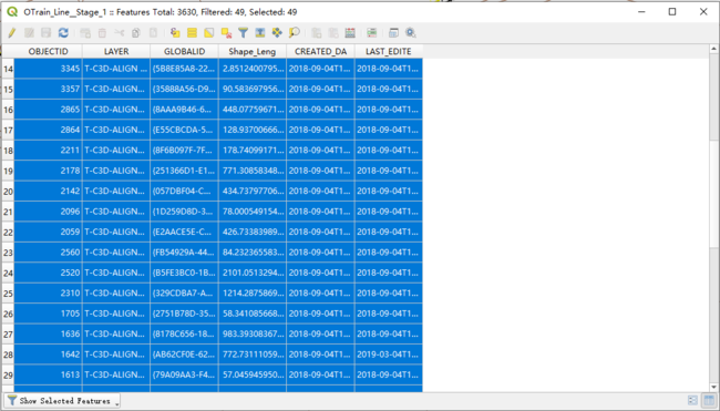
- Click on the Select Feature by Area or Single Click
 icon at the top middle of the screen, select a continuous route that goes from the beginning (Tunney's Pasture) to the end (Blair) of Line 1. Hold down SHIFT to select multiple parts. If you missclicked, click again to deselect.
 - Below is an example of what my selection result looks like, note that only 49 out of 3630 features are selected.
- Click on the Select Feature by Area or Single Click
- After completing your selection, right-click on the layer's name in the Layers panel and select: Export > Save Selected Feature As...
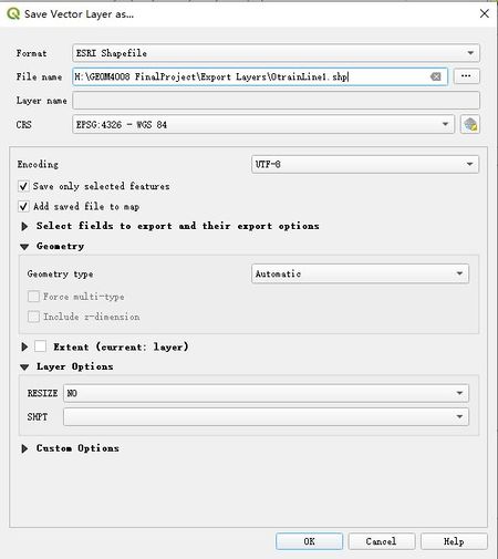
- Set your output format as ESRI Shapefile in the popout window, give it a proper name such as OtrainLine1. Leave other settings as the default and click OK.
- The selected part will be added into your layers automatically. You can double click on the symbol in the layer panel to set the symbology to match the Line 2 format.
- Before Preprocessing:
- After: Pre processing:
- Now, since the newly exported file is made out of many sections, we need to use the Dissolve function under Vector > Geoprocessing Tools > Dissolve...
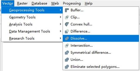
- Select your exported layer as the input in the popout, then press Run.
- As a result, you will get a new layer called Dissolved and if you open the attribute table by right click the name > Attribute table, you can tell that it only has one part.
- Next, we want to combine O-Train Line 1 and Line2 into one layer. To do so, turn on the Union tool under Vector > Geoprocessing Tools > Union...
- Select the Dissolved layer and the Line 2 layer, and press Run.
- Similarly, you will get a new layer called Union in the layer panel.
- However, you might have noticed that the result of Dissolve and Union did not specify a storage path. That is because those layers are not permanent and will disappear after the project is closed.
- To save the result, right click on the name of the layer and select Make Permanent...
- In the popout window, select ESRI Shapefile as the format, enter the path to a folder or use the browse button on the right to specify a file path and file name.
- Note: the layer will become permanently stored if the tool is executed successfully, but the layer name will not change. Thus it will still be called Dissolved in our case.


Now let’s add the bus routes. For simplicity propose, we will choose a start point somewhere away from the O-Train line and a destination close to the O-Train line. Let’s simulate an Ottawa citizen traveling from Westgate residential area to ByWard Market, using public transit (bus + O-Train) vs driving a personal vehicle.

After quick search using Google’s travel schedule explorer, the relevant bus routes are: 80, 81, 85, 34 and 7. Let’s add the corresponding bus routes shapefile downloaded from OC transpo website to the map.

Below is what it looks like after adding the bus routes and changing the symbol for all bus routes to red lines.

Since the bus routes are made out of many segments, so similar to the previous step, use dissolve tool on each bus routes. However, you might noticed that the union tool only allows us to merge 2 layers together, to merge more than 2 layers, we can do the following:
- 1.Run make permanent tool to export all shapefiles.
- 2.Go to Vector > Data Management tools > Merge vector layers, which will open up new window “Merge vector layers”
- 3.Click the … (browse) button under Input layers and select all the layers you want to merge.
- 4.Click Run.
- 5.Change the symbology of your merged layer.

Merge Result:

Also, don't forget to dissolve your merged bus routes layer.
Now, you should have three merged, dissolved layers for buses, roads, and O-Train respectively. Before combing all three, we need one more step.
As shown below, there are some overlaps between bus routes and roads, also similar issues for O-trains and roads.

Strictly speaking, they are not overlaps since there are small distances between lines, as shown below. The distance is less than a meter.

To solve this issue, we need to buffer the O-Train and bus routes layers by a small amount (for example 5 meters) and cut out the road segments that fall within these areas. To do so, go to Vector > Geoprocessing Tools > Buffer to create buffer layers. And Vector > Geoprocessing Tools > Differences to cut out unnecessary parts. In the end, you will get a road network layer similar to the following:

The final step is to use the “Merge vector layers” tool you used for combing the 5 bus routes to combine the Otrain, buses and processed road layers into the vector version of the cost surface.
- Final Result for Preprocessing:

Making Cost Surface
To conduct a least cost path analysis, we first need to make a cost surface.
A cost surface, or cost grid, is a raster grid in which the value in each cell represents the cost that a particular activity or object would be in that cell. Costs could be measured monetarily or in other ways such as amount of time. A cost surface includes the cost of reaching certain cells from one or more source cells. ("wiki.gis.com, 2016")

In our case, the cost will be the amount of time spent to travel through the cell. For example the walking on the sidewalks will have a larger cost than taking a bus because the former cost more time to travel through the same amount of distance (cells).
To assign cost values, we need to know how fast you can travel using different means of transport.
For simplicity purpose, we will use the following number (note the table shows how the cost factors are calculated), which is derived from online searching and GIS based calculations. Note, all speed values have accounted for factors such as traffic light and bus stops.

Now, to assign the cost factor to respective polyline features, open the attribute table of the preprocessing result layer (the one with all three type combined), you will see three records. These data should be identical to the three dissolved layers. So you can tell which belongs to what layer. Or, you can select a row and the content will show up in yellow.
Below is an example, and we can tell the selected feature is the Otrain route visually.

After confirming which row represents what, right-click on the layer in the Layers panel, and select Toggle Editing. In this way, you are allowing QGIS to make this field editable.

Next, find the New Field button ![]() on the top of your attribute table window. In the popout, give your new field a name such as “CostFactor”. Leave the type as integer and click ok.
on the top of your attribute table window. In the popout, give your new field a name such as “CostFactor”. Leave the type as integer and click ok.

The new field will show up in the far-right, manually enter the cost factor we assigned to the corresponding transportation type.

Next, we need to convert the vector file to raster format to create a cost surface. Go to Raster > Conversion > Rasterize (vector to raster)...
In the popout window, select the merged layers as your input layer, CostFactor as the burn-in value field. We also want to set up the cell size for the new raster layer. The layer's default georeferenced unit is degree. Thus the Width/Horizontal and Height/Vertical resolution needs a fraction of it. Since 1 degree approximately equals to 111 km, we will use 0.0001 which is about 11 meters for resolution. In this way, we can capture enough detail while not causing too big of data size. For Output extent, we will click the ... button and choose Use Layer Extent, and choose the input layer to make the raster has the same extent as input vector. Click Run.

A new layer called Rasterized will be added to your map. To check the result, adjust the symbology by right click on the layer > Properties > Symbology. Select Paletted/Unique values as the Render type, then click the classify button below. Since our layer should only have three categories of data (i.e. the cost factor we entered manually), the result shall look like this:

And your cost surface should look like this:

To simulate driving, we want to create a second cost surface, which is similar to the first one but easier.
For the driving cost surface, add a cost factor field for your dissolved roads layer. assign it a value of 21, which is derived from the cost table. Then go through the same rasterize process again. Your output should look like this:

Create Start and End
The last step of preparation is to make the starting point and endpoint. In QGIS, create a new layer is easy. At the top left corner of the window, right underneath the save button, there is a New Shapefile Layer ![]() button. Click on that and a window will popout for creating new shapefiles. Use the browse button to specify a path to your new file. And leave all other settings as default. Click OK.
button. Click on that and a window will popout for creating new shapefiles. Use the browse button to specify a path to your new file. And leave all other settings as default. Click OK.
- Do it twice, one for the start and one for the end

Now two new point layers will be added to your layers panel. Select the start point, and toggle on the editing. Then press Ctrl + . or click the add point feature button ![]() on the top of the window near the new shapefile layer button. Then click on the map to create a new point.You should select location near Westgate and Byward Market on your map.
on the top of the window near the new shapefile layer button. Then click on the map to create a new point.You should select location near Westgate and Byward Market on your map.
- Note: be sure to click at a point that falls within your two raster cost surface layers. Otherwise, the next step will fail because all the blank areas do not contain any cost factor value and the least cost path algorithm will not be able to create cost path through these areas.
Once finished, make sure to save your edits and turn the editing off. You will be asked for ID for your newly created points, which does not matter for this case, you can give it an ID like 001.
Below is where I put my start and endpoint:


Least Cost Path
To conduct the least-cost path analysis, we need to first install the plug-in. Go to Plugins > Manage and Install Plugins... Type in least cost path and install the package. It should take less than a minute.

To use the tool, press down Ctrl + Alt + T or go to Processing > Processing Toolbox. In the search bar, type in least cost path to find the plugin we just installed.

Run the least cost path tool by double click on it. In the popout, choose the raster cost surface we created as the cost raster layer. Choose your start and end point accordingly and hit run. Repeat the same process with another cost surface.

You will get two new layers in the layers panel, both named "Output least cost path". Feel free to rename them so you can differentiate them easier.
After confederate the symbology, your final output should look like this:

In this final output, the red line represents the least cost route using public transit, and the green line is the least cost route when driving.
Result Analysis
Some quick analysis of the result:
- In the attribute table, the total cost of the public transit's least-cost path is 31073.045.
- In the attribute table, the total cost of the driving's least-cost path is 16220.786.
- These numbers tell us that public transit is about twice as slow as driving in our scenario.
- The public transit route overlaps with the O-Train route, which tells us that the O-Train is the preferable method of traveling between the two selected locations.