Creating IDW and Spline Interpolation Maps Using QGIS
Contents
- 1 Learning Outcomes of this Tutorial
- 2 Purpose
- 3 Introduction
- 4 Open Source
- 5 About QGIS
- 6 Example 1 IDWs of Chemical Concentrations
- 6.1 Data
- 6.2 Downloading the Data
- 6.3 Editing the Data
- 6.4 Adding a Base Layer
- 6.5 Specifying a Project Projection
- 6.6 Loading CSV File Data and Provincial Boundary File
- 6.7 Creating the IDW Interpolated Raster Surfaces
- 6.8 Customize the Symbology
- 6.9 Clipping Interpolation Surface to Create a New Raster Layer
- 6.10 Exporting the Final Maps
- 7 Example 2 Meteorological Data
- 8 Creating a Spline Interpolation
- 9 Conclusion
- 10 Resources
Learning Outcomes of this Tutorial
By the end of this tutorial, you will be able to perform the following tasks within 'Quantum' GIS (QGIS):
- Importing point data files (shapefile, CSV)
- Importing satellite imagery basemaps
- Labelling point data using attribute information
- Creating interpolated raster surfaces using (IDW Inverse Distance Weight) and spline interpolation methods
- Symbolizing the interpolated raster surfaces
- Clipping raster surfaces with digitized polygons
- Exporting the raster surfaces as a finished map
Purpose
The purpose of this tutorial is to introduce users to IDW and Spline interpolations, using several tools and plugins within QGIS, with the goal of creating interpolation maps.
IDW uses the measured values surrounding the prediction location to predict a value for any unsampled location, based on the assumption that things that are close to one another are more alike than those that are farther apart. For more information on IDW visit How IDW works.
Spline Interpolates a raster surface from points using a two-dimensional minimum curvature spline technique. The resulting smooth surface passes exactly through the input points.
IDW and Spline interpolations are similar in that they are methods that create surfaces based on similarity of the data or the degree of smoothness. However, spline differs from IDW in that it passes through each sample point. IDW does not pass through any points.
Introduction
QGIS is a free and open source geographic information system (GIS) that is developed and supported by thousands of users and organizations around the world. It's core features include a suite of vector and raster tools that are compatible with many of the most popular geospatial file formats.
This tutorial was completed as a partial requirement of the GEOM-4008 GIS course at Carleton University as the final course project. For a complete list of other tutorials created for this course by students in the past, visit the CUOSG page.
This tutorial incorporates step-by-step instructions and screenshots for each procedure which should be easy to follow along at any skill level.
Open Source
The term ‘open source’ refers to accessible, free and redistributable programs available to the public. Compared to more common commercial packages such as ArcGIS, which have costly license subscriptions, open source programs like QGIS are free of charge to use. Additionally, open source programs and data allows individuals to work together to code. This type of model encourages open collaboration. If you would like, feel free to look at available open source technology at OSGeo.
About QGIS

As described on their website, QGIS is a "A Free and Open Source Geographic Information System", and the latest version of the software (v3.26 Buenos Aires as of September 2022) is available for download on their Official Website. Similar to other GIS platforms it can be used to edit, create, visually represent, analyze and export a variety of geospatial data and it is licensed under the GNU General Public License. QGIS is an official project of the Open Source Geospatial Foundation (OSGeo). It runs on Linux, Unix, Mac OSX, Windows and Android and supports numerous vector, raster, and database formats and functionalities.
Installing QGIS
There are several versions of QGIS available for download. For the purposes of this tutorial, we will be using the long-term release version (QGIS 3.22).
- Follow this link QGIS Download to the QGIS site.
- Ensure that you are on the “Installation Download” tab.
- There are three versions of the QGIS installer available in this tab. The first is a network installer which is not needed for our application, the other two are the latest release (Version 3.26) and the long-term release (Version 3.22). We will be using the long-term release because it provides the most stability and is more widely used due to it receiving minor updates less frequently.

- The slightly older version of QGIS that will be used for the purpose of this tutorial is v.3.22, which can be downloaded by clicking this link.
- Once you have downloaded the software from the QGIS website, follow the step-by-step installation instructions on your computer. After the QGIS v.3.22 LTR is downloaded and ready to execute, double click the QGIS shortcut icon on your Desktop or search for it in the Start Menu. The QGIS window opens, and we are ready to begin.
Example 1 IDWs of Chemical Concentrations
Data
The dataset selected for the purpose of this tutorial is publicly available from the Government of British Columbia (GoBC) from the Regional Geochemical Survey. The joint federal-provincial Regional Geochemical Surveys (RGS) have been carried out in British Columbia since 1976 as part of the National Geochemical Reconnaissance (NGR) program to aid exploration and development of mineral resources. The British Columbia Geological Survey (BCGS) maintains provincial geochemical databases capturing information from multi-media surveys. The latest release (as of September 2022) augments the database with new RGS data compiled from BCGS and Geoscience BC publications between 2016 and 2019. For more information visit the Regional Geochemical Survey Page.
This tutorial uses data provided by the GoBC. However, any point dataset can be used for the purpose of this tutorial, as long as the points have a geographic location and an attribute that can be used for the interpolation (elevation, chemical concentration, precipitation measurements, etc).
Downloading the Data
- Go to the Regional Geochemical Survey Data Page, scroll down to the Data and Resources section and click download to the right of the 2020 database Excel file labeled RGS2020 data.
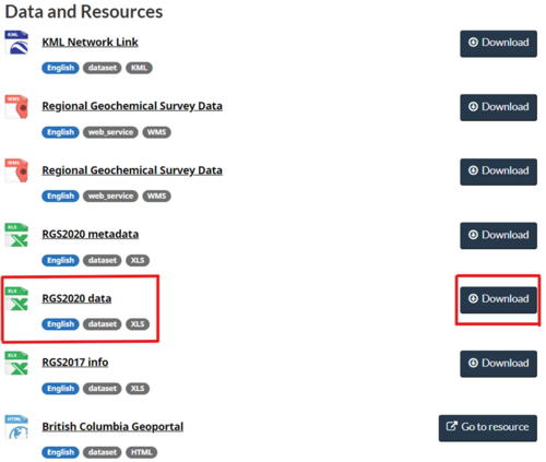
- It is recommended that you also download the metadata file associated with the data if you would like to know an explanation of the various headings.
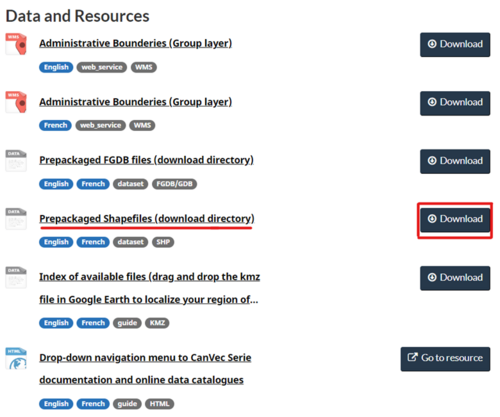
- We will also be using a boundary shapefile to create the extent of the survey data’s raster from Administrative Boundaries in Canada, Download the Prepackaged Shapefiles then add the ‘geo_political_region_2’ files to your project folder.


Editing the Data
This data has very large amounts of variables. As such we need to edit it to make it easier to work with:
- Open the Excel file (or other spreadsheet software- if opening a CSV file make sure that you select "separated by a comma" to format the file correctly).
- Beginning with the variable to include in the set, in this case we are using arsenic concentration in parts per billion (ppb) in filtered, acidified water by ICP-MS.(As_ppb). Use the metadata file to locate the chemical concentration of interest and delete all other variables not dealing with location or identification.
- Once you have done this save your data as a CSV file (File, export, change file type, CSV, Save As) and you are ready to bring them into QGIS.
Adding a Base Layer
- Launch QGIS once you have installed it on your computer and downloaded a suitable dataset to work with.
- At the top of your toolbar, click the plugin tab and click the "manage and install plugins" item.
- In the "all" tab, search for the " HCMGIS" plugin and install it to QGIS. Once this is done restart QGIS.
- Once you are back into a new project layer, click the HCMGIS tab at the top and go to the BaseMap dropdown and select ‘Bing Virtual Earth’.
Specifying a Project Projection
You will also need to specify a projected coordinate system for the project and shapefiles, in order to run interpolations on the data’s output shapefile in later steps. For North American datasets, one would commonly use the NAD83 UTM projections, making sure to select the correct UTM zone for the map area of your dataset. However, for the British Columbia dataset used in this tutorial, NAD83 / BC Albers was chosen for the projection, as it is a British Columbia Environment Standard Projection.
- Use Ctrl+Shift+P.
- In the CRS tab search ‘BC’.
- Click NAD83 / BC Albers under projected coordinate systems then click ‘OK’.

Loading CSV File Data and Provincial Boundary File
There are two simple ways to import the point data into QGIS, depending on the type of data that you downloaded (shapefile, CSV file, excel spreadsheet). If your data is in the form of an Excel spreadsheet (where the points have associated latitudes, longitudes and attribute data), save it as a comma-separated value (CSV) file before trying to import it into QGIS.
- Create a New Empty Project.
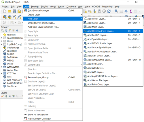
- To import a CSV file, click on the ‘Layer’ tab in the upper left-hand corner of the screen, and select the ‘Add Delimited Text Layer’ tab.
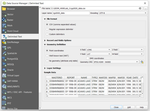
- A window will then prompt you to navigate to your saved CSV file on your hard drive. It is recommended to create a space where you will be saving all your files and file layers (creating a new folder to keep everything in to keep all paths the same for the project is recommended).
- Assign a layer name for the output point data, for this tutorial ‘rgs2020_data’ was assigned. Select the ‘longitude’ field to represent the x-values and the ‘latitude’ field to represent the y-values. You may be also prompted to provide a map projection for the data. If so, select the appropriate geographic coordinate system for your dataset, such as WGS-84 or NAD-83. Then click ‘Add’ on the right-hand side to load the xy point data.
- The next step when loading a CSV file is exporting the loaded point data (from the previous step) to a shapefile. To do this in QGIS, right-click on the loaded point data layer and click export "save feature as".
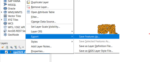
- A window will then prompt you to pick the format of the file being saved, choose ‘ESRI Shapefile’. Browse for a location to save the shapefile on your hard drive and assign the filename RGS_data' for the output shapefile. Make sure the check box for ‘Add saved file to map’ is checked. Then click ‘OK’
- For the provincial boundary shapefile click on the layer tab at the top of the page go to the "add layer" tab and scroll to the "add Vector layer" tab.
- In the new window, click the 3 dots at the top right corner of the screen (you will be finding the boundary file we downloaded) in the package you downloaded click the file with the .shp end to it and add it to your project.
- Once it is loaded right-click on the layer and select "Open attribute table"
- Once open, click the pencil at the top left of the window to toggle editing.
- Then select all layers besides those labelled British Columbia and click the "delete selected feature" (red trashcan).
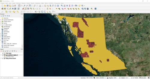
- Once this is complete you should have the RGS data layer, the British Columbia boundary layer, and the base map layer in your project layers from top to bottom. It should look like the image below.


Creating the IDW Interpolated Raster Surfaces
Before creating the IDW layer the data should be cleaned, first, we need to select all areas with water with valid arsenic concentration levels (i.e. > 0): to do so, follow these steps:
- Right click on the RGS_data layer and open its Attribute table.
- Click on “Select features using an expression”.
- In the window, write the following expression: "As_ppb" > 0, and then click “Select features”.
- Invert Selection using Ctrl+R, edit the selection with Ctrl+E and delete the selected features.

Now that we have selected all the survey areas with arsenic concentrations greater than 0, we can proceed with the IDW interpolation.
- Click on the ‘Processing’ tab and select ‘Toolbox’ or Ctrl+Alt+T. Search IDW. You will notice that QGIS draws tools from different GIS sources (GDAL, GRASS, SAGA, etc.) including its own QGIS tool selection. If you use the IDW tool from GRASS or GDAL, it will provide more options including how many sampling points to be used, radius distance, cell size, etc. compared to default QGIS IDW Interpolation tool which only allows specifying the P value, and number of output rows and columns. For this tutorial we will use the protectory software provided by QGIS.
- Click on the IDW interpolation tool from QGIS.
- The IDW input window will then appear, which allows you to input the data layer being interpolated and customize the interpolation based on your needs. For the ‘Vector layer’ input use the ‘RGS_data’ shapefile layer.
- Next, specify the Interpolation attribute, which is the field value to be interpolated. The map we are making deals with arsenic concentration levels so chose the corresponding field, ‘As_ppb”. Click on the ‘+’ sign to add the attribute.
- The Extent will be the BC boundary, choose the ‘calculate from layer’ dropdown, then choose the ‘geo_political_region_2’ layer. Then at bottom of the window tool, you can specify a place where the output will be saved. If you want to view the result before you save it, leave it as temporary file. For the tutorial we will name the file ‘IDW_QGIS’ Finally click Run button to start the interpolation. When finished the result will be added to your QGIS map canvas. See image below for inputs.

Customize the Symbology
The IDW interpolation tool will then output a black and white interpolated raster surface onto the map area. Drag the grid layer bellow the point shapefile layer. To make it more beautiful customize the symbology. To do it, right click the output result and select Properties (Or simply you can double click the layer name). The Layer Properties window will appear. Select Symbology. In the Band Rendering option change the Render type to Singleband pseudocolor. Right away the output value will be classified into some classes with different colour. You can change the number of classes or change the colour, just explore if you want.
After modifying the colour ramp values to reflect the range of values in a suitable way click ‘apply’ and ‘ok’ and you will now have coloured map of the IDW interpolation surface for arsenic concentration in parts per billion (ppb) in filtered, acidified water in British Columbia with a matching legend. Figure 7 is an example of inputs used. The values were classified initially using the mode ‘quantile’ then reclassified to spread out the larger concentrations of arsenic (since there are very few areas with larger quantity of arsenic). The colour ramp used is Viridis. The last step of this mapping process is to create a polygon of the BC boundary which will be used as a mask to clip the interpolation surface.
Additionally, feel free to play with the symbology of the RGS_data points to make them visible from the new coloured IDW layer using the same symbology tab or add labels.

Clipping Interpolation Surface to Create a New Raster Layer
This portion of the tutorial will provide instructions on how to create a clipping mask for the interpolation raster surface. So that the interpolation does not extend onto different areas which are not the province of BC. Please note that since this is not a tutorial on a specific area the land concentrations may have very different Arsenic concentrations compared to water.
- At the top of the application there is a raster tab. Go to the dropdown ‘Extraction’ tab and select the “Clip Raster by Mask Layer”.
- At the top of the window select your interpolated layer as the “input layer”, the IDW_QGIS layer. The mask will be the shape of BC’s boundary so choose the boundary file, geo_political_region_2 as your “mask layer”.
- Ensure that both layers are using the same projection and then click run.
- You will notice that the reclassified grid is now clipped, but the default original greyscale colouring has returned.There is a quick way to re-symbolize the clipped raster with the appropriate colour ramp.
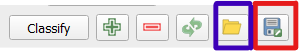 ‘Export Colour Map File’ is in red, ‘Load Colour Map from File' in blue
 - Right-click on the ‘reclassified grid’, the IDW_QGIS layer which still has its intact colour ramp and open the properties menu. Click on the ‘export colour map file’ button and save the text file to hard drive. Then re-open the properties menu for the ‘Clipped(mask)’ raster, select the ‘symbology’ tab, and then pick ‘Singleband Pseudocolor for the ‘render type’. Then click on the ‘load colour map from file button’ (to the left of the ‘export colour map to file’ button) and open the saved text file from the earlier step. You will now notice that your legend is back to the original format.
- You will notice that these layers are only temporary and if you close the application the created layers would not save. To combat this, we need to export the layer as its GeoTIFF file so that we can save the data for later.
- Right-click on the layer and click export “save feature as”.
- Make sure the format is GeoTIFF and click the 3 dots next to the file name. in the folder you created earlier give this layer a name such as final_RGS_IDW. Save the project if you have not done so already.

Exporting the Final Maps
Now we will make a print layout of the map and save it as an image.
- Under the ‘Project’ tab, select “New Print layout”.
- Assign a ‘print layout title’ that will be used for the new print layout (For example: ‘Ex1 Map’).
- Under the ‘Layout’ tab, you can add a number of map elements to the print layout including the actual map, a legend, scale bars, etc., depending on the nature and purpose of the final map.
- For this tutorial, experiment by adding the IDW interpolation map, map title (under ‘add label’), a legend and scale bar. A few tips: Make sure you zoom to the layer extent of the spline interpolation map first before adding it as a map to the print composer, text editing for the ‘label’ is done in a text editing box on the right-hand side of the print composer window. There is a wide variety of graphics editing tools within this print composer, so feel free to explore and play with them before exporting the final map.
An example final output map is shown below.

The last step of this tutorial will be exporting the map.
- There are a number of formats available to export the final map as, which including: PNG file, PDF or as an SVG file. For the purpose of this tutorial, we will export the map as an Image (PNG) file. To export the map, click on the ‘layout’ tab and select the ‘Export as Image’ tab.
- Assign a file name to the exported file and click save.
That concludes this tutorial.
Example 2 Meteorological Data
Data
Data can be downloaded from the Government of Canada’s Monthly Climate Summaries which has values of various climatic parameters, including monthly averages and extremes of temperature, precipitation amounts, degree days, and sunshine hours.
Follow the steps on the site to download data from a specific date, province/territory, and data format.
- For the purpose of this tutorial we will download the data from August 2022 for all of Canada.
- Download the CSV. If you want to choose from the variables they give download the legend in a txt format as well.
- Save the file to a project file in your drive.

- We will be using the same extent boundaries from Administrative Boundaries in Canada as we had in the previous section.
Editing the Data
The climate data has very large amounts of variables. As such we need to edit it to make it easier to work with like we had done in the previous example.
- Delete the variables that are unneeded.

- The location data, identifiers and mean temperature data was kept (see figure x), cells without data were also deleted.
Loading CSV File Data
- Open QGIS and create a New Empty Project.
- Add the boundary layer.
- We need to clean up the boundary file to use the data. Go to the Layer tab, add vector layer then upload the 15m Canada boundary file named ‘geo_political_region_2’ shapefile. Open the attribute table, toggle the edit mode then delete any cells that are ‘Not Identified’ and that are ‘Outside of Canada’ in the ‘bodt’ variables.
- Follow the steps from the previous example to add the csv data for the climate data. I had renamed the created vector layer into ‘Climate_Canada_082022’. Export then save feature as shapefile. I renamed the points as ‘CC2022’.
- Right click the new ‘Climate_Canada_082022’ layer.
- The projection of the map was also changed to ‘Canada_Albers_Equal_Area_Conic’ at this point as well. See the previous section on Specifying a Project Projection.
- Save the project. The result should look like the image below.

Run the IDW Tool
- Click on the ‘Processing’ tab and select ‘Toolbox’ or Ctrl+Alt+T. Search IDW. For this tutorial we will use the protectory software provided by QGIS.
- Click on the IDW interpolation tool from QGIS.
- The IDW input window will then appear, which allows you to input the data layer being interpolated and customize the interpolation based on your needs. For the ‘Vector layer’ input use the ‘Weather Station’ vector layer, previously the ‘CC2022’ shapefile layer.
- Next, specify the Interpolation attribute, which is the field value to be interpolated, ‘TM’, the Temperature means of August 2022. Click on the ‘+’ sign to add the attribute.
- This time we will change the distance coefficient P to 4 to account for more sparse northern areas in this dataset.
- The Extent will be the Canadian boundary, choose the ‘calculate from layer’ dropdown, then choose the ‘geo_political_region_2’ layer. Then at bottom of the window tool, you can specify a place where the output will be saved. If you want to view the result before you save it, leave it as temporary file. For this example, leave it as a temporary file.
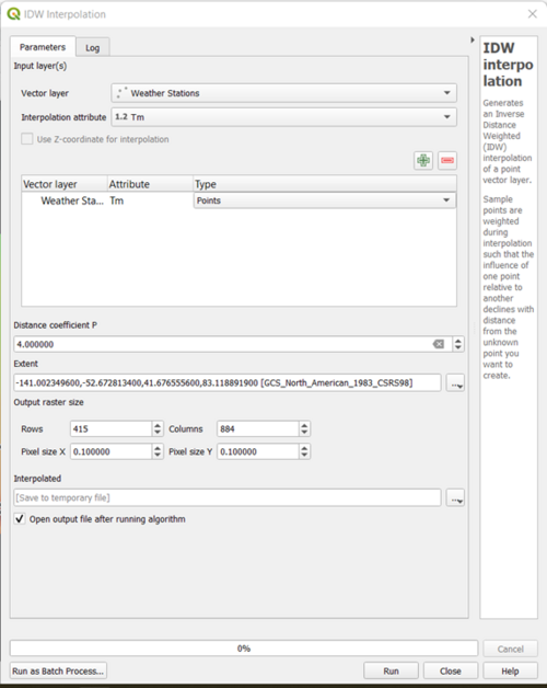
- Finally click Run button to start the interpolation. When done the result will be added to your QGIS map canvas (See figure 5 for an example inputs).
- You can save the new raster file for later use by right clicking on the new IDW layer, hover over the export dropdown menu, and saving the feature as a geoTIFF file.

Clipping the Raster Layer and Changing the Symbology
Create a clipping mask for the interpolation raster surface.
- At the top of the application there is a raster tab. Go to the dropdown ‘Extraction’ tab and select the “Clip Raster by Mask Layer”.
- At the top of the window select your interpolated layer as the “input layer”, the Mean Temperature raster layer we had created in the previous step. The mask will be the shape of the Canadian boundary so choose the boundary file, geo_political_region_2 as your “mask layer”.
- Ensure that both layers are using the same projection and then click run.
- You will notice that the reclassified grid is now clipped.
- To change the symbology, right-click on the new clipped raster layer, open the properties menu for, select the ‘symbology’ tab, and then pick ‘Singleband Pseudocolor for the ‘render type’. Choose the way in which you would like to classify the data, for this data the continuous mode was used. The colour ramp used is called turbo.
- You will notice that these layers are only temporary and if you were to close the application the created layers would not save to combat this, we need to export the layer as its GeoTIFF file so that we can save the data for later.
- Right-click on the layer and click export “save feature as”.
- Make sure the format is GeoTIFF and click the 3 dots next to the file name. In the folder you created earlier give this layer a name such as Mean_Temperature.
- (optional) Add baselayer of choice from the HCMGIS plug-in as you had done in the previous example.
- Save the project if you have not done so already. For an example of the symbology inputs thus far see the image below.

Create a Print Layout
- Create a print layout using Ctrl+P.
- Use the ‘Add Item’ tab to add a map, scale bar, north arrow, and title.
- Play around with it stylistically.
- The end result will look like the photo below.

Creating a Spline Interpolation
The next interpolated raster surface that will be created in this tutorial is a thin plate spline interpolation surface, using the ‘Weather Stations’ point dataset as the input.
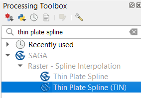
- Use the same map window as the IDW interpolation, just turn off the ‘Mean_Temperature’ raster layer so that just the data points are visible again. In the processing toolbox search for ‘Thin Plate Spline’ which will result in one SAGA spline tool with that title. Open the SAGA ‘Thin plate spline (TIN)’ tool.
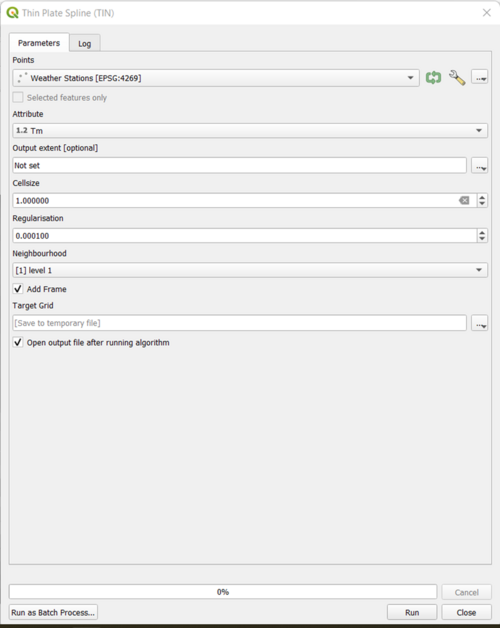
- Use the ‘Weather Stations’ for the input data points. Again, use Tm for the input attribute. Use the value of 0.000100 for the ‘Regularization’ input. Change the ‘Neighbourhood’ to ‘[1] level 1’. The remainder of the inputs were left with their default value, except cell-size which was changed to 1.0. Run the tool. Change the values if needed.
- Rename the output grid layer from ‘Target Grid’ to ‘SplineTM’. It should look like the image to the right.
- Next, we will clip the ‘SplineTM’ raster with the Canadian boundary shapefile, using the same technique that was used for the IDW interpolation surface raster Clipping tutorial. Use the ‘SplineTM’ as the input and specify an output filename of ‘SplineClip’. Now that the spline interpolation surface has been clipped, the last step is to assign a colour ramp to it.
- The next step will be to symbolize this output grid with the same range of Mean Temperature value used in the IDW interpolation tutorial. Right click on the layer, open the ‘Properties’ into the ‘Symbology’ tab. In the Band Rendering option change the Render type to Singleband pseudocolor. After modifying the colour ramp values to reflect the range of values in a suitable way click ‘apply’ and ‘ok’. The mode used for the spline interpolation is similar to that of the IDW Mean Temperatures layer. The mode was ‘Continuous’ and the colour ramp was ‘Turbo’.
- Create a print layout, export the map, and that is all for the Spline portion of the tutorial. The resulting final spline interpolation surface should look like the image below.


A map with the IDW and Spline Interpolations will look like:

Conclusion
In conclusion, this tutorial aimed to show the user how to import point data into QGIS, run interpolations on the point data, clip and symbolize the data and export the interpolated data as a finished map. I hope this tutorial provided adequate instructions on how to download the software and data, edit data, and to perform the various tasks needed to create IDW and thin plate spline interpolation maps. Perhaps in the future a kriging tutorial could be added to this interpolation tutorial.
Resources
- ArcGIS Pro 3.0. (n.d.-a). How inverse distance weighted interpolation works. ArcGIS Pro. Retrieved October 5, 2022, from https://pro.arcgis.com/en/pro-app/latest/help/analysis/geostatistical-analyst/how-inverse-distance-weighted-interpolation-works.htm
- ArcGIS Pro 3.0. (n.d.-b). IDW (3D Analyst). ArcGIS Pro. Retrieved October 5, 2022, from https://pro.arcgis.com/en/pro-app/latest/tool-reference/3d-analyst/idw.htm
- ArcGIS Pro 3.0. (n.d.-c). Spline (3D Analyst). ArcGIS Pro. Retrieved October 5, 2022, from https://pro.arcgis.com/en/pro-app/latest/tool-reference/3d-analyst/spline.htm
- BC Environment Standard Projection. (n.d.). Retrieved October 5, 2022, from https://ibis.geog.ubc.ca/~brian/Course.Notes/bceprojection.html
- Environment and Climate Change Canada. (2022, August 17). Monthly Climate Summaries - Climate. Environment and Climate Change Canada. https://climate.weather.gc.ca/prods_servs/cdn_climate_summary_e.html
- Han, T., & Rukhlov, A. S. (2020). Update of the provincial Regional Geochemical Survey (RGS) database at the British Columbia Geological Survey. British Columbia Ministry of Energy, Mines and Petroleum Resources, British Columbia Geological Survey GeoFile. https://www2.gov.bc.ca/gov/content/industry/mineral-exploration-mining/british-columbia-geological-survey/geology/regional-geochemical-survey
- Homepage - OSGeo. (n.d.). OSGeo. Retrieved October 5, 2022, from https://www.osgeo.org/
- Jones, L., & Rukhlov, A. (2020, December 10). Regional Geochemical Survey Data - Open Government Portal. Government of British Columbia. https://open.canada.ca/data/en/dataset/49a73c36-4a25-4be5-b6d1-abd020fb031a
- Natural Resources Canada. (2022, February 1). Administrative Boundaries in Canada - CanVec Series - Administrative Features. Government of Canada; Natural Resources Canada; Strategic Policy and Innovation Sector. https://open.canada.ca/data/en/dataset/306e5004-534b-4110-9feb-58e3a5c3fd97
- OSGeo. (n.d.). Choose a project - OSGeo. OSGeo. Retrieved October 5, 2022, from https://www.osgeo.org/choose-a-project/
- QGIS. (n.d.). Welcome to the QGIS project! Retrieved October 5, 2022, from https://www.qgis.org/en/site/
- Wikipedia contributors. (2022a, June 16). Universal Transverse Mercator coordinate system. Wikipedia, The Free Encyclopedia. https://en.wikipedia.org/wiki/Universal_Transverse_Mercator_coordinate_system
- Wikipedia contributors. (2022b, June 24). Interpolation. Wikipedia, The Free Encyclopedia. https://en.wikipedia.org/wiki/Interpolation
- Wikipedia contributors. (2022c, August 16). QGIS. Wikipedia, The Free Encyclopedia. https://en.wikipedia.org/w/index.php?title=QGIS&oldid=1104710526
- Wikipedia contributors. (2022d, August 27). North American Datum. Wikipedia, The Free Encyclopedia. https://en.wikipedia.org/wiki/North_American_Datum#North_American_Datum_of_1983
- Wikipedia contributors. (2022e, August 30). Comma-separated values. Wikipedia, The Free Encyclopedia. https://en.wikipedia.org/wiki/Comma-separated_values
- Wikipedia contributors. (2022f, September 15). Geographic Information System. Wikipedia, The Free Encyclopedia. https://en.wikipedia.org/w/index.php?title=Geographic_information_system&oldid=1110491855
- Wikipedia contributors. (2022g, September 22). Projected coordinate system. Wikipedia Contributors . https://en.wikipedia.org/wiki/Projected_coordinate_system
- Wikipedia contributors. (2022h, September 28). Geographic coordinate system . Wikipedia, The Free Encyclopedia. https://en.wikipedia.org/wiki/Geographic_coordinate_system
- World Geodetic System 1984 (WGS84). (n.d.). Qinsy. Retrieved October 5, 2022, from https://confluence.qps.nl/qinsy/latest/en/world-geodetic-system-1984-wgs84-29855173.html