Making Maps that Look Great Using QGIS and Inkscape
Purpose
The purpose of this tutorial is to demonstrate how to edit the appearance of a map made in QGIS by importing it into Inkscape as a scalable vector graphic (SVG).
Introduction
After reading the purpose you might be asking yourself “Why bother? Are the default settings in QGIS not good enough?”. This introduction will attempt to answer those questions.
The definition of cartography from the International Cartographic Association is “The art, science, and technology of making maps, together with their study as scientific documents and works of art. In this context may be regarded as including all types of maps, plans, charts, and sections, three-dimensional models and globes representing the Earth or any celestial body at any scale” (Meyen 1973, 1)
In the paper cited above, Meyen outlined the importance of aesthetics and design in cartography, as it is both an art and science. Although the priority when making a map is conveying the necessary information, improving the aesthetics of the map can significantly improve its quality and usability. Often, attractive design will go hand-inhand with clarity of information. Not only will working on design improve the visual appeal of a map, but it can also help convey the information better.
Some advantages of a well-designed map include: higher professionality, higher engagement with viewer attention, conveying of information more effectively, and invoking intended impressions from viewers.
The cartographic community has quite a few online resources to share maps, receive feedback, and browse other creations. Some include:
- www.cartographersguild.com
- www.cartotalk.com
- www.maproomblog.com
- Map Making Subreddit
- Axis Maps Cartographic Guide
Principles of design and cartographic design have both been written on extensively. Reading up on these will give you ideas of concepts you should consider while designing your maps. The following are a few links to articles on principles of design:
- Design Principles for Cartography
- 8 Basic Principles of Design to Help You Create Awesome Graphics
- Labeling and Text Hierarchy in Cartography
- Make Maps that People Want to Look at
- Basics of a Map
These offer up some principles that you can use to guide your design. Some more specific cartographic elements that you should consider when creating map layouts are:
- Colour: You should select colours that complement each other, draw attention to the important parts of them map, and convey the intended message. Looking at a colour wheel can help you determine which colours go together, but experimenting to see what looks good also works. Colour can be used in text, backgrounds, fills and outlines of objects, or any other part of a map. A good resource to find colour schemes for maps is Colour Brewer. This site lets you choose if your data is sequential, diverging or qualitative. Furthermore, making your map accessible is an important consideration when determining which colour scale you will be implementing. Individuals with visual impairments can often have difficulty interpreting colour schemes for qualitative data due to the differences in which they perceive various hues and shades. Designing Maps for the Colour-Vision Impaired explains how these impairments manifest when engaging with maps, and provides solutions so that visualizations are attractive to all users, including those with colour vision deficiencies.
- Text: Picking the right fonts is important to the design of a map. A font should be legible, look good and fit in with the theme of the map. In addition to default fonts pre-loaded in text editing software, there are many resources online for open-source fonts. A good start is Google Fonts. To install fonts from here, find one you like, download and unzip it, then right-click the TrueType file for the styles you want and select “Install for all users” (this is how to do it on Windows - check documentation for other operating systems). The font should then be useable in QGIS, Inkscape or any other software. In addition to selecting a font, choosing its size, weight and colour is also important to determine where it stands in the visual hierarchy. Much like the colour scheme, font choice can have a significant effect on the accessibility of the map for users experiencing limitations in the vision. Text halos, spacing, and distinction in what your labels are classifying can improve readability and grow your maps audience by connecting with users from different backgrounds. The Typography chapter of Sarah Schlosser's cartography visualization guide provides further examples on why this is important and the considerations that should be made when beginning the design process.
- Composition: The arrangement of the components of your map is integral to the impression it gives the viewer. A map where everything is placed deliberately and effectively will have a sense of balance to its appearance, without which the map will look sloppy. Finding the right composition for a layout requires experimentation, and there is usually more than one possibility for balanced arrangements. Furthermore, the visual hierarchy defined by your map's composition can have an effect on how your audience prioritizes their focus when engaging with the map, determining their understanding of the information being presented.
- Map Elements: Each element of a map should be carefully considered. This can include the data frame, title, scale bar, legend, north arrow, inset map, etc. They should be consistent and unified in their appearances to ensure the final product looks cohesive. Editing these in QGIS can be a laborious process, but Inkscape lets you fine-tune them manually, giving you much more control over their appearance and opening up new possibilities.
Hopefully this section has answered the question of “Why bother?” and explained the importance of aesthetics in cartographic design. It should also have given a conceptual basis in map design, that can be used in accompaniment with the technical skills that will be taught in this tutorial, to create maps that look good.
Software
This tutorial will use two different free open source programs; QGIS and Inkscape.
If you do not already have QGIS, it can be downloaded here. QGIS version 3.44.3 'Solothurn' will be used in this tutorial, though other versions should work just as well. It will be assumed that the user already has a basic knowledge of QGIS but some details will be provided on how to set up a project and extract data from a shapefile. If you would like to learn more about these things, there are plenty of resources on the internet, including on the QGIS website.
The second part of this tutorial will use Inkscape. Inkscape is a free and open-source design software which allows users to work with vector graphics. Transitioning from QGIS to Inkscape will give the user much finer control over the design of the map, but without losing any quality, as it is works with vectors just like QGIS. Using Inkscape, you will be able to manually edit every element of the map. Inkscape 0.92.3 can be downloaded here. Inkscape provides some tutorials on their website if you would like further guidance on their software. It is worth noting that Inkscape also requires the program XQuartz to run, this can be downloaded on the same page as the Inkscape download, or here, and the website provides installation instructions there as well as in their FAQ section.
This tutorial will assume users have little to no experience with Inkscape or QGIS, as such, there will be some explanation on their tools and strategies that can be used to improve map design. Let's get started!
This tutorial will assume users have little to no experience with Inkscape or QGIS. It will explain some of the tools within these softwares that can be used to improve your map designs. Inkscape has tutorials on their website if you would like more information. QGIS has tutorials on their website. There are also many tutorials to be found elsewhere on the internet for both programs.
Data
In this tutorial users will create a map of Canada, showing the provinces and their capitals. The data for this will come from Natural Earth. This is a great place to download free open-source vector or raster files for the entire Earth. Two files will be downloaded from this website, click their names in the list below to download them.
Download the above files, then extract them to the folder where you will store all the data for your QGIS project. Both files cover several countries, so the data for Canada will need to be extracted in QGIS.
Tutorial
Setting Up the Map in QGIS
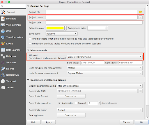
Once you have all the software installed and the data downloaded, open QGIS and start a new project. In the project properties set the project home to the folder where you extracted the data, then set the project coordinate reference system to “NAD83/Statistics Canada Lambert” (EPSG: 3347); this projection will place Canada in the centre, so it does not look distorted.
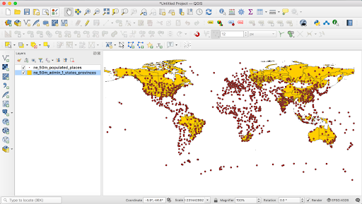
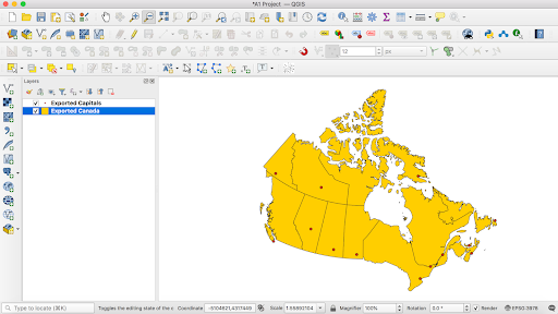
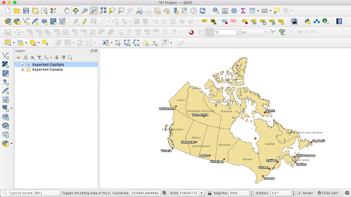
Add the shapefiles to the data frame, and arrange the layers so they are both visible. Your project should look something like this:
Next, using “Open Data Source Manager” add the shapefiles to the data frame, and arrange the layers so they are both visible.
Your project should look something like this:
As was previously mentioned, the shapefiles we have cover more than just Canada. When designing maps, having background data in the final layout can be good, providing context to the area of interest. However, this presents a challenge when working with these two programs. Exporting an SVG file from QGIS extracts everything in the data frame, not just what is displayed in the layout. This leaves you with excess data in Inkscape, making it difficult to work with. For this tutorial, we will be extracting the Canada data from the downloaded shapefile as its own file, so that is all that will be included in the SVG.
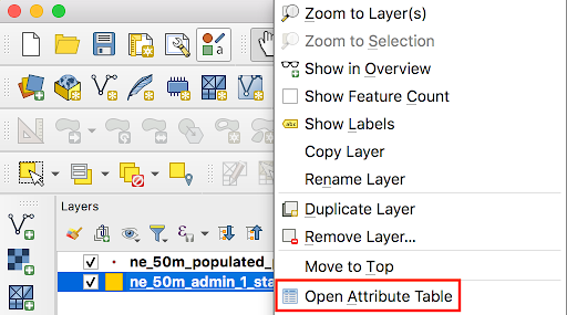
To extract Canada’s provinces, select the "Properties tab for this layer, then select the "Open Attribute Table".
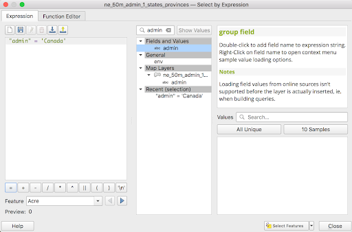
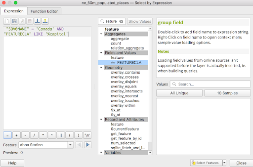
Use the “Select by expression”, which is located at the top of the attribute table.
Use the expression:
Once the area of Canada is highlighted in yellow, you know it is selected. Now right click the layer and select the "Export" option, next select the "Save Selected Features As..." Now, to the right of the "File Name" option make sure to click the 3 dots and select where you want the shapefile to be saved. It is best to save it in a folder where your project is located.
Extract the selected features, saving them into the folder where the rest of your data is stored, with an appropriate name.
To extract Canada’s capitals, do the same with the expression:
Once this is done, you can remove the two original shapefiles. You now have all the data you need. Your project should look like this:
Starting the Layout in QGIS
You can now begin designing your map. You should add all of the map elements in QGIS before bringing the map into Inkscape. Inkscape will give you much more control over the minute details, but QGIS will make larger-scale changes easier, such as adding all required map elements.
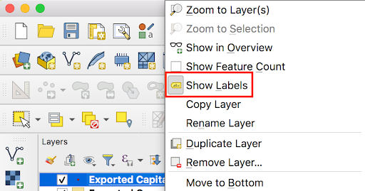
First you should add labels for both the provinces and cities with their respective “name” fields. This can be done by right clicking the desired layer and selecting “Show Labels".
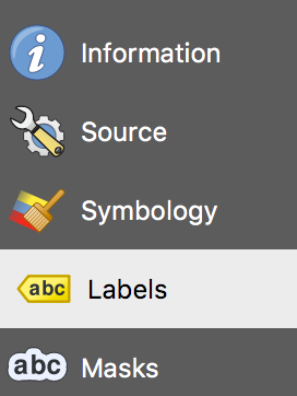
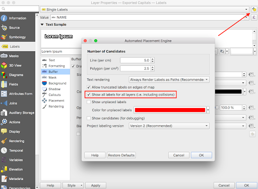
To customize the labels, navigate to the Layer Styling panel by right clicking on the desired layer, selecting properties, and then clicking on the "Labels" section of the menu, it should resemble the screenshot below:
Here you can also select font type, style, size and colour. You should play around with these, as well as the symbology for the layers until you get something you like. Some recommendations to consider, but note that you will be able to edit all of this in Inkscape:
- Choose serif fonts for a more clean, modern look to your map, and choose sans-serif to give it a more formal appearance, reminiscent of a newspaper or magazine (this will not always be that case, and you can use a mix if you want). This tutorial will go with the latter option, though you could just as easily go in the other direction. The design created here uses the fonts “Cinzel” and “EB Garamond”, both found on Google Fonts. A good choice of sans serif font that can be found there is “Roboto”.
- Colour is also important to the feel/theme of the map. Using a beige/brown/red colour palette will also contribute to that formal look, giving it an almost historical appearance. You can use the “colour picker” feature in QGIS to copy the colours from the images here. Use any colour scheme you feel looks good and supports the theme.
- Font size, weight and colour will influence the visual hierarchy. The example here uses a larger but slightly lighter font for the province labels, and a smaller, darker font for the city labels.
- Consider the symbology for both layers. The default may look fine, but you could almost definitely improve it, even with small changes.
An example of what the map might look like once the labels and colours have been edited can be seen below. Feel free to copy the style used here, or to go off in your own direction. Do not worry about label placement, as that will be much easier to edit in Inkscape. In this case, I have altered the symbology so that provincial capitals are in bold and have a black buffer surrounding them so that the lettering is clearly visible against the background. Additionally, I have changed the polygon colouring for the extracted province shapefile to further enhance clarity and give the map an aged appearance.
There is an important step that must be done before proceeding in order to ensure a smooth transition to Inkscape. Go into the Rendering tab of the labeling panel, and make sure that the box for Show all labels for this layer (including colliding labels) is checked. Do this for both layers. This will ensure that all labels appear on exported map, and that the text is recognized as text in Inkscape. See the image below for where to find these settings.
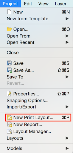
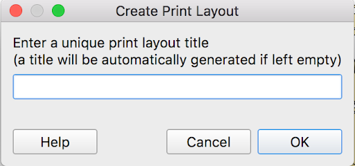
The next step is to create a new layout in QGIS. You will want to add all the components to this layout: the map, scale bar, legend, title and a north arrow. Set the scale for the map to around 1:53247772 as this will fill out the page well. For the other elements, select the font and style that you like. In the “Project” tab at the top of your screen select “New Print Layout” and enter an appropriate layout name of your choice.
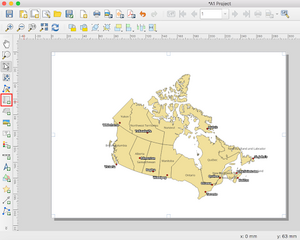
Adding the map to the layout is simple, first click on the "Add Map" icon on the left side toolbar. This will add the current version of the map which is already loaded in QGIS so make sure to add the map after figuring out the proper scale you want the map to be.
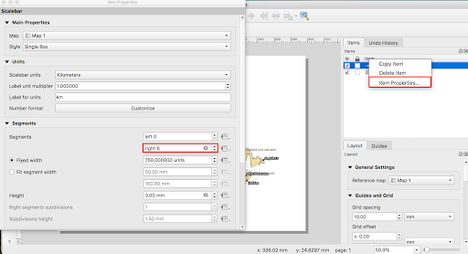
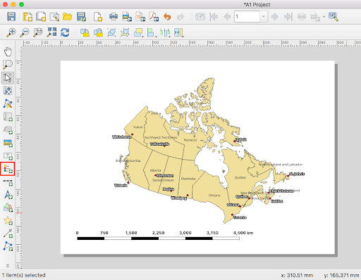
To add the scale bar, click the "Add Scale Bar" option on the same left side toolbar as “Add Map”. If you wish, you can then edit the size of the scale bar. Make sure the scale bar is set to the proper map in the properties tab of the scale bar. This is only an issue when dealing with inset maps because sometimes the scale will automatically attach to the inset map rather than the desired map. You can also adjust the amount of segments that you desire in the properties tab.
To add the legend, make sure to select the "Add Legend" icon in the same toolbar as “Add Map” and “Add Scale Bar”. You can then adjust what you want to put in your legend by turning off the "auto update" option in the "Properties" tab for the legend. Now select what you want to be removed and click the red minus button. This is very helpful to remove base maps and other unimportant items from the legend. Much like the scale bar, you can also edit other properties within the legend to customize its appearance, such as changing the border, font, etc. To do this, perform the same steps as you did to edit the scale bar, right clicking on the <Legend> in the “Items Pane” on the right side of the window. As you can see below I’ve once again made the font bold to improve readability.
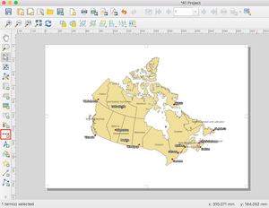
As you can probably guess, to add the north arrow you must select the "Add North Arrow" option on the same toolbar as the “Add Legend” and “Add Scale Bar” icons. You can then adjust the size to what looks the best with your map.
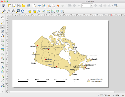
I have reorganized some of the map elements, but the final product of the map should look something like this:
Transitioning from QGIS to Inkscape
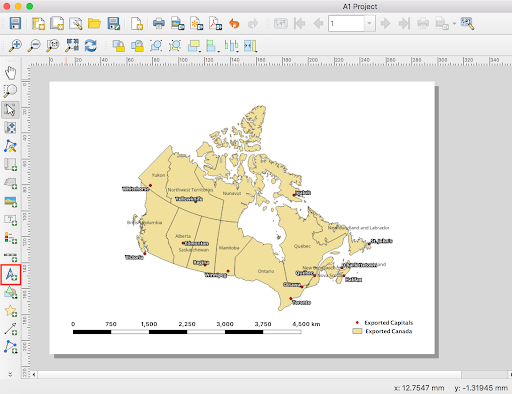
This layout is coming together, but the labels are a mess, the legend is very plain, and there are a few other improvements that could be made. This will all be most easily done in Inkscape. To get your layout into Inkscape, you will need to export is as an SVG file. This is done easily by clicking the “Export as SVG” icon at the top toolbar.
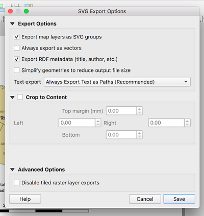
Close the message that pops up, choose where you want to save it, then do so. An options window will pop up, your setting should look like the following:
Hit save, then you will be ready to move to Inkscape.
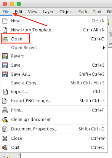
Open up Inkscape, click File > Open, locate the SVG you just exported, then open it.
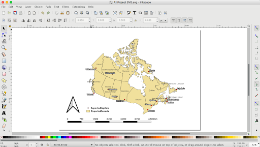
Your layout should be there, more or less exactly as it looked in QGIS. In the case of the map made here, it looked like this:
You can now start editing your layout.
Finishing Your Layout in Inkscape
Inkscape can look daunting when you open it for the first time, however it is not too difficult to learn the basics.
The toolbar on the left has a variety of tools for editing or drawing on the layout. The mouse pointer at the top that is selected by default, lets you click on any shape to transform it, move it, resize it or edit its properties. Hover over any of the other tools for a brief description. Along the top are the settings for the currently selected tool.
The toolbar on the right side of the window controls snapping. It lets you enable or disable various types of snapping for when you’re moving shapes, resizing them, etc. The colour scale toolbar along the bottom of the window is used for editing text, fill/stroke, alignment and layers. You will likely want to use these to edit the elements of your map.
If you click around the map area in the centre of the window you will notice that QGIS has divided up your layout into different layers that are independently selectable, so you should toggle them on and off to see which one is which. The background layers can be locked so they don’t get in the way while editing.
Also remember that you are able to change the colour of the vectors in each layer, edit fonts and import graphics.
Before beginning I would suggest clicking around the map to see how each component can be selected for editing.
Fixing the Labels
As you can see, the text for the provinces got smaller in the map. This is because of the new version of QGIS where it will automatically convert labels to paths rather than a text feature meaning you cannot edit the actual text of the label in Inkscape. The size of the text can be changed if you select the item and you can manually select the height and width of each individual text object which is located at the top of the screen. While this can be tedious, it is the best way to ensure the map is fully customized to your liking.
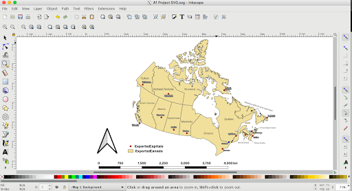
The map is currently looking very busy due to the cluttered and awkward placement of the city/province labels, but Inkscape will let you fix that. Start by simply moving them around, getting them as close to fitting as you can.
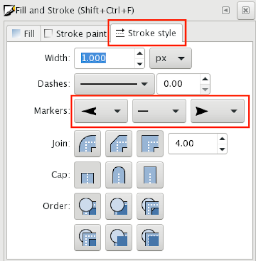
For those that are too large for their provinces (Newfoundland and Labrador for example), you can place the labels outside the shape, then use an arrow to connect them. To do so, select “Draw a bezier curve and straight line” tool along the left toolbar.
Following this, select the "Edit fill and stroke properties" tool along the top toolbar to manipulate the line.
This will open the "Fill and Stroke" menu with marker editors to create the arrow shape from line segments.
If a label has to cross over a boundary, to ensure that it is still legible, you can give it an outline in the Fill and Stroke menu. It’s worth noting, the more text effects you add to your map in QGIS, the more complicated the label will become. Each effect will be treated as a separate layer in Inkscape, as such, my text buffers all had to be manipulated independently from the labels lettering. While it is manageable, it does create extra steps in the editing phase.
Once all the labels are placed satisfactorily, they might look like this:
Adding some Colour
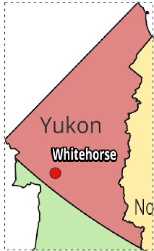
At this point, your map is starting to look good. The labels are much clearer and well oriented with the province shapefiles, but the overall design is lacking colour. As mentioned before, colour is an important aspect of the map that draws the eye and helps convey the intended message. While our solid colours are a good choice, we can have fun here with some of the options available to us in Inkscape. First, select each province separately by right clicking on them. To set a new colour for each province, simply select a colour from the colour scale at the bottom of the window.
This should automatically change the colour for only the polygons associated with the selected province, as shown below:
It’s worth noting, some of the smaller islands have been given their own polygon, separate from the mainland. Be sure to zoom in and make sure you have changed all of these islands to your desired colour so that the map is uniform.
Improving the Legend and Finishing the Layout
The current legend is very plain. Luckily Inkscape offers plenty of possibilities for improving it. Before doing that, there is one change that should be made. Ottawa is the national capital and not a provincial capital, so it should have its own symbol and legend entry. Using the duplicate object tool, make a copy of our capital city's symbol and alter it so that it stands out from the other, through colour, size, shape, etc.
Once you have done that, make a copy of the symbol to use in the legend. The legend and symbols may be stored in a group, so to edit them individually, right-click on each aspect of the legend.
From here, edit the legend text to be more descriptive, add a title if you want to, maybe play with the font settings to find something that is more appropriate for the style of map you are creating. Select the alignment tools in the Object menu along the top of the window, this will allow you to make sure the items and labels line up with each other.
Try creating a rectangle around the legend items to act as a border. To do this select the “Create Rectangles and Squares” tool from the left toolbar.
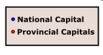
You can tweak each element in your legend until the whole thing looks good. An example of a relatively simple legend can be seen below:
To finalize your map, look over every element and make sure it looks good and fits with the rest of the design. This includes the title and scale bar which can also be edited. In the document properties window (File > Document Properties) you can change the page size and background colour. Once you are satisfied with your layout you can export your map as a PNG under File > Export as PNG Image.
Conclusion
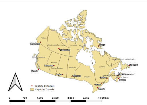
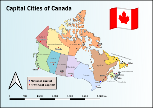
This tutorial has provided you with a conceptual and technical basis for creating maps that are visually appealing. Aesthetics is an important aspect to making maps that should not be overlooked, as they are usually the first characteristic noticed by an audience. There are plenty of great free open source guides that can be used to enhance the appearance of your maps, but the best resource you possess is exploring these programs in your free time and gaining experience by creating maps for fun. Hopefully this has been demonstrated to you. As a final illustration of the difference that aesthetics can make in the quality of a map, see below. The first is the original map created in QGIS, the second is the same map, but enhanced using the library of tools provided by Inkscape.
Some of the changes shown above, such as the flag and background changes, were completed without instructions, using tools found within Inkscape after messing around with various settings. As mentioned above, experimenting beyond the provided steps is an important part of the learning process, as it allows you to discover new techniques and develop a personal style. In map design, this plays a big role in developing the final product, as developing confidence in your abilities can be just as important as following instructions.
References
- Kent, A. J., Field, K., Jenny, B., & Hopfstock, A. (2013). Cartographic Design and Aesthetics “FAQ”. Cartographic Perspectives, (73), 13-16. doi:10.14714/CP73.594
