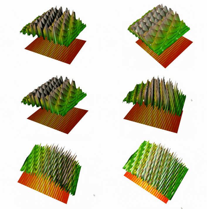
R Studio’s Spatial Capabilities going 3D!
Contents
Purpose
This tutorial prominently features the spatial abilities of R Studio; an open software program with its own scripting language. R Studio is often used for data analysis, statistics and graphing of very large datasets. For university students, R Studio is generally used for its ability to analyze, graph and model datasets, to determine relevant correlations and outliers.
However, the software contains libraries capable of manipulating spatial data, making it an asset for geography students looking to model and manipulate large quantities of data.
The spatial data package offers a wide range of tools that accept input data and create custom maps with various customization options. However, this package is not an equivalent to ArcMap or other such dedicated mapping platforms, but it allows the user to perform many of the same functions with some added features.
For more about the spatial data package: https://cran.r-project.org/web/packages/sp/sp.pdf
This tutorial demonstrates how to create 3D maps and images using the R language – if you're not familiar with R or some of its other mapping capabilities the following tutorials are provided below:
Julia Riddick -> R Studio's Spatial Capabilities at http://gracilis.carleton.ca/CUOSGwiki/index.php/R_Studio%27s_Spatial_Capabilities
Uzayr Siddiqui -> Introducing Geoprocessing Capabilities of SAGA in R Environment using RSAGA (Saga + Rstudio) at http://gracilis.carleton.ca/CUOSGwiki/index.php/Introducing_Geoprocessing_Capabilities_of_SAGA_in_R_Environment_using_RSAGA_(Saga_%2B_Rstudio)
The software doesn't have the same graphical capabilities as other platforms however, it is easier to handle and manipulate at a coding level.
Objective
The objective of this tutorial is to develop the users' familiarity with R Studio, increase competence in the R language, and to demonstrate some of the various ways that 3D maps and images can be created within this software.
The goal is to get users thinking about how R can do more than just manipulate statistics. This tutorial is aimed to get users to think beyond tables and lists and start manipulating data in 3 dimensions.
Software Introduction
Rstudio
R Studio is an open software program that creates a user-friendly graphic interface for accessing the R statistical analysis and scripting language. R is often used for data analysis, statistics and graphing of very large datasets. It is also capable of interfacing with the SAGA spatial analysis program through the 69 modules shown below. Users are able to use spatial data and manipulate and perform geoprocessing via special commands within this software. Initially everyone may face difficulty utilizing the R language, however, if the basics are understood well, it eases the application of major geoprocessing tools. R studio is known for handling large datasets with efficiency, and helps in optimizing results quickly in order to perform them multiple times without the need to reiterate. R not only processes data, but can also visualize spatial output through the use of a package called sp.
To download RStudio click the link --> https://www.rstudio.com/products/rstudio/download/
There's a great introduction on the R Studio layout and configuration found on Julia Riddick's R Studio's Spatial Capabilities at http://gracilis.carleton.ca/CUOSGwiki/index.php/R_Studio%27s_Spatial_Capabilities, so take a look and become familiar with the software.
Throughout this tutorial we will use datasets that are pre-installed in R, saving time in tracking down data as well and to ensure that users can follow along with the tutorial.
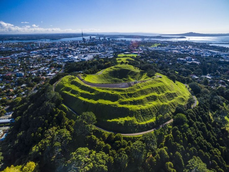
R studio has a great volcano dataset that represents Maunga Whau (Mt Eden). This mountain is one of 50 volcanos in the Auckland volcanic field. This data set represents the topographic information for Maunga Whau on a 10x10 meter grid.
The scripts within this tutorial are straightforward and simple, so users will be allowed some creative freedom in how they wish to apply these functions.
3D Mapping in a Myriad of Ways
Before doing any coding in R you'll need to think about what 'tools' you'll need.
Through this tutorial we'll focus on four specific packages;
plot3D for more info look here -> https://cran.r-project.org/web/packages/plot3D/plot3D.pdf
plotly for more info look here -> https://cran.r-project.org/web/packages/plotly/plotly.pdf
rgl for more info look here -> https://cran.r-project.org/web/packages/rgl/rgl.pdf
lattice for more info look here -> https://cran.r-project.org/web/packages/lattice/lattice.pdf
The following code will install each and unpack them for use.
#You can click on the packages in the package pane (bottom right) for a full description of their functions
#
#install packages utilized within this tutorial
install.packages("plotly")
install.packages("lattice")
install.packages("plot3D")
install.packages("rgl")
#impliment packages within the script
library(plotly)
library(lattice)
library(plot3D)
library(rgl)
Using Basic Contours
The easiest way of map visualization is a contour map.
Install the plotly package and load it using the command library(plotly).
#install the plotly package
install.packages("plotly")
#load the plotly library
library(plotly)
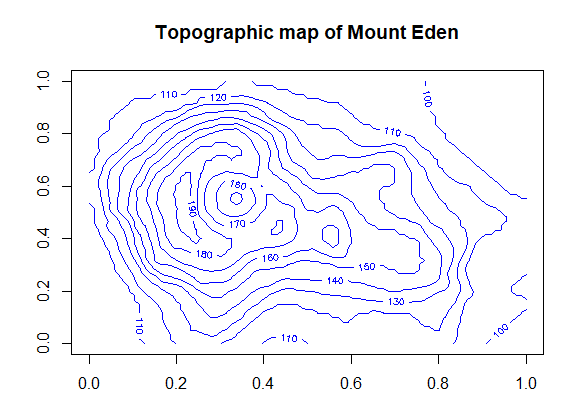
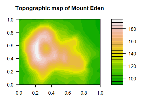
The following codes are examples of two basic ways of plotting contour maps using the Mount Eden dataset.
A contour line map is created through the use of the contour( ) function.
#The contour line creates a basic contour map with lines in blue
contour(volcano, main = "Topographic map of Mount Eden", col = "blue")
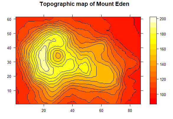
A color gradient representation of the contour line map is achieved through the use of the filled.contour( ) function.
#Creates a map that represents elevation change with a color gradient
filled.contour(volcano, color.palette = terrain.colors, main = "Topographic map of Mount Eden")
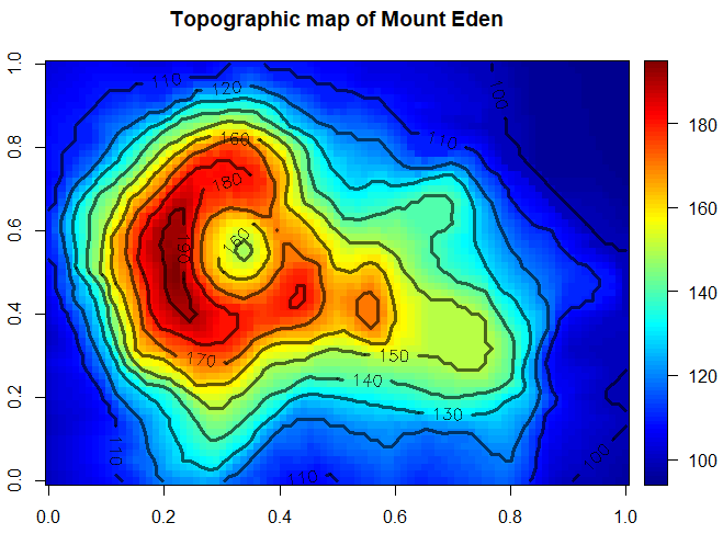
By utilizing the plot3D package we can take both of these contour map representations and merge them into a single map that demonstrates the elevation with a color gradient and contour lines simultaneously.
We start by installing the plot3D package
#install the plot3D package
install.packages("plot3D")
#load the plot3D library
library(plot3D)
Next we will be making use of the image2D( ) function, which will generate a color gradient for the elevation data and overlay the contour lines.
#takes a matrix as the first argument and displays it as a color gradient
#overlays contour lines and labels to identify the elevation
image2D(Volcano, contour = list(col = "black", labcex = 1, lwd = 3, alpha = .6))
Alternatively the lattice package has the ability to create a contour map, through the use of the levelplot( ) function.
#Takes the matrix of data and assigns a pixel to each value
levelplot(Volcano,main = "Topographic map of Mount Eden",xlab="",ylab="",contour = TRUE,col.regions = heat.colors)
This example demonstrates the flexibility of R Studio with respect to visualizing topographic data.
Using a Lattice (Wireframe)
A straightforward method of creating a 3D image on R can be done using the Lattice package. This creates powerful and elegant graphics with minimum tuning.
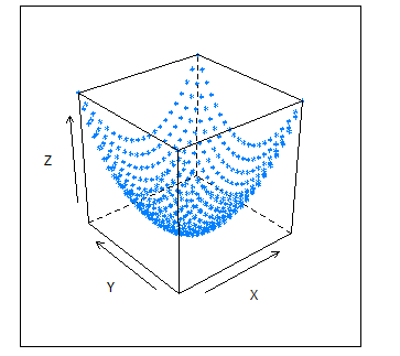
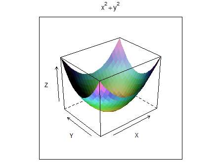
At its most basic level this package has the ability to create a 3D scatter plot (using x, y, z) and draw wires across all the points, creating a 3D image.
In the context of mapping this involves using variables like the latitude, longitude, and elevation to create a 3D image, akin to a Digital Elevation Model. Within this tutorial we are going to use a stored dataset volcano to illustrate the lattice method.
Before writing any code, the lattice package needs to be installed. Clicking on the Tools tab, then clicking Install Packages will bring up the Install Packages Window. In the blank Packages box, type in the desired package and click Install.
This will take a few seconds to install but will allow provide full access to the functions.
Here's what the code looks like.
#volcano data is accessed and assigned to the variable "cano"
data("volcano")
cano <- (volcano)
#The wireframe function displays the surface of Mount Eden
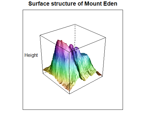
wireframe(unclass(cano),shade = T, aspect=c(1,1), main = "Surface structure of Mount Eden",
          xlab = "",ylab = "",zlab = "Height", scales = list(draw = FALSE, arrows = FALSE))
The first two lines bring in the volcano dataset and assign the data into a matrix called cano.
The last line will create the fictional scatter plot and drape wires across the points to create the 3D image.
The parameters that are set will use an unclassified matrix called cano, shade the wires, tell it the aspect angle, determine a title, label the axis, and determine how the scales are depicted.
This code will create the following image:
Try other parameters and see what happens. Maybe change shade = F or draw = TRUE? Changing the aspect will also change orientation of the image.
Using image2D and persp3D
Using the image2D and persp3D extension from R's image and persp function you can create 3D segments of maps, but you won't be using the scatter plot method seen previously in the wireframe function. First a 2D image will be generated using a default dataset, a 3D segment will then be created from this 2D image.
Ensure that you have the necessary packages installed. Make sure you have plot3D and misc3d as they will allow you to plot with multi-dimensional data. You can click on them in the package pane (bottom left) to get a better description of their capabilities.
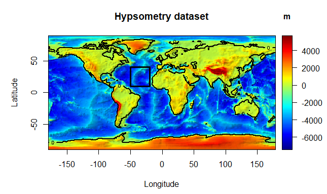
For this map you will use the hypsometry dataset that is pre-loaded within R Studio. Hypsometry is the measurement of land elevation relative to sea level. The 2D image will be created will illustrate areas above and below sea level.
#Create a 2 dimensional map of land elevation
image2D(Hypsometry, xlab = "Longitude", ylab = "Latitude",
        contour = list(levels = 0, col = "black", lwd = 2),
        shade = 0.1, main = "Hypsometry dataset", clab = "m")
#Determine the Area of Interest and draw an overlay
rect(-50, 10, -20, 40, lwd = 3)
Similar to creating a graph the user has the ability to set the parameters and labels as they see fit. The Hypsometry data is assigned as the input data, then we set the axis labels, determine how the contours will be set, finally we give it a title and a key to explain the color gradient.
This results in the following:
This should look familiar as most elevation maps have a similar color gradient. Try googling some of the areas that are red and see if they correspond with geographical phenomenon.
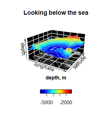
From here we'll create a 3D image using AOI within the Hypsometric map (the black square). Creating a 3D image of all the globe would use up a lot of visual space and sacrifices detail for coverage.
#Create the Area of Interest within the bounds of the previously stated rectangle
#
#alonglong stores data points that are within the longitudinal bounds of the area of interest
alongLong <- which(Hypsometry$x > -50 & Hypsometry$x < -20)
#alonglat stores data points that are within the latitudinal bounds of the area of interest
alongLat <- which(Hypsometry$y > 10 & Hypsometry$y < 40)
#seabed creates a range of elevation values that will be accepted
seabed <- c(-10000,0)
#plot the surface condition based on the area of interest and elevation scale we pre defined
persp3D(z = Hypsometry$z[alongLong,alongLat], xlab = "Longitude",bty = "bl2",
        ylab = "Latitude", zlab = "Depth", main = "Looking below the sea", clab = "Depth, m",
        expand = 0.5, d = 2, phi = 20, theta = 30, resfac = 2,
        contour = list(col = "grey", side = c("zmin", "z")),
        zlim = seabed,colkey = list(side = 1, length = 0.5))
Looking at the alongLat & alongLong variables you can see that hypsometry$_ coincide with the Latitude and Longitude columns of Hypsometry.
These first two lines are used to store the AOI within variables, which will be used within the persp3D( ) function.
The variable Seabed becomes the upper and lower limits of elevation that will be depicted on the scale.
This 3D image illustrates a ridge/trench that runs along the sea.
Creating 3D interactive maps with the RGL package
Utilizing the rgl package will allow you to create 3D maps that can be rotated 360 degrees independent of RStudios' GUI.
RStudio doesn't have the capability to move the map's perspective in real time, so it creates an external window to display the model.
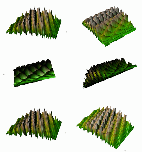
The following script creates a 3D model of Mount Eden:
#Create a 3D model of Mount Eden
#
data(volcano)
#scale the x,y and z variables in order to exaggerate the difference between the
#highest and lowest values
z <- 3*volcano
y <- 10*(1:nrow(z))
x <- 10*(1:ncol(z))
#set the elevation range
zlim <- range(z)
zlen <- zlim[2]-zlim[1]+1
#Assign color values
colorlut <- terrain.colors(zlen, alpha = 0)
col <- colorlut[z-zlim[1]+1]
#Generate the 3D model of surface conditions
open3d()
rgl.surface(x, y, z, color = col, alpha = 1, back = "lines")
This code utilizes the volcano dataset and exaggerates the z values in order to produce a model that better demonstrates the variance in elevation.
Running this code will generate a 3D model of the selected AOI within another window.
This model can be manipulated by clicking and dragging the cursor across the screen.
You can see the color gradient shifting from low on the periphery to high near the peak. From observing the underside of the model you can see how the 'mountain' was rendered by R.
#Create a 2D model of Mount Eden
#
#Apply a different color scheme to contrast the 3D model
colorlut <- heat.colors(zlen, alpha = 1)
col <- colorlut[z-zlim[1]+1]
#Generate a 2D model of the surface conditions
rgl.surface(x, y, matrix(1, nrow(z), ncol(z)),color = col, back = "fill")
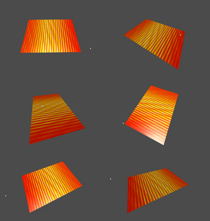
This code creates a 2D model of the same AOI which also depicts the elevation change.
The color scheme is modified to contrast the 3D model.
Running both blocks of code together allows the user to visualize the change in elevation in 2D and 3D simultaneously.
If you look closely you can see how the 2D images corresponds with the changes in elevation. The brighter areas represent areas with higher elevation than those along the edge.
Creating Composites
I've only covered a few ways of mapping in 3D but there are many more. What's really interesting is that you can bring some of the different ways of mapping together and create composites.
When you created some of the previous images/maps you also used a contour to help identify shifts in the sea level/elevation change corresponding with the changing colors.
The next big step is to bring all these different ways of mapping together to create what's called a composite.
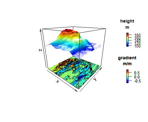
The following code will create a composite map utilizing some of the mapping techniques you've used already.
#Create a composite map consisting of a 3D and a 2D contour representation of Mount Eden
#
#Plot the surface based on elevation data
persp3D(z = volcano, zlim = c(-60, 200), phi = 20,
        colkey = list(length = 0.2, width = 0.4, shift = 0.15,
                      cex.axis = 0.8, cex.clab = 0.85), lighting = TRUE, lphi = 90,
        clab = c("", "Height", "m"), bty = "f", plot = FALSE)
#Create a gradient variable for longitude
canoData <- volcano[-1, ] - volcano[-nrow(volcano), ]
#Create a contour map base with the same color scheme as the 3D model
image3D(z = -60, colvar = canoData/10, add = TRUE,
        colkey = list(length = 0.2, width = 0.4, shift = -0.15,
                      cex.axis = 0.8, cex.clab = 0.85),
        clab = c("", "Gradient", "m/m"), plot = FALSE)
#Add contour lines
contour3D(z = -60 + 0.01, colvar = canoData/10, add = TRUE,
          col = "black", plot = TRUE)
You can see how persp3D, image3D and contour3D are combined to create this model.
The end result should resemble the following:
A definition of the parameters used in the persp3D( ), image3D( ) and contour3D( ) functions are provided:
persp3D/image3D
- z: matrix containing the elevation data of the volcano dataset
- zlim: limits set to create a range of accepted values
- phi: defines the viewing angle of the plot
- length: Length of the scale
- width: Width of the scale
- shift: Offset of the scale
- cex.axis: defines the text size of the scale components
- cex.clab: defines the text size of the scale title
- lighting: When "True" natural light is imposed on the image creating depth
- lphi: lighting direction
- bty: generates a white background for the plot
- plot: when "TRUE" the matrix is displayed
contour3D
- z: height of the image drawn within the plot
- colvar: color scheme used for the image
- add: when "TRUE" this function draws its image within the same plot as the other function
Try changing some of the parameters to produce a modified plot.
Conclusion
As demonstrated, RStudio offers more than just statistical analysis but can also be used to perform mapping and 3D modelling.
This tutorial is a basic introduction on how to conceptualize and do some basic 3D mapping. Users are encouraged to experiment and explore the software to get a better understanding on the full capabilities that RStudio has to offer.
Using RStudio isn't a replacement for other GIS software, as there are many functions that other software perform better. RStudio has the advantage that it gets users to write code and think through steps required to construct their map/models in a comprehensible manner.

