Supervised Classifications using Google Earth Engine
Contents
Introduction
Google Earth Engine is an extremely useful tool for analyzing remote sensing data. It utilizes a massive collection of data, from Landsat and Sentinal imagery, to climate and weather datasets. Within these categories, it has decades worth of data and features plenty of user-created datasets. This can all be accessed and processed within minutes and allows the user to quickly and easily pinpoint an image of their choosing.
In this tutorial, I will be walking you through a supervised classification within Google Earth Engine. The software uses a JavaScript API, so I will introduce you first to the simple processes and functions that we will use, and later to the functions that I created to provide more insight into the classification. A basic knowledge and understanding of both Google Earth Engine and programming is assumed.
Getting Started
We will now begin preparing the image(s) that we will be classifying.
Go to the API for Google Earth Engine, it can be found here.
Some tips before we get going:
- Things will save to you google drive, so be sure it is linked by signing in
- Create a folder in the left tab
- Always save after doing things
- It will save when you run the program
- I would recommend having multiple files doing different things
- It can get a little hectic in the API, so splitting things up is a nice housekeeping habit
- I am using a single small screen, so I could be biased on this point
Accessing and Working with Google Earth Image collections
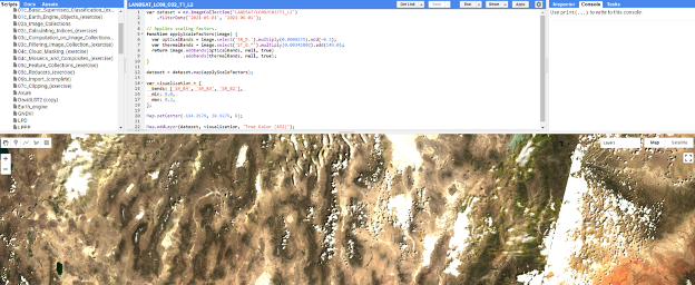
The datasets available on Google earth engine are mostly in form of collections, understanding how to access the wide and numerous datasets on google earth engine, is very important. Image collections are images provided by a single dataset provider but taken at different times and locations. For this tutorial, we will be making use of the Landsat 8 data. You can search the Dataset catalog to find more datasets available to work with. Visit the Landsat 8 Level 2 data, and copy the code to access it.
var dataset = ee.ImageCollection('LANDSAT/LC08/C02/T1_L2')
    .filterDate('2021-05-01', '2021-06-01');

// Applies scaling factors.
function applyScaleFactors(image) {
  var opticalBands = image.select('SR_B.').multiply(0.0000275).add(-0.2);
  var thermalBands = image.select('ST_B.*').multiply(0.00341802).add(149.0);
  return image.addBands(opticalBands, null, true)
              .addBands(thermalBands, null, true);
}

dataset = dataset.map(applyScaleFactors);
var visualization = {
  bands: ['SR_B4', 'SR_B3', 'SR_B2'],
  min: 0.0,
  max: 0.3,
};
Map.addLayer(dataset, visualization, 'True Color (432)');

};
You can add as many bands as possible (that are available in the data), however we will use Band 4, 3 and 2 to visualize the true color composite of the area. Also, the Map.setCenter, sets the center of the image to our selected area.
Creating Geometry
The first step is to create geometry representing the area you want to look at. This step will comprise of creating a polygon that will be used to find and clip images.
To do this, follow these steps:
- Pull the screen up so the map is showing
- Hover over the 'Geometry Imports' tab in the top left of the map
- Select '+ new layer' at the bottom
- In the selection bar next to the 'Geometry Imports' tab choose rectangle or polygon
- It will default to a point
- Now choose the area that you wish to have as your extent
With the polygon created, rename it something like 'extent' or 'AOI'. It will be referenced heavily in this tutorial.
NOTE: Mine is named 'extent'. You will see it in my code.
Important Data
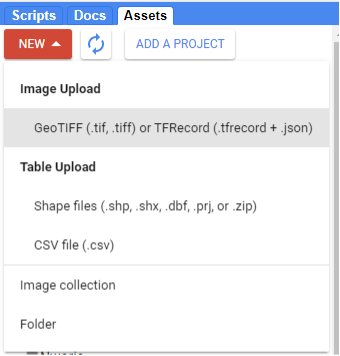
Also most times, we can have a pre-defined area extent or geometry in form of vector or raster data, such data can be used to subset and define our area extent. The data on our computer, can be imported into google earth engine, by using the Code Editor page, ● Go to Assets ● Then Click New ● You will see Table Upload ● Click Shapefiles (if you have a shapefile or CSV)
Select all files accompanying the data you want to import, name it accordingly and click Import.
Displaying Images
Displaying images in Google Earth can take some getting used to. I am aware that I have not shown you how to create an image yet, bear with me. This step is important and will be repeated throughout the tutorial which is why I want to show you now. The application in itself is fairly simple, it takes one line:
Map.addLayer(image)
It is as simple as that; however, there are likely two issues that you will immediately notice:
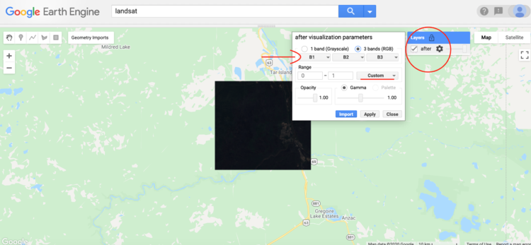
- You will notice that the image is dark. This is because it will automatically set the range of pixel values from 0-1. This is typically not enough to represent an image.
- The colours will not look right. This is due to it automatically setting bands 1, 2, and 3 as R, G, and B. These are not the proper bands for the colours when using Landsat 8. Remedying these issues is fairly simple.
First, navigate to the image settings:
Select the dropdown next to range. I would suggest setting the stretch to either 3σ or 100%. This step only alters the appearance on the map and does not change the image in any way. Therefore it is largely for personal preference.
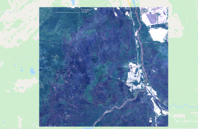
Change the bands to R: B4, G: B3, B: B2. This is the combination for Landsat 8, if you are using any other satellites with different band combinations it may be different.
With these changes, your image should look something like this:
We can make it so that the image loads in with a specific combination of bands, but unfortunately, we cannot apply a specific stretch. If you know the range you want to apply, you can add that.
Map.addLayer(image, bands = ['B4', 'B3', 'B2'])
This will load the image in with bands 4, 3, and 2, being in the R, G, and B slots.
Image Preperation
Google Earth Engine has a large selection of remote sensing data to choose from. You can easily search for anything in the search bar. In this example, I will be using the 'USGS Landsat 8 Collection 1 Tier 1 Raw Scenes' collection. This is a collection of the highest quality images available through Landsat 8.
Throughout the process of choosing imagery, I suggest taking as many opportunities to add the images to the map between processing steps. It will help your understanding of each step. Another tip, by running the following code you can see the data for an image or an image collection in the tab on the right of the screen. It will include specifics like image date, and band or bit values.
print(image);
For now, we can define a variable 'L8' so that you can easily reference this entire Landsat 8 library:
var L8 = ee.ImageCollection('LANDSAT/LC08/C01/T1');
Creating a Cloud-Free Mosaic
Now that we have a variable named L8 that is linked to the Landsat 8 collection that we want, we can begin to filter images and choose what we want. For this example, I will create a cloud-free mosaic of Fort McMurray in the month after the major fire that swept through in May of 2016. I have created two functions for this, one that creates a cloud mask and the other that creates a simple composite from a collection of images.
By utilizing the 'BQA' band present in Landsat 8 imagery, we can create a cloud mask to remove any cloud pixels that may alter the result. I created a function that will select any pixel that has cloud cover with even moderate confidence. The function will return a mask that removes all of these pixels from an image. Note that I have commented on this one fairly heavily due to it be slightly confusing at first.
- I should add again, if you haven't already explored all the bands of your chosen imagery, do. There are plenty of interesting things that can be used.
// Cloud mask for L8 imagery
var L8CloudMask = function(collection) {
  var qa = collection.select('BQA');  //selects the BQA (quality) band
  var CloudOrShadow = qa.bitwiseAnd(1<<4) //chooses pixels where cloud is present
            .and(qa.bitwiseAnd(1<<6)) //and pixels where cloud confidence ic greater than 34%
            .or(qa.bitwiseAnd(1<<8))  //or pixels where cloud shadow confidence is greater than 34%
            .or(qa.bitwiseAnd(1<<12));  //or pixels where cirrus confidence is greater than 34%
  var masked = collection.mask(); //creates a mask
  return collection.updateMask(CloudOrShadow.not()).updateMask(masked); //updates mask to remove any pixels as described above in 'CloudOrShadow'
};
Now onto the composite. This is a much simpler function, it intakes a collection of images and uses the built in 'simpleComposite' function to combine them into the best possible image.
// Function to create composite
var createComp = function(collection) {
  var comp = ee.Algorithms.Landsat.simpleComposite({
    collection: collection,
    asFloat: true
  });
  return comp;
};
With the two main functions created, we can now use a few lines to create our final image.
// Select all images within June 2016 that touch the extent and have the least removed from the cloud mask
var after = L8
        .filterDate('2016-06-01', '2016-06-30')
        .filterBounds(extent)
        .map(L8CloudMask); // Applies the cloud mask

// Create composite of images chosen above
var compAfter = createComp(after);
// Clip to extent
var clipAfter = compAfter.clip(extent);
Adding Bands
Now that you have the image you would like to use, there is an optional step that will vary based on the application of your classification. By using band math you can create and add a new band into an image. Since my location has been largely impacted by burn, I will create a Normalized Burn Ratio band. Doing this is fairly simple, there is already a normalizedDifference function in Google Earth Engine, so one way of creating it is as such:
// UDF to create and add an NBR band
var calcNBR = function(image){
  var NBR = image.normalizedDifference(['B5', 'B7']).rename("NBR"); // NBR is the normalized difference between NIR and SWIR
  var newImage = image.addBands(NBR);
  return newImage;
};

// Add a normalized burn ratio band into the image
var bands = ['B2', 'B3', 'B4', 'B5', 'B6', 'B7', 'NBR'];
var clipAfter = calcNBR(clipAfter).select(bands);
Notice that before I added the NBR band to 'clipAfter', I created a variable holding all the bands that I want to use in the classification. This is not essential but it will definitely come in handy and removes 'useless' bands such as coastal aerosols and the panchromatic band through the .select input.
NOTE: This is not the only way to do this, you can use band math to do calculations within the bands as well. For further examples of this check here
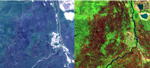
After creating a cloud-free mosaic of my study area, adding an NBR band, and changing the visual parameters to show SWIR, NIR, and Green, as R, G, and B, respectively (a common colour infrared to identify burn), this is what my image currently looks like:
Getting Training Data
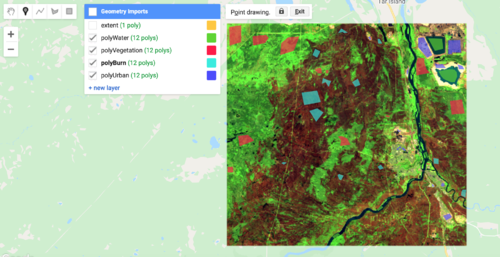
Now that we have our image ready, we need to create the polygons that will represent each landcover class in our classification. For me, there will only be four: Water, Vegetation, Urban, and Burn.
Create Landcover Polygons
Much like when we created the 'extent' polygon, we will create new layers under geometry imports. However, this time we will be going into the setting and changing them into 'FeatureCollection' from 'Geometry'. This will allow us to create multiple features within the class, as well as assign a property to the collection. For each class that you create, assign a number to the collection property (ie. Water = 0, Vegetation = 1, Urban = 2, Burn = 3) and name the property something like 'LC' or 'landcover'. Once I created my classes, this is what it looked like:
I will not go into too much detail about how to choose your classes and polygon locations, but keep in mind that you want to encompass all spectral variances that are in a class. We will look into assessing the quality of polygons in the next section. In general, each class should be normally distributed and not overlapping substantially with any other class. There is plenty of information online and in classes about what to take into account when selecting classes.
Assess Usability of Data
Before we can go any further, we must ensure that the data is properly distributed and distinctly represents each class. We can create histograms showing the distribution of the pixel values within each class. We can create a simple function to generate histograms, it is as follows:
// Prints a histogram of the polygons
var print_hist = function(image, poly, title){
  var options = {
    title: title,
    fontSize: 20,
    hAxis: {title: 'DN'},
    vAxis: {title: 'count of DN'},
  };

  var histogram = ui.Chart.image.histogram(image, poly, 30)
      .setOptions(options);

  print(histogram);
};
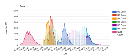
This will print a histogram containing all the bands for one class. An example of one of my classes can be seen below:
The charts are interactive, and you can play around with them to see whatever data you wish and you can easily save them as a csv or png. You will have to create charts for all of your classes, and you can compare them once they are made.
For the purpose of the tutorial, I will continue with these classes. There are no extreme cases of variance within the bands so it is sufficient for my purposes.
Gather Data from Polygons
Now that our polygons are chosen and verified, we can combine all of the classes into one collection by using merge. This will make one collection of polygons, and each individual polygon will maintain the property that you give it, so all water polygons will still have property 'LC' = 0, and so on for the other three classes.
var ABtrainingPolys = polyWater.merge(polyVegetation) //Merges all points
                          .merge(polyBurn)
                          .merge(polyUrban);
This new collection we just created is currently just sitting on top of our image, they are not actually representing any of the pixels that they encompass. We can use the sampleRegions function to gather the pixel data below the polygons.
var ABtrainingPixels = clipAfter.sampleRegions({
  collection: ABtrainingPolys,
  properties: ['LC'],
  scale: 30
});
This creates a new collection that has band information for all the pixels that are within a training polygon. It maintains the property 'LC' and samples pixels to a scale of 30m, the same as Landsat imagery.
NOTE: At this point, the collection will be full of thousands of points, so printing it out to view will either take a long time or time out entirely.
Create Training and Validation Sets
With all the data now tied to the polygons, we can split the data into training and validation datasets. This is done so that we can test the classifier on a validation set of data that it has not seen before. Since we know the assigned value for each pixel, we can then compare them to what has been classified and generate a resubstitution error matrix and accuracy. Using this created function we can quickly split the data:
// Splits data into training and validation groups. Set at 70% training/30% validation
var splitData = function(data){
  var dict = {};
  var randomTpixels = data.randomColumn();
  var trainingData = randomTpixels.filter(ee.Filter.lt('random', 0.7));
  var valiData = randomTpixels.filter(ee.Filter.gte('random', 0.7));

  dict.training = trainingData;
  dict.validation = valiData;

  return dict;

};

var ABdata = splitData(ABtrainingPixels);
This function will split the data and return it as a dictionary with two keys: training and validation. Each key will contain all the data for their pixels.
Classification
We now have all of our pixel data split into training and validation sets. With this, we can proceed to training our classifier and testing it before running it on the entire image. Training the classifier is fairly simple, it is only one line of code:
var ABclassifiedTD = ee.Classifier.smileRandomForest(10).train(ABdata.training, "LC", bands);
NOTE: I am using a random forest classifier with 10 trees for this, but there are many others that you can choose from. See here for more.
This code uses the training data stored in the ABdata dictionary created in the last step, is classified into categories based on the property 'LC', and takes into account the bands we set earlier.
Test on Validation Data Set
The classifier is now trained, but before we can use it on the entire image, we must use it on the validation data set first. Since we split the data earlier, the classifier was not trained on any of the validation data, therefore it means that it has not seen any of it. This allows us to test it on known values to see how it will perform. Using the errorMatrix function within Google Earth Engine, we can create a simple error matrix from the validation data.
The following code includes a function I created to easily print the error matrix and the way to classify the data.
// Creates error matrix
var createMatrix = function(data){
  var trainAccuracy = data.errorMatrix("LC", "classification");
  print('Resubstitution error matrix: ', trainAccuracy);
  print('Training overall accuracy: ', trainAccuracy.accuracy());
};

var ABvalidation = ABdata.validation.classify(ABclassifiedTD); // Classifies the validation data

createMatrix(ABvalidation); // Print the error matrix
The function uses the already known 'LC' property and looks at the 'classification' property which represents how the classifier assigned the pixel. My matrix looked like this and had a 99% accuracy rating:
0: [6225,0,5,0]
1: [2,18217,0,1]
2: [4,6,6853,0]
3: [0,0,3,8799]
The number before the list indicates the expected class, and the numbers in the list indicate how it was classified. For example, 5 pixels that were within a water polygon were classified as urban. This result is not too much of a concern for me; however, if there were a substantial misclassification between classes I would look at my training polygons again and reconsider their placement or even class choices.
Run on Chosen Image
We now have a tested classifier with sufficient accuracy, the next step is to apply the classification to the entire image. The process is the same as classifying the validation data, except substitute the validation data for the image you are classifying.
var postBurn = clipAfter.classify(ABClassifiedTD);

var ABcolours = ['1923d6', '6fba00', '000000', 'ef0b0b']; // Create a colour pallete

Map.addLayer(postBurn,
            {palette: ABcolours, min: 0, max: 3}, // min and max indicate that there will be 4 classes coloured
            "After Burn"); // Add the classification to the map with the four classes being coloured according to ABcolours
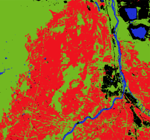
My result is as follows:
As you can see, the classification appears to have worked fairly well. An important thing to note is that I only used 10 trees in my classification, increasing the number of trees may have made my model slightly more accurate. BUT you must remember that over modelling is just as bad as having an underperforming model.
Improving the classification results
We can improve the classification result, the availability of multiple datasets helps in improving image classification. We sometimes, just need to add more data such as the vegetation indices, built-up indices and all kind of indices that can easily distinguish land cover classes from one another. Adding indices BSI - Bare soil index NDVI - Normalized Difference Vegetation Index MNDWI - Modified Normalized Difference Water Index NDBI - Normalized Difference Built_up Index
var addIndices = function(image) {
  var ndvi = image.normalizedDifference(['B5', 'B4']).rename(['ndvi']);
  var ndbi = image.normalizedDifference(['B6', 'B5']).rename(['ndbi']);
  var mndwi = image.normalizedDifference(['B3', 'B6']).rename(['mndwi']);
  var bsi = image.expression(
      '(( X + Y ) - (A + B)) /(( X + Y ) + (A + B)) ', {
        'X': image.select('B6'), //swir1
        'Y': image.select('B4'),  //red
        'A': image.select('B5'), // nir
        'B': image.select('B2'), // blue
  }).rename('bsi');
  return image.addBands(ndvi).addBands(ndbi).addBands(mndwi).addBands(bsi)
};
Normalizing data inputs
The best data inputs for machine learning models are the inputs who are same scaled. By normalizing the inputs, the accuracy of the model is increased. Normalization of input data ensures that each individual inputs have values ranging between 0-1
function normalize(image){
  var bandNames = image.bandNames();
  // Compute min and max of the image
  var minDict = image.reduceRegion({
    reducer: ee.Reducer.min(),
    geometry: boundary,
    scale: 10,
    maxPixels: 1e9,
    bestEffort: true,
    tileScale: 16
  });
  var maxDict = image.reduceRegion({
    reducer: ee.Reducer.max(),
    geometry: boundary,
    scale: 10,
    maxPixels: 1e9,
    bestEffort: true,
    tileScale: 16
  });
  var mins = ee.Image.constant(minDict.values(bandNames));
  var maxs = ee.Image.constant(maxDict.values(bandNames));

  var normalized = image.subtract(mins).divide(maxs.subtract(mins))
  return normalized
} ;
Calculating Area of Each Class
We can now calculate the area of each class, in my case, this is important for understanding the range of the burn. This function is significantly more complicated than the others, but it should not be to difficult to alter to any specific needs:
var classArea = function(image){
  var areaImage = ee.Image.pixelArea().addBands(
        image);

  var areas = areaImage.reduceRegion({
        reducer: ee.Reducer.sum().group({
        groupField: 1,
        groupName: 'classification',
      }),
      geometry: image.geometry(),
      scale: 30,
      maxPixels: 1e8
      });

  var classAreas = ee.List(areas.get('groups'));

  var classAreaLists = classAreas.map(function(item) { // Function within a function to create a dictionary with the values for every group
    var areaDict = ee.Dictionary(item);
    var classNumber = ee.Number(areaDict.get('classification')).format();
    var area = ee.Number(
      areaDict.get('sum')).divide(1e6).round(); // The result will be in square meters, this converts them into square kilometers
    return ee.List([classNumber, area]);
  });

  var result = ee.Dictionary(classAreaLists.flatten()); // Flattens said dictionary so it is readable for us
  return(result);
};
Running your classified image through this function will produce a simple list with the area of each class:
print('after:', classArea(postBurn))

// Values are in km2
after:
Object (4 properties)
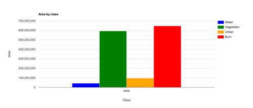
0: 43
1: 592
2: 97
3: 645
Creating a Chart of Landcover
Another way to view the class areas is by creating a bar chart. This method could be considered easier and simpler than the last.
var create_chart = function(classification, AOI, classList){ // for classList, create a list of your classes as strings
  var options = {
    hAxis: {title: 'Class'},
    vAxis: {title: 'Area'},
    title: 'Area by class',
    series: { // You can change these to be whatever colours you'd like. Simply add numbers to match how many classes you have
      0: {color: 'blue'},
      1: {color: 'green'},
      2: {color: 'orange'},
      3: {color: 'red'}}
  };
  var areaChart = ui.Chart.image.byClass({
    image: ee.Image.pixelArea().addBands(classification),
    classBand: 'classification',
    scale: 30,
    region: AOI,
    reducer: ee.Reducer.sum()

  }).setSeriesNames(classList)
  .setOptions(options)
  ;
  print(areaChart);
};
Just like the histograms, the chart is interactable and you can hover over the classes to see their exact area. The chart will look something like this:
Adding Legend to the map
Legends define features in a map, to someone without prior understanding of the color code, the map will pass no specific information. Therefore, it is important to add legends to serve as labels to distinctly differentiate features in the map. The legend represented the different land covers with their respective colors.
var legend = ui.Panel({
  style: {
    position: 'bottom-left',
    padding: '8px 15px'
  }
});
// Create legend title
var legendTitle = ui.Label({
  value: 'Legend',
  style: {
    fontWeight: 'bold',
    fontSize: '18px',
    margin: '0 0 4px 0',
    padding: '0'
    }
});
// Add the title to the panel
legend.add(legendTitle);
// Creates and styles 1 row of the legend.
var makeRow = function(color, name) {

      // Create the label that is actually the colored box.
      var colorBox = ui.Label({
        style: {
          backgroundColor: '#' + color,
          // Use padding to give the box height and width.
          padding: '8px',
          margin: '0 0 4px 0'
        }
      });
// Create the label filled with the description text.
      var description = ui.Label({
        value: name,
        style: {margin: '0 0 4px 6px'}
      });

      // return the panel
<syntaxhighlight lang="javascript">
      return ui.Panel({
        widgets: [colorBox, description],
        layout: ui.Panel.Layout.Flow('horizontal')
      });
};
// Palette with the colors var palette =['1923d6', '6fba00', '000000', 'ef0b0b'];
// name of the legend var names = ['Water','Vegetation','Burn', 'Urban'];
// Add color and and names for (var i = 0; i < 4; i++) {
 legend.add(makeRow(palette[i], names[i]));
 }
// add legend to map (alternatively you can also print the legend to the console) Map.add(legend);
Exporting the Classified Image
We can also export our result to our drive for further analysis. You can do this by creating a folder in your google drive, I have named mine ‘earth engine’.
<syntaxhighlight lang="javascript"> var exportImage = postBurn
Export.image.toDrive({
   image: exportImage,
   description: 'LandCover',
   folder: 'earthengine',
   fileNamePrefix: 'LandCover',
   region: extent,
   scale: 10,
   maxPixels: 1e9
})
There are so many things that you can do with Google Earth Engine. I have just scratched the surface with a random forest supervised classification. If you followed this tutorial you will have completed your own classification. I encourage you to try using different classification algorithms and experiment with different band combinations.
If you have any questions about Google Earth Engine, be sure to check out the documentation here. It was written by the developers and is full of useful information and tips & tricks.
Conclusion
There are so many things that you can do with Google Earth Engine. I have just scratched the surface with a random forest supervised classification. If you followed this tutorial you will have completed your own classification. I encourage you to try using different classification algorithms and experiment with different band combinations.
If you have any questions about Google Earth Engine, be sure to check out the documentation here. It was written by the developers and is full of useful information and tips&tricks.
