Making Maps that Look Great Using QGIS and Inkscape
Contents
Purpose
The purpose of this tutorial will be to show the user how to create a map in QGIS, then import it into Inkscape as a scalable vector graphic (SVG), where they will edit its appearance. This will allow the user to create an aesthetically appealing map, with visual features beyond what could be created using QGIS. To provide an example of this, the user will be guided through the creation of a map of Canada. The goal will be to provide them skills transferable to any maps they make in the future, all while using free open-source software.
Introduction
After reading the purpose you might be asking yourself “Why bother? Aren’t the default settings in QGIS good enough?”. This introduction will attempt to answer those questions.
The first priority when making a map should be conveying the information you want to convey, however from there improving the aesthetics of the map can improve its quality significantly. Often attractive design will go hand-in-hand with clarity of information. Not only will working on design improve the visual appeal of a map, it can help it convey the information better. Kent et al. (2013) provide a great explanation of aesthetics and design in cartography and their importance, stating:
"Maps are created for many purposes, from navigation to nostalgia. If we are concerned with good cartographic design, we are interested in making maps that are more effective in serving their purposes, both in how they function and in how they look. Design is therefore relevant to many general elements of the map, such as color, typography, generalization, visual balance, and layout, as well as the character and shape of the symbols themselves. Simply put, good design is getting the balance of all the graphical elements on a map to work harmoniously. It is also important to consider that function and appearance are intertwined. The function of a map will drive many of the design considerations the cartographer makes, but beyond that there is also considerable scope to address the look and feel of a map. In cartography, aesthetics is about the visual effect of a map—its partic¬ular “look”—which is constructed from the interplay of the graphical elements. Aesthetics is a highly debated issue; opinions are strong and varied and there are no universal rules, even though when we say a map is “beautiful” we believe that others ought to agree with us." (pgs. 13-14)
A well designed and aesthetically pleasing map has many advantages over one where aesthetics were not a priority. It can look more professional, draw the viewers attention, convey information more effectively, or invoke certain impressions in the viewer, to name a few.
There are no universal and unbreakable laws of cartographic design, or design in general. Often the best choice is the one that simply looks right. While the quality of a design is ultimately subjective, having an strong aesthetic sense improves one’s ability to decide what looks good and what doesn’t. This can be developed through formal education and through experience in map making, however there are ways to improve without either of these.
Simply looking at maps made by others is a great way to improve your ability to create attractive maps. If you are unsure about an aspect of you map, look at how someone else did it and integrate what you see into your design. A great resource for this is www.cartotalk.com. On this website you can look at maps posted by others, and post your own maps to receive feedback from their community.
Principles of design and cartographic design have both been written on extensively. Reading up on these will give you ideas of concepts you should consider while designing your maps. The following are a few links to articles on principle of design:
- Design Principles for Cartography
- 8 Basic Principles of Design to Help You Create Awesome Graphics
- Labeling and Text Hierarchy in Cartography
These offer up some principles that you can use to guide your design. You don’t have to go over every one of them with each map you make, but it can help to keep them in mind. Some more specific cartographic elements that you should consider when creating map layouts are:
- Colour: You should select colours that compliment each other, draw attention to the important parts of them map, and convey the intended message. Looking at a colour wheel can help you determine which colours go together, but experimenting to see what looks good also works. Colour can be used in text, backgrounds, fills and outlines of objects, or any other part of a map.
- Text: Picking the right fonts is important to the design of a map. A font should be easily legible, look good and fit in with the theme of the map. Computers have many fonts preinstalled, but sometimes you can’t find the right one for the job among them. Luckily there are many sources out there for quality free open-source fonts. One of these is Google Fonts. To install fonts from here, find one you like, download and unzip it, then right-click the TrueType file for the styles you want and select “Install for all users”. The font should then be useable in QGIS, Inkscape or any other software. In addition to selecting a font, choosing its size, weight and colour is also important to determine where it stands in the visual hierarchy.
- Composition: The arrangement of the components of your map is integral to the impression it gives the viewer. A map where everything is placed deliberately and effectively will have a sense of balance to its appearance, without which the map will look sloppy. Finding the right composition for a layout requires experimentation, and there is usually more than one possibility for balanced arrangements.
- Map Elements: Each element of a map should be carefully considered. This can include the data frame, title, scale bar, legend, north arrow, inset map, etc. They should be consistent and unified in there appearances to ensure the final product looks cohesive. Editing these in QGIS can be an laborious process, but Inkscape lets you fine-tune them manually, giving you much more control over their appearance and opening up new possibilities.
Hopefully this section has answered the question of “Why bother?” and explained the importance of aesthetics in cartographic design. It should also have given a conceptual basis in map design, that can be used in accompaniment with the technical skills that will be taught in this tutorial, to create maps that look good.
Software
This tutorial will use two different free open source programs; QGIS and Inkscape.
If you do not already have QGIS, it can be downloaded here. Version 3.4 will be used in this tutorial, though other versions should work just as well. It will be assumed that the user already has a basic knowledge of QGIS. Detail will not be provided on how to set up a project, or extract data from a shapefile. If you would like to learn more about these things, there are plenty of resources on the internet, including on the QGIS website.
The design side to this tutorial will use Inkscape. Inkscape is a free and open-source design software which allows users to work with vector graphics. Transitioning from QGIS to Inkscape will give the user much finer control over the design of the map, but without losing any quality, as it is works with vectors just like QGIS. Using Inkscape, you will be able to manually edit every element of the map. It can be downloaded here.
This tutorial will assume users have little to no experience with Inkscape. It will explain some of the tools within the software that can be used to improve your map designs. Inkscape has tutorials on their website if you would like more information, there are also many tutorials to be found elsewhere on the internet.
Data
In this tutorial users will create a map of Canada, showing the provinces and their capitals. The data for this will come from Natural Earth. This is a great place to download free open-source vector or raster files for the entire Earth. Two files will be downloaded from this website, click their names in the list below to download them.
Download the above files, then extract them to the folder where you will store all the data for your QGIS project. Both files cover several countries, so the data for Canada will need to be extracted in QGIS.
Tutorial
Setting Up the Map in QGIS
Once you have all the software installed and the data downloaded, open QGIS and start a new project. In the project properties set the project home to the folder where you extracted the data, then set the project coordinate reference system to “NAD83/Statistics Canada Lambert” (EPSG: 3347), this projection will make Canada the centre, so it does not look distorted.
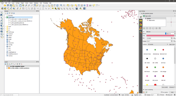
Add the shapefiles to the data frame, and arrange the layers so they are both visible. Your project should look something like this:
As was previously mentioned, the shapefiles we have cover more than just Canada. When designing maps, having background data in the final layout can be good, providing context to the area of interest. However, this presents a challenge when working with these two programs. Exporting an SVG file from QGIS extracts everything in the data frame, not just what is displayed in the layout. This leaves you with excess data in Inkscape, making it difficult to work with. One way to solve this would be solved by clipping the files down to the area you want shown. For this tutorial, we will be simply be extracting the Canada data from the downloaded shapefile as its own file, so that is all that will be included in the SVG. The right choice between these two methods will depend on the map. In this case, Canada is well known enough that the extra context from background data would not be necessary.
To extract Canada’s provinces, use the “Select by expression” tool on the polygon layer, with the expression:
"admin" = 'Canada'
Extract the selected features, saving them into the folder where the rest of your data is stored, with an appropriate name. To extract Canada’s capitals, do the same with the expression:
"SOV0NAME" = 'Canada' AND "FEATURECLA" LIKE '%capital'
Once this is done, you can remove the two original shapefiles. You know have all the data you need. You project should look like this:
Starting the Layout in QGIS
You can now begin designing your map. You should try to take the map layout as far as you can in QGIS before bringing into Inkscape. Inkscape will give you much more control over the minute details, but QGIS will make larger-scale changes easier, such as editing all labels at once.
First you should add labels for both the provinces and cities with their respective “name” fields. This can be through the Labels tab of the Layer Styling panel after selecting the desired layer. Here you can also select font type, style, size and colour. You should play around with these, as well as the symbology for the layers until you get something you like. Some recommendations to consider:
- Choose serif fonts for a more clean, modern look to your map, and choose sans-serif to give it a more formal appearance, reminiscent of a newspaper or magazine (this will not always be that case, and you can use a mix if you want). This tutorial will go with the latter option, though you could just as easily go in the other direction. The design created here uses the fonts “Cinzel” and “EB Garamond”, both found on Google Fonts. A good choice of sans serif font that can be found there is “Roboto”.
- Color is also important to the feel/theme of the map. Using a beige/brown/red colour palette will also contribute to that formal look, giving it an almost historical appearance. You can use the “colour picker” feature in QGIS to copy the colours from the images here. Use any colour scheme you feel looks good and supports the theme.
- Font size, weight and colour will influence the visual hierarchy. The example here uses a larger but slightly lighter font for the province labels, and a smaller, darker font for the city labels.
- Consider the symbology for both layers. The default may look fine, but you could almost definitely improve it, even with small changes.
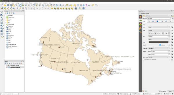
An example of what the map might look like once the labels and colours have been edited can be seen below. Feel free to copy the style used here, or to go off in your own direction. Do not worry about label placement, as that will be much easier to edit in Inkscape.
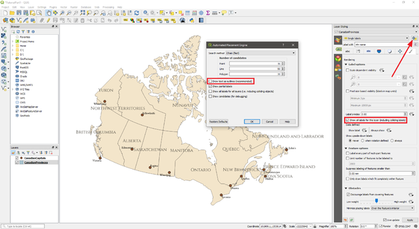
There are two very important steps that must be done before proceeding, in order to ensure a smooth transition to Inkscape. The first is to go into the Rendering tab of the labeling panel, and make sure that the box for Show all labels for this layer (including colliding labels) is checked. Do this for both layers. The second is to open the Automated placement settings window (the button is at the top right of the labels panel), and uncheck the box for Draw text as outlines. This will ensure that all labels appear on exported map, and that the text is recognized as text in Inkscape. See the image below for where to find these settings.
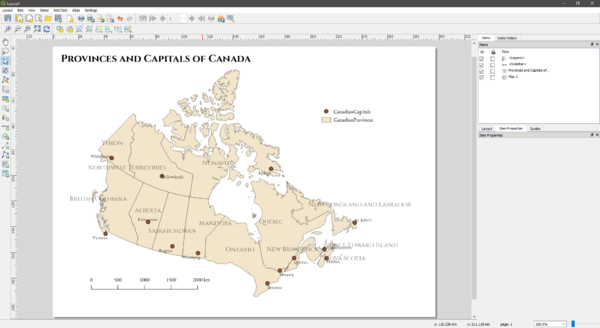
The next step is to create a new layout in QGIS. You will want to add all the components to this layout; the map, scale bar, legend and title. Set the scale for the map to around 26,000,000 as this will fill out the page well. For the other elements, select the font and style that you like. Once you have everything, the layout should have everything seen here:
Transitioning from QGIS to Inkscape
This layout is coming together, but the labels are a mess, the legend is very plain, and there are a few other improvements that could be made. This will all be most easily done in Inkscape. To get your layout into Inkscape, you will need to export is as and SVG file. This is done by clicking Layout > Export to SVG. Close the message that pops up, choose where you want to save it then do so. An options window will pop up, your setting should look like the following:
Hit save, then you will be ready to move to Inkscape.
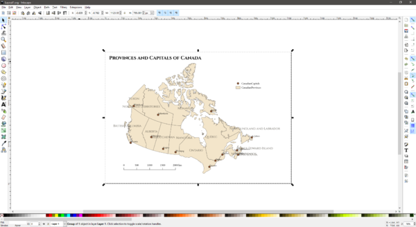
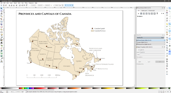
Open up Inkscape, click File > Open, locate the SVG you just exported, then open it. Your layout should be there, more or less exactly as it looked in QGIS. In the case of the map made here, it looked like this:
You can now start editing your layout.
Finishing Your Layout in Inkscape
Inkscape can look daunting when you open it for the first time, however it is not too difficult to learn the basics.
The toolbar on the left has a variety of tools for editing or drawing on the layout. The mouse pointer at the top that is selected by default, lets you click on any shape to transform it, move it, resize it or edit its properties. Hover over any of the other tools for a brief description. Along the top are the settings for the currently selected tool.
There are two toolbars on the right side of the window. The rightmost one controls snapping. It lets you enable or disable various types of snapping for when you’re moving shapes, resizing them, etc. The second toolbar on the right has a variety of options, such as saving, copying, pasting, etc. Towards the bottom, there are buttons to open the different windows for editing text, fill/stroke, alignment and layers. You will likely want to use these to edit the elements of your map.
QGIS will divide up your layout into layers, so you should toggle them on and off to see which one is which. The background layers can be locked so they don’t get in the way while editing.
Fixing the Labels
The labels are currently very cluttered and awkwardly placed, but Inkscape well let you fix that. Start by simply moving them around, getting them as close to fitting as you can.
The labels that are too long for their shapes, such as Saskatchewan and Northwest Territories, can be split into two lines through the Text and Font window.
For those that are too large for their provinces (Newfoundland and Labrador for example), you can place the labels outside the shape, then use an arrow to connect them.
If a label has to cross over a boundary, to ensure that it is still legible, you can give it an outline in the Fill and Stroke menu. Once all the labels are placed satisfactorily, they might look like this:
Improving the Legend and Finishing the Layout
The current legend is very plain. Luckily Inkscape offers plenty of possibilities for improving it. Before doing that, there is one change that should be made. Ottawa is the national capital and not a provincial capital, so it should have its own symbol and legend entry. Alter the symbol so that is stands out from the other, through colour, size, shape, etc. Once you have done that, make a copy of the symbol to use in the legend. The legend and symbols may be stored in a group, so to edit them individually, right-click the group and select Ungroup.
From here, edit the legend text to be more descriptive, add a title if you want to, maybe play with the font settings to find something that works. The alignment tools will allow you to make sure the items and labels line up with each other. Create a rectangle around the items to act as a border. Adding dotted lines between the symbols and labels is another possibility to improve the appearance. You can tweak each element until your legend until the whole thing looks good. An example of relatively simple legend, that is still beyond what could be made in QGIS can be seen below:
To finalize your map, look over every element and make sure it looks good and fits with the rest of the design. This includes the title and scale bar which can also be edited. In the document properties window (File > Document Properties) you can change the page size and background colour. Once you are satisfied with your layout you can export your map as a PNG under File > Export as PNG Image.
Conclusion
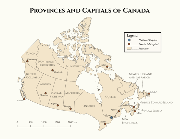
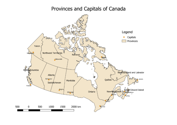
This tutorial has provided you with a conceptual and technical basis for creating maps that look good. Aesthetics is an important aspect to making maps that should not be overlooked. There are plenty of great free open source resources that can be used to enhance the appearance of your maps, in addition to just making them. Hopefully this has been demonstrated to you. As a final illustration of the difference that aesthetics can make in the quality of a map, see below. The first is the map created over the course of this tutorial, the second is the same map, except made using QGIS’s default settings.
References
- Kent, A. J., Field, K., Jenny, B., & Hopfstock, A. (2013). Cartographic Design and Aesthetics “FAQ”. Cartographic Perspectives, (73), 13-16. doi:10.14714/CP73.594
