Spatial data and analysis in R using terra
Spatial analysis and the handling of spatial data have long been powerful capabilities in R. However, recently the dominant libraries providing these capabilities (including sp, raster, rgdal, ...) have been declared obsolete and were removed from current versions of R. New replacement packages include terra and sf. This move has advantages in that it removed a mix of incompatible tools, forcing standardization, and boosting the ability to use larger, modern datasets. It does mean, however, that there are a lot of tutorials and other documentation on the Internet or in books about spatial data analysis which is now also out of date.
This tutorial aims to help fix that situation. In the spirit of most of the tutorials on this site, it will use only open data, and while we focus on data centred on Carleton University, the same methods should work on similar data from anywhere else in the world. It was developed using R-4.3.1, and I am running it within the RStudio environment, which will show up in screenshots, and there are a few setup instructions given that are specific to RStudio. Besides that, the actual processing will be demonstrated using just console-based R commands, so they should work in any R environment.
This is written assuming that you have general computer / file management skills. We don't assume you already know how to use R, but we also don't go out of our way to explain it. A good general introduction is available at the RSpatial site (click here). We also assume that you already know some basics of spatial data, such as what is meant by vector and raster data, projections, and coordinate reference systems.
At the time of this writing, this tutorial at the RSpatial site is the only solid source of instruction about terra that I've found, beyond the built-in software help. This tutorial aims to help diversify the available guidance with examples that should work with a variety of real datasets.
As of this writing, I consider this a first draft version of this tutorial. I will be going through it with a class later today, which will be the first good test of the instructions and generality! Feedback is welcome.
Contents
Get data
To start with, we need some data. On your computer's local storage / hard drive, please create a new folder where you will store everything related to this exercise.
First, we will use some Landsat imagery, from the open archive provided by USGS.
To speed things up, I used Google Earth Engine, to take advantage of their huge collection of open data and their tools so I could quickly search for images free from cloud cover, and clip then export an image surrounding Carleton University. Here's a short tutorial on how to make use of Google Earth Engine to look for and download imagery. As long as you pick an area that includes some version of a substantial portion of the Ottawa region, centred on downtown Ottawa or around Carleton University, the rest of this tutorial should work (only the classification exercise at the end should be sensitive to the spatial extent). While you are in Google Earth Engine, please take note of the unique identifier (ProductID) of the image that you obtain - you can do that by looking at the metadata printed to the console when you run the script in the tutorial. In my example, I obtained the GEE id: LANDSAT/LC08/C02/T1_L2/LC08_016028_20210824; the last part of that (starting with LC08, is the ProductID.
However, if you're in a rush and want to stay focused on R, the file linked here contains an image I have already exported in GeoTIFF format. Also, if the classification exercise at the end doesn't work for you, this image should fix it.
Next, we will get some vector data from the City of Ottawa Open Data; there's a lot there you can explore, but to get started, we will download Parks and Greenspace data and Ottawa Neighbourhoods into the same folder you used above. Extract the contents of any .zip files.
Start R using RStudio and set environment
Launch RStudio on your computer (e.g. on a Windows computer, find it on the Start Menu; on a macOS computer, it's probably in your Applications folder). On the File menu, choose New Project. Choose the Existing Directory option, and then point it to the directory where you saved your data files, above. You should then have a blank RStudio project, set to use your data directory as the working directory for all work in R (you could use the getwd() command to double check this).
Try loading the Terra and rpart libraries (we will discuss more on what this does below) by typing the following at the prompt in the RStudio Console, and pressing Enter:
library(terra) # loads the terra library
library(rpart) # loasd the recursive partitioning and regression tree library
If you get an error stating that either library was not found, you will need to install it in the local library collection on your machine, using the following command (e.g. - replace terra with rpart if that's missing):
install.packages("terra")
That should download and install the library, so that it will be available for you from then on if you return to this same computer.
About the Terra library
When you loaded the Terra library, it added a number of classes to the R environment that support spatial data, and functions to access, analyze, and visualize those data. The data class SpatVector holds vector data, and SpatRaster handles raster data (for more details, see RSpatial's documentation of SpatVector and SpatRaster). When I wrote that SpatRaster "handles" raster data I chose that verb carefully - an important advance in raster data handling compared to some older libraries is that the data do not have to all reside inside the R data library - R typically holds all of its active data objects in the computer's working memory. Raster grids can be very large, so loading all the raster files you are working on into the computer's active memory can quickly fill it up; instead, it is much more efficient to keep the raster data on your storage device (hard drive, network drive, etc.) and just access parts of the grid as needed. SpatRaster objects CAN have data stored within them, but in the majority of "real life" cases, most of the data stays in external files and the R data object holds metadata like the coordinate reference system being used, the bounding coordinates and resolution of the grid, etc.
Reading spatial data into R
To load in the satellite image, use the following command at the R command prompt. Note that one thing that the RStudio development environment provides on top of basic R capabilities is things like command completion prompts. When you start typing the first few letters of a data object or function name, hit the tab key, and a list of potential matches to what you have entered appears; once you see the one that matches, you can just choose it (with the mouse or the up / down keys on the keyboard) instead of typing the whole name in. Similarly, once you open the brackets at the end of a function name, you can use the same completion mechanism to put R objects in as parameters to the function.
rawImage <- rast(file.choose())
The choose.files() function will cause the RStudio gui to pop up a window that lets you navigate to and select the input file, which in this case is the Landsat GEOTiff downloaded above - note that alternatively, you could have typed that file name (with quotes) in as the function's argument.
Now import the vector data:
parks <- vect(file.choose())
and then choose the file (I downloaded a shapefile, so chose the file ending in .shp; adjust as needed for the file format you chose).
And the same for the neighbourhoods data:
nbrhds <- vect(file.choose())
(this time I tried a GeoJSON file, which was nice since it was a single file download)
Investigating the data
Now let's take a look at what we've imported. Enter just the name of our image at the R command prompt (and press Enter):
rawImage
You should see output something like:
> rawImage
class       : SpatRaster
dimensions  : 1029, 1716, 19  (nrow, ncol, nlyr)
resolution  : 30, 30  (x, y)
extent      : 425535, 477015, 5002485, 5033355  (xmin, xmax, ymin, ymax)
coord. ref. : WGS 84 / UTM zone 18N (EPSG:32618)
source      : exportedImage2.tif
names       : SR_B1, SR_B2, SR_B3, SR_B4, SR_B5, SR_B6, ...
min values  :    16,    79,  4493,    ? ,    ? ,    ? , ...
max values  : 54928, 53621, 58744,    ? ,    ? ,    ? , ...
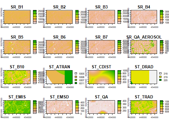
Let's look at the images. If you simply enter the following command, R will cram each band into the output plot window:
plot(rawImage)
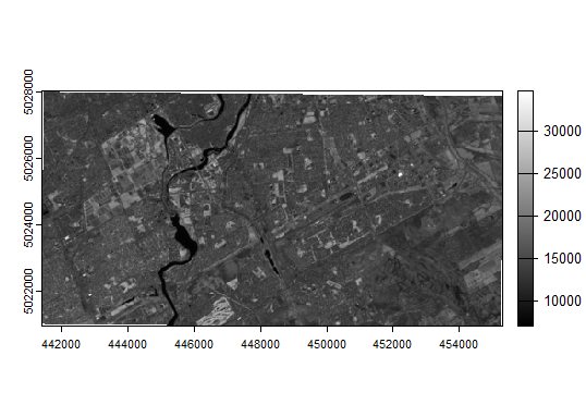
If you wanted to look at just the NIR band, using 255 shades of grey, you could use this:
plot(rawImage$SR_B5, col=gray(0:255 / 255))
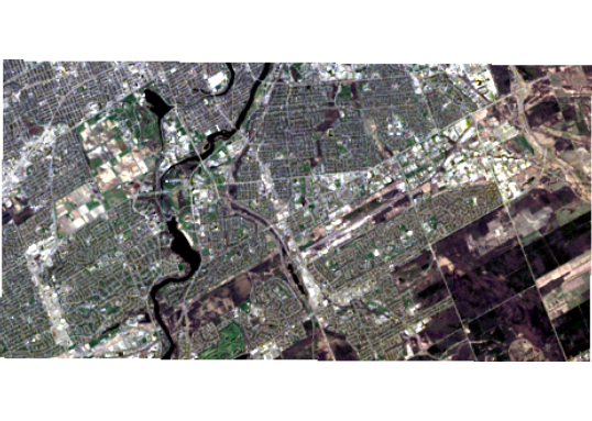
How about a visual composite (assigning the "true colour" red, green, and blue measurements to their respective colours on the display)?
plotRGB(c(rawImage$SR_B4, rawImage$SR_B3, rawImage$SR_B2), stretch="lin")
Analysis
Now let's imagine you were interested in measuring relative amounts or vigour of vegetation in different parts of Ottawa. We will start with a neighbourhood-based analysis. Then we'll compare that to one restricted to parks and greenspaces, to see what kinds of differences we find. We will use NDVI as an index of vegetation vigour and photosynthetic biomass.
Image algebra to calculate NDVI
NDVI <- ((rawImage$SR_B5 - rawImage$SR_B4)/ (rawImage$SR_B5 + rawImage$SR_B4))
I can check the distribution of NDVI across the image with this:
hist(NDVI, xlab="NDVI", ylab="Frequency")
And make a map of it:
plot(NDVI, col=rev(terrain.colors(10)), main="NDVI")
Image statistics (zonal)
Now we will find out the average NDVI by neighbourhood. While there is a extract() function that could tell us about the distribution of NDVI in each neighbourhood polygon, I found I was getting errors that didn't make sense when I tried to do this across the city. Then I noticed in the help pages for extract() it mentioned that rasterizing the polygons and then using zonal() was a more "efficient" alternative. I tried it, it worked, so I think that efficiency includes use of RAM, and I was probably running out once I tried it across on a significant spatial extent.
I did learn through trial and error that I really needed to set up the spatial layers so they aligned perfectly to make this work, though, so that's the reason for the following transformations:
rast_nbrhds <- rast(NDVI) # create an empty raster with same spatial qualities (CRS, resolution, extent) as NDVI
What is the CRS for NDVI?
crs(NDVI)
At the end of that output, you should see that the EPSG code for the CRS is 32618, so we do this to create a version of the neighbourhood polygons that is reprojected to match:
nbrhds_proj <- terra::project(nbrhds, "EPSG:32618") # reproject Neighbourhoods to UTM 18N
Finally, rasterize the neighbourhoods polygons, using the "ONS_ID" field to populate the raster cells:
nbrhdIDrast <- rasterize(nbrhds_proj, rast_nbrhds, "ONS_ID")
I originally thought I needed to crop the neighbourhoods layer because some of them extended outside the extent of the image I had created, and that works, using the crop() function. But it turns out that was redundance because the above steps accomplish the cropping already, by virtue of the fact that rast_nbrhds is defined to match the extent of NDVI. So I just mention it here so that you're aware of the crop() function if you ever DO need such a tool.
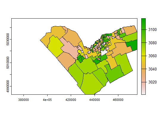
Let's take a look to make sure this has accomplished what we think it did:
plot(nbrhdIDrast)
lines(nbrhds_proj)
You should see a map with the neighbourhood polygon boundaries, "coloured in" using the rasterized neighbourhood ID pixels. If your image boundaries are smaller than the Ottawa boundary, some neighbourhoods will be cut off at the edges of the map, but since we're using a pixel-by-pixel extraction, that will work fine for this analysis (with the proviso that in border cases, we're not looking at the full neighbourhood). Exercise for the reader - how could this workflow be modified to make sure we only look at full neighbourhoods?
Finally, let's extract the average NDVI per neighbourhood:
NDVIbyNbrhd <- zonal(NDVI, nbrhdIDrast, "mean", na.rm=TRUE)
That produces a data frame:
> zonal(NDVI, nbrhdIDrast, "mean", na.rm=TRUE)
   ONS_ID     SR_B5
1     3001 0.2718333
2     3002 0.2549597
3     3003 0.1818396
Join tables
The column names of that table could use fixing; ONS_ID is fine, but the second column inherited its name from a default assignment back when the NDVI image was created from the original Landsat bands (in this case Band 5, I assume because that was the first object referenced in the assignment equation that created the NDVI object). That's easy to fix; and while we're at it, fix the NDVI naming so anything else we do doesn't have the same problem:
names(NDVIbyNbrhd)[2] <- "NDVI"
names(NDVI) <- "NDVI"
If you look at the NDVIbyNbrhd object now, you should see that the second column has been renamed to NDVI.
Now let's join that to the full neighbourhoods vector layer's attribute table, using merge():
newNbrhds <- merge(nbrhds_proj, NDVIbyNbrhd)
So... which neighbourhood has the highest average NDVI on my image date?
> newNbrhds[newNbrhds$NDVI == max(newNbrhds$NDVI)]$ONS_Name
[1] "NAVAN - SARSFIELD"
Exporting data
Finally, let's export the resulting neighbourhoods data and inspect it in a GIS package. I've decided here to write out the new neighbourhoods layer into a geoPackage:
writeVector(newNbrhds, filename="NeighbourhoodNDVI.gpkg", filetype="GPKG")
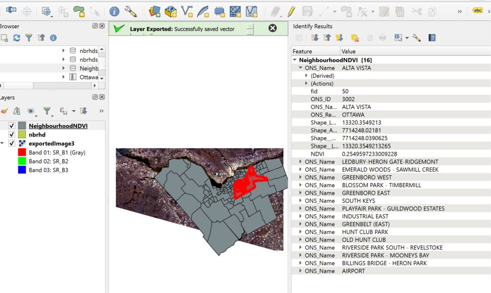
And when I look at the file in QGIS, I see that indeed the NDVI attribute is now populated:
Do parks and protected spaces have higher NDVI?
Let's do a contrast of NDVI in areas of the city that are "protected" with the region as a whole...
# create a reprojected and rasterized version of the parks layer
parksProj <- terra::project(parks, crs(NDVI)) # note shortcut compared to previous reprojection in this tutorial
parksRast <- rast(NDVI) # create an empty raster using metadata from the NDVI raster grid
parkID <- rasterize(parksProj, parksRast, "PARK_ID") # create a raster based on parksRast with pixels assigned ParkID
parkNDVI <- zonal(NDVI, parkID, "mean", na.rm=TRUE)
So, let's look at some descriptive statistics:
summary(NDVI)
summary(NDVIbyNbrhd)
summary(parkNDVI)
What are those three tables summarizing, and what do they tell us about vegetation vigour in different divisions of space in our image?
Classifying Image
I'd like to take a look at NDVI in different land covers, but I don't have a land cover map handy. I'm going to demonstrate classification possibilities in R to generate one. Please note this is definitely a "quick and dirty" classification, skipping several best practices and quality checks that you would normally perform in a proper classification exercise.
I've done some quick digitization of basic land covers in the Ottawa area, and saved the data here. Download the data and put the file in the same folder as the other tutorial project files.
Use the following commands to read in and quickly take a look at the data:
lcpolys <- vect("RSpatialExamples.gpkg")
plotRGB(c(rawImage$SR_B4, rawImage$SR_B3, rawImage$SR_B2), stretch="lin")
polys(lcpolys)
text(lcpolys, lcpolys$LandCover)
You will likely need to zoom into the plot to see anything useful.
Assuming you used the GEE tutorial linked above to obtain an image, you'll have a Landsat image that has all sorts of bands that don't really make sense to use in a classification. I'm going to proceed using just the first 9 bands in the file, which map energy from the ground, as opposed to atmospheric measurements and quality control additions. You can apply similar logic to other forms of imagery.
LS8Image <- subset(rawImage, 1:9) # use just the first 9 bands in the source file
Choose some training samples, randomly:
set.seed(1) # create a seed for random number generation
trainingSamples<-spatSample(lcpolys, 600, method="random") # Sample 600 points randomly from the polygon data
plot(trainingSamples)
table(trainingSamples$LandCover)
sampledImage <- extract(LS8Image, trainingSamples, ID=FALSE)
head(sampledImage)
sampData <- data.frame(class = trainingSamples$LandCover, sampledImage)
head(sampData)
Create a regression tree model:
cartmodel <- rpart(as.factor(class)~., data=sampData, method='class', minsplit=5)
print(cartmodel)
plot(cartmodel, uniform=TRUE, main="Classification Tree")
text(cartmodel, cex = 1)
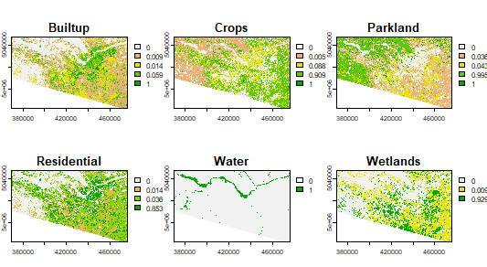
Classify the image based on the regression tree. This creates probability maps for each class.
classify <- predict(LS8Image, cartmodel, na.rm=TRUE) # will take some time
plot(classify)
Use the maximum likelihood to determine class assignment for each pixel:
landcover <- which.max(classify)
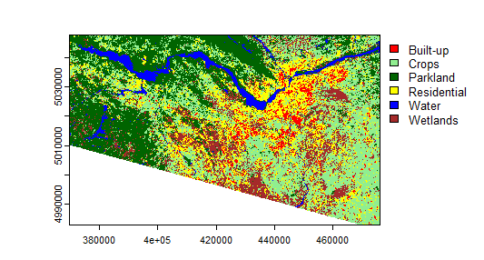
Plot the predicted classes:
myClasses <- c("Built-up", "Crops", "Parkland", "Residential", "Water", "Wetlands")
levels(landcover) <- data.frame(id = 1:6, class=myClasses)
mycolors <- c("red", "lightgreen","darkgreen","yellow","blue","brown")
plot(landcover, col=mycolors)
Not too bad for quick and dirty, eh? I was not expecting good results given how quickly I created the training data. How bad is it? Let's look at some accuracy evaluations. Let's use the example provided by RSpatial as a basis to create error matrices and calculate overall accuracy. This will be easier if you create a separate R script file instead of using the console directly. Click the button with the blue "+" symbol near the top left of the RStudio window, then "R Script". Copy the following into the resulting window:
k <- 10 # number of times to cross-validate (k-fold cross-validation)
j <- sample(rep(1:k, each = round(nrow(sampData))/k))
resultList <- list() # create a new empty list to hold each validation result
for (x in 1:k) {
    train <- sampData[j != x, ]
    validation <- sampData[j == x, ]
    # Create a CART model as above but with new training subset
    cartmodel <- rpart(as.factor(class)~., train, method = 'class', minsplit = 5)
    pclass <- predict(cartmodel, validation, na.rm = TRUE)
    # assign class to maximum probablity
    pc <- apply(pclass, 1, which.max)
    # use labels instead of numbers
    pc <- colnames(pclass)[pc]
    # create a data.frame using the reference and prediction
    resultListx <- cbind(validation$class, pc)
}
# create a data.frame of results based on the lists we just created
resultDF <- do.call(rbind, resultList)
resultDF <- data.frame(resultDF)
colnames(resultDF) <- c('observed', 'predicted')
# confusion matrix
conmat <- table(resultDF)
print(conmat)
Save the script and then source it. Which classes are most confused with each other?
What is the overall accuracy (see code below)?
# Calculate overall accuracy
totalSamples <- sum(conmat)
diagonal <- diag(conmat)
overallAcc <- sum(diagonal) / totalSamples
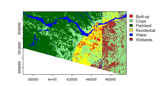
Note that when I did the same classification technique with the Landsat QA bands included, though, I got a horrible-looking map with crazy artifacts (below), but the accuracy was JUST AS HIGH! Amazing how accurate a single metric can make things look if you don't pay attention to the details, isn't it?!
Instead, you should have something like the following:
Given all of the above I'm not sure how much I trust this LC map, but for the sake of this exercise, what ARE the NDVI trends?
summary(zonal(NDVI, classify, "mean", na.rm=TRUE))
