Time Series Analysis using Google Earth Engine and Google Colab
Introduction/Earth Engine Background
Google Earth Engine is a powerful and useful platform with many built-in tools to run geospatial analyses using Google's servers and computational infrastructure. Earth Engine hosts a number of datasets of various categories and applications including selections of Landsat collections from 1979 to present, Sentinel collections, MODIS collections, and a host of various data including DEMs, crop inventories, several radiance sensors, and many more vector and raster datasets.
This data can be accessed, queried, and processed within a short timeframe and allows a user to select and process data into workable products within minutes. Google Earth Engine relies on user scripting to query datasets and process data into charts, graphs, maps, animations, applets, and any available products that Google's API offers. This tutorial will assume that you have an understanding of Python scripting and GIS experience, however all code will be provided.
Earth Engine offers a 'Code Editor' and 'Explorer' to find, access, and manipulate data. The Code Editor is used in strictly JavaScript API/language, an example of which can be seen at Supervised Classifications using Google Earth Engine by Loucas Diamant-Boustead. Rather than using the Code Editor exclusively, Google also offers a Python API within the Google Colab environment. Colab allows for instant Python writing and execution within a web browser, with little setup required. There are plenty of Python libraries that can be used to assist in geospatial analysis, with the ability to create, query, and mutate dataframes (like Excel), perform spatial joins, perform statistical analysis, and to map and plot trends using Earth Engine datasets.
This tutorial will focus on using Google Colab as a platform to perform Earth Engine analyses. Python functions and processes will be displayed as code and explained at a basic level, with a focus placed on the meaning/reasoning behind the code, rather than a full explanation of how Python scripting works. Basic levels of knowledge and understanding of GIS, statistics, and Python is highly recommended for this tutorial.
The subject of this walkthrough will focus on Google Earth Engine's Sentinel 5-P TROPOMI dataset, which is offered at a level 3 (pre-processed) product. Because it is pre-processed, its data products can be used directly to perform analysis. No pre-processing or quality assurance work is necessary (as is necessary with other Level 1-2 remote sensing datasets). Google Earth Engine's Colab API will be utilized to analyze changes in atmospheric nitrogen dioxide (NO2) during the 2020 COVID pandemic (specifically, their related lockdowns) using TROPOMI products. An example of both statistical/quantitative analysis and visual/qualitative analysis will be provided and walked through.
Initial Setup
Signing up for an Earth Engine Account
A key part in using Google Earth Engine for any purpose, either in Colab or the Code Editor, is setting up an account and applying for Earth Engine access.
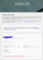
Although Google Earth Engine is an 'open' platform, it does require that you fill out a form to setup an Earth Engine account. As well, you'll need to create a Google-platform account in order to access Earth Engine and Google Colab notebooks/Google Drive, so the preliminary step would be to sign-in or sign up for a Google Account on the Google platform.
With a Google account, you can apply for an Earth Engine account here. The setup process will be detailed below.
Steps to the setup process:
- If you haven't already, create a Google platform account (with any type of email) at Google.ca (top right corner of page).
- Go to this website and sign-up for an Earth Engine account
- Add your email (this will be done automatically if signed in to Google).
- Add your first and last name (don't lie here!)
- Add your institution (likely Carleton University) and type of institution (likely Education/Academic).
- Select your region (likely Canada)
- Provide a few sentence description of why you want to use Earth Engine
- Accept the Terms of Service
- Do not apply for a commercial-use license
- Prove you are not a robot
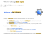
- You will likely receive an email of your successful registration within 24 hours.
And that's all it takes to sign-up for an Earth Engine account! It usually is a very simple process, and if you are denied you can re-apply. The most common reason for denial would be incorrect information, or the accidental application for a commercial license.
Setting up your Google Colab Environment
The first step in setting up a Colaboratory (Colab) environment is to go to this website.
This page will also provide you with some background on what Colab is, what it is used for, its advantages, some basic information and demonstrations, and the various applications of the environment and application. Reading this page is highly suggested to learn more about Colab and how it uses Python in an interactive notebook environment, as well as providing useful links for how-tos and demonstrations showing how and what Colab can do.
Once you have read through the 'splash' page for Google Colab, you can create your own Colab notebook by clicking 'File/New notebook' to create your own, blank Python notebook.
Within the Colab notebook environment (and within your new notebook), you can add two types of cells to your notebook:
- Markdown Cells are used to add formatted text, headings, sub-headings, notes and anything that isn't Python script to your notebook. In this tutorial, we won't be using many markdown cells (some may be used for images/illustrations), and they aren't relevant to the process of strict geospatial analysis within this environment. They are quite useful, however, for interactivity, whether using them as the basis for a tutorial (rather than a Wiki page or website), a laboratory for academic purposes (they can be used as text for a lab-writer, or textual answer blocks for a lab student), or other uses, they can be used to illustrate actions being performed in Python in plain English.
- Code Cells allow you to write and execute Python code/scripts within your web browser, which provides a powerful tool for using Earth Engine data in a new environment. Python has plenty of built-in geostatistical libraries, including Pandas, Plotnine (ggplot from R), Altair, matplotlib, scipy, and many more. Others have also made Earth-Engine specific python libraries (specifically geemap, which builds on Colab's Earth Engine mapping methods) that greatly increase the usefulness and user-friendliness of Python/Colab as an Earth Engine tool.
For each step of this tutorial, you can create your own 'Code' cell to coincide with the code that will be written in
a code block, like this.
Installing Python Libraries and Authenticating your Earth Engine Access
Once you have your own, blank Colab notebook, you can begin this exercise by importing relevant Python libraries, and authenticating your Earth Engine session. You'll have to authenticate every time you open the notebook (but only have to authenticate once when starting up). The most important library, called geemap, will have to be downloaded first as seen below. In order to import or install libraries, create a code cell by clicking '+ Code', and type or copy the code blocks below into them. Once fully filled into the code block, 'run' the code by clicking on the large 'Play' button on the left side of the code block.
# This installs the geemap library, a useful mapping and visualization python library for Earth Engine
!pip install geemap
Useful Tip: You can delete outputs from code cells by clicking the 'triple dots' in the top corner of your code cell, and selecting 'clear output'.
The above block of code will install all the dependencies and core of the geemap library, which is used to map Google Earth Engine in the Python environment. In order to used newly installed packages, you'll have to click 'Restart Runtime'.
With that installed, the rest of the Python libraries necessary are built-in, and only need to be imported. We will import the libraries below. Create a new code cell for each of the code blocks, to keep things separated and tidy.
# Import the necessary libraries
import ee
import numpy as np
import geemap.eefolium as geemap
import pprint
import pandas as pd
import altair as alt
import folium
import plotnine
from scipy import stats
# Set up a 'pretty printer' to print 'nicely' within Python
pp = pprint.PrettyPrinter(depth=3)
Some of these libraries (ee, geemap eefolium, folium) are used for interactive mapping (in a similar way as Google Earth/Maps, using its applet). Others are used for statistics (numpy, pandas, scipy/stats), and for our plots (pprint, altair, plotnine).
The final setup step for our Colab environment is Earth Engine's Authentication system. This is necessary for Earth Engine processes to be available within Colab, and for Earth Engine and Colab to have access to your Google Drive (for read/write purposes). Create another code block and add the following:
# Authenticate and initialize this instance of GEE in Google Colab
## Follow the prompts and fill in authentication code
ee.Authenticate()
ee.Initialize()
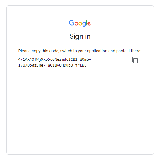
Authentication and initialization will provide you with an output that has a link you must follow to sign-in and get an authentication code (see images).
In order to authenticate and initialize this Google Earth Engine instance in Colab, follow the link given in the output section below your code block. Once the prompts are followed at the webpage (sign-in, accepting terms), copy your unique code into the vacant 'Enter verification code' in the first image and press Enter. This will successfully save an authorization token, and then we're ready for analysis!
Time Series Analysis
Introduction to Time Series Analysis and this Case Study
Time-series analysis simply refers to analyzing a series of data indexed by their order in time. Typically, this involves comparing two (or more) data points taken at equally spaced intervals of time. Time-series can be used for a variety of subjects to find temporal autocorrelation, study seasonality, stationarity, and compare trends between time periods. In remote sensing, it can be used for many purposes, such as to monitor crop and vegetation conditions, ecosystems, sea temperatures, urban sprawl, and air quality/atmospheric gas levels. In this case study, we can use time-series to study atmospheric gas (NO2) and its trend across the same time period (by day of year) in 2019 and 2020.
In this tutorial, we will work with Sentinel 5 P's TROPOMI (Tropospheric Monitoring Instrument) sensor's converted Level 3 products to analyze changes in atmospheric gases (Specifically NO2, or Nitrogen Dioxide) related to the COVID-19 pandemic and strict 2020 lockdown period. This will be compared to the 2019 'baseline' NO2 level. Time series visualizations (simple interactive, symbolic maps), alongside utilization of Python plotting/graphing libraries and statistical testing to create interactive plots and quantitative analysis of TROPOMI data products in Google Earth Engine.
The unprecedented nature of the COVID-19 pandemic led to various public safety measures, particularly in early to mid 2020. These measures included partial or complete lockdowns, curfews, shuttering of businesses, and restrictions in industrial activity.
There have been noted broad reductions of air pollutants in many cases, and unusual changes (some products such as Ozone have increased with the decrease of NO2) found in regional air pollution of gases such as NO2 (Nitrogen Dioxide), SO2 (Sulfur Dioxide), CO (Carbon Monoxide), Ozone (O3), and others related to COVID-19 and imposed lockdowns. These variations have been particularly noticeable in urban/industrial areas.
NO2 (Nitrogen Dioxide) is considered one of the main resulting gases from the burning of fuel. High levels of NO2 are produced from emissions from vehicles and industrial activity. During periods of strict lockdown under public health measures, levels of NO2 were noticeably reduced in China and Italy, India, as well as many other urban centres, seen with the TROPOMI sensor. NO2 is an atmospheric pollutant emitted by combustion processes and has a short lifetime of less than one day; this means that molecules of NO2 stay fairly close to their sources and so it is an appropriate choice to look for changes in emissions.
In Ontario, a State of Emergency was declared initially on March 17, 2020, with stay-at-home orders lasting in their strictest form (no groups/gatherings outside households) until June 12, 2020. Because of this time period of 'strictest' lockdown, dates within/near this timeframe (March 23rd, 2020 to June 23rd, 2020) will be selected as our study period.
GIS and remote sensing tools have been utilized to study the COVID-19 pandemic. In particular, many studies have focused on the observed reduction of NO2 related to the pandemic's restrictions and lack of vehicular and industrial traffic. Multiple studies utilized Sentinel 5P's TROPOMI dataset and Earth Engine to analyze the trend change.
Applications of these studies include future emission planning, as lockdowns provided a real-world 'simulation' of what is needed for future emission goals. Other studies even provided a link between high NO2 concentrations and COVID complications/mortality, further illustrating the need for emission reduction, and studying the same data in a different context.
Section 1: (Visualization and Qualitative Analysis)
In this step, we will use the TROPOMI NO2 Offline Nitrogen Dioxide product available at its native 1113.2-meter resolution. The band of interest for our purposes will be the 'tropospheric_NO2_column_number_density', measured in molecules per meter squared (mol/m2), with an absolute minimum of around -0.005375, and an absolute maximum of 0.0192044. Negative values will be filtered out of our visualization parameters.
Because the Level-3 product has directly filtered cloudy/snowy/bad data using a Quality Assurance (QA) band, we can jump straight into masking functions to create an image collection and display it on a map using reducers. For now, we will zoom in on a pre-selected study area (Toronto) and analyze a March 23-June 23 NO2 'baseline' in 2019, and a 'lockdown' in 2020.
Let's take a look at how to do this in Python in our Colab notebook (create another code cell below your initialization cells).
# Start with an image collection for 2019 (Baseline)
# This code will grab an image collection from the TROPOMI data catalogue
# ... based on our parameters for band and date filter
Baseline2019 = ee.ImageCollection('COPERNICUS/S5P/OFFL/L3_NO2')\
        .select('tropospheric_NO2_column_number_density')\
        .filterDate('2019-03-23', '2019-06-23')\

# Note that slashes \ are used in the code above to allow another line of code for
# formatting appearance (the code could all be on one long line, if you wanted).
# In some cases, code automatically continues to the next line, e.g. when there are commas,
# but sometimes we need to tell the code that we are continuing on the next line with a \.

# Get the median pixel value for 2019's study period by observation
# This is a temporal reducer
Baseline2019Median = Baseline2019.median()

# For Tropospheric concentrations, this is considered a 'reasonable range' to visualize at.
# Feel free to change it to analyze different ranges of particulate density.
# You can also try some other colour palettes linked below
visParams = {
    'min': 0,
    'max': 0.0002,
    'palette': '00FFFF, 0000FF'
    };
# This set of code will use the geemap package to display the map within your Colab
# environment, of the rates of atmospheric NO2 in 2019
Map = geemap.Map()
Map.addLayer(Baseline2019Median,visParams,'2019 "Baseline" NO2 Levels')
Map.addLayerControl()
# This is Toronto
Map.setCenter(-79.3832, 43.6532, 8)
Map
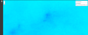
This will give us a 'coarse' (low-resolution) map that looks like this for our 2019 'Baseline' Level:
Depending on monitor size/window size your view may not be centered properly. You can turn off the layer in the top right of the map screen and can scroll to our study area in Toronto (or another urban centre).
Next, let's search for a 'pandemic-affected' 2020 NO2 map centered on our study area.
# We will now get an image collection for 2020
Baseline2020 = ee.ImageCollection('COPERNICUS/S5P/OFFL/L3_NO2')\
        .select('tropospheric_NO2_column_number_density')\
        .filterDate('2020-03-23', '2020-06-23')\

# Note that slashes \ are used in the code above to allow another line of code for
# formatting appearance (the code could all be on one long line, if you wanted).
# In some cases, code automatically continues to the next line, e.g. when there are commas,
# but sometimes we need to tell the code that we are continuing on the next line with a \.

# Get the median pixel value for 2020's study period
# This is a temporal reducer
Baseline2020Median = Baseline2020.median()

# For Tropospheric concentrations, this is considered a 'reasonable range' to visualize at.
# Feel free to change it to analyze different ranges of particulate density.
visParams = {
    'min': 0,
    'max': 0.0002,
    'palette': '00FFFF, 0000FF'
    };

Map = geemap.Map()
Map.addLayer(Baseline2020Median,visParams,'2020 "Pandemic" NO2 Levels')
Map.addLayerControl()
Map.setCenter(-79.3832, 43.6532, 8)
Map
This will give us a 'coarse' (low-resolution) map that looks like this for our 2020 'COVID' Level:
Note the difference in 'blueness' between the median values of NO2 in 2019 and 2020 during lockdown months. If you want, you can try investigating other colour palettes to try and show the difference in different visualization schemes.
We did not filter the bounds/study region for our image, so the collected data showed worldwide medians of NO2 concentrations for each year. You can take a look at other cities/countries (Particularly Italy, Great Britain, China, and Italy (the latter two may require a date shift a couple months earlier)) by panning and zooming to different urban areas across the globe.
Was there a reduction in NO2 emissions in 2020 during the lockdown period? Where are the ‘hotspots’ of NO2 emissions in Ontario and Canada and how did they change during 2020? This process is hardly exact, but it provides a solid preliminary basis to visualize the variations that were widely seen in this time period in 2020.
The median pixels are derived from the daily medians across our entire study period (92 days). To investigate further, we can create time-series charts and statistical products to analyze how NO2 concentrations played out in our study region in the first half of 2019 and 2020, respectively, which will be conducted in the next section.
Section 2: (Pandas, Statistics, Plotting, and Quantitative Analysis)
In order to create a time series analysis, we can either look at the change in pixel values over time for a single pixel (at a pre-defined point) or we can look at the change in values over time for a region of pixels (in a created polygon/geometry). In both cases, reducers are required to produce average values for charting.
Google's Chart.UI library incorporates this reducing capability into its chart functions, but in the Python API in colab, we need to define the functions that will apply a reducer across an image collection before we plot the time series. The functions below were taken directly from a GEE Python Charting Tutorial.
The first function is actually used to create another function, in a clever use of Python. The code below defines a reusable function that can perform the reducing task for different datasets. The function accepts arguments such as scale and reduction method to parameterize the operation for each particular analysis.
Do not worry too much about trying to understand how the function works. For our purposes, we just need to know that they work (they do) and that we can re-use them to convert image collections to tables.
# Define a function (and embedded function) for reducing a region for charting
# See the function descriptions defined in red within the functions

def create_reduce_region_function(geometry,
                                  reducer=ee.Reducer.median(),
                                  scale=1113.2,
                                  crs='EPSG:4326',
                                  bestEffort=True,
                                  maxPixels=1e13,
                                  tileScale=4):
  """Creates a region reduction function.

  Creates a region reduction function intended to be used as the input function
  to ee.ImageCollection.map() for reducing pixels intersecting a provided region
  to a statistic for each image in a collection. See ee.Image.reduceRegion()
  documentation for more details.

  """

  def reduce_region_function(img):
    """
      Function returns
      An ee.Feature that contains properties representing the image region
      reduction results per band and the image timestamp formatted as
      milliseconds from Unix epoch (included to enable time series plotting).
    """

    stat = img.reduceRegion(
        reducer=reducer,
        geometry=geometry,
        scale=scale,
        crs=crs,
        bestEffort=bestEffort,
        maxPixels=maxPixels,
        tileScale=tileScale)

    return ee.Feature(geometry, stat).set({'millis': img.date().millis()})
  return reduce_region_function
Now that these functions have been defined for our statistical analysis, we will use them on an image collection of NO2 within our GTA study region. We will get two tables (2019 and 2020) that we can use as input to do some charting, and it can also be used for statistical testing (not shown).
# Let's gather some TROPOMI NO2 data as we did above, for a 2019 baseline
NO2Baseline = ee.ImageCollection('COPERNICUS/S5P/OFFL/L3_NO2')\
        .select('tropospheric_NO2_column_number_density')\
        .filterDate('2019-03-23', '2019-06-23');
# Define an area of interest (aoi)
# We will look at the GTA (broad definition)
aoi = ee.Geometry.Polygon([[-80.69265, 43.0689],
                           [-78.782,43.0689],
                           [-78.782,44.472],
                           [-80.6965,44.472],
                           ])
# Let's gather some TROPOMI NO2 data as we did above, for our 2020 lockdown study period
NO2Lockdown = ee.ImageCollection('COPERNICUS/S5P/OFFL/L3_NO2')\
        .select('tropospheric_NO2_column_number_density')\
        .filterDate('2020-03-23', '2020-06-23');
# Define an area of interest (aoi)
# We will look at the GTA (broad definition)
aoi = ee.Geometry.Polygon([[-80.69265, 43.0689],
                           [-78.782,43.0689],
                           [-78.782,44.472],
                           [-80.6965,44.472],
                           ])
# Check out the AOI if you want to visualize it (can also be used to create your own AOI)
# If you've seen enough of the GTA, you can skip this step (you'll have to scroll to the GTA to find the study area, potentially)
Map = geemap.Map()
Map.addLayer(aoi,{},'AOI')
Map.setCenter(-79.3832, 43.6532, 8)
Map
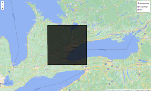
This code will create an AOI in Toronto and display to the user.
The next code chunk does three things:
Assigns the reduce function with specific parameters to the prior created function, reduce_NO2. This will make it simpler to map the function across the image collection. Maps the function over the NO2Baseline and NO2Lockdown image collections to reduce each image. Filters out any resulting features that have null computed values (occurs when all pixels in an AOI are masked).
# Use the above defined function to create a reducing function specific to our data
## We are going to leave most of the arguments as their defaults (see the above code)
## except geometry which we set to our aoi, the reducer which we will set as the median
reduce_NO2 = create_reduce_region_function(
    geometry=aoi, reducer=ee.Reducer.median())

# Convert the image collection to a feature collection with the reducer function
## this step just applies the function we created above (reduce_sst), with its defined inputs to our
## image collection for 2019
NO2_stat_fc = ee.FeatureCollection(NO2Baseline.map(reduce_NO2))
# Filter out null values based on bandnames of the first image in the feature collection
NO2_stat_fc = NO2_stat_fc.filter(ee.Filter.notNull(NO2Baseline.first().bandNames()))
# Use the above defined function to create a reducing function specific to our data
## We are going to leave most of the arguments as their defaults (see the above code)
## except geometry which we set to our aoi, the reducer which we will set as the median
reduce_NO2 = create_reduce_region_function(
    geometry=aoi, reducer=ee.Reducer.median())
# Convert the image collection to a feature collection with the reducer function
## this step just applies the function we created above (reduce_sst), with its defined inputs to our
## image collection for 2020
NO2_stat_fc_2020 = ee.FeatureCollection(NO2Lockdown.map(reduce_NO2))
# Filter out null values based on bandnames of the first image in the feature collection
NO2_stat_fc_2020 = NO2_stat_fc_2020.filter(ee.Filter.notNull(NO2Lockdown.first().bandNames()))
Now, we have to convert from Feature Collection to a Python dictionary, and convert that into a Pandas dataframe.
In this step, we will create a function used to convert an ee.FeatureCollection to an ee.Dictionary. Then we convert the ee.Dictionary to a pandas dataframe, which is a common table format in python.
Google Earth Engine's workflow in processed via communication between your computer/Python API and Google's servers for computation. In order to plot charts without the ability to use Google's built-in capabilities, we need to move the data from the server side (Google) to the client side (your computer) which is done with the .getInfo() function in Earth Engine.
This workflow can be utilized for integrating Google Earth Engine data with other python libraries and data processing functions, not just for charting.
Let's convert this data using these functions and try some charting!
# Define a function to transfer feature properties to a dictionary.
# We use this to convert our earth engine object (reduced image collection) to a
# collection of properties and their values

def fc_to_dict(fc):
  prop_names = fc.first().propertyNames()
  prop_lists = fc.reduceColumns(
      reducer=ee.Reducer.toList().repeat(prop_names.size()),
      selectors=prop_names).get('list')

  return ee.Dictionary.fromLists(prop_names, prop_lists)
The data now needs to be passed into the function to convert it into a dictionary that can be used on our own computers. This will take a while, as Google throttles these processes.
Running the following code cells should take a few minutes. If it times out, try running it again.
# Convert feature collection to dictionary and use .getInfo() to transfer to our own computers
NO2Baseline_dict = fc_to_dict(NO2_stat_fc).getInfo()
# Convert feature collection to dictionary and use .getInfo() to transfer to our own computers
NO2COVID_dict = fc_to_dict(NO2_stat_fc_2020).getInfo()
These can be converted to data frames, which we can analyze via the pandas library. We will create columns for each of our key:value dictionary pairings, and then we will do some charting and statistical tests. This can be conducted via a .DataFrame() call from the pandas library, imported as 'pd'.
# Conversion of dictionary to dataframe for pandas usage for both years
NO2COVID_df = pd.DataFrame(NO2COVID_dict)
NO2Baseline_df = pd.DataFrame(NO2Baseline_dict)
Now, let's clean up this data so we have a better, more intuitive date format with distinct Years, Months, Days, and Days of Year (DOY) variables in our data frame.
We can also drop some unnecessary data.
# Function to add date variables to DataFrame.
# This function just uses pandas functions on the millis column within our dataset to create date time columns

def add_date_info(df):
  df['Timestamp'] = pd.to_datetime(df['millis'], unit='ms')
  df['Year'] = pd.DatetimeIndex(df['Timestamp']).year
  df['Month'] = pd.DatetimeIndex(df['Timestamp']).month
  df['Day'] = pd.DatetimeIndex(df['Timestamp']).day
  df['DOY'] = pd.DatetimeIndex(df['Timestamp']).dayofyear
  return df
# apply the date info function to the dataframe
NO2Baseline_df = add_date_info(NO2Baseline_df)
NO2COVID_df = add_date_info(NO2COVID_df)
# Rename the sst column SST and remove the unnecessary millis and system:index columns, also renaming our columns to make them easier to read
NO2COVID_df = NO2COVID_df.rename(columns={
    'tropospheric_NO2_column_number_density': 'Median NO2 Concentration (mol/m2)'
}).drop(columns=['millis', 'system:index'])
NO2Baseline_df = NO2Baseline_df.rename(columns={
    'tropospheric_NO2_column_number_density': 'Median NO2 Concentration (mol/m2)'
}).drop(columns=['millis', 'system:index'])
In this final exercise, let's try plotting a trend in NO2 in both 2019 and 2020 within our study area. Because we have reduced our Earth Engine data to table format, we can work within Pandas.
Technically, we could simply export the data at this point to Excel to create graphs, but this is Python-based so let's try in Python! It has plenty of libraries for creating beautiful aesthetic graphs, and they can even be interactive in the Colab environment.
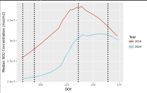
Let's try using ggplot functions from the plotnine library. We will combine the 2019 and 2020 dataset and plot them on the same plot, with coloured labels to differentiate. It should show lower NO2 values in 2020 than in 2019, within the same timeframe. We'll use DOY to serialize the plot, and Year to separate 2019 and 2020.
We will also add vertical lines (via geom_vline()) to represent the following dates:
March 23rd, 2020 (DOY 83): Closure of Non-Essential Businesses
April 3rd, 2020 (DOY 94): Closure of Non-Essential Businesses extended to include more stores/businesses, limitation of social circles to household
May 15th, 2020 (DOY 136): Re-opening roadmap Stage 1 begins
June 12th, 2020 (DOY 164): Social Circles increased to 10 persons, Re-Opening stage progresses (at a different rate) province-wide
# Let's combine both datasets so we can plot them both on the same line graph.
bigDataset = NO2Baseline_df.append(NO2COVID_df)
# Change the 'Year' variable to a string for this purpose, as it makes the year more 'categorical' on the map.
bigDataset.Year = bigDataset.Year.astype(str)
(
    ggplot(data = bigDataset, mapping = aes(x = 'DOY', y = 'Median NO2 Concentration (mol/m2)', color = 'Year'))
    # Smoothed line instead of straight (confidence interrvals not implemented in this package)
    + geom_smooth() + geom_vline(xintercept= [83, 94, 136, 164], linetype = 'dotted', size = 1.5)
)
This graph, in general, shows that NO2 concentrations were above their tropospheric values in 2019 than in 2020. There are a few 'spikes' in the 2020 dataset, but in general, the 'high' NO2 days of the year in 2019 exceeded those in 2020, particularly in the earlier part of our dataset (March to early May), with things approaching a more 'normal' year during June as traffic slowly returned to the roads/industries.
Overall, we can confirm using our statistical analysis, time series maps, and time series plot that NO2 values were generally lower in 2020 than in 2019 during this time period. Based on the day of the year, you can also see seasonal variations, as the two years' data tends to follow the same general 'trend'. You can use DOY to look at seasonal trends across separate time series, but that's an exercise for another day.
Conclusion
Google Earth Engine has a variety of uses for a remote-sensing or GIS oriented user. This tutorial only shows the tip of the iceberg of what the software can do.
If you completed each step of the tutorial and copied each code cell and ran them in succession, you should successfully have created your own visualization and time chart. You can try adjusting parameters in the functions to see what they can do.
If you want to explore Google Earth Engine further, check out the documentation and developer materials here. It is constantly updated, with contributions from developers in tutorials, examples, methods, and articles concerning what Earth Engine can pull off.
